A Look At OS X Yosemite And iOS 8.1
by Brandon Chester on October 27, 2014 8:00 AM ESTNotification Center
Notification Center on OS X has been in a strange situation for a while now. While some features like Spotlight Search transitioned from OS X to iOS, Notification Center went the other way. It has never felt like it had much reason to exist, and it has lacked in features compared to its iOS counterpart. This was made even more evident when iOS 7 and OS X Mavericks rolled out. iOS received the new Today view with new widgets for apps like Calendar, Reminders, and Stocks, while on Mavericks the only change was the removal of the linen texture as Apple began to transition away from their old style of interface design.
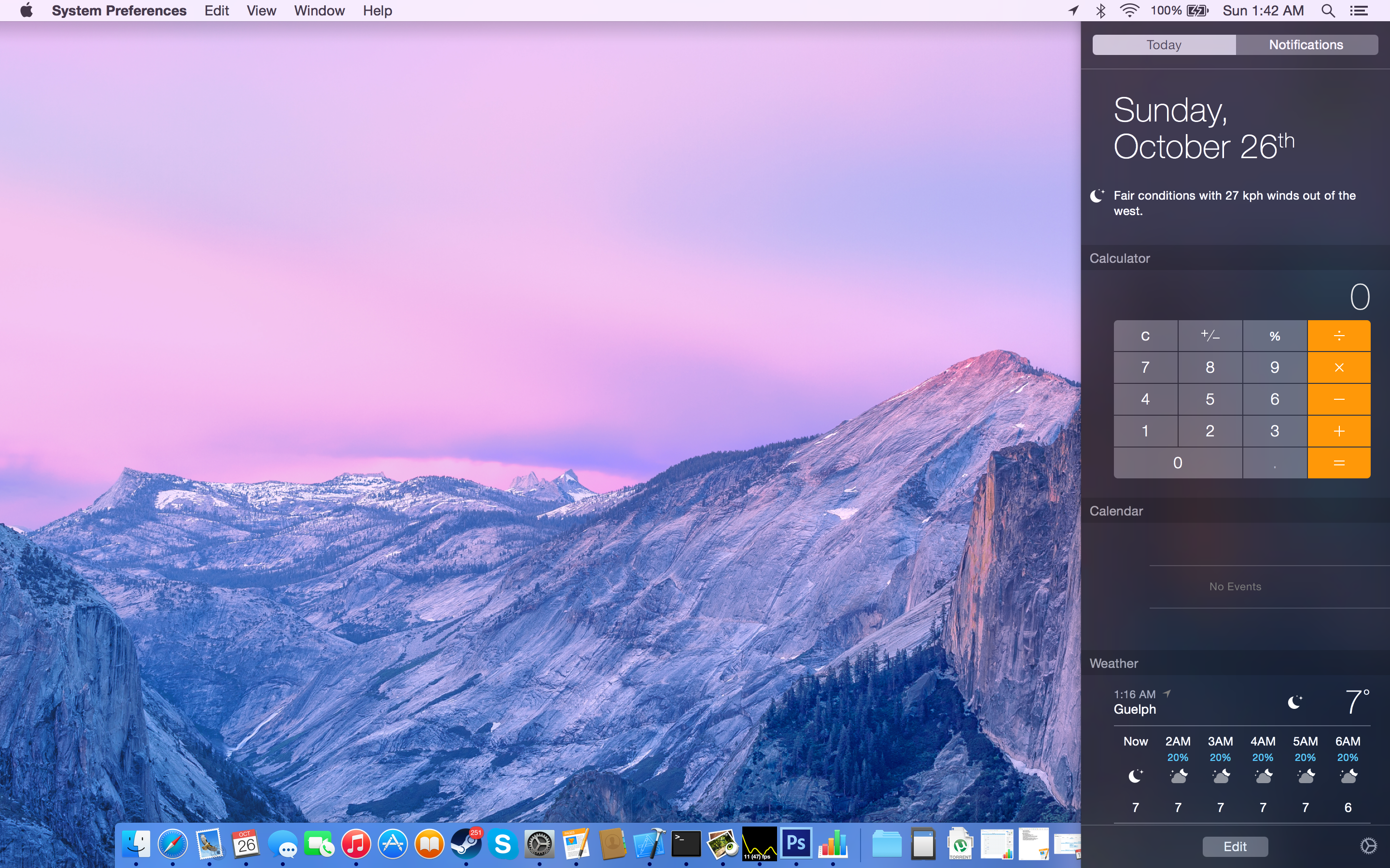
With iOS 8 and Yosemite we receive parity between the abilities and design of the two versions. With the new Yosemite interface being modeled on that of iOS, Apple has been able to bring the new translucent design of Notification Center to OS X, along with the new support for Today view and widgets. Notification Center is one of the best examples of the use of translucency to convey what parts of the interface are on a higher vertical plane than others. While in previous versions of OS X Notification Center pushed the desktop to the left, in Yosemite it simply comes in overtop of the desktop and even the Dock.
Today view gives Notification Center a greater purpose than it previously had. The ability to add widgets allows it to become a hub for getting key information at a glance, or performing quick actions. It's actually even more functional than on iOS because Apple has provided widgets for apps like Calculator which do not have widgets on iOS. A weather widget with a full forecast is also available to make up for the fact that OS X has no standalone weather app.
Because I always keep the dock visible, I can see what applications I need to check based on the red badge. As a result, I still don't use the actual notifications tab of Notification Center very often. But I do use the Today view to check what events I have coming up, what the current weather conditions are, and to do quick calculations using the Calculator widget. Overall I would say that Apple has done a good job with making Notification Center feel useful, and although not every part of it fits into the way I use my computer, I can still find ways to make use of it.
Spotlight Search

Spotlight receives some great improvements in Yosemite. I said in my iOS 8 review that I had never really used Spotlight on iOS because it didn't feel like it offered convenience or features that made it worth using. Apple's improvements actually made me start using it. The same was true of Spotlight on OS X. I had never used it until Yosemite rolled out with the new capabilities that Apple had built in. Spotlight on OS X has an even greater number of improvements than the iOS version, and it starts with the UI. The field for entering your search has gone from a tiny input field in the top right corner of your display to a large window that appears right in the center. This may sound obtrusive initially, but it is done this way because once you begin typing the window expands to the one you see below.
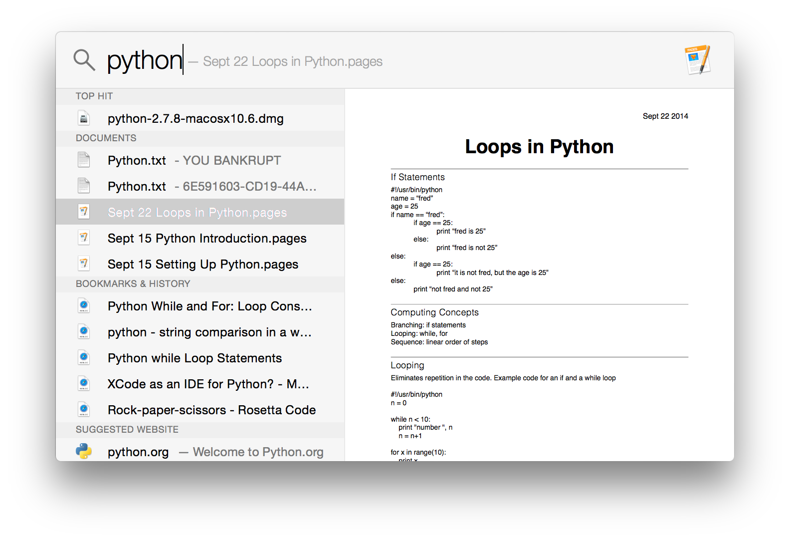
Spotlight now adopts a dual pane design, and it makes it infinitely more powerful and useful than its previous form which was a list of results situated in the top right corner of the display. The left side gives results from Safari, files on your Mac, applications, etc. The right side acts as a preview for what you have selected. This is really useful when trying to find a document when you aren't quite sure of the name, but know what you wrote in it. Rather than having to open every single document that could possibly be the one you're looking for, you can have Spotlight find all the documents with those keywords and you can preview them right in the window without ever having to go into the app itself.
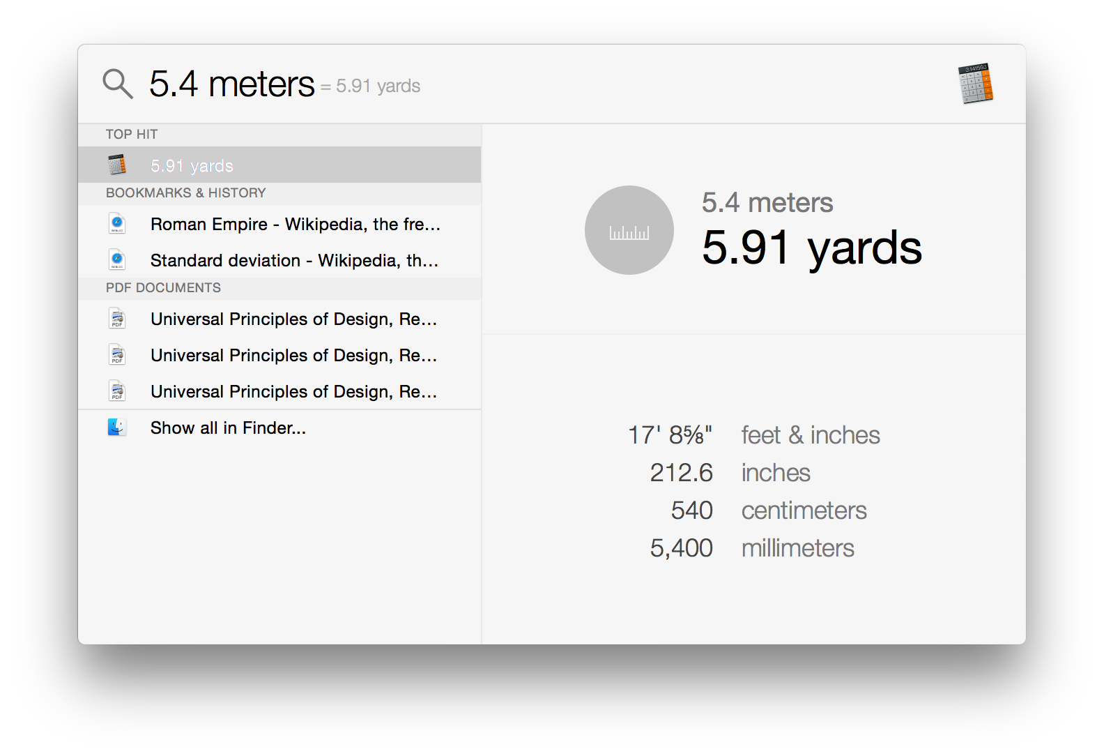
Spotlight can also do quick conversions now. This feature is especially handy, and it's notably absent in the iOS version of Spotlight which shows there's still work to do in creating parity between the features that Apple has on both of their operating systems.
Overall, Spotlight search on OS X has some solid improvements and it's a good feature. It can be hard to get in the habit of using it if you previously ignored it on older versions of OS X, but it's a useful tool to have and I encourage anyone who uses OS X to take a look at it. You may be pleasantly surprised.


173 Comments
View All Comments
DPUser - Wednesday, October 29, 2014 - link
I'm not gonna buy an iMac, but who wants a touchscreen on their desktop? I, for one, do not like fingerprints on my monitors. Or beer for that matter.annah_souls - Saturday, November 1, 2014 - link
$2500 is very cheap. I can buy as many as I want. Soorrry for you, poor guy.I don't understand why you are so upset with Apple. If you think it didn't worth your money, don't buy it. I don't see anyone threaten you to but Apple product. Post your comment like grown up people please.
shahrooz - Wednesday, October 29, 2014 - link
I think people who buy apple products don't really care where their money is going, because all of their products are overpriced. they are not bad at all, but they are never as good as their price suggest.Wolfpup - Wednesday, October 29, 2014 - link
<<<Users who are familiar with computers no longer need a distinct outline and heavy shading to recognize that a button is something they click or tap.>>>This is just plain false. It's not that we don't understand that something doesn't have to physically look like a button to be clickable-the outline or shading or 3D look or whatever is so that it's easily readable AS an interface element.
Mostly the "flat" look is just a stylistic thing, but it does have some drawbacks in areas where it's no longer immediately clear if you can interact with something.
Mostly in both iOS 7 and Windows 8 I don't find it to be a big deal, but an example where it's clearly inferior is the "show desktop" button on Windows 8. In 7, it's not offensive, it just looks raised and is clearly an interface element. In 8, it's still there, but there's no visual way to know that it's there. 8's lack of a start button is another great example. There was no way to know that was clickable and would bring up the start screen unless you already know that it's clickable and brings up the start screen. 8.1 thankfully fixes that, and I think it's an improvement regardless of whether you know what it does.
<<<They don't want their Calendar and Reminders applications to have leather borders, stitching, and paper like their calendar and date book in the real world, because doing so confines them to the limitations of those physical objects. >>>
Neither part of that is true either. The first part is a stylistic choice, and frankly I think it's a fun one. Knowing that a notepad doesn't have to look like a notepad doesn't mean that you won't prefer a fun visual design that looks like one over a plain flat white area to type in (or whatever). that's just personal preference. And making it look like something physical doesn't really restrict any function either. These programs can do all sorts of things physical objects can't, and that's true whether they have a fun real world texture or not.
At any rate I'm 100% in the camp that buttons should look like buttons. Whether flat looking, or 3D looking (once our designer overlords come back around and claim flat is so yesterday and 3D is the big hot new thing again), either way artistic design should NEVER get in the way of usability design. You should be able to at least tell what things you can interact with even if you've never used a program or OS before.
jdshewman - Friday, October 31, 2014 - link
Reading some of these comments are comical and mostly bias. First, the complaint about cost between Mac vs Windows laptops are hysterical. The parts utilized in the Mac are all top notch parts. They are not poorly fabricated nor statistically vulnerable to technical aspects. How many windows laptops have solid state drives, let alone at a reasonable price? I mean, windows runs faster loaded on a mac than a PC manufacturer at the same price point. Second, able to upgrade. Seriously, what would a person need with more than 16gb of ram or a higher CPU (higher than an i5) unless you are cracking the genetic code. These are mindless arguments to the uniformed. Buy a Mac laptop today it will run flawless with any apps for many years. Buy a windows laptop and pray it last more than a couple years with their outdated parts.Impulses - Friday, October 31, 2014 - link
"How many windows laptops have solid state drives, let alone at a reasonable price?"Umm, there's plenty, and you can usually get a larger drive for the same price. Apple has charged a larger than usual premium for drive/RAM upgrades since time immemorium. What does "statistically vulnerable to technical aspects" even mean?
There are things that can justify an Apple price premium (Apple Care, resale value, preference for OS X, display quality)... Somehow you fail to mention even one relevant reason, bravo.
P.S. Every content creator under the sun would smack you for asking who needs more RAM or a faster CPU, for video and photo editing both those things often pay for themselves in no time flat within a professional environment.
V900 - Saturday, November 1, 2014 - link
"Umm, there's plenty"What nonsense. Sure, you can get a Windows laptop with some of the same features as a Macbook. It'll sometimes be cheaper too, just like you can find a Hyundai with a V6 engine for less than you'd pay for a BMW with a V6.
But the two can't compare in neither quality, experience nor resale value, just like the cheap Windows laptop can't compare with a Macbook.
(And usually will cost more in the end. Its nice to save a couple of hundred dollars. But a two year old Macbook will easily sell for 50% of what you paid for it, whereas the "inexpensive" Windows laptop will typically be close to worthless, and will cost you more in the end.)
Sorry buddy, if you want a quality laptop, you can find one running Windows. They're just pretty rare, and cost as much or more than an Apple product.
V900 - Saturday, November 1, 2014 - link
BTW: Your comment about content creators doesn't make any sense.The Macbook and Mac Mini both max out at 16GB RAM. Since time is money for these people, why would they try to save, what amounts to a couple hours overtime pay for them, on installing 3rd party RAM themselves?!?
If they'll really need it eventually, they might as well splurge on the 16GB machine from the get go. Hence they don't really need expandable RAM.
As for regular consumers, they strictly speaking don't really need it anymore either. Upgradable RAM had a purpose when 1gb or 2gb ram was the standard, but not today. A 4gb Macbook will still be plenty fast 5 or 6 years from now. This isn't Windows machines we're talking about, that seem to degrade exponentially for every year.
Which you'd know if you'd ever tried a Macbook. A 4 year old Mac with 2gb ram is fine for everyday use even today.
Impulses - Saturday, November 1, 2014 - link
Not sure why you're so gung ho about replying to my comment, specially when you don't even seem to have read it. I was only refuting that there aren't plenty of Windows laptops with SSD, which the comment I replied to stated.I quoted many of the same reasons you did why a MBP can justify it's price premium (MBA has a tougher case IMO), or did you miss that?
Regarding RAM, the argument wasn't about third party upgrades, but about the fact that "maxing out" at 16GB ISN'T enough for content creators. That would be the bare minimum for many, some would prefer 32GB+ and it has nothing to do with the OS.
V900 - Saturday, November 1, 2014 - link
It's a lot of useful features for sure, but personally I'll wait with upgrading.I really dislike the new design, but hopefully there'll be some third party software options to bring back the Mavericks look. If not, I guess I'll have to wait for 10.11, and the inevitable paring down of the flatness...