A Look At OS X Yosemite And iOS 8.1
by Brandon Chester on October 27, 2014 8:00 AM ESTRethinking OS X
The original interface for iOS was inspired by Apple's Aqua UI, with skeuomorphic elements that mimicked real world objects. Computers have always mimicked the real world to a degree. They have buttons you press, and knobs you turn. The entire desktop metaphor is really just a digitization of the real world office with folders, documents, and a trash can. As computers have evolved and people have become more familiar with them, this overall metaphor has remained for the most part. But many of the visual elements that previously mimicked these real world objects could be simplified to copy in function, but not design. Users who are familiar with computers no longer need a distinct outline and heavy shading to recognize that a button is something they click or tap. They don't want their Calendar and Reminders applications to have leather borders, stitching, and paper like their calendar and date book in the real world, because doing so confines them to the limitations of those physical objects.
iOS 7 was in a sense a rebirth of iOS. The interface that had existed for six years was entirely redone. Core design elements like the homescreen remained, but everything was given a new visual style that eliminated skeuomorphism and ushered in a new era with a new design philosophy for Apple. This style of design is fairly well understood now. iOS makes heavy use of translucency and color. Each application has a primary color throughout which is indicated on its icon. Calendar uses red, Notes uses yellow, etc. With all these massive changes, the future of the design of OS X was uncertain.
One month after we got iOS 7, we got Mavericks. Mavericks was not the major overhaul that iOS 7 was. The visual elements of the operating system were very much the same as previous versions. This can simply be attributed to a lack of engineering resources. Apple's work to redesign iOS most certainly would have began after the departure of Scott Forstall which occurred after the release of iOS 6. Redesigning iOS in less than a year was quite an accomplishment, even with the bugs that were brought along with such a major change. It would have simply been impossible to do the same for OS X within the same period of time.
However, the design in Mavericks did not stand still. While the interface remained the same for the most part, many key applications that implemented skeuomorphic interfaces were redesigned. The leather and stitching was ripped out of apps like Calendar and Notes. The linen was removed from Notification Center and the login screen. These changes were the beginning of the path to what we have now with Yosemite.
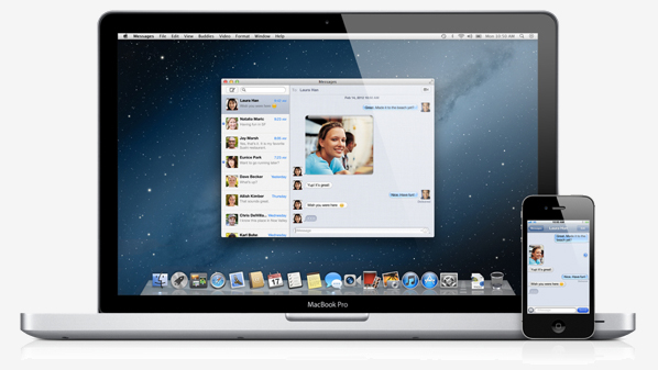
For someone used to older versions of OS X, the above interface may seem like a shocking change. But for people who have been exposed to newer versions of iOS, it will actually feel quite familiar. The use of translucency, the flatter interface, and the new system font all draw upon the design principles that were established with iOS 7. It's important to understand what is meant by that. Apple is not establishing a common interface across their devices. OS X and iOS are not the same, and Apple has shown no interest in making them the same. What they are doing is using the same method of design, and the same type of interface elements, to create an experience across those two different operating systems that feels seamless and unified without having to compromise one to fit within the limitations of the other.
I was a fan of Apple's design direction with iOS 7, and so the same has held true for Yosemite. The use of translucency allows the customization of your wallpaper to have an impact on the appearance of the entire operating system. The status bar, the Dock, Launchpad, and any other window that uses translucency can look very different based on the wallpaper that is chosen. Using the new interface tends to have an interesting effect on the user by revealing how dated many parts of the older interface had become. Even users who enjoyed the older design will quickly find themselves questioning how they ever used such a dated interface. It's the same reaction I observed when the iOS userbase moved to iOS 7.
Usability and UI Performance
When the new design of Yosemite was revealed at WWDC 2014, some users voiced concerns that the new design would reduce clarity due to its lighter weighted fonts and heavy use of blur and transparency. On a typical 23" 1080p monitor I haven't noticed any issues reading text that uses the new system font which seems to be a modified Helvetica Neue, but I can see how it may be an issue on non-retina Macbooks where the viewing distance from the display is smaller than a desktop monitor. The blur is also well implemented to preserve legibility. Only the currently active window has the blur effects and transparency enabled. These sections turn opaque when a window is not being used, which means there are not layers upon layers of blur making it difficult to read any text on top of it.

For those who do find that some of the new design choices affect their ability to read or see things, Apple does provide a number of options for accessibility and visual customization. New additions include "Reduce transparency" which removes the translucency effects across the OS, and "Use dark menu bar and Dock" changes the white translucent material in the status bar, the Dock, and Spotlight Search to a black translucent material similar to Notification Center. I tried using the dark mode but I quickly reverted to the original design because the dark menu bar and Dock looked out of place amongst all the white and grey in the rest of the interface.

One issue I have observed with the blur is that windows will show the desktop wallpaper in addition to the applications between which should be blocking the wallpaper from showing through. As you can see above, despite me putting a completely opaque white box behind the calculator, there is still an area with an orange tint in the center. Removing the white reveals that the desktop has the same pattern. During the beta cycle the transparency would only display the wallpaper, and so there was a fix implemented but it introduced a problem of its own. I have seen complaints from other users about this issue, so hopefully it will be remedied in an upcoming update.
Performance is another area of concern with a new design and graphically demanding visual effects like translucency. I have noticed decreases in UI framerate compared to OS X Mavericks based on measurements with Quartz Debug. Overall the OS runs fairly well, but I would be lying if I said it didn't have its issues. Some scrolling lists will regularly drop to somewhere between 30 and 40fps. Scrolling performance in Notification Center is inconsistent, with performance closer to 60fps at some times, and closer to 30fps at others. The worst case I have encountered is the animation for Mission Control which has dropped as low as 5fps when many applications are open. Going forward it will be interesting to see how quickly and to what degree these issues are fixed by Apple.


173 Comments
View All Comments
Jamezrp - Monday, October 27, 2014 - link
Yeah but have you used sidesync? It's crap. I had it on a laptop awhile back and with my GS3 it was next to worthless.That said, we have this thing called the cloud. Why the hell do we need so much damn connectivity between the phone and computer? I don't need to start writing an email from my phone and move over to a laptop most of the time. And the few times I do, the draft is saved in the cloud somewhere.
Hell, most of the Apple apps are garbage anyways on OS X. I have no problem with Yosemite, and certainly don't like Windows 8 whatsoever (love Win7 though), but handoff is a waste.
SirPerro - Monday, October 27, 2014 - link
Thing is, using google services you have the same sync capabilities as iCloud. It's just you don't need OS X at all.Being attached to Apple acosystem, with their latest soldered-ram/batteries and other anticonsumer practices seem a really really bad idea.
If you don't like google services, you zip all your data into your computer, and kiss google goodbye. If you don't like Apple services you have to buy a plethora of new $1K devices in the first place.
tim851 - Monday, October 27, 2014 - link
> If you don't like google services, you zip all your data into your computer, and kiss google goodbye. If you don't like Apple services you have to buy a plethora of new $1K devices in the first place. <If you don't like Apple's cloud, you can leave it just as easily as Google's.
There's absolutely no reason to rebuy all your devices, Apple's devices work fine without iCloud.
SirPerro - Monday, October 27, 2014 - link
An undeniable truth is that you can enjoy google services in all the devices, but you can only enjoy apple services on apple devices.That for me is a showstopper on apple ecosystem. With iOS being a niche out of the US, and enterprise market completely neglecting OS X worldwide, binding your life to iCloud looks rather ackward.
If OS X had the type of hardware variety Windows/Linux have, I'd be less hessitant. But again, jumping into iCloud and be forced to pay for very expensive device replacements is very dangerous in my opinion.
I understand the love though. Thank god we're free to ignore ecosystems we don't want.
stranger-in-the-dark - Monday, October 27, 2014 - link
That said, you can also use google services on iOS and OSX devices. I bought my iPhone because I liked the look, and at the time the android podcast apps I tried were bad. And I got a macbook for my birthday when I started at university. But on both most of the cloud stuff is either on feedly or through some google service or another. I since use both linux at work and windows at home. And who knows, my next phone might be run ubuntu or android.So yes, you can have apple product without using the ecosystem. And you can easily switch even if you dont (there are programs for that). But that said, I would not buy into apple FOR the connectivity.
stranger-in-the-dark - Monday, October 27, 2014 - link
*even if you do*FATCamaro - Monday, October 27, 2014 - link
Are you trolling? Your first post is oh I hate OSX now and my macbook pro will be the last after being an Apple customer for 13 years. Now you're talking about vendor lockin. It took you 13 years to realize that there is a degree of vendor lockin in Apple's ecosystem?And you can leave iCloud just as easily as Google drive, even though iCloud is on fewer devices.
retrospooty - Monday, October 27, 2014 - link
"I am shocked that standards of journalism and market insight are slipping so low, so fast How long before this becomes yet another fanboy blog?"It's been that way for several years already. Anand now works at Apple and his disciples are now clamoring for Apple's teet... For whatever reason.
anactoraaron - Monday, October 27, 2014 - link
It's only a matter of time before this site has a name change to 'AppleTech'austinsguitar - Monday, October 27, 2014 - link
^ lvl up!