A Look At OS X Yosemite And iOS 8.1
by Brandon Chester on October 27, 2014 8:00 AM ESTRethinking OS X
The original interface for iOS was inspired by Apple's Aqua UI, with skeuomorphic elements that mimicked real world objects. Computers have always mimicked the real world to a degree. They have buttons you press, and knobs you turn. The entire desktop metaphor is really just a digitization of the real world office with folders, documents, and a trash can. As computers have evolved and people have become more familiar with them, this overall metaphor has remained for the most part. But many of the visual elements that previously mimicked these real world objects could be simplified to copy in function, but not design. Users who are familiar with computers no longer need a distinct outline and heavy shading to recognize that a button is something they click or tap. They don't want their Calendar and Reminders applications to have leather borders, stitching, and paper like their calendar and date book in the real world, because doing so confines them to the limitations of those physical objects.
iOS 7 was in a sense a rebirth of iOS. The interface that had existed for six years was entirely redone. Core design elements like the homescreen remained, but everything was given a new visual style that eliminated skeuomorphism and ushered in a new era with a new design philosophy for Apple. This style of design is fairly well understood now. iOS makes heavy use of translucency and color. Each application has a primary color throughout which is indicated on its icon. Calendar uses red, Notes uses yellow, etc. With all these massive changes, the future of the design of OS X was uncertain.
One month after we got iOS 7, we got Mavericks. Mavericks was not the major overhaul that iOS 7 was. The visual elements of the operating system were very much the same as previous versions. This can simply be attributed to a lack of engineering resources. Apple's work to redesign iOS most certainly would have began after the departure of Scott Forstall which occurred after the release of iOS 6. Redesigning iOS in less than a year was quite an accomplishment, even with the bugs that were brought along with such a major change. It would have simply been impossible to do the same for OS X within the same period of time.
However, the design in Mavericks did not stand still. While the interface remained the same for the most part, many key applications that implemented skeuomorphic interfaces were redesigned. The leather and stitching was ripped out of apps like Calendar and Notes. The linen was removed from Notification Center and the login screen. These changes were the beginning of the path to what we have now with Yosemite.
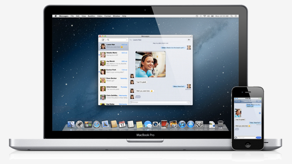
For someone used to older versions of OS X, the above interface may seem like a shocking change. But for people who have been exposed to newer versions of iOS, it will actually feel quite familiar. The use of translucency, the flatter interface, and the new system font all draw upon the design principles that were established with iOS 7. It's important to understand what is meant by that. Apple is not establishing a common interface across their devices. OS X and iOS are not the same, and Apple has shown no interest in making them the same. What they are doing is using the same method of design, and the same type of interface elements, to create an experience across those two different operating systems that feels seamless and unified without having to compromise one to fit within the limitations of the other.
I was a fan of Apple's design direction with iOS 7, and so the same has held true for Yosemite. The use of translucency allows the customization of your wallpaper to have an impact on the appearance of the entire operating system. The status bar, the Dock, Launchpad, and any other window that uses translucency can look very different based on the wallpaper that is chosen. Using the new interface tends to have an interesting effect on the user by revealing how dated many parts of the older interface had become. Even users who enjoyed the older design will quickly find themselves questioning how they ever used such a dated interface. It's the same reaction I observed when the iOS userbase moved to iOS 7.
Usability and UI Performance
When the new design of Yosemite was revealed at WWDC 2014, some users voiced concerns that the new design would reduce clarity due to its lighter weighted fonts and heavy use of blur and transparency. On a typical 23" 1080p monitor I haven't noticed any issues reading text that uses the new system font which seems to be a modified Helvetica Neue, but I can see how it may be an issue on non-retina Macbooks where the viewing distance from the display is smaller than a desktop monitor. The blur is also well implemented to preserve legibility. Only the currently active window has the blur effects and transparency enabled. These sections turn opaque when a window is not being used, which means there are not layers upon layers of blur making it difficult to read any text on top of it.

For those who do find that some of the new design choices affect their ability to read or see things, Apple does provide a number of options for accessibility and visual customization. New additions include "Reduce transparency" which removes the translucency effects across the OS, and "Use dark menu bar and Dock" changes the white translucent material in the status bar, the Dock, and Spotlight Search to a black translucent material similar to Notification Center. I tried using the dark mode but I quickly reverted to the original design because the dark menu bar and Dock looked out of place amongst all the white and grey in the rest of the interface.

One issue I have observed with the blur is that windows will show the desktop wallpaper in addition to the applications between which should be blocking the wallpaper from showing through. As you can see above, despite me putting a completely opaque white box behind the calculator, there is still an area with an orange tint in the center. Removing the white reveals that the desktop has the same pattern. During the beta cycle the transparency would only display the wallpaper, and so there was a fix implemented but it introduced a problem of its own. I have seen complaints from other users about this issue, so hopefully it will be remedied in an upcoming update.
Performance is another area of concern with a new design and graphically demanding visual effects like translucency. I have noticed decreases in UI framerate compared to OS X Mavericks based on measurements with Quartz Debug. Overall the OS runs fairly well, but I would be lying if I said it didn't have its issues. Some scrolling lists will regularly drop to somewhere between 30 and 40fps. Scrolling performance in Notification Center is inconsistent, with performance closer to 60fps at some times, and closer to 30fps at others. The worst case I have encountered is the animation for Mission Control which has dropped as low as 5fps when many applications are open. Going forward it will be interesting to see how quickly and to what degree these issues are fixed by Apple.


173 Comments
View All Comments
retrospooty - Wednesday, October 29, 2014 - link
Oh, well good. You have one that isn't slow or crashing, well, sorry others have them that are. And no, not all iPhones are bending, the point is its so thin that it is structurally weak and is susceptible to be bent. http://www.oneofthenine.com/ - You going to defend that?Anyhow, you have mentioned that fact that I am in my early 40's like 4-5 times now. You mentioned you have been coming to Anandtech as long as I have, so unless you were here as a toddler , you must be gettting pretty close too... Not that age matters, but you keep mentioning it and keep coming back to reply, so as much of a loser as I must be to post here, you are more of one as you are here at the same site, defending a company AND tracking my age and post count on another related site.
KoolAidMan1 - Thursday, October 30, 2014 - link
It's not about the age, it's about you with over 10000 posts on DT and hundreds on Disqus devoted to almost entirely to defending Android and bashing iOS. I expect that from a teenage console warrior, not a grown man.Otherwise, most people have no problems with iOS. Almost nobody has bent iPhones, literally dozens out of tens of millions. Even if it was hundreds it would be statistically insignificant.
Stretching credibility in the name of fanboy desperation is sad for anyone, especially someone that is supposed to be "mature".
KoolAidMan1 - Thursday, October 30, 2014 - link
And to be clear, yes, 1000 bent iPhones (let's throw out a big number) out of tens of millions is bad.That percentage is TINY. Its nothing like actual tech disasters like the RROD or even laptop battery recalls. Get bent out of shape if you want though, your life seems to revolve around phone drama.
HKZ - Monday, October 27, 2014 - link
It's you. Your reading skills aren't very good given the title of this article.KoolAidMan1 - Wednesday, October 29, 2014 - link
He's a fanboy with over 10000 posts between DT and Disqus devoted to talking negatively about Apple.Reading comprehension isn't a factor with zealots like him, just spin
KoolAidMan1 - Wednesday, October 29, 2014 - link
And obviously there are negative things to be said for Apple, same as any other company. For example, the Mac Mini and iPad Mini 3 updates are awful.The problem is that its hard to take anything he seriously when everything he says is negative, a conspiracy, and self-victimizing. He goes so far as to say Anand is a shill for Apple and that his current employment is proof of that.
Nothing he says can be taken seriously because it is constant. At least he doesn't seem bigoted, racist, or homophobic like some of his DT friends.
retrospooty - Wednesday, October 29, 2014 - link
What is funny is the guy that is stalking that guy and hanging off his every word (and yet still gets it so wrong).LOL. What a doof.
KoolAidMan1 - Thursday, October 30, 2014 - link
How is it stalking? You are impossible to miss on DT. As for Disqus, it was the first return from Google.Two clicks to see that profile is "stalking", good one!
retrospooty - Thursday, October 30, 2014 - link
How is it stalking? You are tracking my post count, your last umpteen posts at DT were all about me. You posted on this article, only to me, and to others about me. You seem to be caught up with my age and occupation. Why dont you go troll someone else? why are you fixated on me? Or is it becasue I keep calling you on your 100% one sided biased ass, and shutting you down like I did again here and you are pissed? http://www.dailytech.com/Article.aspx?newsid=36545...Too bad trollboy. But back on topic, my 10000 posts at DT is over the entire history since day 1. FFS, most of it has nothing to do with Apple. Especially any OP's. Often you asshat Apple nutjobs that just cant STAND when anyone doesn't like anything about Apple get all butt hurt and go on and on, so that makes it seem like alot of posts, but its really just a few asshats, yourself included.
FYI, I also say alot of good things about Apple. They moved the whole industry forward in 2007, I love the hardware on iPad Air and Air 2. I love the hw quality in general until it got so thin its structurally weak... And on that subject, it IS weak. There my be only a few thousand people with the issue, but its a young product. the fact its that it is too weak to take much abuse.... All in the name of form over function.
Whatever. You are so stuck on stupid with Apple I cant even relate. Its a company, and you defnd it like its your mother being insulted. Get a grip.
Osamede - Monday, October 27, 2014 - link
Author said:"..... If you own a Samsung smartphone, you may be more inclined to buy a Samsung tablet due to the similar hardware design and user interface. But apart from any brand loyalty you feel, you don't really have any incentive to buy a Samsung laptop which runs Windows and doesn't integrate with your other device..."
Reality is:
http://www.samsung.com/uk/support/convergence/side...
http://www.cnet.com/uk/news/samsung-galaxy-tab-s-s...
I am shocked that standards of journalism and market insight are slipping so low, so fast
How long before this becomes yet another fanboy blog?