The Android 5.0 Lollipop Review
by Brandon Chester on December 1, 2014 10:00 AM EST- Posted in
- Smartphones
- Android
- Tablets
- Android 5.0
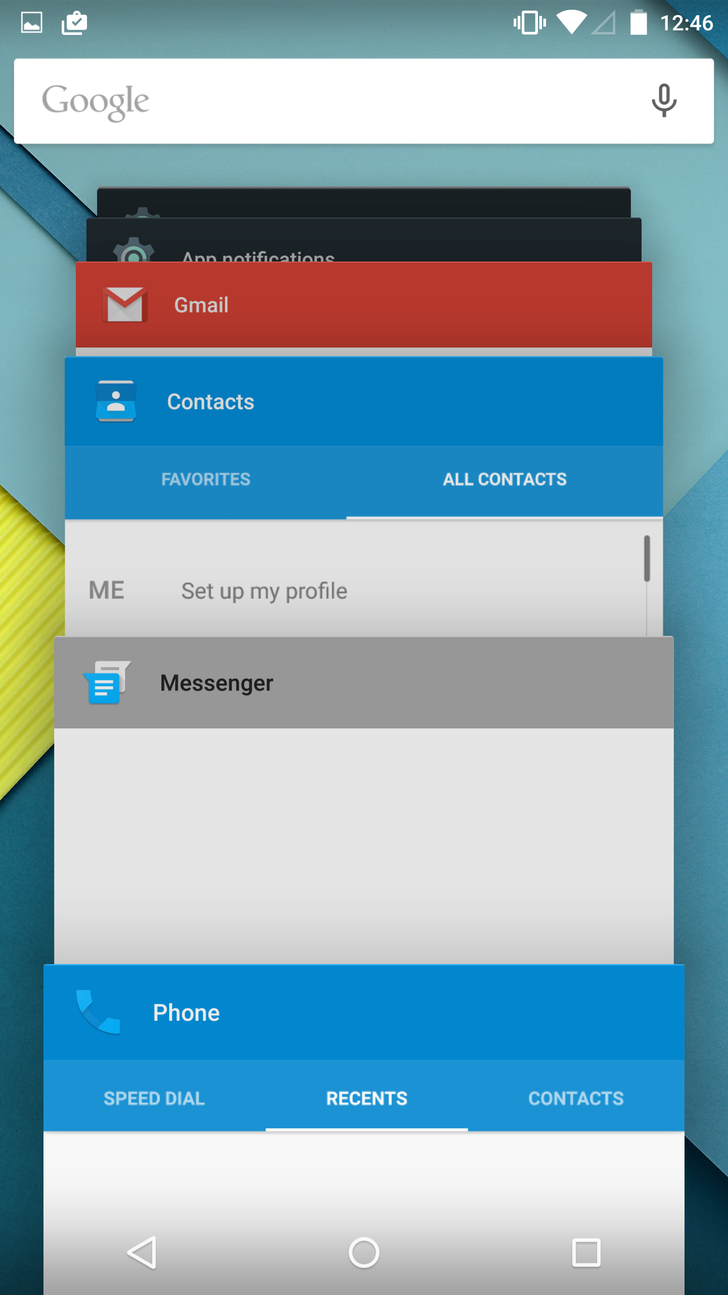
Notification Drawer
Android was the first of the major smartphone operating systems that we have today to implement the idea of a Notification Drawer. The idea of a screen to store all notifications that can be accessed from anywhere is something that both iOS and Windows Phone 8 have borrowed from Android. Although today it seems like the utility of such a design should be self-evident, it clearly was not, as iOS had previously resorted to intrusive alerts that displayed in the middle of the screen and interrupted the user. The designers behind Android's Notification Drawer certainly deserve a lot of credit for improving the state of notifications on mobile devices. In Android Lollipop the Notification Drawer has been redesigned to display like a list of cards, and has been simplified to include the quick settings page alongside the notifications themselves.
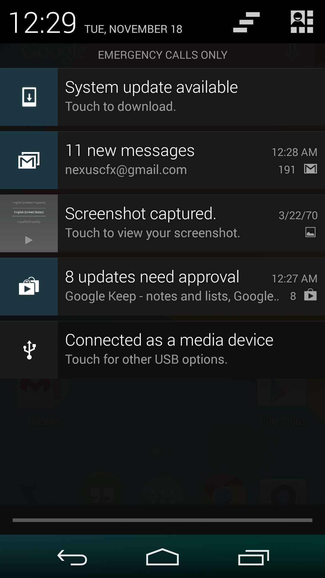
I never quite understood the animation for Notification Drawer in previous versions of Android. If you pull out the drawer in a desk, the first objects you see will be the ones that are closest to the side of the drawer with the handle. This is how the animation for pulling down Notification Centre on iOS functions. But on Android, pulling down Notification Drawer was like pulling down a magic bar that revealed notifications from top to bottom, as though they were already there and the bar somehow revealed them as it went over them. It just didn't really make any sense. In Android Lollipop, Google is clearly displaying each notification as its own separate card, and pulling down the drawer causes them to all expand and slide out from one another. Now it's not much of a drawer, but it's an extremely intricate animation that looks amazing and fits in perfectly with the Material Design aesthetic.
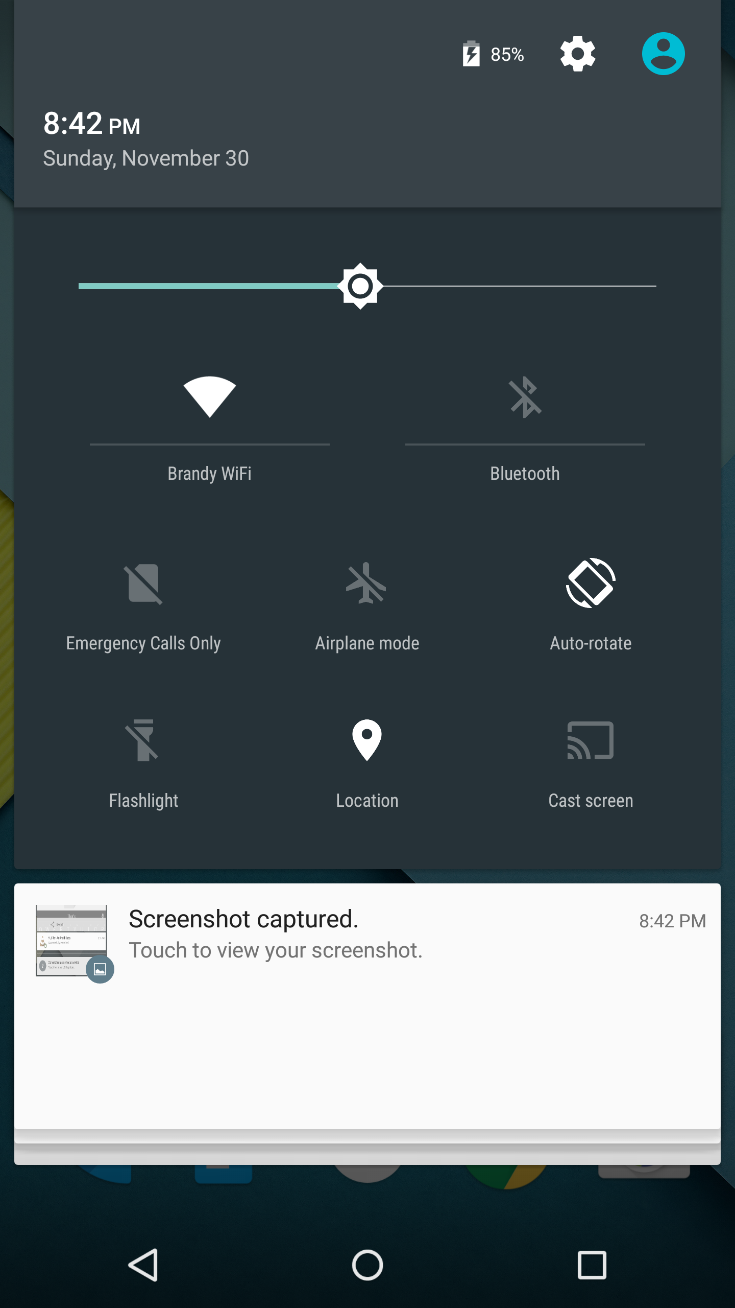
As you'll see above, the quick settings have been integrated into the same section as the notifications themselves. It's now accessed by simply swiping downward a second time after bring down the drawer. I think this works much better than the separate pages that Google was doing previously, which felt more like a way to just throw in quick settings without having to change the design of the drawer beyond the addition of a button. For the most part the settings are the same, but the brightness control is now a slider that can be accessed without having to press anything, and there are a few additions like the Cast screen and Auto-rotate toggles. Google has also finally included a built-in flashlight feature, which may not be welcomed by the developers of ad-ridden flashlight applications, but will certainly be welcomed by users.
The last thing to take note of is the icon in the top right corner. This would normally have your Google avatar, but in my case it's just one of the generic contact icons. Tapping this brings you to the menu where you can add, manage, and switch between multiple user accounts, which is a new feature for phones running Lollipop.
Overall I'm very happy with the new Notification Drawer. It looks better and does more than its previous iteration. My only issue is that it seems that the button to clear all notifications that appears beneath the last notification will not show up if there are too many cards. Swiping upward collapses the list of cards, allowing it to be displayed, but I think Google would be better off just putting it back up top where it was previously so it can always be shown.
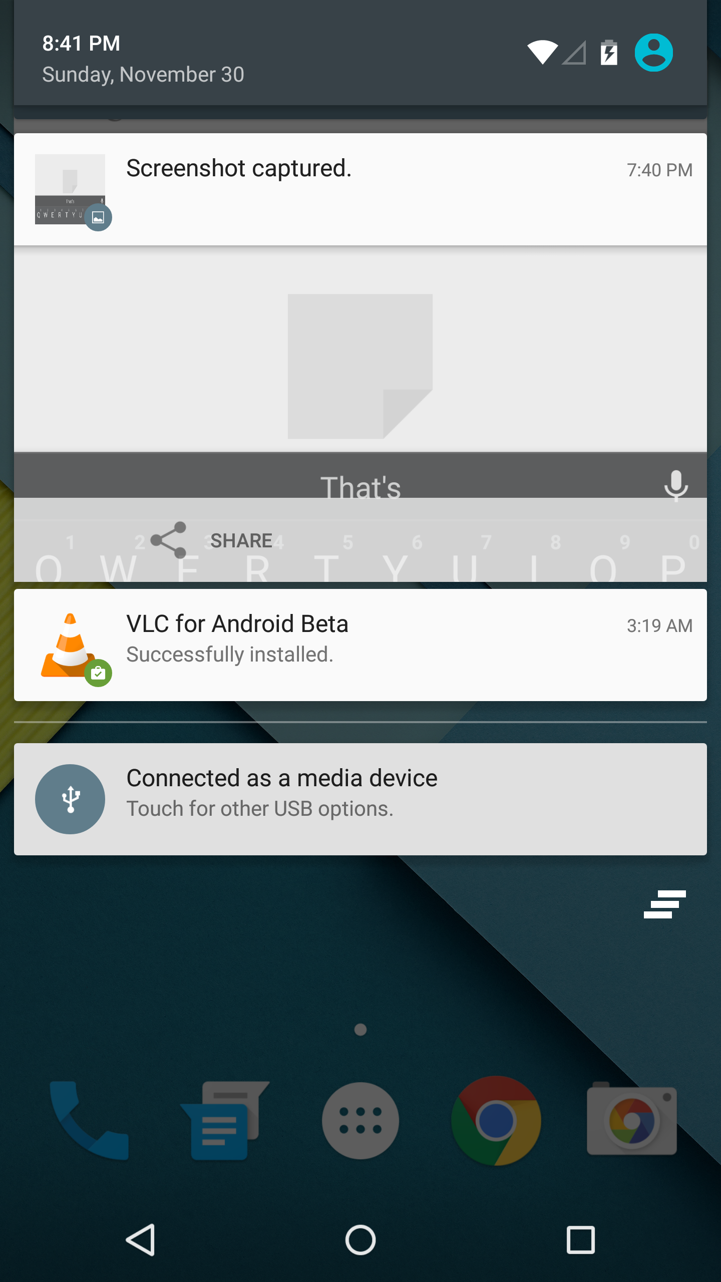
Recent Apps
Like the Notification Drawer, Recent Apps also receives a design overhaul in Android Lollipop. What was once a list of square application previews is now something like a stack of cards which displays the full view of every application, although the perspective limits your view to the upper half. The new design also works well with the new animation when accessing it from within an app, which shows the application falling down beneath the navigation buttons and becoming the first card in the stack.
Functionally, it works the same as previous versions of Android for the most part. There is one significant change, and it's specific to Google Chrome users which I would expect is a sizable portion of the Android user base. In Lollipop, tabs in Google Chrome now appear as separate cards in the Recent Apps switcher. This is an interesting move on Google's part because in a way it knocks down a lot of the segregation between native apps and web apps, as web apps will be displayed in the list along with everything else. The only downside to this feature is that it can make it hard to keep track of tabs, and I've actually disabled it in the settings section of Chrome in favor of having the tabs within Chrome itself because I simply have too many tabs open at a single time to have to search for them among every recently opened application.


126 Comments
View All Comments
OreoCookie - Monday, December 1, 2014 - link
But that's as misguided a statement as »Microsoft didn't invent squares« or »Apple didn't invent rounded rectangles«: Microsoft deserves kudos for being the first to pick up on this trend on a large scale. And if you claim »but they didn't invent it« what you really want to say is that you don't want to give them credit for it.HisDivineOrder - Tuesday, December 2, 2014 - link
I find that most people care less for who does something first and more for who does something best.tralalalalalala40 - Monday, December 1, 2014 - link
Design is never new. People copy each other in this area all the time. Look to the world of fashion how crazy fast people copy.HackerForHire - Monday, December 1, 2014 - link
Maybe because you're incorrect and couldn't be more wrong? To associate a connection between material design and that hideous metro interface is just ludicrous. I've used both interfaces and thankfully I've abandoned that ugly metro interface with its superfluous animations that did nothing but hide the performance problems of the OS. Additionally, it seems the only people complaining about the similarities are butt hurt windows phone fanboys that are upset their OS of choice in tanking so hard.theduckofdeath - Monday, December 1, 2014 - link
Microsoft throwing toys out of the pram because they messed up on mobile (again)...Windows Phone will keep failing as long as Microsoft keeps trying to sell us another closed and locked down ecosystem.
haukionkannel - Tuesday, December 2, 2014 - link
Well... Apple is selling closed and locked ecosystem and is doing better than Android...The WP is just fine mobile os! It is something between iOs and android when compared how locked down it is. It has been very snappy and light (a good thing !) it has been new (bad thing ?)
I have used all those three and all of them have their advantages and disadvantages. It is really good that we have three ecosystem. It keeps competition high enough!
kyuu - Thursday, December 4, 2014 - link
Right. Closed and locked down are the ultimate sins for a mobile operating system and doom it to failure. Just ask Apple.Hyper72 - Monday, December 1, 2014 - link
I'm guessing most people are not in denial, they just don't care whether ideas have been copied, independently developed or somewhere in-between or perhaps trends followed as another commented. Taking inspiration is how the industry have moved for decades and generally it benefits the user.Narg - Tuesday, December 2, 2014 - link
Obviously they don't care. Don't you see how quiet and peaceful they are about the changes.... Oh, wait.tuxRoller - Tuesday, December 2, 2014 - link
Material isn't flat. It uses shading to indicate a z dimension (or layers).