The iOS 8 Review
by Brandon Chester on September 17, 2014 1:00 PM ESTDesign Tweaks
Apple often makes tweaks to existing applications, even when they are not doing an entire redesign. iOS 8 is no exception. I've already covered some of the more significant design changes such as the new Control Center and the new parts of the interface in Messages. Below are some of the other various visual changes that I noticed going from iOS 7.1 to iOS 8.
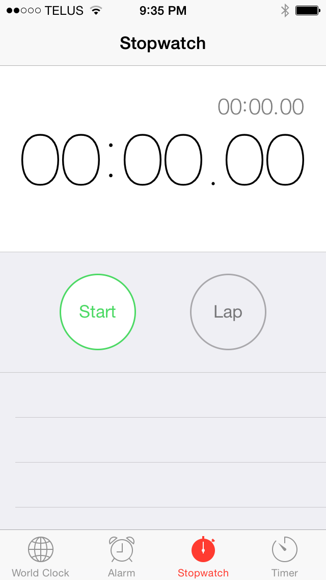
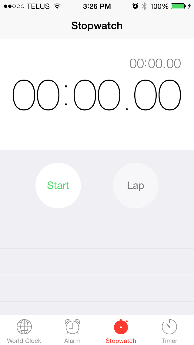
Clocks App. iOS 7.1 on the left, iOS 8 on the right.
The circular buttons in the Clock application no longer have a border, and the lap button has been given a background that is slightly different than the grey color of the app itself. This is a similar change to what we saw with the buttons in Control Center. It seems that Apple no longer feels that users require that a button has an explicit border to recognize that it can be pressed. The smartphone is something most people are familiar with today and so it makes sense that design conventions that would have been necessary with older versions of iOS are no longer necessary today.
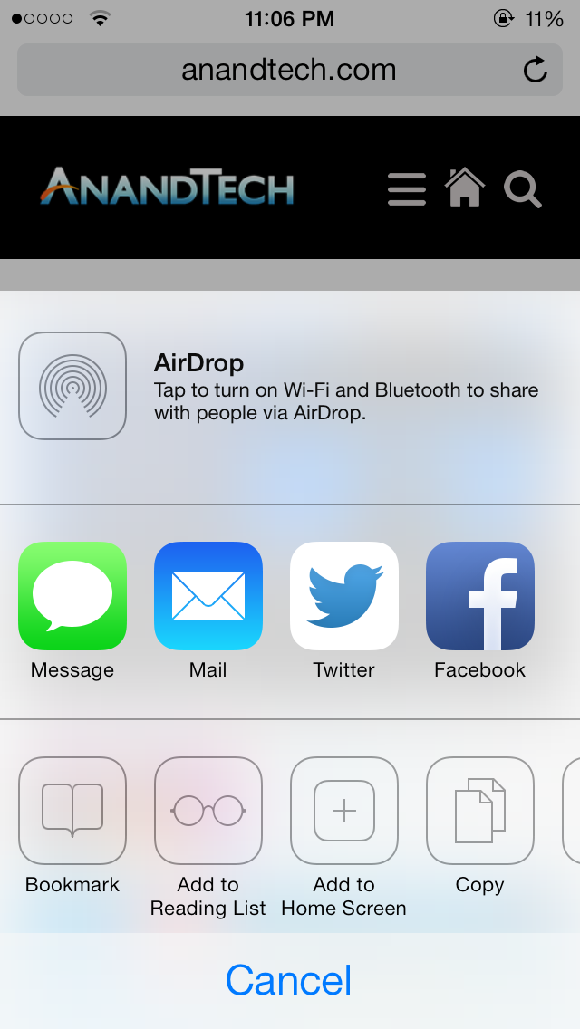
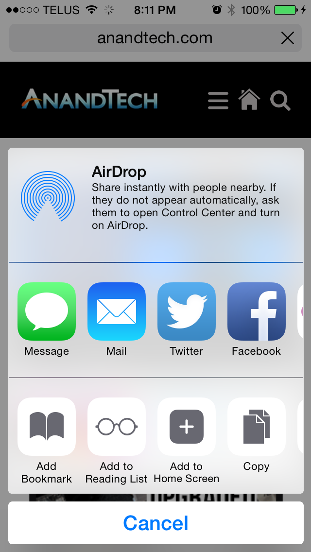
The Share Sheet. iOS 7.1 on the left, iOS 8 on the right.
Apple has also modified the design of the Share Sheet. There is slightly less spacing between icons, and the action buttons in the bottom row also adopt Apple's new style for buttons. The sheet itself is now like a floating card that is separated from the cancel button at the bottom.
The last design change that I noticed is that landscape mode in Apple's stock applications is now a fullscreen interface, with no status bar at the top. This affords a bit of extra space but when using landscape mode I usually have the keyboard up and there's still not even remotely enough space on an iPhone's display to fit much besides the keyboard in landscape orientation. It's possible that this feature offers a greater advantage on newer devices like the iPhone 6 and 6 Plus with their higher screen resolutions.
Application Changes and Additions
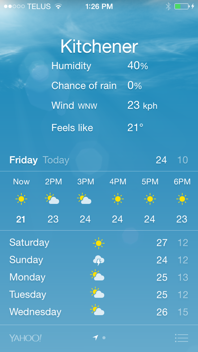
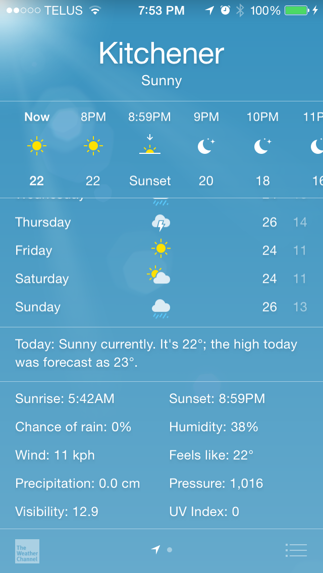
Weather. iOS 7.1 on the left, iOS 8 on the right.
Apple's Weather app receives some improvements in iOS 8. As I mentioned earlier in the section about Notification Center, Apple now sources their weather information from The Weather Channel rather than Yahoo. This allows the app to provide more detailed information and that required some changes in its interface. Both the hourly and daily forecasts have been extended to show information further into the future. Accessing the additional dates requires swiping up in the application. This also reveals a section with detailed information about the current weather. Previously this information was accessed by tapping on the current temperature, which wasn't a very obvious gesture. Putting it at the bottom was also necessary to fit additional information like the UV index, visibility, amount of precipitation, and sunrise and sunset times.
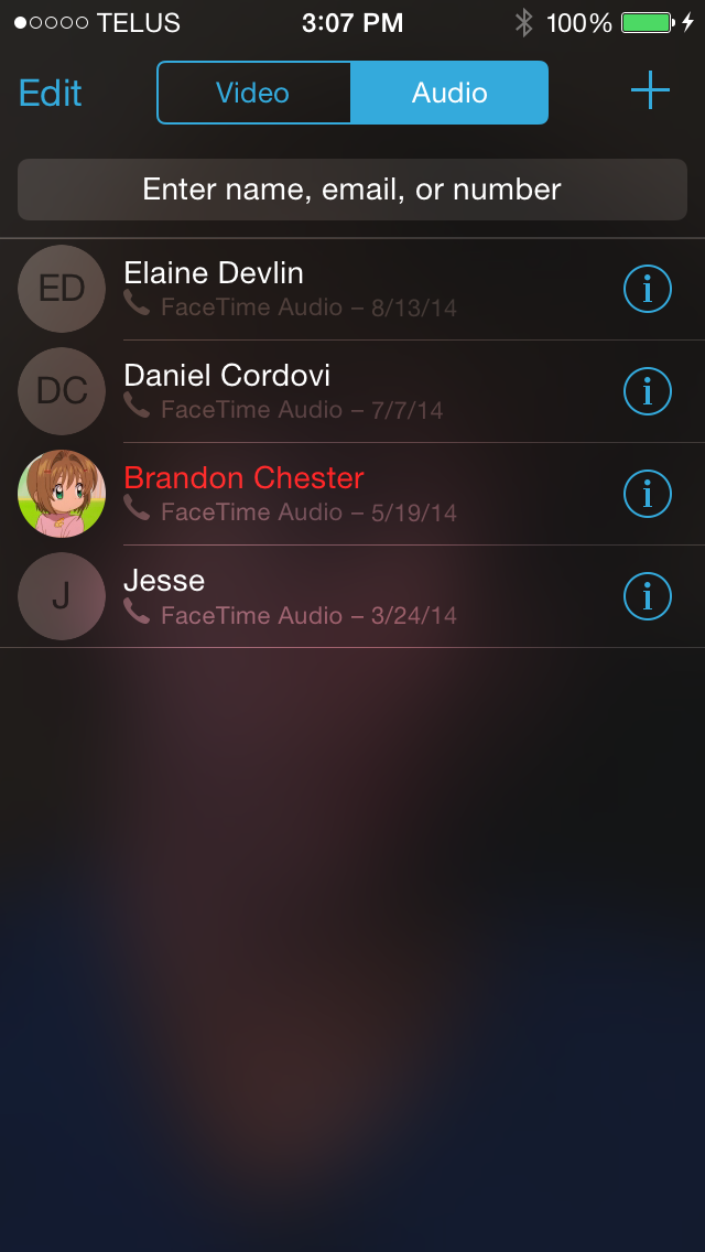
Facetime. iOS 7.1 on the left, iOS 8 on the right.
FaceTime receives some design tweaks in iOS 8 as well. After the inclusion of FaceTime audio calls in iOS 7 it looks like Apple has seen fit to split the app into a section for video calls and a section for audio only calls. The navigation buttons at the bottom have been removed, with the recent calls page now being the main page of the application. The plus symbol in the top right now brings up a list of contacts to select from, rather than its previous function of adding a new contact that seemed out of place.
iOS 8 also brings a new Tips application with hints and information about how to do things on your iPhone or iPad. Given that most things on iOS are designed well enough that they're fairly evident to the user, I don't really see why another application taking up space on my 16GB device is necessary.
In addition, Apple's Podcasts and iBooks apps have also been added as stock applications. Because of this, iBooks is able to adopt the transparent design with the device's wallpaper showing through, like the Newsstand app. Again, I don't think a large enough percentage of users use these applications frequently enough to make them worth including with the operating system rather than keeping them as optional downloads from the App Store. Having to hide them in a folder is annoying, and I feel constrained enough trying to manage storage on 16GB iOS devices with the current size of the OS and all its apps.


164 Comments
View All Comments
Pissedoffyouth - Wednesday, September 17, 2014 - link
How's iOS8 when it comes to app switching kills any web pages you had open?NetMage - Monday, September 22, 2014 - link
Depends on how big the App you switch to is - it seems better than iOS 7 especially switching tabs with-in Safari, but an very image heavy tab (e.g. search Google Images) will still flush the other tabs.Mayuyu - Wednesday, September 17, 2014 - link
Brandon Chester big Madoka fan?MyCookie - Wednesday, September 17, 2014 - link
Looks like Air or Clannad, so probably KyoAni fan.Brandon Chester - Wednesday, September 17, 2014 - link
@MyCookie Which photo are you referring to?MyCookie - Thursday, September 18, 2014 - link
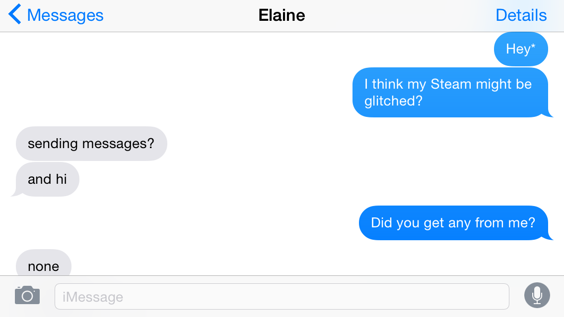
Facetime contacts, on the other changes page.Brandon Chester - Monday, September 22, 2014 - link
Cardcaptor Sakura.kasakka - Wednesday, September 17, 2014 - link
The thing I'm most disappointed in is that there is still no ability to choose what apps you want to use. If you want things to open in Chrome instead of Safari, you can't do that without jailbreaking.Likewise a lack of a central location for managing user loaded content would be welcome. Not necessarily a proper file browser but something that simply collects and curates files downloaded, photos taken, songs added etc. and displays them in an easy way.
kcn4000 - Wednesday, September 17, 2014 - link
thisSirPerro - Thursday, September 18, 2014 - link
Is this even true? So sad