The LG G3 Review
by Joshua Ho & Anand Lal Shimpi on July 4, 2014 5:00 AM EST- Posted in
- Smartphones
- LG
- Mobile
- Laptops
- G3
Software
Lately, there’s been a significant trend towards flatter, simpler UIs. While HTC jumped on the trend early with Sense 5 launching on the One (M7), the Korean OEMs have been noticeably slower to move towards this simplification. In this case, Samsung refreshed TouchWiz for the Galaxy S5, and LG has done the same for the G3. While I had very little trouble getting around LG’s UI before this refresh, it definitely struggled in the aesthetic department. LG previously had a strongly skeuomorphic UI, which meant that the UI elements were designed to resemble physical objects. While this may have helped back when computers were a novel invention, it doesn’t make quite as much sense now. Thankfully, LG has gotten far away from this. Overall, there’s very little unnecessary depth to the user interface, and the result is definitely aesthetically pleasing, although opinions may vary. I definitely feel like this interface is very close in aesthetic design to the Galaxy S5’s TouchWiz UI, although the functionality is different. The only real criticism I have here is that the odd shadow effect on icons should go away, although it doesn’t truly affect the overall design.
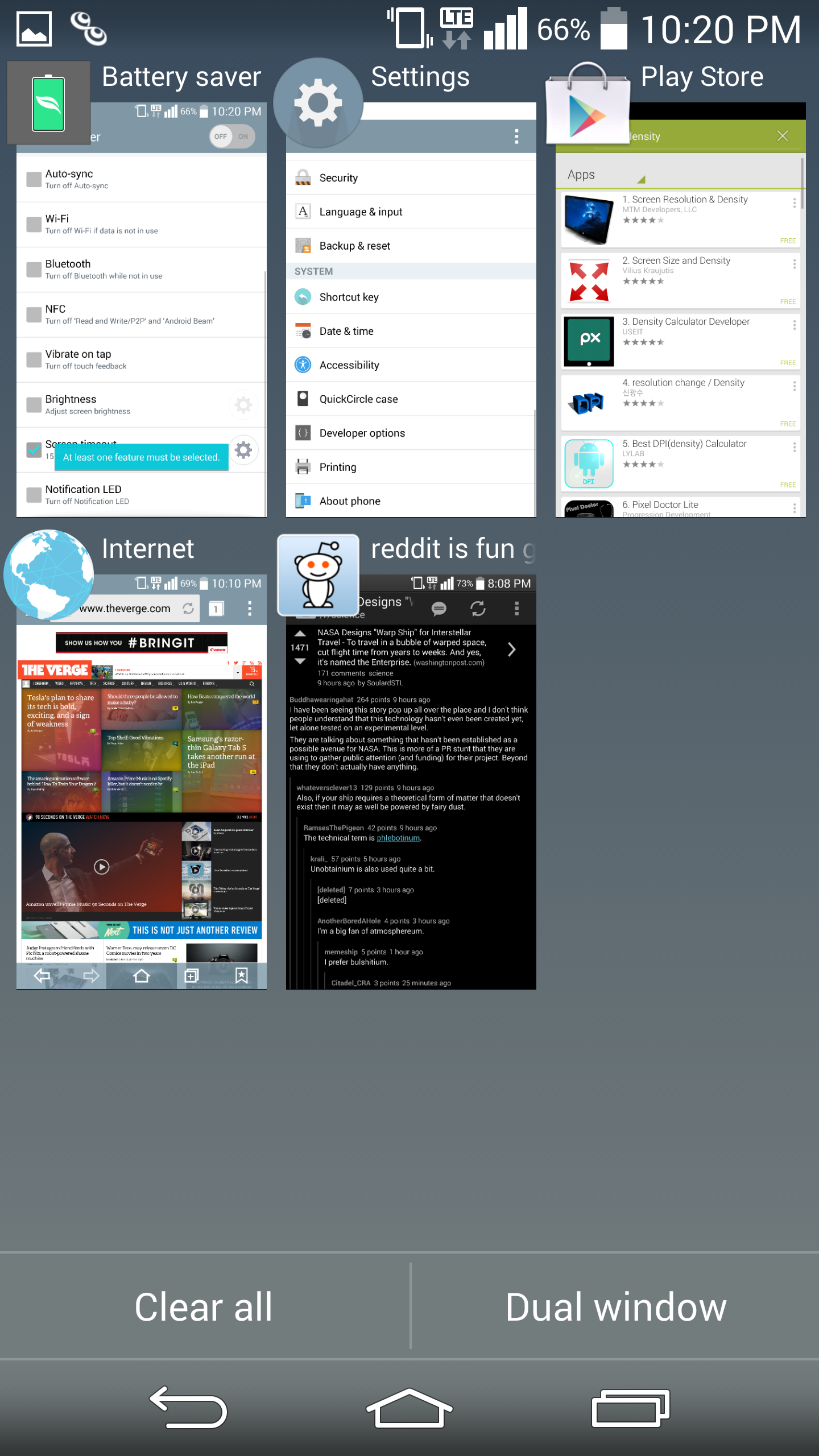
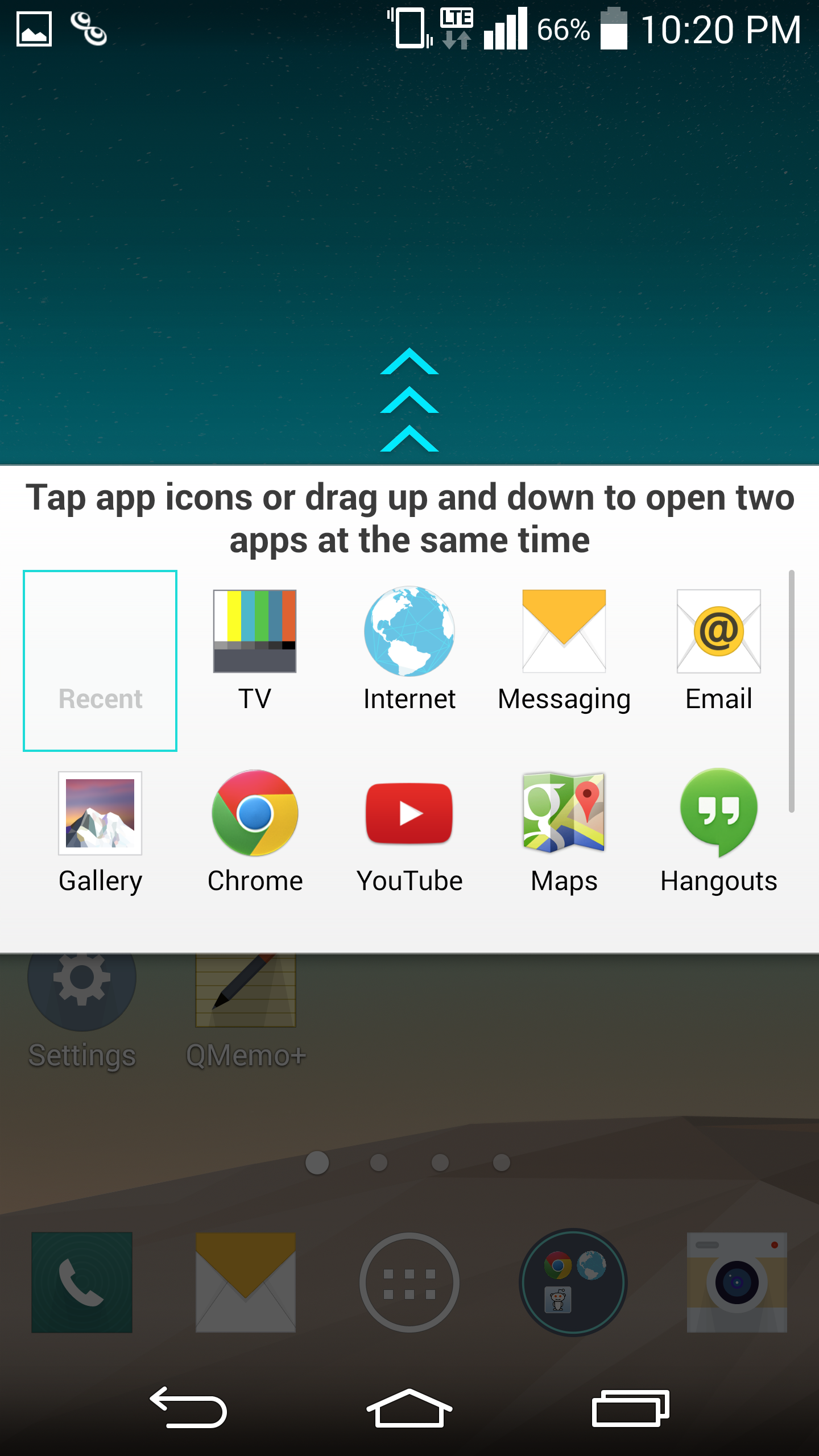
While opinions on how a UI works (or doesn’t) are mostly subjective, in my experience there have been far fewer friction points in the G3 UI when compared to TouchWiz in general. The best example of this is the multiwindow mode in the G3. While Samsung has done a great job of getting widespread developer adoption for their interface, LG has clearly put more thought into the user experience here. Instead of requiring the user to mentally keep track of whether to use Android’s task switcher or the multiwindow option, the multiwindow toggle is in the task switching menu, which means it’s far more likely that it will be used as needed. The multiwindow functionality also allows for switching immediately to the last two windows used to save time. The only issue I have here is that manipulating open windows isn’t as easy as it should be. This is because closing one of the windows is done by tapping the tab separating the two rather than simply swiping up or down. It does make sense once you learn how it works, but may confuse some at first.
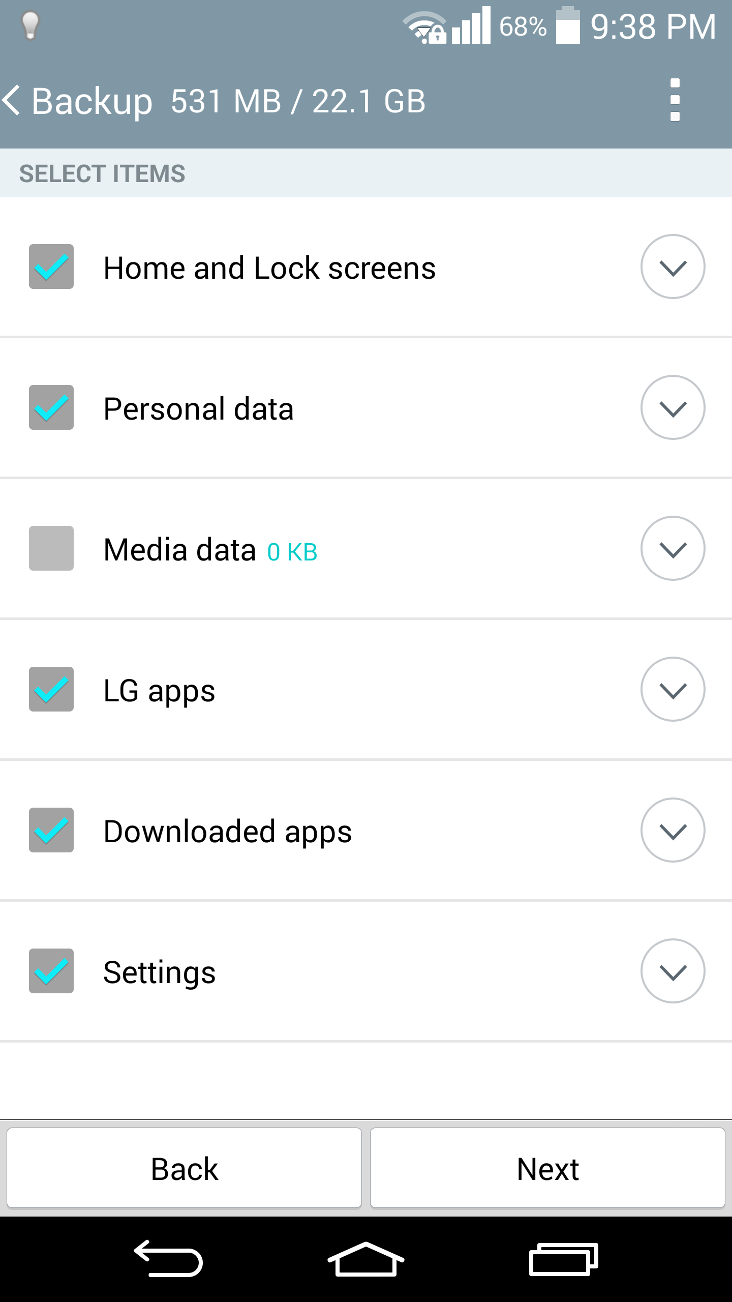
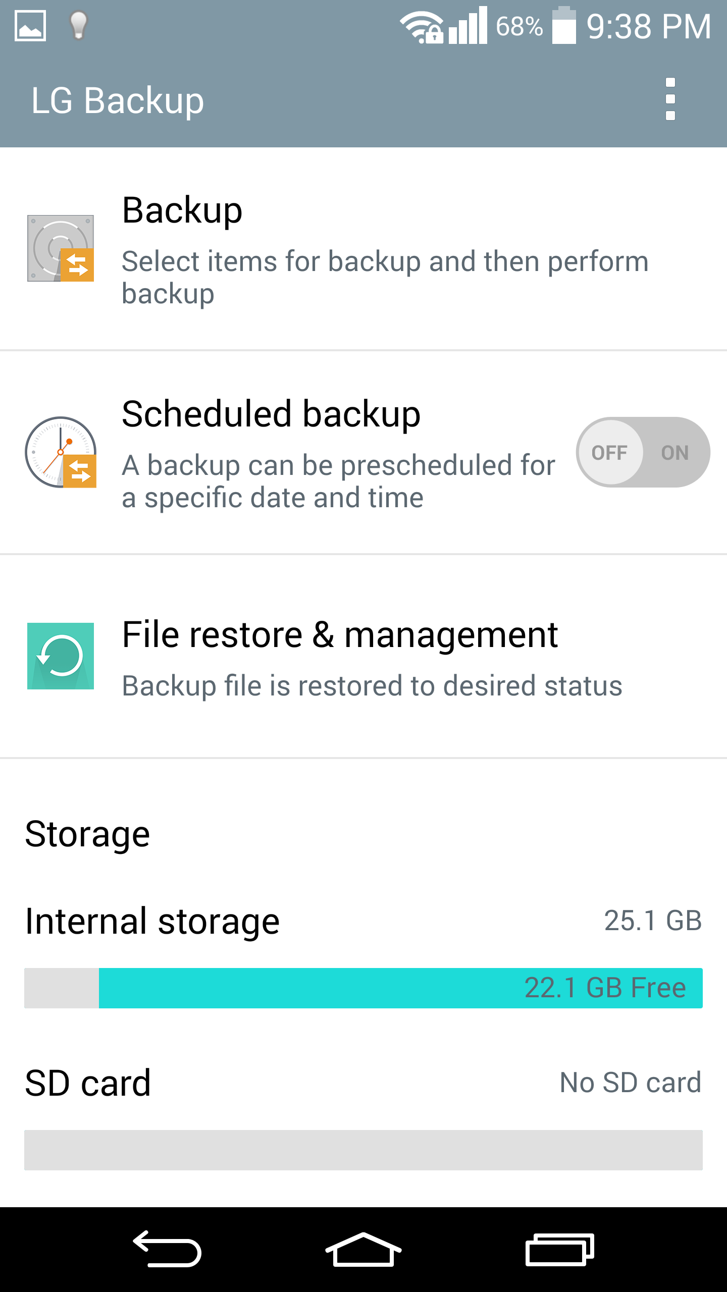
LG isn’t perfect at this though, there are some issues such as the email client. Specifically, email providers like Hotmail/Microsoft don’t work properly if set up as a POP/IMAP account, and rely on the user to know that they have to set up Hotmail as an Exchange account. For the most part though, these issues are rare. LG seems to have done a good job with their applications, with cohesive design throughout that utilizes Google design guidelines. Things like the smart cleaning application in settings, and the LG backup application are all ways that LG has actually improved the user experience. There really aren’t a lot of friction points in the usability of stock applications, other than the ones clearly designed for SKT or are otherwise Korea-only.
Of course, LG’s “gimmicks” also tend to be more useful as well. While I struggled with some unreliability on KnockCode for the G Pro 2, the G3’s version is great in practice. KnockOn and KnockOff both work as expected too. These features are all easy to grasp as well, with very little learning curve. The same isn’t necessarily true for features that ship with the Samsung Galaxy S5, such as the fingerprint sensor. It's not all perfect though, as Smart Notice doesn’t seem to be useful most of the time. Fortunately, it won’t get in your way and it’s integrated well into the clock/weather widget. While both LG UI and TouchWiz have a largely similar experience, I think that LG ends up with a less frustrating one. There are some issues with clutter in the notification bar though, as out of the box there’s almost no room for actual notifications. Althought annoying, it's easily solved by toggling away most of the unnecessary settings.
Overall, I’m happy with LG’s UI. The annoyances are few and far between, and LG has adopted a solid aesthetic design for this generation. While I didn’t notice a significant delta in overall performance compared to the One (M8), I did notice that the G3 had more issues with stutter in animations overall. I suspect that this has relatively little with the UI design itself, as most animations are simple panning movements without 3D effects.


174 Comments
View All Comments
boe - Thursday, July 10, 2014 - link
This is a nice review but it would be great if the battery life chart showed talk time. I know it is crazy, but I use my phone to make phone calls.AncientWisdom - Thursday, July 10, 2014 - link
No way! oOHrel - Thursday, July 10, 2014 - link
Pretty glad I got the G2 this year, this phone sucks. 5.5" really? The G2 is already a bit too large and I have huge hands. 4.7" is probably the ideal size. They need to stop going beyond that.Perhaps because of LG's slim bezel chassis they can go larger, but certainly no larger than 5".
CampoX - Friday, July 11, 2014 - link
I was up for a G3 but after my Ultra died in my pocket this review was the reason I went for an M8 this week.goobersnatcher - Saturday, July 12, 2014 - link
If LG would have kept the size of the G2 and went 1080, QC 805 and made it the next Nexus .... I'd be all over this phone!andredogg - Tuesday, July 15, 2014 - link
Just bought this phone 4 days ago and I must admit it grows on you quickly. Selfie cam looks like a mirror my s5 active selfie cam is not in same league. And if your LG g3 is dim turn off auto brightness. Also like that every icon can be replaced by any pic or icon you find by holding down icon and releasing it and touching little paintbrush. overall experience is great. Also the 2k screen is amazing if you find content to play on it. Knock codes are also useful.yvn - Tuesday, July 15, 2014 - link
I had a chance to check out the display of LG G3 yesterday and oddly I have to disagree with Anand on its color reproduction. Not sure about the charts and other tests he did but it extreme close in color reproduction to my iPhone 5s and with just a tad more on red tones but then I know the iPhone 5s has a little weakens with reds and greens hues, so in other words the colors on G3 is spot on! hmm....Samsung even in "movie" mode looks way off so I am not sure how Anand claims in the review that Samsung has best display??? I am sure it is not so!soldier4343 - Thursday, July 17, 2014 - link
Handled one yesterday in store and its a great device. Waiting for the Note 4 in September to see what changes they made before upgrading which I do once a year.SpartyOn - Saturday, July 19, 2014 - link
Not a single Windows Phone for battery life comparison. It's like being a parent: I'm not upset... just... disappointed.Thanks Anandtech for continuing to promote a mobile phone OS duopoly.
deV14nt - Sunday, July 20, 2014 - link
I'm surprised the Galaxy S5 brightness was not measured with auto on. DisplayMate measured the max brightness at 698 nits with auto on, the brightest display they've tested, beating out the Note 3 by about 50 nits.It also would have been nice to see the G3 auto focus tested at less than 2 feet, to see the laser AF at its best conditions.