The iOS 7 Review
by Brian Klug & Saumitra Bhagwat on September 19, 2013 1:25 AM ESTLike any major design change, iOS 7 definitely takes getting used to. My initial reaction to a lot of iOS 7 was honestly more surprise and aversion than I thought it would be, but over time the changes have grown on me. I like to think that we're pretty open to change, especially as enthusiasts, but it's a natural human response to want things to be familiar and closer to what came before. Considerable time spent running the beta and watching parts of the platform change over time in response to feedback from developers and other third parties makes me optimistic that the new iOS 7 UI will continue to change and evolve the same way previous versions did.
The flip side is that I can't shake the feeling that some of the iOS 7 design is reactionary. Pundits lambasted Apple with iOS 6 and the iPhone 5 release for being pretty much the same OS with minor tweaks and very few stylistic changes. Those vocal members wanted dramatic change in visual appearance just for the sake of having it, and like the idiom goes, be careful what you wish for because sometimes it actually does come true. No matter how you sugar coat it, iOS 7 is a dramatic departure from the visual style that came before.
I like the use of translucency and transparency, and the new eye candy and visual effects in iOS 7 did initially solicit a bit of the same "wow" reaction that I had the first time looking at iOS on the original iPhone. The use of parallax and the translucency really does convey a sense of depth and order without being as garish as drop shadows or the shiny faux-3d buttons of yesterday's iOS.
The downside is that after a few weeks of it, some animations are really just a lot more gratuitous than they need to be – after the thousandth time watching the tiles fly in or application zoom out into the multitasking interface you want it to just happen instantly. I have no doubt that iOS will go the route of OS X and Windows Phone and gradually increase the speed of these animations to make the platform feel faster. They're also bound to have a power penalty at some point.
I guess that's the ironic part – the flagship devices don't drop frames during the transitions, they just feel long. I can speak to iOS 7 performance which is good on the iPhone 4S and above and newest generation of iPads, performance however on the iPhone 4 and iPad 3 leaves a lot to be desired. The iPhone 4 stutters through all of its animations, has sparse use of transparency, and generally feels like it's on its last legs. The iPad 3 unfortunately is much of the same – sparse transparency, occasional stuttery parts throughout, although a lot more usable than the iPhone 4. I guess I'm just surprised to see the iPad 3 get to that point of feeling slow so fast.
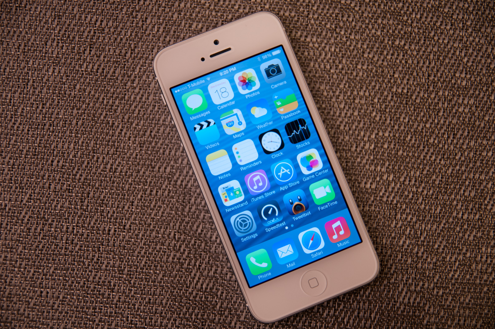
Although a lot of iOS 7 is visual, the functional changes and new features that are standouts really do make a difference. Control center is a long overdue functional improvement that makes controlling a subset of commonly used settings very fast. There's still more Apple could do here to smooth over a few more friction points, but it's a welcome addition. Notification center also feels a lot more well thought out, with logical separation of information that's useful and notifications themselves, even if there's still no "clear all" button.


144 Comments
View All Comments
Guspaz - Thursday, September 19, 2013 - link
One big improvement to the settings app that was missed in the review: per-application bandwidth summaries. Previously, this was all lumped under the "Usage" section, and all you got was a breakdown of cellular data versus tethered data. Especially painful was tracking roaming usage (with carriers often charging insane fees to roam outside the country).This is now handled under the Cellular section. The top-level summary is one line for general data usage total, and one line for roaming data usage. Below that is a list of applications, how much bandwidth each of them has used, and a toggle to disable cellular data usage for that application. Tethered usage is now placed under a "System Services" submenu, which on the top-level screen gives you a total of all system services, but when expanded gives you a breakdown of the bandwidth usage of individual services, including one entry for "Personal Hotspot". It really is rather detailed, even telling you how much bandwidth you've consumed for DNS queries versus Siri versus software updates versus voicemail (and so on).
Impulses - Thursday, September 19, 2013 - link
I'm surprised iOS didn't have that already, pretty good and useful audition. I rarely worry about data usage as my use is pretty darn consistent and I have an unlimited plan anyway... But that should be super helpful for a non-techie on a metered plan who's suddenly worried how much bandwidth he/she may have consumed after an hour of Facetime etc (one of the first things my mother fretted able after finally getting her first smartphone).Impulses - Thursday, September 19, 2013 - link
*useful additionrchan016 - Thursday, September 19, 2013 - link
Back in ios6, when a notification slid in from the top of the screen, you could dismiss it; you would just slide your finger right to left, and then when you let go, the notification is dismissed.althaz - Thursday, September 19, 2013 - link
Love the changes, but the lack of a hardware back button is still hurting the OS, IMO (I won't personally consider one with an LCD screen either, but that's just me). Also, several of these screenshots look ripped straight from Windows Phone (not a bad thing at all).Samus - Thursday, September 19, 2013 - link
Still no live tiles or gadgets to feed you information.So you still need to go into an app for everything. Photo gallery, running tasks, flashlight, weather, alarm, reminders/calendar, shortcuts like shazam, navigate home, quick dials, and so on...
And the multitasking hasn't improved at all. They could at least do what Blackberry did and copy WebOS' card-style tasks interface...
This is the same damn OS all over again with a new font. It's getting ridiculous. No wonder their stock got downgraded by four agencies. Apple makes this ridiculously awesome hardware running an OS from 2007.
Impulses - Thursday, September 19, 2013 - link
Didn't they add some widgets to the notification shade or was that not expanded much? I love that high degree of customization on Android but I find that most non-techies just don't bother with it, in that sense the more seamless tile integration of WP still seems more approachable and generally useful (tho me it still looks like a lot of wasted space).App icons flying in and out seems reminiscent of older Android launcher animations... I don't know that scrolling thru cards was the epitome of task switching paradigms either, HTC did something similar (minus the stacking) on the previous version of Sense and I found it slower than Android's stock thumbnail strip which necessitates less scrolling. Maybe I've forgotten some particularly compelling aspect of this on WebOS (RIP).
Arbee - Thursday, September 19, 2013 - link
Did you actually read the review? It *does* copy WebOS's card-style task list. As a former Palm Pre owner, iOS 7's implementation feels like coming home again :)And you don't need to go into an app for everything, that's the point of the new Control Center.
Daniel Egger - Friday, September 20, 2013 - link
Hopefully without the lag. I don't miss that at all from my 2 Pres...twochoicestom - Thursday, September 19, 2013 - link
Although I see what they were trying to do, after using it for a while, I don't like the animations at all. They slow everything down. I don't care where on the OS I'm zooming into. I care how fluid my device feels.It definitely needs refinement, but it's a very good starting point.