The iOS 7 Review
by Brian Klug & Saumitra Bhagwat on September 19, 2013 1:25 AM ESTCamera
I touched on the new camera interface in my iPhone 5S camera improvement thoughts piece already, but it’s worth talking about again. Camera UI seems to be something that every OEM is changing quickly, and while there are common elements shared between the various camera UIs out there, there’s really no common design like there is say for threaded messaging or a dialer.
The camera UI gets probably one of the more dramatic overhauls in iOS 7, and fixes a lot of things that were slowly becoming a problem as Apple added camera features to its platforms.
iOS 6
iOS 7
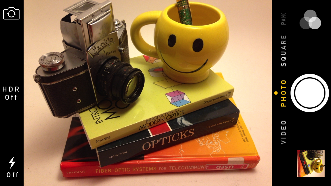
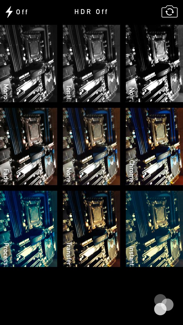
The camera UI has completely different iconography and styling from the old one. Gone is the video toggle, and in its place is a mode ring which switches between slow-mo, videos, photo, square, and panorama. This eliminates some of the feature cruft that was piling up in the “options” button from the old UI. There’s also the filters option which shows a live preview grid of some filters on the image – think photo booth for iOS. My only complaint is that whereas the previous iOS camera UI had more visual cues that made it easy to confirm the camera detected proper portrait or landscape orientation, the iOS 7 camera really doesn’t. Only the thumbnail and flash/HDR/front camera icons rotate. Further, the text ring switcher doesn’t rotate, which adds some mental processing when you’re shooting in landscape (which you should, especially for video).
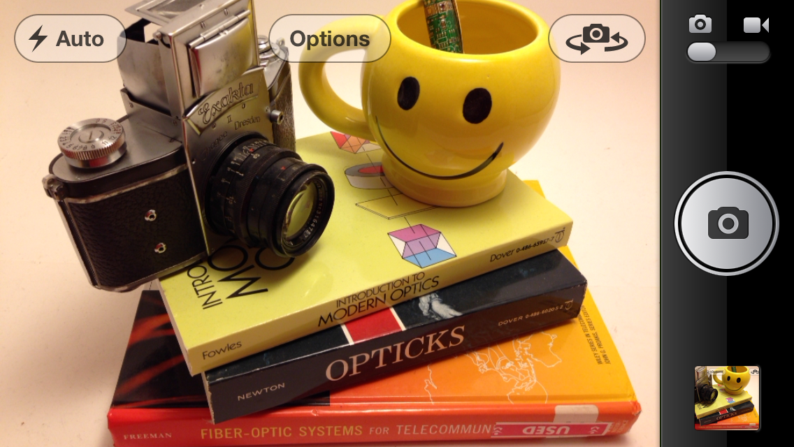
A major problem with the iPhone 5 and iOS 6 camera UI was the aspect ratio mismatch between the camera sensor and display, and the way Apple chose to deal with it. This has become a problem for other OEMs as well since then. The live preview previously was fit to the long axis of the display, chopping the top and bottom of the actual image area off. This hilariously results in a preview that doesn’t actually show what the output image is going to look like, and composition matters when taking photos.
The good news is that in iOS 7 Apple has changed it so the image preview is now aspect-correct without cropping of the image preview. The bad news is that it took a whole iOS release cycle to fix that problem, which is curious considering that problem existed for video already (video is 16:9) on previous iPhones without 16:9 displays and Apple just implemented a double tap to show the full field of view.
On the iPad the camera UI changes slightly, there’s no ring switcher but just a strip with text for the ring switcher and all the controls.

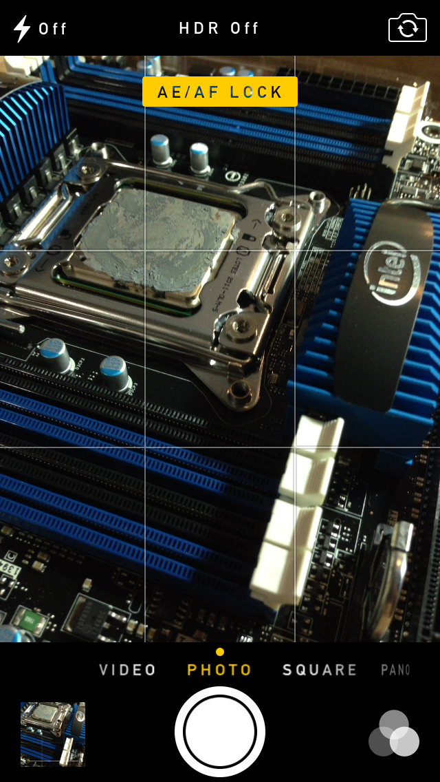
The camera UI still retains AF/AE lock (long press in the preview) and the rule of thirds grid (although this is under settings, outside of camera.app), what’s different is holding the capture button now bust captures on every platform. Previously you could hold the camera button down indefinitely and capture on release, which was great if you wanted to take a selfie with the rear facing camera (just hold it, then release).
Apple has taken the extreme automatic route with its camera UI, you won’t ever see a Nokia 1020-esque UI with optional manual controls for ISO, focus, or exposure time, so getting everything right is very important. I’m really happy that the new UI fixes the aspect ratio cropping issue which was alarming to see shipped on the iPhone 5.
Photos
The Photos application gets an entirely new icon and a number of overhauls inside. In addition to the Albums view there’s a new Photos view which has a few different visualizations and groupings – collections, years, and moments. These group photos together based on time or place in a logical fashion.
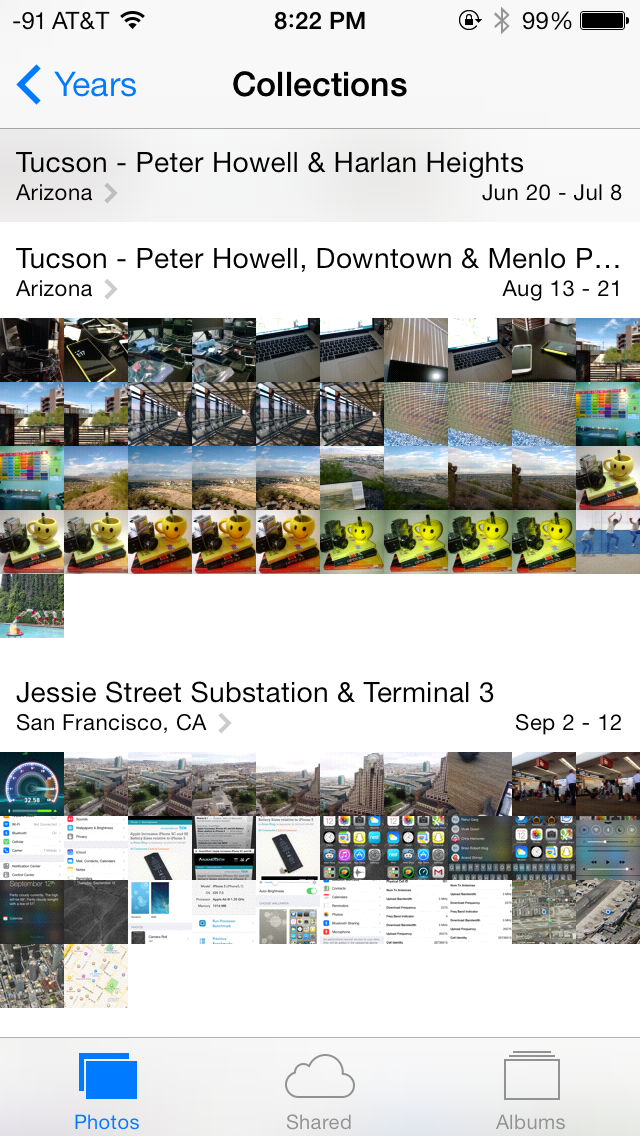

The visualizations show small thumbnails with all the photos automatically grouped together. This is a big step forward from the oldest at top, newest at bottom organization that the albums view provided with fixed size thumbnails that quickly became impossible to navigate after getting a few thousand images in. There are some new multitouch effects in this view too, you can pinch and zoom into images from the moments views and flick them around. The maps view is also still around, which uses the location tags from EXIF.
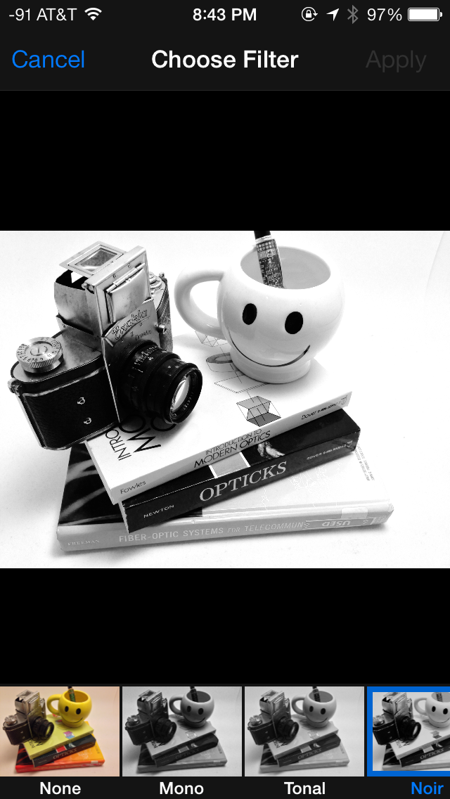
Inside the edit menu there’s also new support added for photo filter effects after the fact. In addition photos taken with the filter toggled don’t actually destructively change the original image, so you can remove these or change them after the fact. I’m not a big filters person but this kind of nondestructive editing is awesome.


144 Comments
View All Comments
uhuznaa - Thursday, September 19, 2013 - link
One point Steve Jobs argued about with the old Apple and that lead to him being fired was that he didn't want the Mac to have more RAM. His way of thinking was that programmers should look for ways to make their apps solve problems by thinking through the problem deep enough to come up with simple solutions that didn't need lots of code or memory. All this "we have actually no idea what the people want to do, so just let's throw raw hardware power at it and give them everything" never was his vision.And everybody who ever designed an app or any software solution to something knows that really diving to the bottom what you want to solve is the crucial part. If you do this right you may end up with incredibly simple solutions that go a very long way. The Wiki idea is a good example here.
Jumangi - Thursday, September 19, 2013 - link
2013 and its still just screens of static icons...boring Apple.kyuu - Thursday, September 19, 2013 - link
Personally, I think the iOS 7 aesthetic is pretty ugly. I like Metro, but you can't simply Metro-ize the old grid-of-chiclets and expect it to look good. The propensity for bright, pastel colors doesn't help either.And then that translucency effect is downright bad, especially if you have a dark background. The simple transparency you get with the iPhone 4 is much, much better and should be the default. There is a (rather obfuscated) setting to turn the translucency off labeled "Increase Contrast".
Also, the contrived text in the notifications pane (it says "It is now X degress. The high today was Y degrees" or some such instead of just showing the current temperature and today's high/low) is a huge space waster and offers nothing over simply showing the numbers.
While the move away from skeumorphism to more modern design was necessary, Apple did it in a pretty poor way, IMO. If I had any inkling to move back to iOS before, Apple pretty much killed it with iOS 7.
mfenn - Thursday, September 19, 2013 - link
Capital letters. Use them please.HardwareDufus - Thursday, September 19, 2013 - link
I'm surprised by the use of bright pastel like colors. I don't like it. I can't stand Kelly Green, Magenta, Cyan and Baby Blue used so extensively. It's like the pulled a 'ME TOO' and adopted Windows8 Crayola color palette.That said, I use Phone8 and I can only stand 2 of the color scheme's available. So perhaps I am well in the minority.
The Von Matrices - Thursday, September 19, 2013 - link
After reading through the article, I'm surprised that the new operating system brings no new software features that make me think "wow, I wish my Android phone did that." From an overall view it seems that more than ever that the only real difference between IOS 7 and Android is their colors, font, and icon graphics. It seems that smartphone operating systems are converging on one UI design, just like desktop operating systems have done in the past few years.Sandiamom1 - Thursday, September 19, 2013 - link
I have always considered myself part of that Loyal Apple fan base. I have owned Apple computers, iPods, iPads, iPhones...I have given them as gifts, etc. I have raved about my phone so much, many of my friends have gotten the iPhone. Yes, I am that middle aged woman, not terribly tech savvy & enjoyed the immediate tech support of Apple & ease of use. Since upgrading to the iPhone 5 in June 2013, I have experienced nothing but frustration! This iPhone 5 is basically a very UNSMART, expensive piece of junk! I tried going to the Apple store for tech support, but they won't talk to me for 4 days! Guess that fast tech support service is a relic of the past. Went to AT&T, but they say it's a hardware problem so I'm at the mercy of a slow to respond Apple service system. Since upgrading to the 5 (had the 4s), some contacts get no texts from me, others it may be delayed by hours or days & vice versa; it frequently won't pick up the wi-fi & won't switch to my data plan so I just can't access the internet at all; it drops calls; Find My iPhone app will not work on this; touch screen & scrolling are frequently unresponsive; other things I can't remember now. A couple family members just got the android Galaxy 4S. I am seriously thinking of dropping all Apple products. Told my friends. They're interested in hearing my thoughts on the 4s if I switch. Apple store didn't seem concerned about losing a longtime, dedicated customer, which makes me think it's time to go.kwrzesien - Friday, September 20, 2013 - link
You got a lemon, get Apple to swap it out. Don't restore your 4S profile to it, start from scratch, re-download the apps you still need/want from the App Store, let the contacts sync with iCloud and/or Gmail and/or Facebook, etc. Every few weeks kill all the running apps from the task manager (double-click the home button, hold an app until the "x's" appear) and then reboot. The friends that aren't getting your texts probably have iPhones on Verizon, switch to sending to them as SMS - there is much more delay between AT&T and Verizon then there is internally, I think Apple has different server clusters for each and the interconnect can either get bogged down or jammed. I think the iMessage servers for Verizon in general seem to be slow.The iPhone 5 hardware is very good, but the key is that you did an UPGRADE. I think the software just gets screwy with this and I recommend doing a fresh install. If that doesn't fix your issues then get it replaced.
dcost11 - Friday, September 20, 2013 - link
The apps move when you tilt your device on the ipad, has anyone else noticed this? its like they are on a layer above the wallpaper and as you move the device you see more or less of the wall paper. It doesn't seem to work on my iphone 4Gorgenapper - Friday, September 20, 2013 - link
Updated my iPad 3 to iOS 7 last night.1) Apple fans complain so much about the occasional lag on Android devices, well now they can have some of it too. But of course, Apple lag is in fact a built-in value-added feature. I'm just using the iPad wrong.
2) I think I can hire a chimpanzee to design and draw better icons than most of the ones that have been updated. I mean, sure, the iOS 6 sunflower icon for photos has been around for roughly a million years or more and was due for replacement, but they couldn't draw up one or two abstract representations of photos and instead gave us this Wheel-O-Colors that makes no sense whatsoever? Some of the other icons are so hilariously minimalistic and juvenile in execution that it cheapens the entire experience of using the iPad.
3) No calculator for the iPad? Really? Seriously? Most of the free ones out there are full of ads.
4) Movies on my iPad no longer have titles, I'm supposed to know which movie it is by looking at the thumbnail. Let's see... I have... "A Movie shot in Black", "The Terrifying Darkness", "Noire", "Black Screen of Death II", "Random Face Caught in Motion" and "Unidentified Body Part". Another value added feature from Apple, thanks!