The Windows RT Review
by Vivek Gowri & Anand Lal Shimpi on October 25, 2012 12:00 PM EST- Posted in
- Windows RT
- Operating Systems
- Microsoft
- Mobile
- Windows 8
- Tablets
Xbox Live: Music, Video, and Gaming
The music and video players are now part of the Xbox Live family of services, so they’re connected to Xbox Music and Xbox Video respectively. The applications are separate but are very similarly designed and laid out, with local content on the left, featured content in a central location, and content stores to the right. The bottom edge swipe brings up the ability to specify a file for playback, as well as a now-playing control bar. The music application looks quite good when snapped to the edge, with various album art from your library appearing as the background for the music controls.

Hilariously, videos can also be played back when snapped, albeit in a very small window. It’s not the best way to watch a video (who enjoys watching video content in a 320x180 window? Anyone? No takers?) but you can do it if you really want to. The video playback controls are pretty elegant in full-screen mode, and both players seem to have taken a number of interface design cues from the Zune software. I’m a huge fan of the Zune desktop software and how elegantly it operates, so I think this is great. I’m also just glad to not have to deal with Windows Media Player.
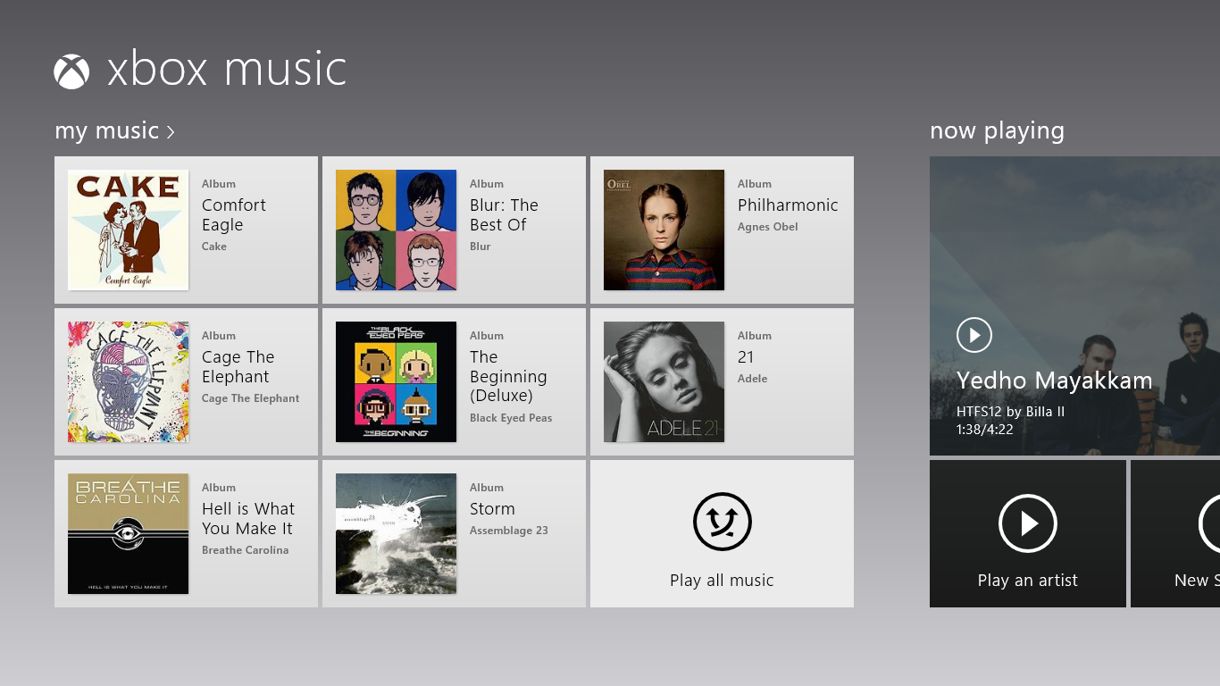
Both Xbox Music and Xbox Video look very similar to the latest Xbox dashboard update, and it’s clear that Microsoft is pushing a unified entertainment content front here. I remember when Microsoft was supporting a half dozen different music stores when the original Zune launched in 2006, so I’m just glad that they’re finally consolidating all of their services and concentrating on a single content store. Xbox has been their most successful entertainment effort to date, so it’s no surprise to see Microsoft put their faith in it for media as well.
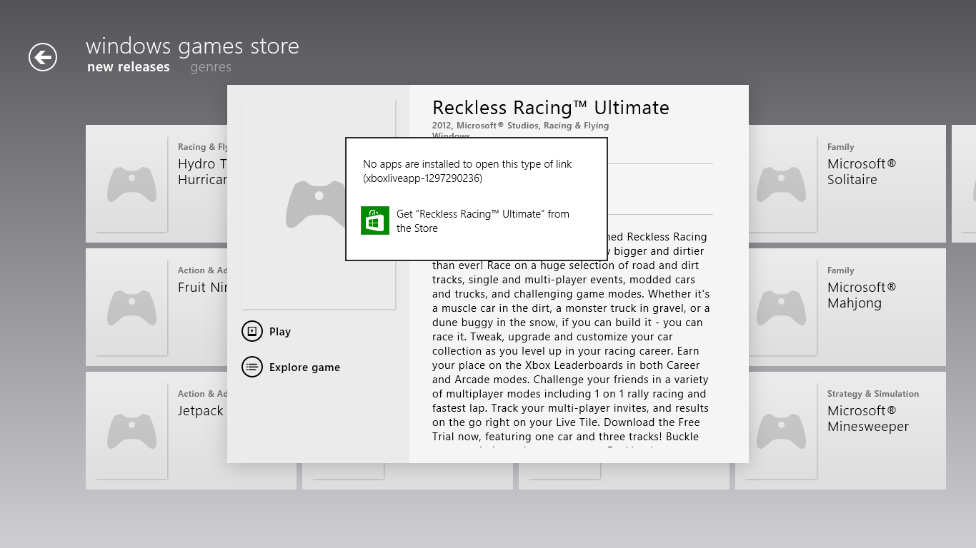
Now, we can’t discuss Xbox without touching on gaming. Xbox Live is obviously the gaming portal of choice for Windows RT, and offers various hubs for Windows and Xbox 360 games. The Xbox Live application didn’t appear to be ready at the time of posting, with broken links and missing pictures for all the games and hubs. This is still an unreleased software (until Friday, anyways) so it’s possible that we’ll see the application be updated between now and then for a working final release. We will also have to wait until then to see what game support will be like out of the box; currently, the Xbox Windows Game store shows titles like Reckless Racing, Hydro Thunder Hurricane, Fruit Ninja, Cut the Rope, and a number of Microsoft classic titles like Minesweeper and Solitaire, amongst others.
Camera and Photos
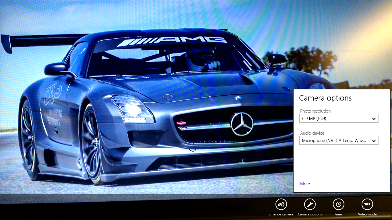
The camera application is about as basic as you can get, with a translucent control bar that lets you switch cameras, change between still and video capture modes, set up a timer, and basic picture quality settings. Basic isn’t necessarily a bad thing though, as the application operates smoothly and quickly, with near-instant switching between modes and cameras. The controls are very straightforward - tap and hold to lock exposure is supported, and to capture an image you can just tap anywhere on the screen. It’s one of the easiest capture mechanisms out there, and fits right in with the simple UI.
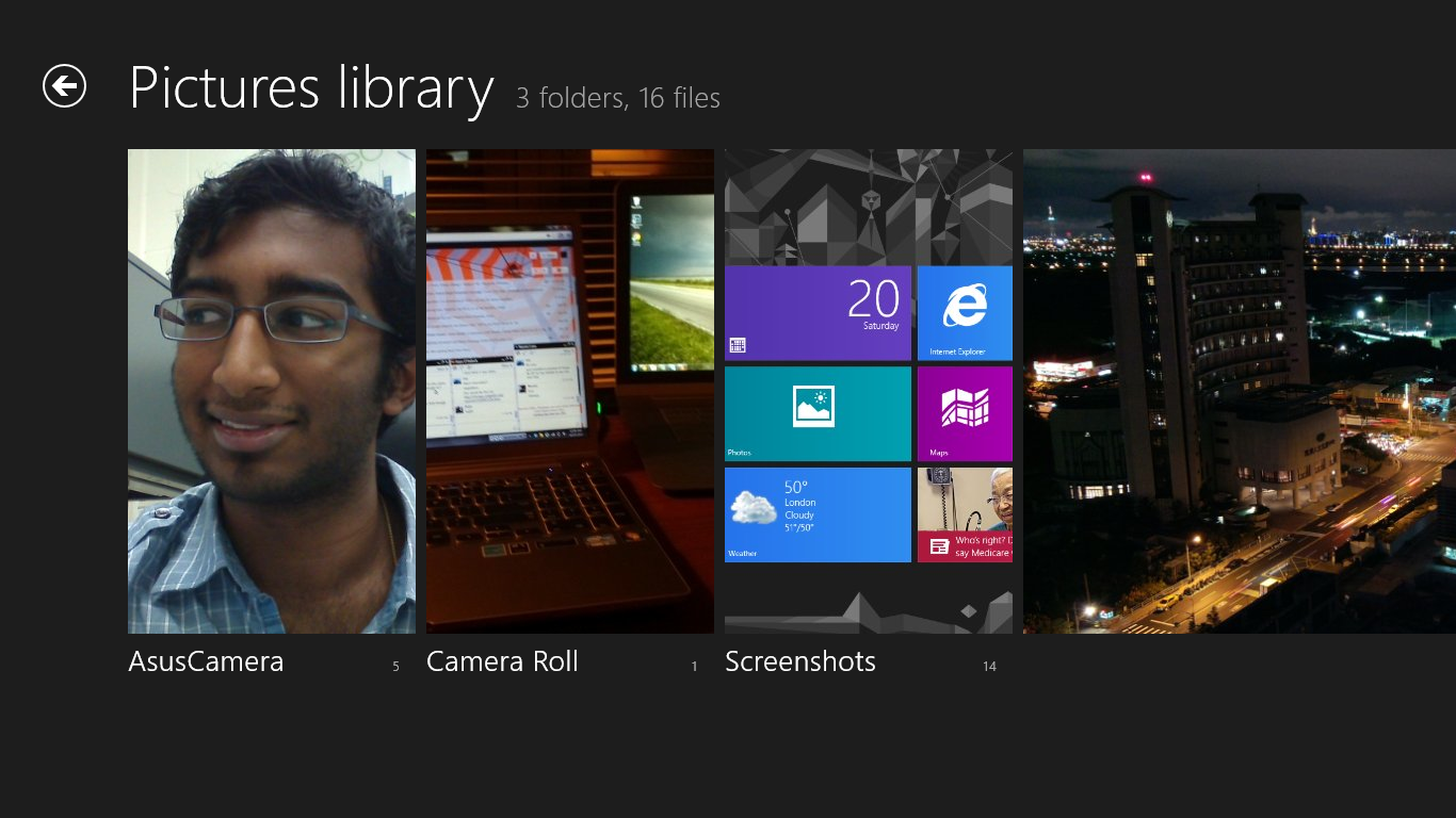
The photo application pulls images from your local pictures folder and camera roll, as well as being able to connect to Facebook, Flickr, and SkyDrive. They show up as panels for each service, which show a full list of thumbnails. It’s worth pointing out that you can only see photos uploaded to Facebook from your own account, not friend’s images or pictures you’ve been tagged in. As is now the norm with tablet picture galleries, you can view images in slideshow form or just flick through them individually. For local images, the bottom edge swipe brings up an option to delete the images, as well as setting as the lockscreen image and starting a slideshow. For images on Facebook, there’s an option to view them in Facebook, though you need to actually be signed into Facebook in IE for this to work.
The overall takeaway from the camera and gallery applications is that they’re designed as minimally as possible and do exactly what they’re supposed to with a minimum of fuss. You won’t see any spectacular functionality, though the ability to slideshow through Facebook galleries is a nice touch. I think we’ll see manufacturers offer their own spin on these applications, like ASUS and their separate camera application, in an attempt to gain minor levels of platform differentiation. Microsoft has kept a pretty tight reign on the customizations allowed for the Windows Phone platform though, so I can’t see them allowing anything too invasive on Windows RT devices either.


233 Comments
View All Comments
steven75 - Friday, November 2, 2012 - link
Huge problem. Windows 8 x86 != Windows RT compatible version.There's basically no reason to make Metro apps if you already have a working x86 app unless RT is some kind of phenomenon.
Oxford Guy - Thursday, October 25, 2012 - link
horrifyinghttp://images.anandtech.com/doci/6392/Music-Sideba...
http://images.anandtech.com/doci/6392/Screenshot%2...
http://images.anandtech.com/doci/6392/Charms.png
bad
http://images.anandtech.com/doci/6392/TaskSwitcher...
Sharp edges everywhere. Playskool colors without the roundness that makes Playskool stuff far less wretched. Misdirection aplenty.
No way. Sticking with iOS.
Oxford Guy - Thursday, October 25, 2012 - link
I think that third pic should be called the schizophrenia design language.kyuu - Thursday, October 25, 2012 - link
... Are you talking about the *background*? You're seriously going to leverage a complaint about the OS based on the *background image*?Wow.
Oxford Guy - Thursday, October 25, 2012 - link
I am not just talking about the background.kyuu - Thursday, October 25, 2012 - link
Lol.Aesthetics are, of course, completely subjective, but complaining about Metro/Modern-UI while sticking with the chiclets-on-a-grid iOS just seems silly to me.
Oxford Guy - Thursday, October 25, 2012 - link
Aesthetics is not an area that is anywhere near being completely subjective. For instance, eye tracking research has found that men look at crotches and women don't. There is a lot of psychology involved in designing an attractive and usable interface. Unfortunately, a lot of designers think aesthetics is a more subjective field than it is. Many think, erroneously, that what works well on paper works well on the screen, too.Those photos present clutter, disorder, sharp edges, and other unpleasant design attributes. The giant sharp-edged colored box look that's so prevalent is jarring, unpleasant, and unfortunate.
iOS's chiclets, at least, have softer more humanized edges and adequate space between. The soft rippled background on my iPhone 5 is also more humane than the schizoid gizmo look.
If you think aesthetics is totally subjective, explain why Microsoft Bob didn't succeed. Why don't all our computers look like THAT?
ludikraut - Friday, October 26, 2012 - link
I guess that must make me a schizo then, since I disagree with all of your points.l8r)
Dorek - Friday, November 2, 2012 - link
What, are you worried you'll cut yourself?Devo2007 - Thursday, October 25, 2012 - link
"Swipe in from the left and you flip through apps, giving Microsoft the win for quickest task switcher among all tablets"While it's not iOS or Android, the BlackBerry PlayBook can swipe through apps by swiping in from the left or right. So in this case, I'd call it a tie.