LG Optimus 4X HD: Tegra 3 Handsets Stay Global
by Vivek Gowri on August 29, 2012 4:30 AM EST- Posted in
- Smartphones
- LG
- Ice Cream Sandwich
- Mobile
- Tegra 3
The Optimus 4X represents a thorough overhaul in LG’s design language. Gone are the melted-by-microwave contours, replaced by a sparse, geometric design focused on flat surfaces and radiused chrome edges. The overall effect is actually very reminiscent of the international and AT&T versions of the much-loved Galaxy S II because of the chrome ring around the bezel as well as the general flatness of the design. It’s different, with tighter radiuses making the rectangularity of the device that much more apparent, as well as an interesting brushed pattern to the plastic battery cover, but similar enough to make the comparison. As a huge fan of the Galaxy S II I-9100, I find it to be a very pleasing design. It doesn’t feel as ultramodern as the SGS3 and the One X, maybe a little bit last generation even, but there are some benefits to that.
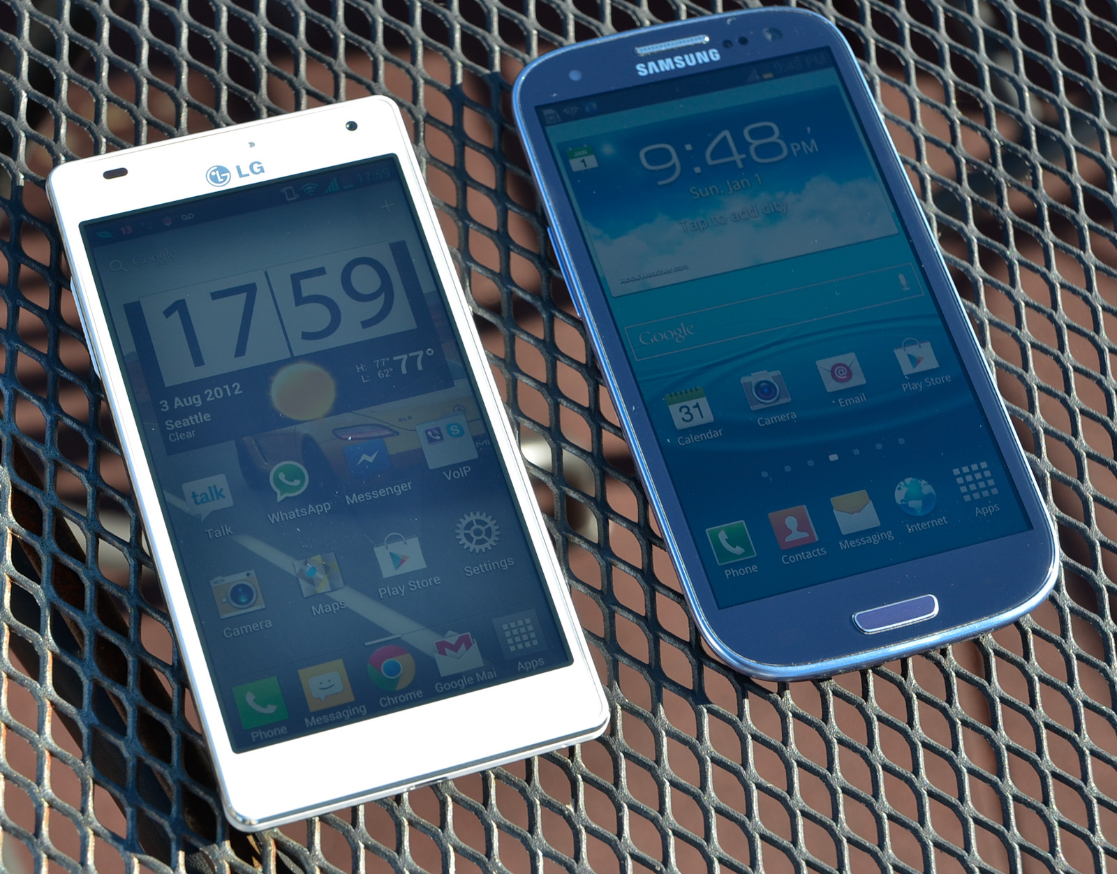
The rectangular shape helps give the O4X very compact dimensions, with minimal overhang from the 4.7” display. As display sizes grow, the amount of wasted space around the display becomes a much larger concern to maintain pocketability and in-hand usability. While HTC and Samsung went with contoured design languages to combat this issue, LG stuck to basic geometric shapes and was very fastidious about keeping the footprint as small as possible. And for the most part, they’ve succeeded. It’s smaller than both the One X and SGS3, and comes very close to matching the Galaxy Nexus (4.65” display).
The styling is very, very clean, with minimal extraneous details. The front is entirely clean, other than the chrome LG logo, front facing camera, earpiece, and proximity sensor. There are three capacitive touch buttons (back, home, menu) that light up when touched but otherwise disappear to make it look like an unblemished piece of plastic. Having buttons appear only after they’re touched sounds counterintuitive, but you learn quickly to just stab in the general area of the button you’re going for. If you’ve ever used an Android device before, it comes pretty naturally. I do take issue with LG’s inclusion of a menu button instead of a task switcher, as I do with Samsung and the Galaxy S III. I much prefer the button layout of the GNex and HTC’s One series, with a dedicated task switching key in place of the menu button. My other problem with the O4X button layout is that the buttons are all placed very close to the screen, so it’s easy to accidentally press one of them while typing. A common one for me is hitting the space bar and the home key at the same time, which can get annoying pretty quickly. Ideally, LG would have included an extra millimeter or so, in order to give a bit more buffer room between the screen and the capacitive buttons.

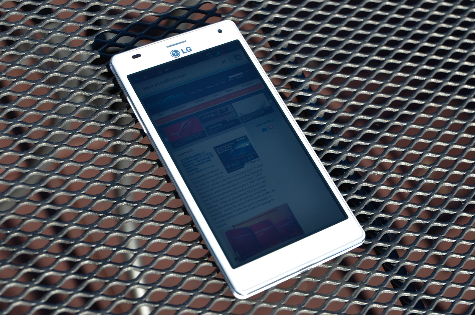
The sides of the O4X HD are basically made up of two chrome rings separated by a contoured plastic center. The volume toggle protrudes from the plastic on the left side and is very easy to find by touch. The hardware button layout is dead set perfect; the power button and headphone jack are at the top and the micro-USB port is centered at the bottom, just as God intended them. I’ve gotten used to Samsung and Nokia’s fascination with putting power buttons on the right side, but it’s always a relief to get my hands on a device with everything in the right place.

The battery cover is white plastic, but not nearly as cheap feeling as the plastic used in the Galaxy S2’s battery door. It has beveled edges all the way around, giving it a bit of visual interest as well as making it easier to hold. The brushed texture also gives it an interesting feel, but contrasts weirdly with the triangular texture used on the sides and volume buttons. Removing the battery cover doesn’t really inspire much confidence in its construction, but it is at least better than what Samsung usually does, and I’ve dealt with enough of LG and Samsung devices to know that even if they don’t feel particularly solid, it’ll take more than standard operation to break the plastic. It’s reassuring to see removable batteries in the SGS3 and the O4X HD, with so many manufacturers switching to sealed batteries and unopenable devices in recent times. The Apple effect is catching on, but apparently the Koreans haven't gotten the memo, thankfully.


46 Comments
View All Comments
Belard - Wednesday, August 29, 2012 - link
"The hardware button layout is dead set perfect; the power button and headphone jack are at the top and the micro-USB port is centered at the bottom, just as God intended them."That is an opinion, not a statement of fact. Its a preference that works for you - but doesn't mean it'll work for others. By all means - the button arrangement should be mentioned for reviews. Also, I didn't know that God had a cellphone preference... :)
When I was deciding on my next phone. It was a toss up between the HTC One X / SGS3 (Nokia 800 briefly) and even the Sony Xperia Ion (Which looks good, has a good texture - but feels odd). I simply can't stand touching the glossy back of the SGS3, its finger print-hell, it looks cheap because it is cheap. The HTC One feels good overall, the sticking-out camera lens is somewhat stupid, but its a great feeling and looking phone otherwise. 1st phone I noticed with a message light (before I found out most ICS phones have this feature). The physical HOME button on the SGS3 is also a selling point.
Then at the store I notice something with the HTC One. Besides the USB connector is in the way when charging and using the phone (never perfect anyway) the Power button is at the TOP. I tried out the phone with using that power button - since it'll always be used to wake up the thing.
HATE IT! That alone changed my mind with the HTC One.
Then on this site, they previewed the Motorola Atrix HD. I liked how it looked. Then I had a chance to try it out in the store and use it. The power button is on the side. And I'm good for the headphone jack and USB ports on top (as on my Galaxy S1 phone), The phone feels great in the hand (texture) - NO FINGER prints. The various types of materials on the side feels good, looks good. Having the top of the phone bigger means you'll know quickly which side is up. It doesn't have an "buttons" as it uses ICS on-screen menu buttons for navigation. Cool thing about hat, if the phone is upside down, the UI flips correctly - it doesn't matter. (okay, when talking to someone - yes).
The HTC One has been reduced to $100, same as the Atrix HD - but it includes a car-dock which charges and holds the phone and put it into a GPS mode. It'll also tag your car location when you remove your phone in case you forget where you parked. The screen on the Atrix HD looks better than the SGS3... the camera is sub-standard compared to any other ICS phone on the market. (sigh) - but my main camera is real, no a big deal. A cool feature included is that I have the VOL button set as a shutter button. (handy!) Its battery isn't as good, but better than phones form 2 years ago.
(I gather Atrix HD won't get a full review, oh well... I value phone reviews here than most other places since this site compares against other devices on your various standards)
Its like when you responded above with "But honestly, I enjoy using the LG more, simply due to the software. It's essentially the same rationale behind me sticking to a Galaxy Nexus" (Even thou the HTC One is better). For me, the HTC One wouldn't work for me... even thou its better in almost every way over the Atrix HD. A business partner needed a new phone, I had him try out the 3 phones (HTC / SGS3 / Atrix HD) - The power button location nixed the HTC, he liked how the SGS3 looked.
Thanks for the review... and using it for real. Hope LG does well with this phone, more competition = better phones. (And apple's lawsuits is why I won't buy Apple)
Myrandex - Wednesday, August 29, 2012 - link
USB port on the bottom is the proper spot? Not in my book. I enjoy sitting my phone in my cup holder in my truck, and with it sitting upright, having the USB port on top makes much more sense then being on bottom. Otherwise it would be upside side down. And when I've used headphones in a situation like that, having both the headphone port and USB port on top is perfect.Power button on the side took a little used to using, but I don't mind it there.
Belard - Wednesday, August 29, 2012 - link
Yep... that is how it is in both of my cars. I drop the phone in a side pocket or cup holder and all is good.powerarmour - Wednesday, August 29, 2012 - link
Have to say the Galaxy Nexus scores need updating to JB level, I'm getting 1480ms in Sun spider and 1665 in Vellamo :)It might be getting on a bit in some areas (GPU...), but I still think its the best overall Android phone out there.
Skiddywinks - Wednesday, August 29, 2012 - link
"Thus arrives the Optimus 4X HD, the flagship of LG’s new lineup, a device goinghead to head with the international versions of the HTC One X and Samsung Galaxy S III"Wow, I thought AT didn't recognise an international SIII even existed, given the lack of anything to do with in on this site.
/butthurt waiting for IS3 review
fixxxer0 - Wednesday, August 29, 2012 - link
Any numbers for that phone, specifically the LTE??It was said when the first round of reviews were being done that no VZW phone was had yet... but its been a few months now.
Bob-o - Wednesday, August 29, 2012 - link
> Having buttons appear only after they’re touched sounds counterintuitive,> but you learn quickly to just stab in the general area of the button you’re
> going for. If you’ve ever used an Android device before, it comes pretty naturally.
You can get used to anything, but it is still a bad design choice. Every "normal" user I know who has encountered this hates it. Including my neighbor who just bought her first smartphone, an LG Lucid. She was going to return it because of this, as she didn't think anyone could design something so stupid. She thought the phone was malfunctioning.
Personally I think if you are going to have dedicated "buttons" then they should be, you know, friggin' buttons. But then I'm old and not onboard with a lot of the junk they're slinging these days. . .
Origin64 - Thursday, August 30, 2012 - link
This is 2012. Why is anyone still using hardware buttons on phones? Seriously. Android has already changed the guidelines for button layouts, what, 2 or 3 times in the past 2 years? Having the software buttons that are now the rule for ICS and up would give any device more flexibility and would also add to the look of it. If LG has tried so hard to minimize the bezels, why include a strip at the bottom that they could've left out just as easily.Also, I actually like the power button on the side of a device, that way I can actually turn my phone off with one hand without getting carpal tunnel.
Origin64 - Thursday, August 30, 2012 - link
And secondly, while I'm on the point, why hasn't any manufacturer released a phone with Jelly Bean yet? I'm running a custom based on it on my S1, and the UI is smoother on my 2 year old phone than it is on a brand new S3. I think being the first guys to have a phone that is released with JB in stores would be a significant competitive advantage. Android with an actually smooth UI, why, that's unheard of!powerarmour - Thursday, August 30, 2012 - link
This is exactly why I'm still using a Galaxy Nexus, once you use Jellybean, you can't really go back!JB even runs superb on a Nexus S, very smooth indeed 95% of the time (with the odd dodgy transition), but how old is that phone now?, I'd still rather have that than any ICS based phone, no matter the hardware inside.