The Apple iPad Review (2012)
by Vivek Gowri & Anand Lal Shimpi on March 28, 2012 3:14 PM ESTHandheld Image Editing: iPhoto for iOS
by Vivek Gowri
Alongside the iPad 2, Apple launched iOS versions of iMovie and GarageBand. Now, Apple has announced iPhoto for iOS, completing the iLife collection for iOS. Like iMovie and GarageBand, iPhoto goes for $4.99 on the App Store and makes an ideal companion for the iPad Camera Connection Kit.
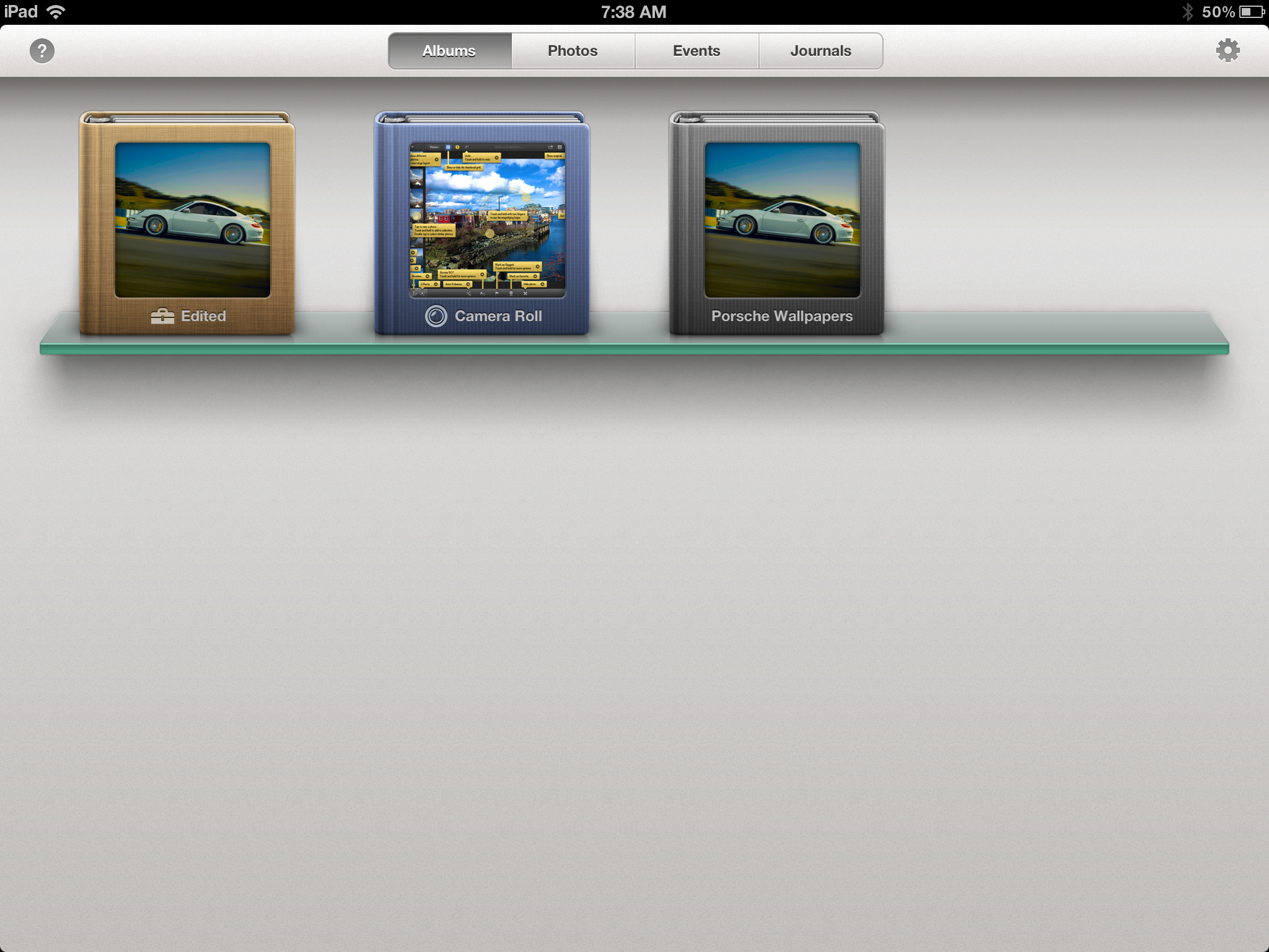
iPhoto can take images from multiple sources, including iTunes, Camera Roll, iCloud, as well as pictures imported through the Camera Connection Kit’s SD card. When you open iPhoto, you’re greeted by thumbnails of photo albums corresponding to the albums synced from iTunes, the desktop iPhoto, and iCloud Photo Stream, as well as the device’s Camera Roll, images imported from the Camera Connection Kit, and a set of albums created within iPhoto for edited photos, flagged images, favorites, or pictures beamed to the iPad from other iOS devices with iPhoto. The album view is similar to iBooks or Newsstand in that the thumbnails are displayed on shelves, though instead of a virtual wooden bookshelf, iPhoto has a more modern aesthetic with glass shelves floating on a light gray background.
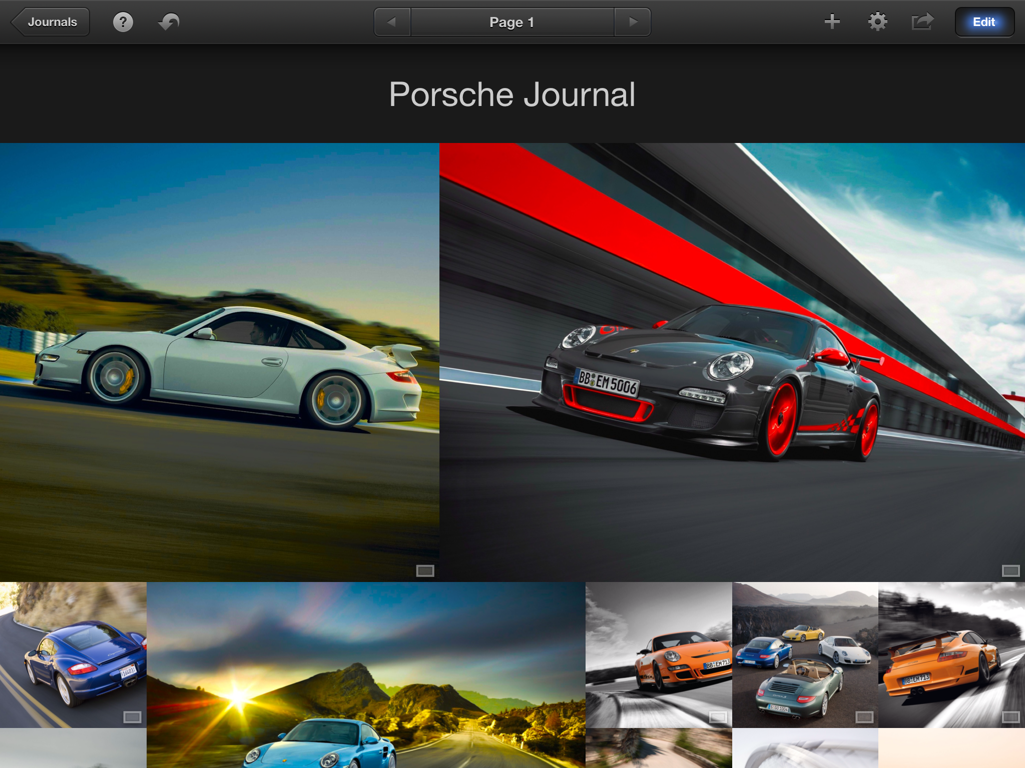
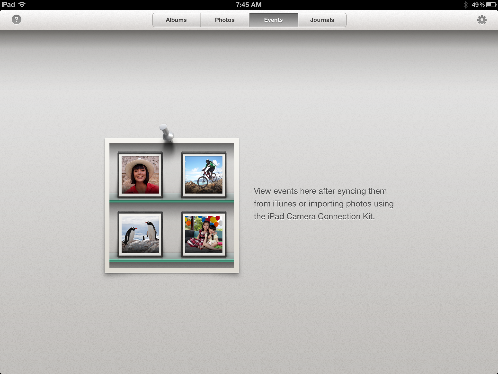
The other tabs are photos, events, and journals. Photos simply is all the photos taken on, imported to, or beamed to the device. Events are collections of images synced to your device from iTunes or imported using the Camera Connection Kit. iPhoto journals are a digital scrapbook of a selected set of images, arranged as a flow of differently sized elements in a digital mosaic.
From an album, event or the photo box, tapping an image will take you to the main image page, with a few buttons on the top bar. The most prominent and most important is the edit button in the top right corner, along with options for sharing, image information, and a “show original” button on that side of the toolbar, while the left side of the toolbar has an option to show/hide the thumbnail grid on the left edge, a help button, and an undo button (that only functions in image editing mode). Touching and holding the image with two fingers brings up a magnifying loupe to zoom in on a specific spot.
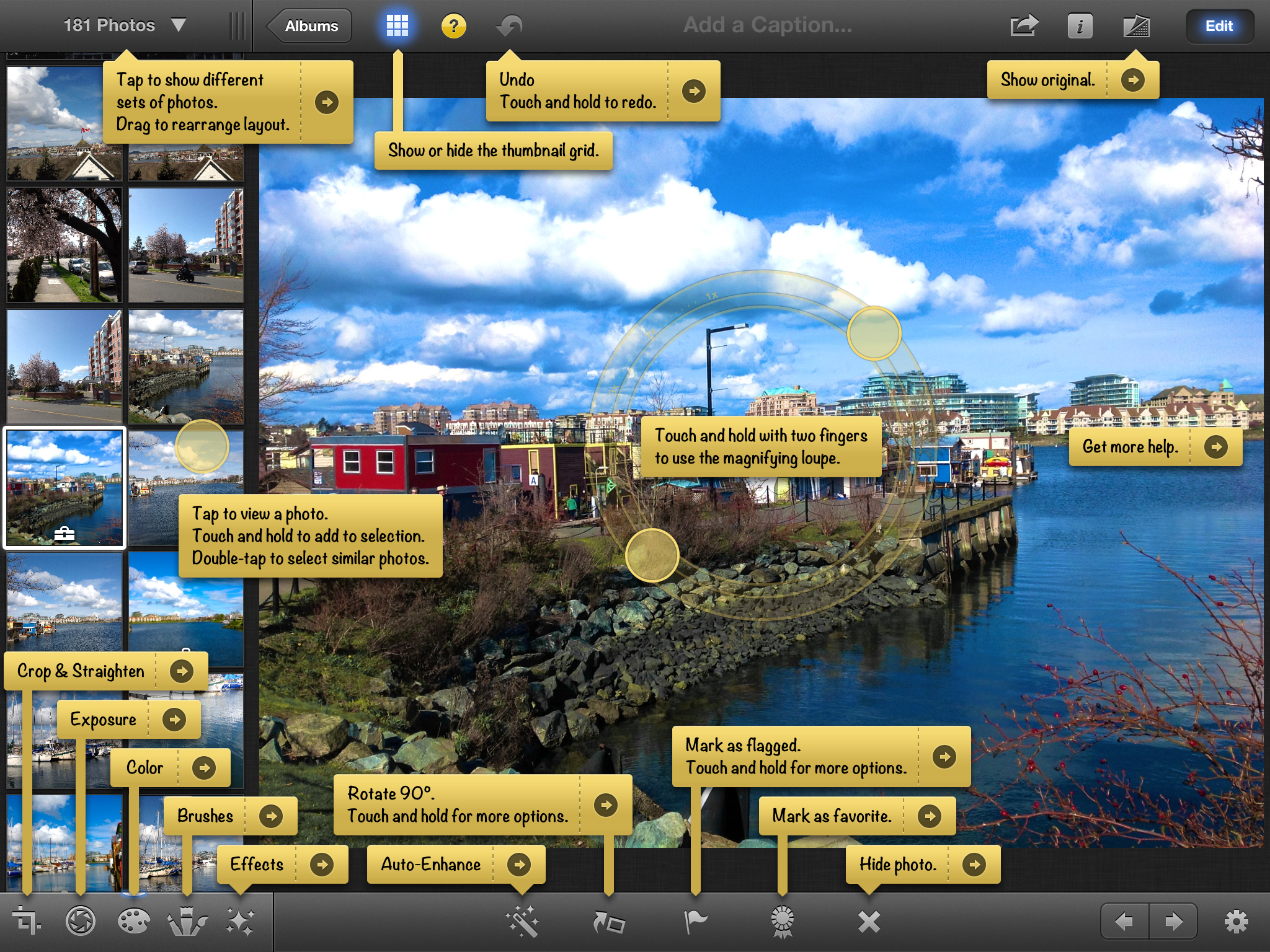
Entering the editing mode brings up a toolbar on the bottom, with editing tools, tagging options, and a gear that brings up secondary options. As far as editing tools go, iPhoto has most of the major ones—crop and rotate, exposure, color saturation, brushes, and various effects, all of which take up residence in 5 buttons at the bottom left corner. More general options are in the middle: auto-enhance, 90-degree rotation, flagging, favoriting, and hiding, then on the right side a settings menu that allows for selecting multiple photos, copy/pasting edits to multiple photos, and reverting to original.

Cropping is pretty straightforward, with pinch to zoom and a composition grid, as well as a few preselected crop aspect ratios accessible via the options gear. Rotation comes courtesy of a dial at the bottom of the screen, which allows you to accurately straighten your images.
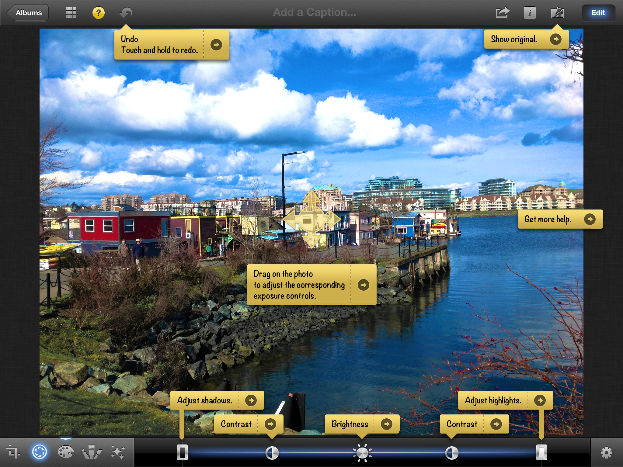
Exposure controls brightness and contrast, which are combined into a slider that allows for adjustment of the dynamic range. You can control all three separately using that slider, or by pressing and holding the image, bringing up a four directional arrow that you can drag. The two different axes represent control over two different options, depending on where on the image you press. The options gear has three options: copy, paste, and, like in all of the editing modes, a reset for the individual editing mode (as opposed to the entire image). The entire editing process is very intuitive and the tactility of the program makes post-processing easy to control even for imaging novices.
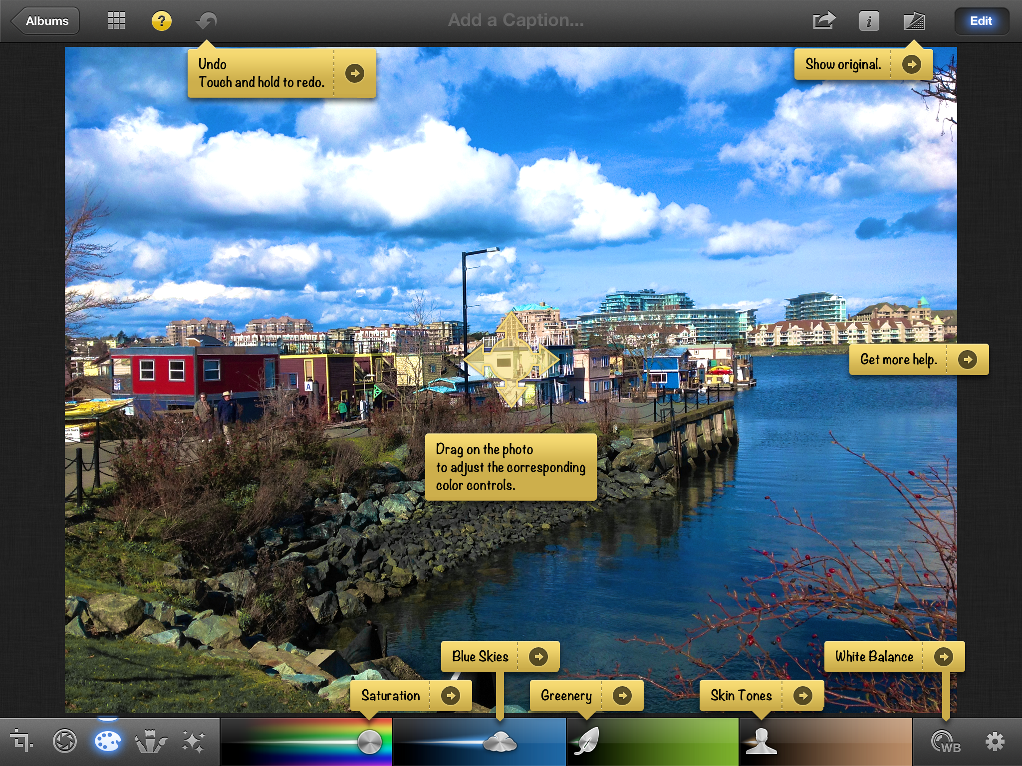
The color options are pretty basic; there are sliders for color saturation, skies, grass and plants, and skin tone, along with a circle with WB for the different white balance options—as shot, sun, cloudy, flash, shade, incandescent, fluorescent, face balance, and custom, which brings up a magnifying ring to select a point of neutral color. The gear brings up the standard copy, paste and reset, but also has a setting to preserve skin tones, for keeping skin tones as shot while saturation is increased or decreased.
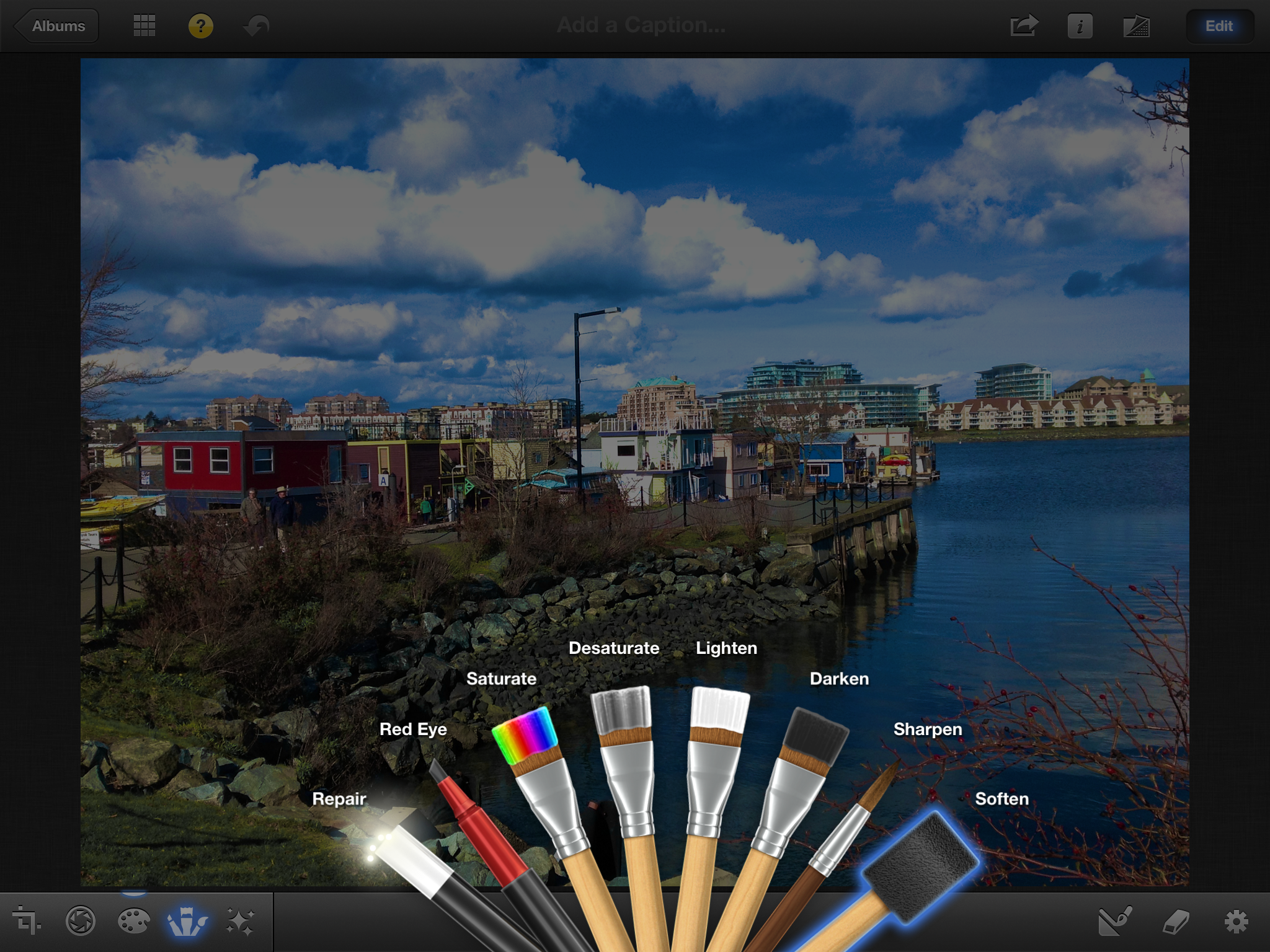
The brushes are the most interesting tool here, basically letting you paint on the image to edit in very specific regions. There are eight different brush tools—repair, red eye, saturate, desaturate, lighten, darken, sharpen and soften. Repair patches areas of a photo using pixels from the surrounding areas, while the rest are pretty self explanatory.
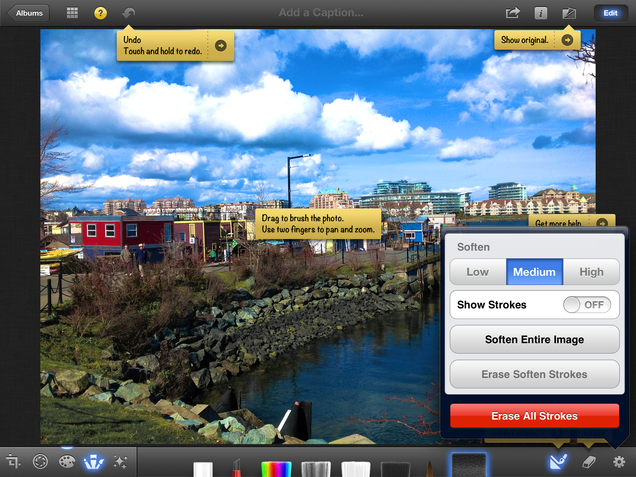
The settings and options with the brush tools are pretty endless. The most useful one is probably the edge detection setting, which lets strokes apply only to areas similar to the initially painted region—ie, if you were softening a body of water or the sky. Other options include strength and intensity of the brushes, the ability to erase individual brush strokes, having brush strokes shown as they’re drawn, and to apply the effect to the entire image. The other nice touch here is that, in addition to being able to reset all brush strokes for an image, you can reset the strokes made with any specific brush. Thus, you can reset the softening brush while not changing any edits made with the other brush tools.
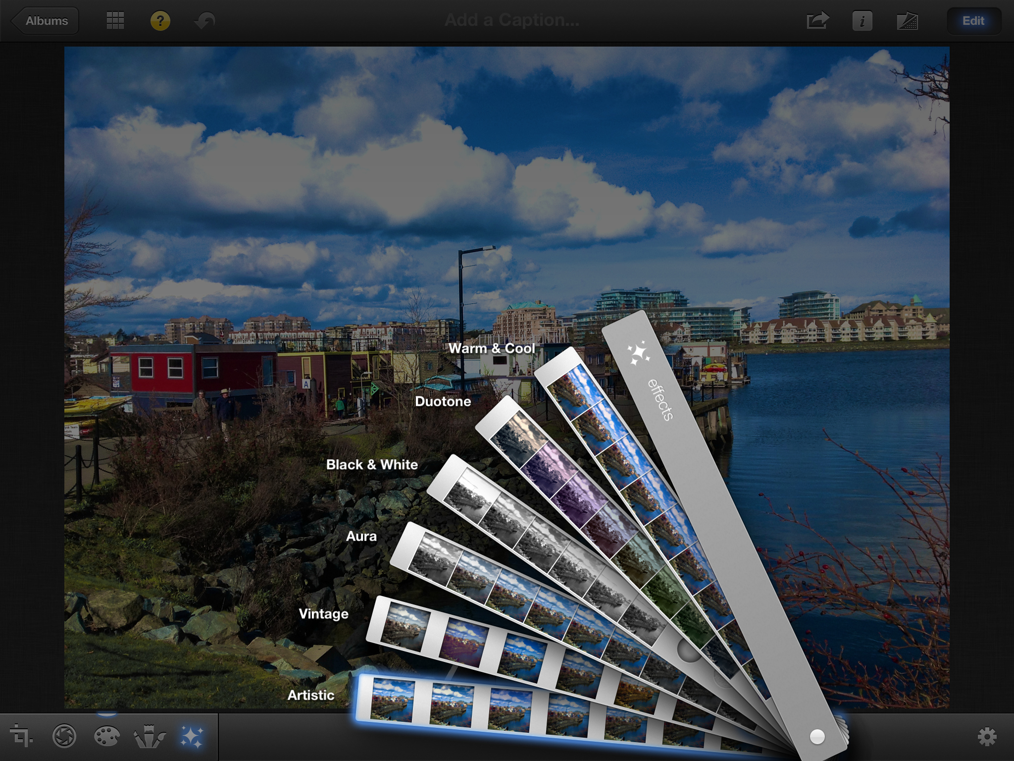
The last editing mode is effects, which lets you apply a number of different effects and filters. There are six different preset effects that are displayed in a swatch book—artistic, vintage, aura, black and white, duotone, and warm and cool. Each effect has options, with artistic and vintage having different filters and the others having sliders to adjust the color or level of the filter. Some of the effects have vignetting (which can be adjusted with a pinch motion), while others have color and texture options like adding grain or a sepia tone. Effects is a fun one for the Instagram crowd, my thirteen year old brother particularly enjoyed playing with them.
The tools themselves are pretty decent in mobile use; all of the main features you would want in an editing program are there, and the simplicity of use quotient is really high. But iPhoto was unexpectedly slow on the new iPad—simple stuff like filters and color editing feel a little bit sluggish, with changes taking a beat to show up, but more complex operations with brushes feel like they take forever to happen. Just entering brushing mode takes a decent chunk of time, over 10 seconds, and the editing once you get there is far from smooth. If you’ve applied a brush tool then want to add an effect, expect things to move at an agonizing pace.
Using iPhoto, it’s easily possible to peg both cores at near-100% CPU utilization, particularly when applying a brush. This is one of the very few times I’ve felt like the iPad is CPU-limited, but a quad-core SoC would likely have been very helpful in making the iPhoto experience smoother and faster. iPhoto is available for the A5-based iPad 2 and iPhone 4S, as well as the A4-based iPhone 4. The original iPad is excluded from the list of supported devices, as is the 4th gen iPod touch, presumably due to concerns about system RAM (the iPad and iPod touch 4 had 256MB RAM instead of the iPhone 4’s 512MB), but even so, I can imagine iPhoto being terribly slow on the single-core iPhone 4.
But other than the smoothness, iPhoto is a nice tool to have at your disposal. For basic edits, iPhoto is definitely adequate, and it makes image post-processing a much more attainable tool for beginners, both in terms of ease of use as well as cost—compared to how much Lightroom or the different versions of Photoshop cost, $4.99 is almost a pittance. For serious photographers, it’s not powerful enough or fast enough for normal use, but it’s an interesting tool to quickly create previews in mobile situations. And for casual users, it excels, delivering a lot of flexibility and a decent amount of editing power literally at one’s fingertips.
Apple gave us a number of high-res photos to try out iPhoto with. We gave the originals along with a new iPad to a photographer and had her try her hands at editing on the iPad. The result of her editing work is below, hover over the links to show you what type of editing you can do with iPhoto for iOS.

| Sample 1 | Sample 2 | Sample 3 |
| Before (original) | Before (original) | Before (original) |
| After (original) | After (original) | After (original) |


234 Comments
View All Comments
name99 - Friday, March 30, 2012 - link
Compared to the iPad1, the screen is, IMHO slightly smoother and a lot more oleophobic (ie it's a lot easier to clean off fingerprints by wiping a cloth over it). I never had an iPad2 so I don't know if these improvements are new or came with iPad2.shompa - Friday, March 30, 2012 - link
See = AppleTVTouch = Ipad.
But there was rumors about touch feedback from the screen. Probably in the next Ipad.
rakez - Friday, March 30, 2012 - link
as long as they stick with 4:3 i will never buy it.darkcrayon - Friday, March 30, 2012 - link
Similarly, that's one of the best things about the iPad. I can't see using a widescreen tablet in portrait mode, there is pretty much no popular content that works well there. On the other hand, 4:3 isn't as good for video, but the net effect is that the video is just smaller. I'll take properly positioned and scaled documents and smaller video over larger video and tiny documents.shompa - Friday, March 30, 2012 - link
You know that 16:9 is interesting if movies is the only thing you want to do.If you want to work on a tablet 16:9 does not work. You cant use landscape mode and see enough of the screen when you type. The 4:3 sceen is a bold move against tech nerds. I bet you are one of the tech nerds that screems when there are black bars on the side on you 16:9 TV. "why aren't the TV shows using the whole screen".
Then stupid TV people listen to you and crop 4:3 TV shows to fit 16:9 and cutting of large part of the picture.
The whole 16:9 debacle is actually a step backwards for the computing industry. Apple introduced widescreen displays early 2000. Steve made a great choose in 16:10. 2004 Apple invented the 2560x1600 screen. 16:10. Today its almost impossible to get a 16:10 screen. We all use TV LCDs for our computers = 16:9. 2560x1440. You loose 10% of real estate.
KoolAidMan1 - Saturday, March 31, 2012 - link
4:3 is better for web browsing and applications on a screen that size, the vertical room in landscape is great. It also makes for a much better balanced feel when holding it in portrait mode.Do you also like 16:9 on a desktop monitor? I sure don't, not unless it 27" 2560x1440
rakez - Saturday, March 31, 2012 - link
it's hard to argue with isheep and their products designed by god. i am pretty sure i know what i like more than someone else would know what i like. that being said, once again i prefer to not have 4:3 on my tablet. to each his own,Formul - Saturday, March 31, 2012 - link
starting with isheep and ending with "to each his own" ... you do love your bipolarity, don't you?rakez - Saturday, March 31, 2012 - link
sounds like i hit a nerve. go ahead keep following the herd. in the meantime i will buy what i want.PeteH - Monday, April 2, 2012 - link
Out of curiosity, what do you dislike about the 4:3 aspect ratio, and what's your preferred aspect ratio?