In-Depth with the Windows 8 Consumer Preview
by Andrew Cunningham, Ryan Smith, Kristian Vättö & Jarred Walton on March 9, 2012 10:30 AM EST- Posted in
- Microsoft
- Operating Systems
- Windows
- Windows 8
There are two versions of Internet Explorer 10 in Windows 8—a Metro app and a desktop app. Both share the same rendering engine and, unsurprisingly, perform identically on the same hardware. The only difference is UI, and the fact that Metro’s IE will not run plug-ins like Adobe Flash or Microsoft’s own Silverlight.
To reflect the distinction between the Metro version of IE and the desktop version, both Metro and the desktop retain separate default browser settings—you can run Firefox or Chrome as your default browser on the desktop and stick with IE in Metro, but you can also specify desktop browsers as the default Metro browser, meaning that links clicked in Metro apps like Mail will dump you to the desktop to open rather than stay in the Metro interface. Oddly, if you decide not to use IE as your default Metro browser, the IE completely disappears from Metro, and it takes a trip into the desktop Internet Settings control panel to re-enable it.
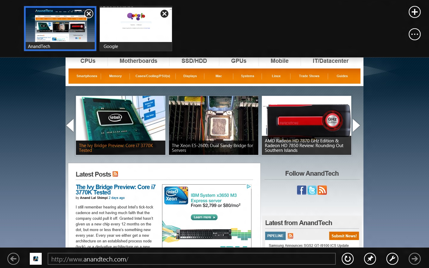
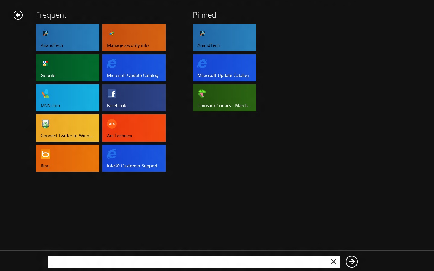
The Metro version of IE is a minimalist, touch-centric affair—the address bar is located at the bottom of the screen, and will disappear from view when it’s not being used. While typing in the address bar, IE will display a tiled list of your most frequently visited sites, as well as sites that you have “pinned” using the address bar’s pin button—these pinned sites will also show up on the Start screen. The address bar also has the requisite Back, Forward, and Refresh buttons, as well as a Tools button that will let you search the current page or open the page in the desktop version of IE (the desktop version contains no such button to open pages in Metro mode, at least for now).
The most consistent way to bring up the address bar on a PC is by using the Windows + Z keyboard shortcut that we discussed earlier, which will also bring up Metro IE’s tab interface, which displays big, clickable thumbnails of all your open tabs. You can also open new tabs, clean up your tabs (which closes all but the active tab), or open a new InPrivate browsing tab, which is clearly marked with a blue “InPrivate” icon.
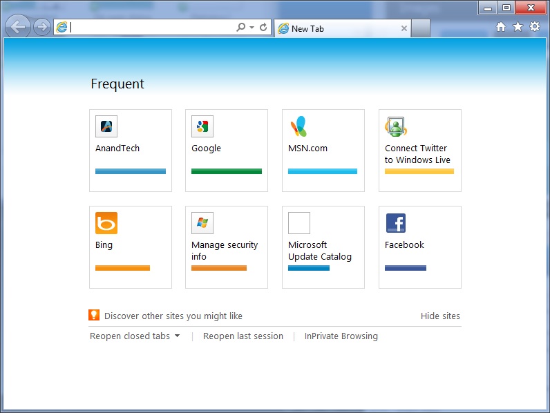
The desktop version of IE looks more or less like IE9, though of course the UI hasn’t necessarily been finalized at this point. One of the only noticeable differences is the presence of a Metro-style scrollbar on pages that require one. Also new is an “Install new versions automatically” checkbox in the About Internet Explorer page, reinforcing Microsoft’s desire to get and keep Windows users on the most current IE version their operating system supports. There’s no evidence that Microsoft plans to move to the rapid-release cycle that Google and Mozilla have both adopted (such a decision would give enterprise IT managers apoplexy), but this sort of functionality would theoretically make it possible.
Benchmarks
Now, let’s peek under the hood and get a few performance numbers. According to these basic tests, IE10 is faster than IE9 by a noticeable margin, but it can’t quite catch up to the current versions of Firefox or Chrome. These benchmarks were all run on the Dell Latitude E6410 that served as my main Windows 8 machine for this review.
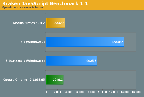
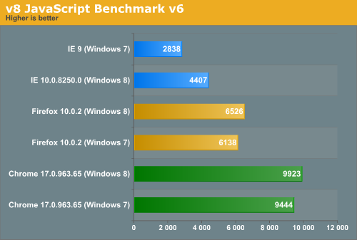
Interestingly, all browsers performed the v8 benchmark slightly faster in Windows 8. The difference isn’t huge—just a few hundred points in both cases—but it is both consistent and measureable, and I thought it interesting that the OS update slightly improved the performance of these third-party programs. Kraken scores were consistent across Windows 7 and Windows 8.


286 Comments
View All Comments
phoenix_rizzen - Friday, March 9, 2012 - link
God that Start Screen is ugly, disorganised, and hard to look at. Boxes are different sizes. Boxes are different colours with no apparent relationship between colours and program groups. Some have graphics, some have icons, some have multiple lines of text. There's no symmetry to anything. It's just like the default Control Panel layout in Windows 7 ... a disorganised mess.The fact that they had to add a search field, and implement "type to start searching" is a giant red flag that should have warned them they had failed. You should not need a search option for your program launcher.
Granted, the default layout of the Start Menu in every previous version of Windows wasn't much better, as there was no enforced organisation (each vendor dropped whatever they wanted, wherever they wanted), but at least it was easy-to-navigate and easy-to-scan to find things.
Kiouerti - Friday, March 9, 2012 - link
I have to agree. The aesthetics of the Metro are just horrible.Andrew.a.cunningham - Friday, March 9, 2012 - link
Aesthetic issues aside, almost all modern OSes have a search feature built into their launchers: the Windows 7 Start menu has one, OS X and iOS have Spotlight, Android has one... they're pretty much universal.phoenix_rizzen - Saturday, March 10, 2012 - link
They might be universal, but Metro Start Screen basically makes it required/mandatory.Search in KDE's Lancelot and whatever the default menu is called is optional. Everything is organised according to type of task and easily reachable in under 4 clicks (generally 2 clicks). But you can type-to-search if you aren't sure where to find something.
Search in the Windows 7 Start Menu is optional. Things are still (sorta) organised, although by vendor instead of by task, and still easy enough to find things.
Same with Windows Vista Start Menu.
Search is optional. Metro Start Screen basically requires type-to-search to find anything. Otherwise, you have to spent minutes trying to read everything onscreen to find anything.
p05esto - Friday, March 9, 2012 - link
Right, why in the world is there a search box at all on a computer? lol. If you can't organize files and put applications int he right place then you need to go back to a pen and paper. A search box is not a navigation option, it's a last resort and a cumbersome at that for the unorganized.phoenix_rizzen - Saturday, March 10, 2012 - link
IOW, you agree with what I'm saying. ;)dan0512 - Friday, March 9, 2012 - link
If I can't change the name of the executable window to Programs, then I won't buy this product. I hate the noun "Apps".alpha754293 - Friday, March 9, 2012 - link
bwahahahahahaa.....that's all I gotta say about that.
(Surprised that given the specs of the systems, that people couldn't have deduced that he's testing with whatever hardware he had laying around....)
bwahahahahaha...still that update is hilarious! (And the fact that he had to write the update...makes it that much the better...)
Andrew.a.cunningham - Friday, March 9, 2012 - link
Glad I'm not the only one seeing the humor in it. :-)Mathragh - Friday, March 9, 2012 - link
Just made this account to express my gratitude for the author(s) of this article.This has been the most complete, readable and (arguably) objective article about the consumer previes so far, so great job!
I also think that most of the people really underestimate the time and effort that goes into writing something like this, so even more kudo's for not letting yourself brought down by some of the comments people make!
Also, I have been using this version of windows 8 for some time now as main OS on my laptop, and it is indeed how you described it yourself aswell. The more time you spent using it, the more you start to like it. All the added functionality is really awesome. The only thing I dont really get the the fact that the desktop version of remote desktop has been hidden like this. If not for this article I wouldnt even have known it still existed.
Keep up the writing! Loving every article on this site.