In-Depth with the Windows 8 Consumer Preview
by Andrew Cunningham, Ryan Smith, Kristian Vättö & Jarred Walton on March 9, 2012 10:30 AM EST- Posted in
- Microsoft
- Operating Systems
- Windows
- Windows 8
As soon as the setup process is finished, you’re presented with your first look at Windows 8’s primary innovation: Metro. This new UI, which originated in Windows Phone 7 and has since been extended to the Xbox 360, is the Wave of the Future at Microsoft, and it’s part and parcel of Windows 8. There is no classic Start menu to fall back on. There’s nothing built-in to the OS that allows you to disable it or boot to the desktop by default (though surely various hacks will enable this if they haven’t already). Metro is here, and if you use Windows 8 you’ll have to come to terms with it.
That’s because Microsoft is going a step further than Apple with regards to its operating systems: while Apple is busy porting iOS features and characteristics to a desktop operating system that is still recognizably OS X, Microsoft insists that the tablet is just another kind of PC, and to that end is building a unified OS for both tablets and traditional PCs. Microsoft tablets (whether running Windows 8 or Windows on ARM) will run the same core software as PCs, will be able to run many of the same apps as PCs, and (most importantly for Microsoft’s ecosystem of enterprise users) can be managed using the same tools as PCs. We’ve known for years that the traditional Windows desktop doesn’t work well on tablets, but does an interface designed for touch also work with a mouse and keyboard?
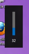 Metro, with its large fonts, bold colors, and large buttons was designed to be touched, and I think once we get some tablets designed for Windows 8 people are going to warm up to it. It’s well thought-out and with a little polishing will stand up well to iOS and Android in terms of features, and in terms of aesthetics it's already there—animations are fluid and attractive, and nice touches like a volume overlay (see right—finally!) bring an extra level of modern polish to Windows.
Brian Klug and Ryan Smith talked a bit about using Metro on a tablet in their piece on September’s Windows 8 Developer Preview, a process which is more or less the same in the Consumer Preview, so what I’ll be focusing on here is the general layout and function of Metro in the Consumer Preview, and my experience using it with a keyboard and mouse.
Introducing Metro
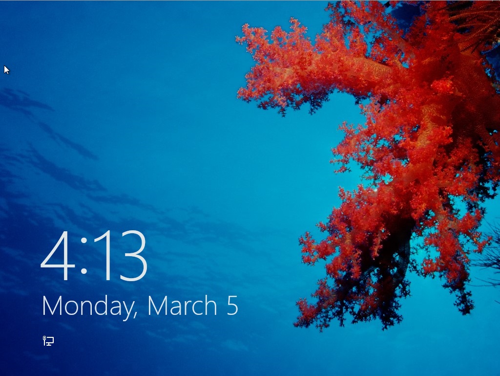
We’ll start with the entry point: the new login/lock screen. In previous Windows versions, this screen told you nothing about the computer—it was simply a gateway, and as such it either showed you a list of user accounts on the computer or displayed a CTRL + ALT + DELETE prompt with username and password fields. In Windows 8, the lock screen shows you the date and time and your current battery life and network connectivity status, set against a user-configurable background. Other Metro apps, like Mail and Messages, can also be configured to display status and notification messages on the lock screen. The look is reminiscent of most tablets and smartphones, but its big, high-resolution, striking images reminded me more of the Kindle Fire than anything. It’s a nice effect.
Press any key on your keyboard and the login image will slide upward, revealing the traditional Windows name and password fields. Authenticate, and you’ll be looking at the Metro-style Start screen.
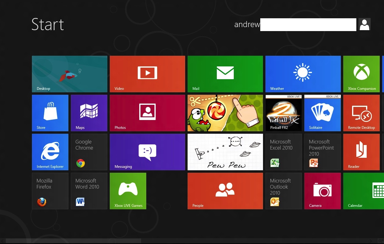
Tiles for Metro-style apps are big and colorful, and can usually be set to two sizes, a smaller square that allows for two tiles to sit side by side in a column, and a longer rectangle that spans the entire column. Metro columns on the Start screen will expand or contract to fill all of the screen resolution available to them, as evidenced in the screenshots above and below, and your mouse or trackpad’s vertical scrolling function will let you move left and right (horizontally, I know) through all of your apps. You can also scroll by grabbing the scrollbar at the bottom of the screen, or by moving your mouse pointer all the way to the left or the right of the screen.
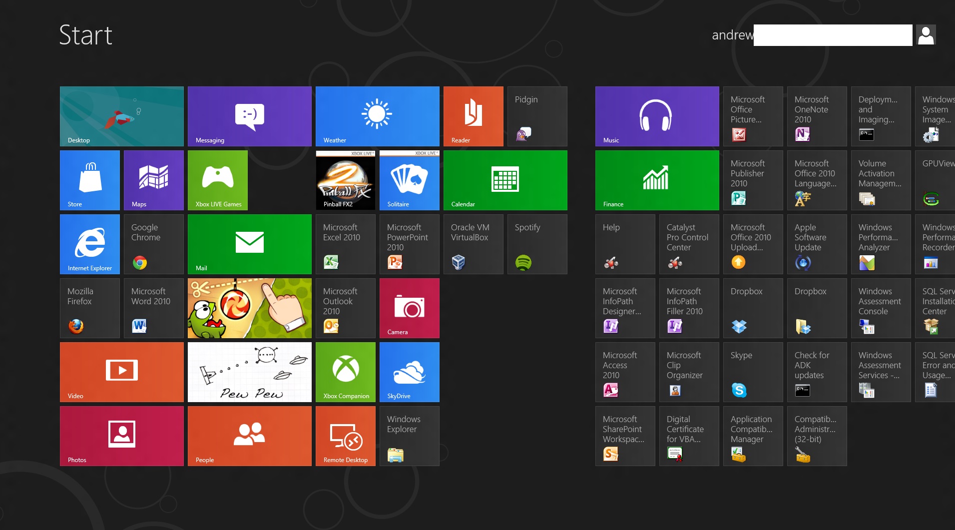
Displays with more pixels can display more items
Above, you can see most of what constitutes a Metro page: tiles of apps lined up into neat columns. Tiles can be moved around at will, and will try their best to rearrange themselves dynamically. The wider gap between two of the columns is a divider between “pages” of apps. There is no limit to the horizontal size of pages, and you can freely drag tiles to either side of these wider divides.
Right-clicking a Metro app will bring up a list of actions at the bottom of the screen—most Metro tiles will let you shorten or lengthen them, remove them from the Start screen, or uninstall them.
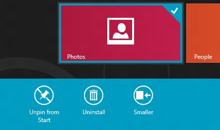
Standard desktop programs also show up on the Start screen as rather unglamorous-looking gray tiles that show the name of the program and its icon. Left clicking on it will dump you to the desktop and open the app as it would open in older versions of Windows, and right-clicking will bring up that app’s standard right-click menu in the Metro style across the bottom of the screen, with the added option to uninstall the program without going into the Programs and Features control panel.
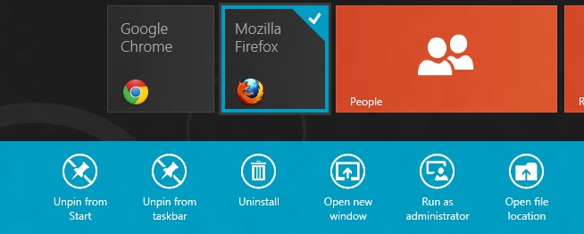
To add and remove desktop app icons from the Start screen, right-click them and then click “pin to Start.” Desktop apps can be pinned to and unpinned from the desktop taskbar and the Start screen from the desktop or from Metro, the first of many ways in which the two interfaces are integrated.
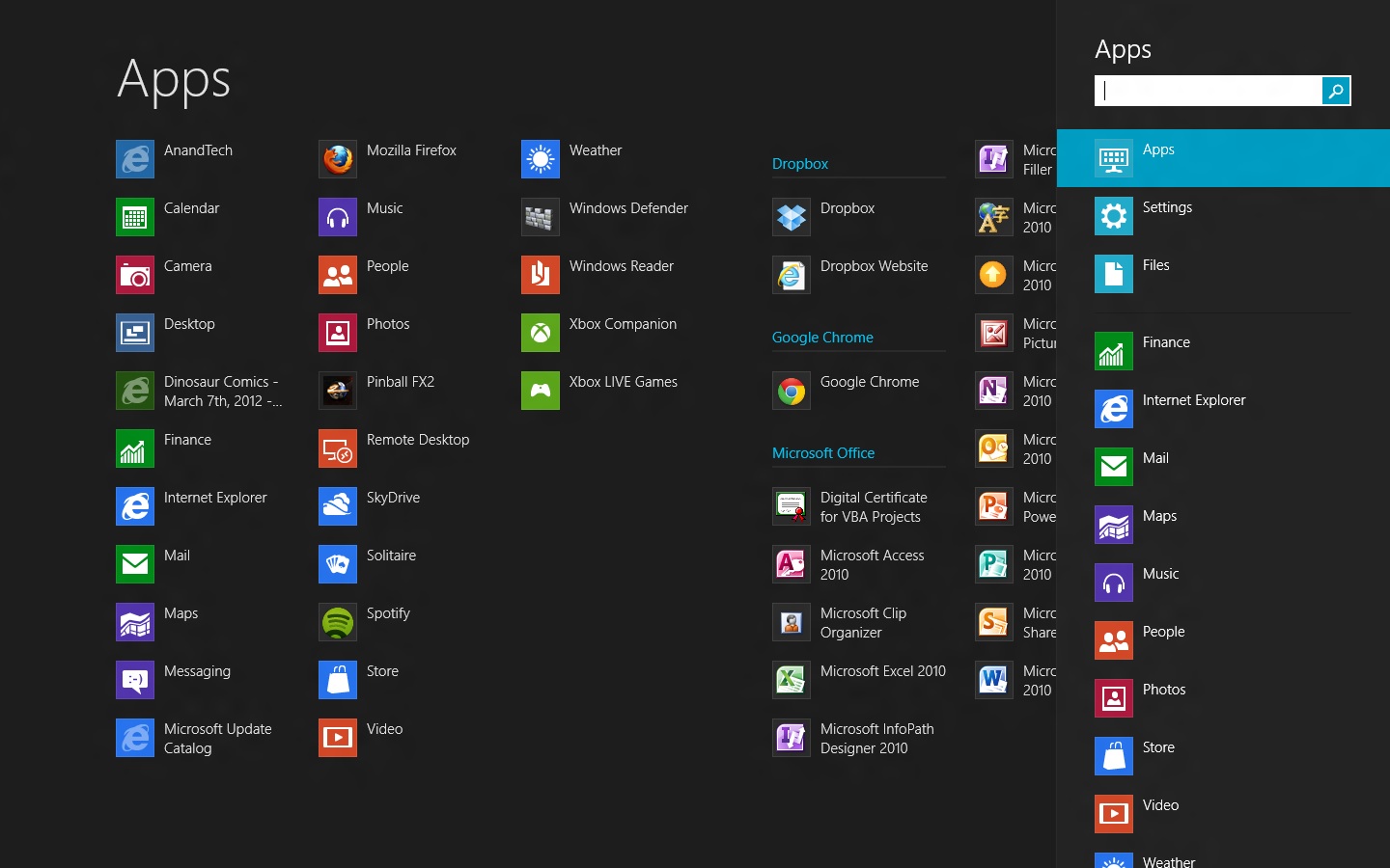
Windows Search can be invoked automatically from the Start screen if you begin typing. In Windows 8, there are three distinct search categories: Apps, which will display most Metro and desktop programs; Settings, which will search through the Metro and desktop control panels; and Files, which is self-explanatory. You can also search through any Windows Search-enabled Metro app, which you can see listed below the three main headings. I’d love to see a unified search group like we had in the Windows 7 Start menu, especially given the sometimes-blurry line between what appears in Settings and what appears in Apps, but search in Windows 8 is powerful and it’s fast, even using slower processors and mechanical HDDs.
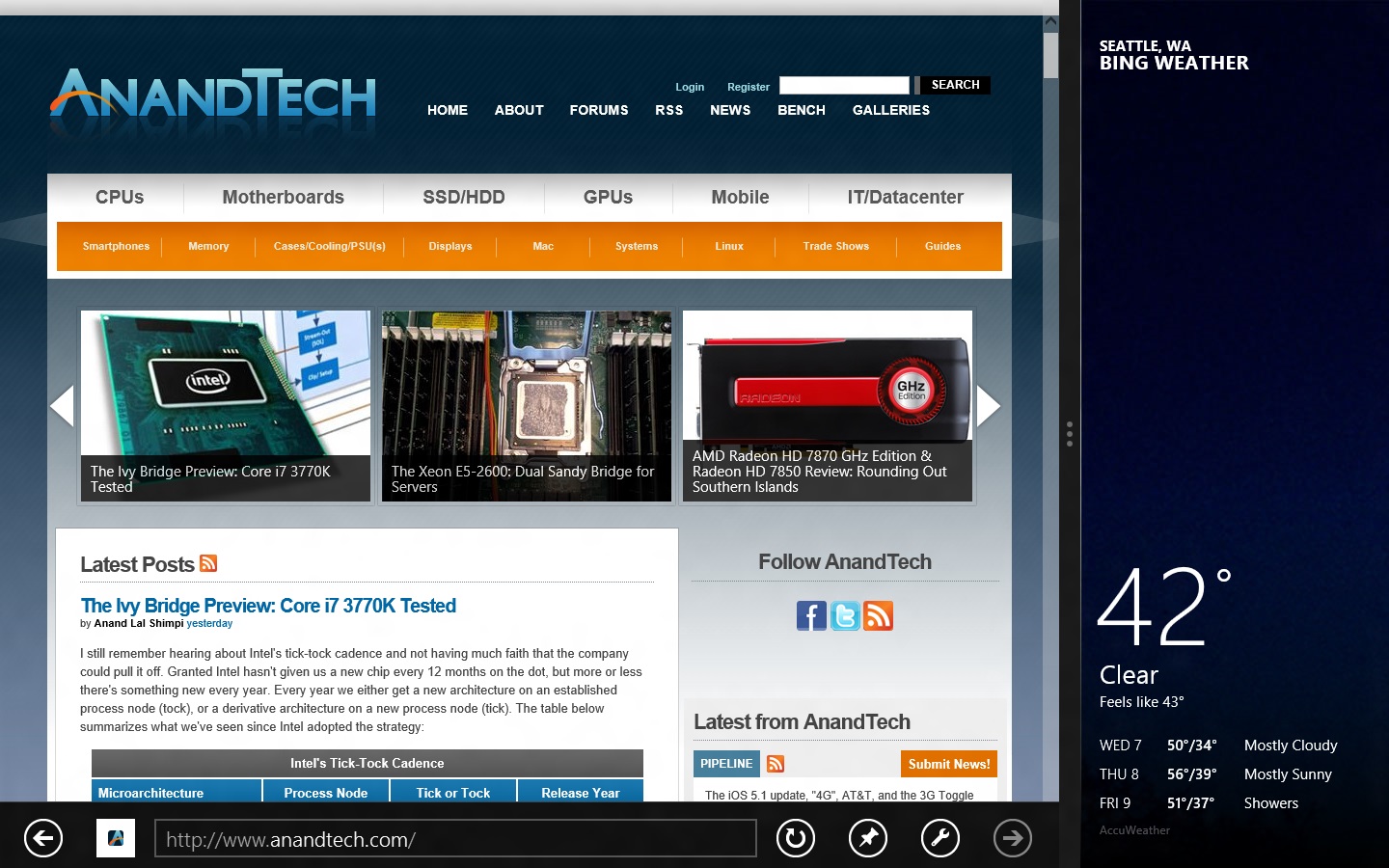
All Metro apps, including the desktop, can be “snapped” to the left or right edge of the screen, which lets one app use up about a fifth of the screen while another app uses the remaining space—I’ve seen this called “Metro Snap” and that’s how I’ll refer to it for the rest of the article. This is especially useful for things like Twitter or messaging clients that work well with a single vertical strip of screen space. Metro Snap will only work on panels that are 1366x768 or higher—anything smaller has too few horizontal pixels to make effective use of the feature—but the Windows desktop’s Aero Snap features will continue to work as they did in Windows 7.
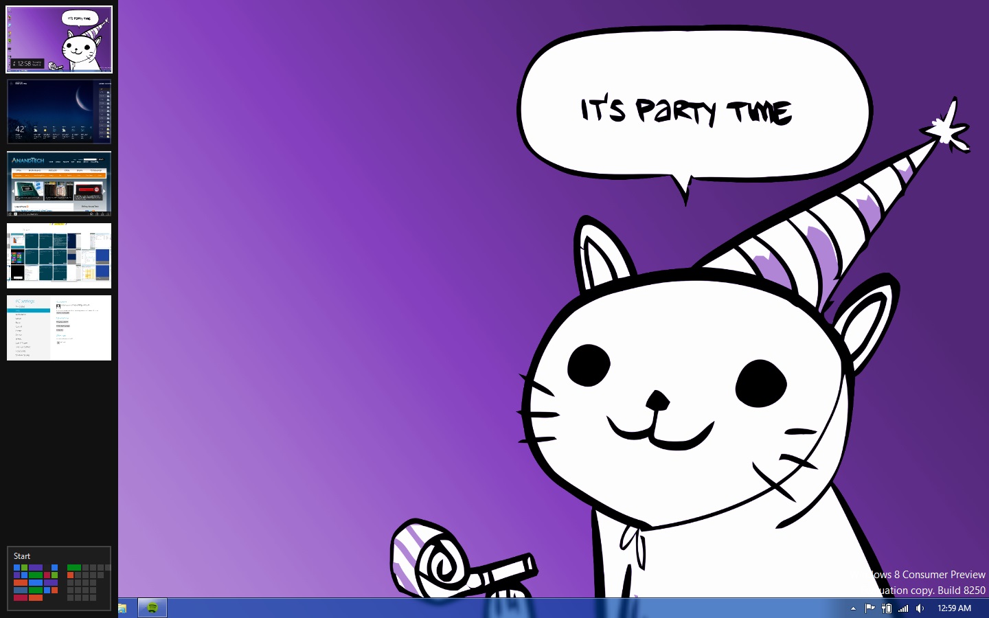
Party Cat knows when it is time to party. Also, the app drawer is on the left.
Metro has a few menus that can always be brought up no matter what app you’re using: the left edge of the screen is for an application drawer (above), which serves a function similar to the application switchers in iOS and Android. It shows all of your currently running apps and allows you to either switch to them from the currently running app or close them. The desktop will show up in the application drawer as a single item regardless of how many programs you have running on it, and while you can “close” it, this only makes the tile vanish from the drawer, and won’t close any of the programs running on the desktop.
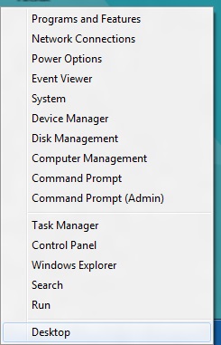
Update: Several readers have pointed out that right-clicking in the lower left corner of the screen brings up a mini-Start menu of sorts, where the Explorer, Search, the Run dialog box and several control panels can be accessed more easily. Thanks to all who sent this in!
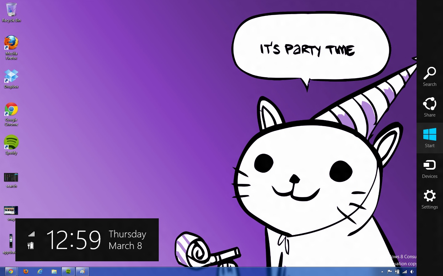
The right edge of the screen is for Charms (above), Microsoft’s name for the buttons that let you access several high-level settings and features. The Charms are, from top to bottom:
- Search, which brings up the Search menu (which, remember, can also be invoked by typing from the Start screen). The default search view is Apps.
- Share. While in a Metro app like Photos, you could use this charm to send a picture to someone using another Metro app like Mail.
- Start, which brings up the Start screen.
- Devices, which brings up attached devices like printers and extra monitors and gives you some configuration options for them—for instance, it will allow you to change your display settings if you’ve got a second monitor or projector attached, and it will bring up a Print menu if you click an attached printer. This charm is context-sensitive—if there’s nothing in your app to print (or if the app doesn’t support it), for example, any printers attached to your computer won’t show up in the menu as a selectable option.
- Settings. This brings up both general settings and options for the currently-running application as well as some system-wide settings like brightness, volume, notifications, language, network connectivity, and shutdown options. The “More PC Settings” link brings up the system-wide Metro control panel, where one can control things like the lock screen and Metro backgrounds, your PC’s refresh and reset functionality, and a few other settings.
Screen resolution requirements
As we’ve discussed, using Metro Snap requires a screen resolution of at least 1366x768, but there’s one more very important resolution requirement in Windows 8.
While working on my netbook, I quickly found that almost all Metro apps included in the Consumer Preview wouldn’t run on its 1024x600 display. After some research I found that, yes, Metro apps are only going to run on screens that are 1024x768 or higher. It’s important to give developers a minimum screen resolution to shoot for (and we may even see some tablets that use 1024x768 panels, given the precedent set by the iPad, the HP TouchPad, and others), but it means that users of PCs with smaller screens aren’t going to be able to use Windows 8’s defining feature (though the Start screen and system menus will still work just fine). This is too bad, since the limited amount of screen space on a netbook is a decent fit for Metro's simplified interface and full-screen apps.
Now that you know the basic features and layout of Metro, it’s time to teach you how to use it with a mouse and keyboard.


286 Comments
View All Comments
jardows2 - Saturday, March 10, 2012 - link
This "new" Metro interface seems quite reminiscant of the Windows 3.1 Program manager. I actually prefer the program manager to the start menu, it seemed better organized and more efficient to me. I'll have to give this a try!Beenthere - Sunday, March 11, 2012 - link
...before I use Win 8.bigboxes - Sunday, March 11, 2012 - link
Ever try uTorrent?androticus - Sunday, March 11, 2012 - link
Please stop aping the Microsoft Marketing Machine (MMM) use of the term du jour, "fluid"--it is annoyingly littered throughout all their Win 8 materials, both promotional and technical. No one ever used this term to describe UI's before this new fetish introduce by MS. Please stop embarrassing yourselves by so slavishly following their lead. Thank you!jabber - Sunday, March 11, 2012 - link
I wouldn't call anything that involves me having to move far left and right across the screen to do stuff 'fluid'.Bloody stupid maybe.
Fluid as in a full fishtank in the back seat of car maybe.
samgab - Sunday, March 11, 2012 - link
I tried Win8CP for a day before I gave up on it and rolled back to Win7.Allow me to attempt to review it in three words:
I hate it.
noname3 - Sunday, March 11, 2012 - link
Nice article, but I disagree with some of the conclusions. Any program that goes full screen on my 30” monitor has to be either a game or a program that has some bugs in it. The whole premise of Windows is that you can control the size of the…Windows. This is a tablet oriented operating system pretending to be useful on the desktop.After >20 years of using and programming in Windows, I am seriously considering switching to a Unix variant. Enough of the Microsoft marketing bs, they have no respect for their legacy and they have completely alienated their strongest user base.
The Windows 8 kernel is a gem, but any benefits are obliterated by the brainless UI. Good luck to them trying to sell this crap. Experienced users will want proper Windows, business are just upgrading to Windows 7, Apple and Android selling like hot cakes, they will only have some dedicated funs upgrading to this abomination, the future looks not very promising for them. This is the worst time to piss off their dedicated followers.
The funniest thing is that they have applied the same brainless UI in the Windows Server 8 too. Using the UI over remote desktop does not activate the corner controls consistently and you end up using the console commands to achieve anything. If this is what I have to do why should I not use a Unix OS? If I have to learn how to use computers from scratch and basically keep searching for everything and memorizing shortcuts, I may as well move to Linux, there is no difference.
I installed Vista since the “beta” days and I found it more functional than XP (maybe I am the only one) but I likes it a lot (even though I found a lot of the controls scattered all over the place). Then Windows 7 came out and it was what Vista should be and so far I think it is the best OS, unfortunately it is the last one too. I am not going to wait until 2015 or 2020 for Microsoft to get their act together, I have a career to maintain.
Microsoft has turned the UI over to a bunch of marketing clowns chasing Apple and Google. I do not like this circus-type company anymore, Sinofsky and Ballmer need to get fired soon and get some serious and creative people at the top, enough we those “me too” mappets.
thebeastie - Sunday, March 11, 2012 - link
I say you will be able to download a dodgey complete release in late July more likely August.But I dont think you will see a Tablet in a store with Windows 8 on it until December, part of my gauge for that is that MS stock price has gone up %25 in the last 3 months and its ALWAYS about the money when it comes to MS releasing important new revenue generating software, sorry to you naive tech heads.
Just match the release dates in the past to their stock chart when its flat to dropping, it fits great, its that simple.
Robo2k - Sunday, March 11, 2012 - link
...and Microsoft tells you: "Your future computer experience: keyboard shortcuts"SERIOUSLY????
I mean they did so many things right with Win 7, now they're talking a huge step backwards in time. With defacto nonexistent multitasking, keyboard shortcuts and a terrible waste of screen real estate.
Never an OS has looked so damn stupid.
Hopefully the many issues will be corrected util it goes gold.
jabber - Sunday, March 11, 2012 - link
I must admit I never ever got into using shortcuts. Should I have done? I started using a mouse when I was 16 when I got a Mac 512k and thought I was supposed to use that for getting around. I found it far more useful than using the keyboard.Today I still only use the keyboard for entering text like I am now. The rest of the time its trackpad or mouse. I don't know any of my customers that use them either.
Now I'm having to learn Windows 8 (well I'm going to have to support my customers aren't I going forward) and having to learn all the keyboard shortcuts.
Just feels like going backwards.
I guess my training/install costs will have to rise as it's going to take more than the usual 5 minutes explaining Libraries and Shutdown in Windows 7 migration.
Plus at the end of the day...who wants to buy a Windows Tablet?