In-Depth with the Windows 8 Consumer Preview
by Andrew Cunningham, Ryan Smith, Kristian Vättö & Jarred Walton on March 9, 2012 10:30 AM EST- Posted in
- Microsoft
- Operating Systems
- Windows
- Windows 8
Task manager
For the first time in memory, the Windows Task Manager has gotten a significant overhaul, and that doesn’t just refer to its new Metro-esque styling—Task Manager now combines functions from the old Task Manager, the Windows Resource Monitor, and MSConfig into a new, more useful app that provides a lot of information in a clean and simple way.
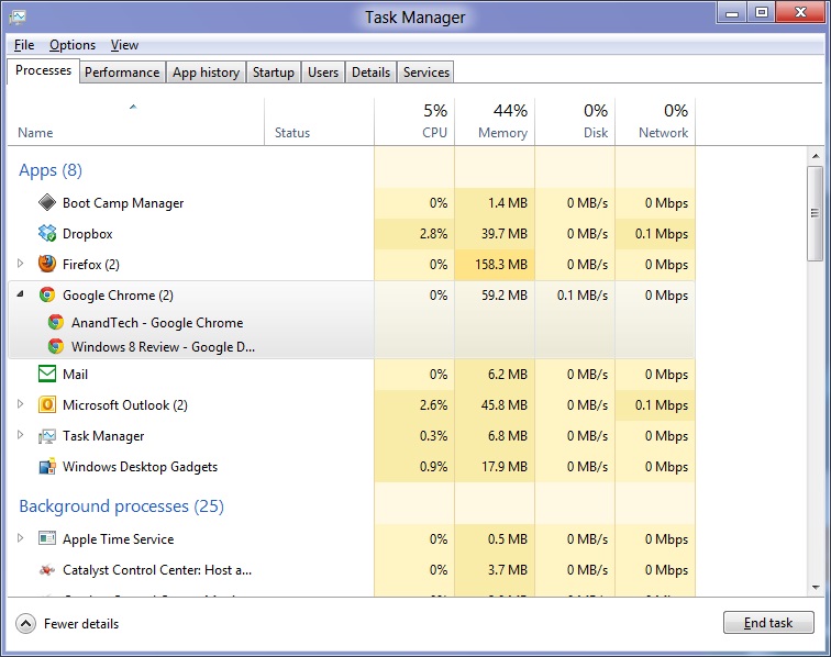
Open up the Task Manager and click “More Details” and the first thing you’ll see is the Processes tab, which gives you a clean list of all Metro and desktop apps running on your system and the resources they’re using—the new Task Manager tracks CPU, RAM, disk, and network bandwidth usage. You can see both absolute values (Firefox is using 164.7 MB of RAM) or in percentages (Firefox is using 8.9% of your RAM), and you can spot resource hogs at a glance—as you can see in the screenshot above, the colors in the Task Manager vary based on how much of a given resource a process is consuming. Apps, background processes, and Windows/system processes are each displayed under their own subheadings.
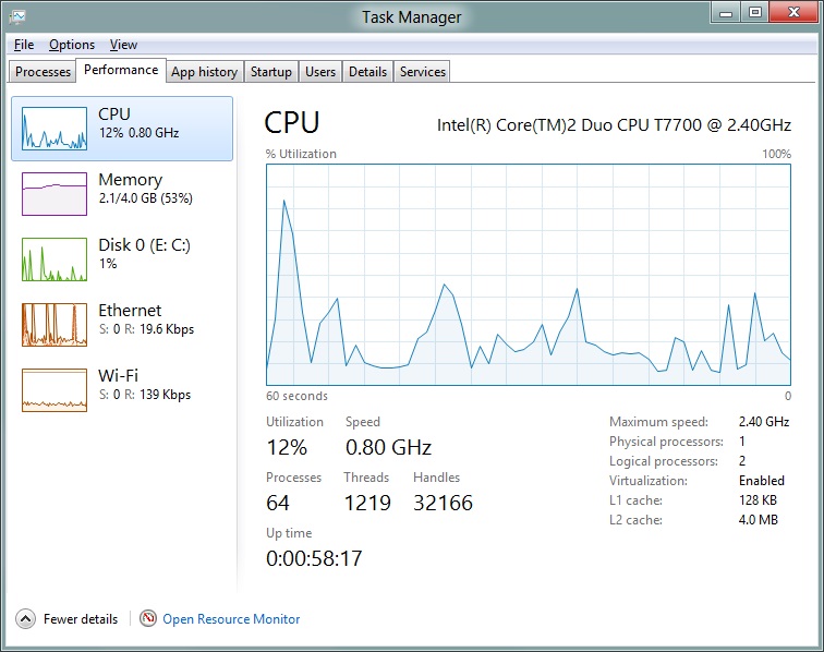
The Performance tab now tracks CPU, RAM, disk, and network usage, and it tracks each network interface separately for your convenience. The CPU graph can be configured to show activity on all cores combined or separately. You can view both graphs and hard numbers for each resource, and you can also see different information about your computer’s hardware—the current clock speed of your CPU, the number of RAM slots you have and how many are occupied, your current IPv4 and IPv6 addresses, and more. The Resource Monitor is still available if you need a more advanced view, but this tab alone drastically increases the Task Manager’s usefulness.
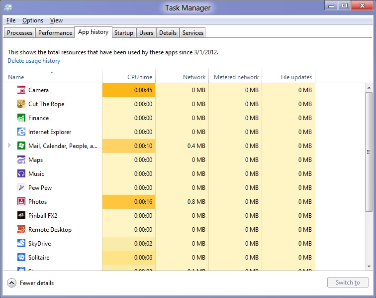
Next up, the App History tab shows statistics for resource usage over time. It’s mostly geared toward network usage, breaking out stats for how much data an app has used on both metered and non-metered networks, as well as how much bandwidth has been spent on keeping Metro live tiles up to date. It also gives you statistics for CPU time. App usage history can be deleted at any time if you’d like a fresh start.
The other tabs are pretty self-explanatory, so we’ll go through them quickly: the Startup tab shows a list of programs that launch when your computer starts. This functionality used to be handled by a combination of the “Startup” folder in the Start menu and a tab in the MSConfig.exe utility (which still exists, but is no longer used to control startup items). The Users tab shows resource usage broken out by logged-in users, much like in the old Task Manager, and will also allow administrators to disconnect users. The Details tab gives a complete unadorned list of all processes and their resource usage, while the Services tab shows all services on your computer whether they’re running or not—you can start, stop, or restart services from this tab, but you’ll have to go into the Services utility for more options.


286 Comments
View All Comments
phoenix_rizzen - Friday, March 9, 2012 - link
God that Start Screen is ugly, disorganised, and hard to look at. Boxes are different sizes. Boxes are different colours with no apparent relationship between colours and program groups. Some have graphics, some have icons, some have multiple lines of text. There's no symmetry to anything. It's just like the default Control Panel layout in Windows 7 ... a disorganised mess.The fact that they had to add a search field, and implement "type to start searching" is a giant red flag that should have warned them they had failed. You should not need a search option for your program launcher.
Granted, the default layout of the Start Menu in every previous version of Windows wasn't much better, as there was no enforced organisation (each vendor dropped whatever they wanted, wherever they wanted), but at least it was easy-to-navigate and easy-to-scan to find things.
Kiouerti - Friday, March 9, 2012 - link
I have to agree. The aesthetics of the Metro are just horrible.Andrew.a.cunningham - Friday, March 9, 2012 - link
Aesthetic issues aside, almost all modern OSes have a search feature built into their launchers: the Windows 7 Start menu has one, OS X and iOS have Spotlight, Android has one... they're pretty much universal.phoenix_rizzen - Saturday, March 10, 2012 - link
They might be universal, but Metro Start Screen basically makes it required/mandatory.Search in KDE's Lancelot and whatever the default menu is called is optional. Everything is organised according to type of task and easily reachable in under 4 clicks (generally 2 clicks). But you can type-to-search if you aren't sure where to find something.
Search in the Windows 7 Start Menu is optional. Things are still (sorta) organised, although by vendor instead of by task, and still easy enough to find things.
Same with Windows Vista Start Menu.
Search is optional. Metro Start Screen basically requires type-to-search to find anything. Otherwise, you have to spent minutes trying to read everything onscreen to find anything.
p05esto - Friday, March 9, 2012 - link
Right, why in the world is there a search box at all on a computer? lol. If you can't organize files and put applications int he right place then you need to go back to a pen and paper. A search box is not a navigation option, it's a last resort and a cumbersome at that for the unorganized.phoenix_rizzen - Saturday, March 10, 2012 - link
IOW, you agree with what I'm saying. ;)dan0512 - Friday, March 9, 2012 - link
If I can't change the name of the executable window to Programs, then I won't buy this product. I hate the noun "Apps".alpha754293 - Friday, March 9, 2012 - link
bwahahahahahaa.....that's all I gotta say about that.
(Surprised that given the specs of the systems, that people couldn't have deduced that he's testing with whatever hardware he had laying around....)
bwahahahahaha...still that update is hilarious! (And the fact that he had to write the update...makes it that much the better...)
Andrew.a.cunningham - Friday, March 9, 2012 - link
Glad I'm not the only one seeing the humor in it. :-)Mathragh - Friday, March 9, 2012 - link
Just made this account to express my gratitude for the author(s) of this article.This has been the most complete, readable and (arguably) objective article about the consumer previes so far, so great job!
I also think that most of the people really underestimate the time and effort that goes into writing something like this, so even more kudo's for not letting yourself brought down by some of the comments people make!
Also, I have been using this version of windows 8 for some time now as main OS on my laptop, and it is indeed how you described it yourself aswell. The more time you spent using it, the more you start to like it. All the added functionality is really awesome. The only thing I dont really get the the fact that the desktop version of remote desktop has been hidden like this. If not for this article I wouldnt even have known it still existed.
Keep up the writing! Loving every article on this site.