Microsoft BUILD: Windows 8, A Pre-Beta Preview
by Brian Klug & Ryan Smith on September 13, 2011 12:05 PM EST- Posted in
- BUILD
- Windows
- Microsoft
- Windows 8
- Trade Shows
Mobile Experience Side
Coming from the smartphone side of things, I really see many shades of WP7 inside Windows 8. That’s actually dramatically understating the state of things - the core of what we’ve been shown of Windows 8 that’s new literally is either adopted from or directly analogous to much of WP7.
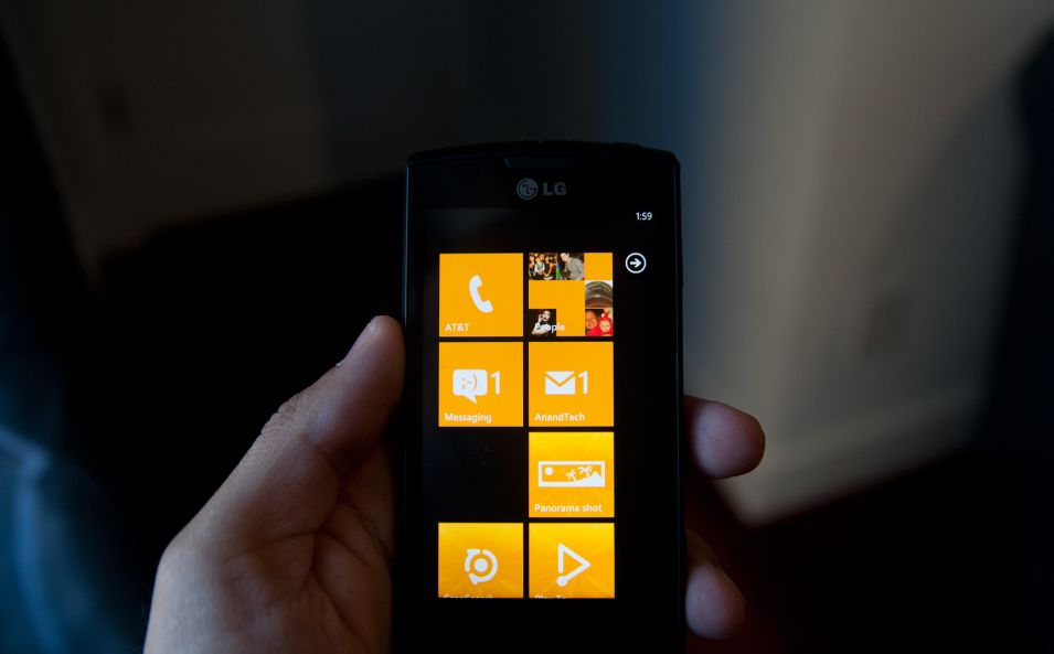
It doesn’t come as a surprise to me at all that the desktop Windows experience is moving in this direction, (and it seems as though the Xbox 360 interface will follow shortly). The positive result is that Windows 8’s touch experience feels much closer to the ground-up approach Android Honeycomb or iOS have taken than the than the “Tablet-Edition” versions of Windows XP and the tablet integration in Vista and 7. I used a UMPC and remember Origami and how that application lived as its own standalone mode of operation as an application within windows. What Windows 8 is the inverse - Windows now lives inside a Metro-themed Start screen that looks like WP7 for the desktop. Or at least it does in this demo we’ve been shown currently.
The tablet experience is now absolutely on par with modern mobile OSes - sure there are a few more things that need to be included, but the foundation is there for Windows to suddenly become more than an OS that also can do touch-based interaction.
IE 10
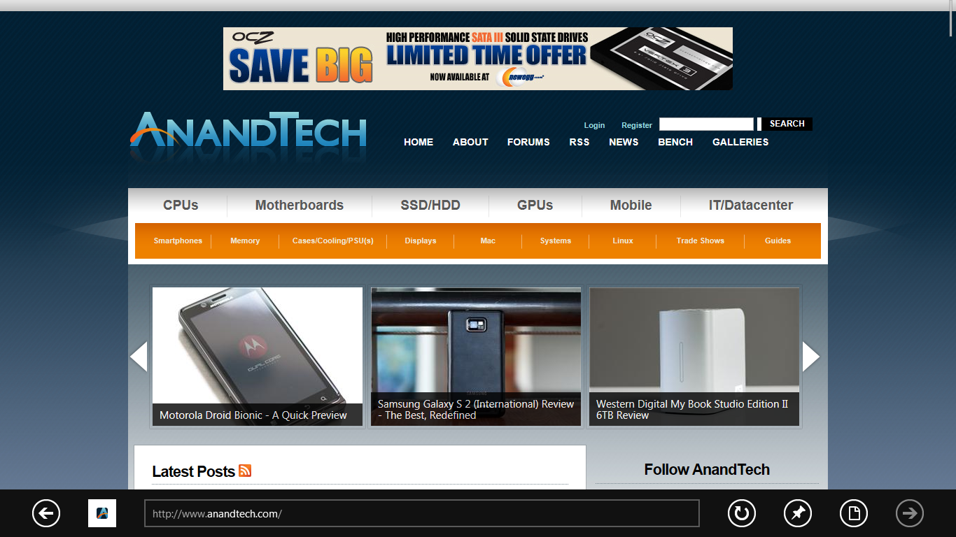
Microsoft has been actively promoting IE 10 since MIX 11, with two platform previews so far, and IE 10 is an integral part of Windows 8 both as a browser and as a runtime for HTML based Metro applications. We won’t go into exacting detail about what’s new and interesting inside IE10, beyond mentioning that it improves upon IE 9’s GPU acceleration and improves web compliance support including CSS3. What’s relevant in Windows 8 is that IE 10 gets two views - one belonging to the Metro-heavy start menu experience, which we’ll call the mobile view, and the other belonging to the traditional desktop windows view.
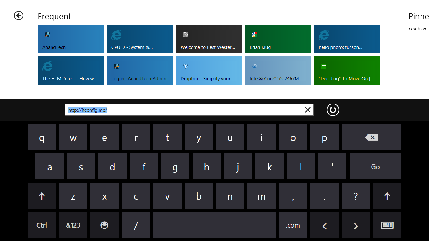
This dichotomy exists between the two IE10 experiences, which is in itself a bit curious. The mobile view is almost exactly what IE looks like inside Windows Phone 7.5 - at the bottom is the URL bar and controls, and with a slide down gesture, at the top are tabs. Meanwhile the IE10 desktop experience uses the older IE 9 UI. At this point, it doesn’t appear that windows opened in one are transportable to the other.
The mobile view is almost exactly like WP7.5’s however, the URL bar disappears when scrolling, and the browser supports a completely fluid multitouch experience that feels speedy.
Cloud
Windows 8 offers considerable integration with Windows Live and SkyDrive. Local user accounts can be directly tied to a Live account on trusted PCs, and then be used for live roaming. Live roaming enables each connected device to access the same set of accounts for photos, email, calendar, and contacts and speed up initial setup. For example, photos captured on a WP7.5 device’s camera roll can be immediately visible on a Windows 8 PC authenticated against the same Live account. This is very close to how camera roll will integrate into Apple’s iCloud and synchronize across iOS and OS X Lion.
One thing is clear, and it’s that Microsoft plans to heavily integrate and leverage its Live services into Windows 8 and provide an ecosystem-wide way to migrate accounts settings, photos, and data between mobile, tablet, and desktop.
Samsung’s Reference Tablet
We’ve been loaned Samsung tablets running the Windows 8 Evaluation copy used for this article, and thought it bears going over since the device will no doubt become a reference platform for Windows 8 development. This hardware is also being given away to developers in attendance at BUILD as well.
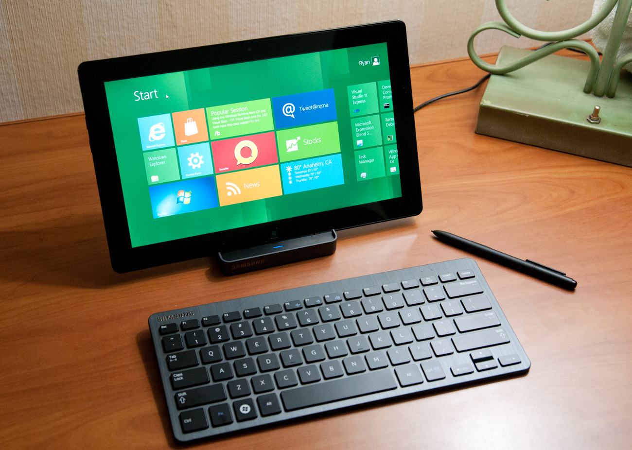
The Samsung tablet is none other than the 700T model announced at IFA very recently, and it packs a relatively impressive spec list.
| Samsung 700T Windows 8 Development Notebook/Slate - Specifications | |
| Processor |
Intel Core i5-2467M (2x1.6GHz + HT, 32nm, 3MB L3, 2.3GHz Turbo, 17W) |
| Chipset | Intel 6 series |
| Memory | 4 GB DDR3 1333MHz RAM (1 SODIMM) |
| Graphics | Intel HD 3000 |
| Display | 11.6" Super PLS (1366x768) |
| Hard Drive | 64 GB Samsung SSD |
| Networking | 802.11n WiFi + Gigabit Ethernet + GSM/WCDMA HSPA+ |
| Sensors | NFC, Magenetometer, Accelerometer, GPS, ALS, Front, Rear Camera |
| Dimensions | 12.9 mm thick, 909 grams |
The 700T includes GSM/WCDMA cellular connectivity courtesy of an Option GTM661W combination cellular modem and WiFi card. The GTM661W uses a Qualcomm MDM6200 baseband, which also provides GPS. There are also sensors such as ambient light, an accelerometer, and the two cameras onboard.
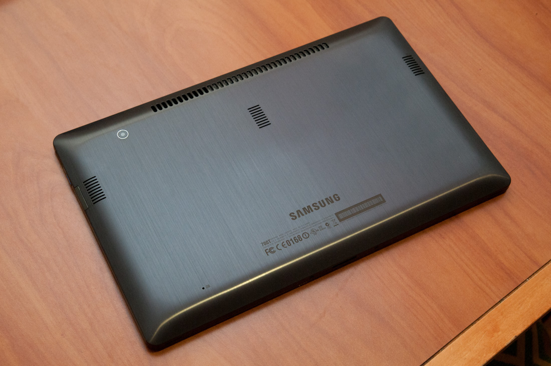
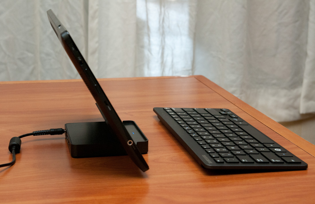
In addition, the 700T includes an active digitizer and capacitive touch display, making it suited for all three interaction modes that Windows 8 will support. The device comes with a dock that doubles as a charging stand, and also replicates full size HDMI, GigE, and a USB 2.0 port on the back. The slate has one USB 2.0 port, a headphone jack, microSD card slot, SIM slot, and a rotation lock button.
Samsung calls the 700T a slate, we've elected to call it a tablet, and the device feels decent if not a bit heavy in the hands. The 700T is also the first 16:9 tablet we've seen, with Android adopting 16:10 and iOS going with 4:3, which makes portrait a bit extreme.


235 Comments
View All Comments
Zan Lynx - Wednesday, September 14, 2011 - link
Interesting isn't it, that Microsoft has made versions of Server 2008 that don't have a desktop.I haven't run a server with a GUI in the last 12 years. Who would?
Text file based configuration that can be remotely managed, programmed and monitored entirely by script...
Using a GUI to point and click is horribly inefficient and doesn't scale to more than two servers.
Real sysadmins don't do pretty. They want it to work. Real sysadmins don't spend time clicking GUI buttons configuring new machines. They boot them and they auto-configure from the network. You never touch a GUI. Just the power button.
You might use a GUI to configure one user as a template in Active Directory. You'd never use the GUI to add 100 new employees to the system.
The real use for the GUI is to distract the management while you get real work done behind the scenes using a laptop and an SSH command line.
A GUI for tiling your command windows might be acceptable. Barely.
smithg5 - Wednesday, September 14, 2011 - link
My point wasn't that all sysadmins use GUIs now, but that the GUI hasn't gotten in the way of sysadmin work on a command-line, even though in most cases for Windows it starts up with the computer. This is a useful analogy for all these fears about Metro in a business environment.That said, most of the volume Microsoft sees for Windows server is that "two servers" size environment. Most businesses don't even have 100 employees. For the rest you'll still have your desktop, and that desktop will still have a command-line interface. And hey, they might even make desktop-less, Metro-less versions for the enterprise. If they don't, it won't somehow make your text-file configuration, CLI remote administration wizardry stop working. You'll just be a couple of clicks from that when you start up your server/laptop, and then you'll have something pretty to look at during your breaks. Those servers that you never see the desktop of will benefit from a smaller memory footprint. What's the problem?
piroroadkill - Thursday, September 15, 2011 - link
No, not really. For the vast majority, the gui represented a way to use a computer that made sense to more people.Metro is just a kind of gui, but heavily designed around touch and full screen tablet style use.
It's simply a bad fit for desktop users. I tried the dev preview, and I'm not impressed in the slightest.
This time, it isn't about resisting change for the sake of it. Really. The dev preview is seriously quite bad. Keyboard and mouse wise, it just sucks.
TEAMSWITCHER - Wednesday, September 14, 2011 - link
I've got the Developer Preview Up and running on a machine and I must say that I absolutely hate it! Whenever I click on the Windows Start Icon (lower left corner) you go to the Start Screen (METRO GUI), the Start Menu is gone! That's just not cool. Also the full screen metro apps are real easy to get lost in, it's begging for some kind of Mac OS X like Mission Control to see all running processes. There is no Back Button, I have to hit the Windows key to get back to the Start Screen. The Desktop (which has been standard on every Windows machine since the dawn of time) is now a strange bolt-on appendage to the METRO GUI experience. I don't know...this isn't beta yet and things may change....but so far consider me one totally pissed off Windows user...this shit isn't Windows. Feels more like Vista meets Bob. Oh, and calling icons "Charms" is gay.UMADBRO - Wednesday, September 14, 2011 - link
Well, at least you tried it. But try and remember, this is still a pre-beta, and isnt finished yet.Icehawk - Wednesday, September 14, 2011 - link
What are they trying to achieve? If it is one OS to rule them all I think they are making some serious mistakes as I do not believe traditional computing will be dominated by cellphones or tablets, they serve a much different function and will continue to do so indefinitely IMO. The apparent dumbing down of the OS to mimic a smartphone seems like a terrible idea to me.*Assuming* the desktop/Metro experience isn't radically altered the paradigm shift to right-hand panes (ie, the "charms" menu) makes no sense, for the last 10-15 years we've worked from the left. Works fine if I'm using a tablet but that is it - on a desktop nothing could be more jarring. Especially when it isn't uniform, for example the Start menu still pops up on the left. Ugg.
Also why does anyone think I want a touchscreen on my desktop? How am I supposed to reach it my arms are not 3' long! I guess we'll be forced at the least to use multi-touch pads? I hope it will work in tandem with a mouse since I'm not sure how the hell I'd game using a touchpad.
Shinya - Wednesday, September 14, 2011 - link
Microsoft,I really dont care for Ubuntu (lack of support and games) and OSX (lack of games, software, etc etc)
Please don't make me switch.
give us the ability to turn off Metro when it releases
ct82fl - Wednesday, September 14, 2011 - link
I think if Microsoft really wants to succeed in the tablet market with their OS, they really need to figure out a new innovative way to navigate. I saw very similar things to Apple's OS and iOS. In order to beat the competition they are going to need to figure this out and figure it quickly.cyberguyz - Wednesday, September 14, 2011 - link
Sorry but I am a power user of my computers. I don't want them looking or working like a tablet or my iPod.While I am usually on the bleeding edge with Windows, from beta onward with each release, this is one I am most definitely sitting out. It does not appeal to the way I want to use my computer at all. For a tablet that I am not expecting to use for heavy input or output, Win8 is just too cumbersome and tied to mouse or touch as primary inputs.
Rand - Wednesday, September 14, 2011 - link
A few suggestions, make CERTAIN your applications all have different names. If your applications have an uninstall.exe they will all be grouped together on the start screen with no way to differentiate them or tell which is for what program.Similarly, if your apps have a config.exe you won't be able to tell which is for which without opening them individually. Any executables must have clearly differentiated names that indicate precisely what they are.
Also, you absolutely must trim down your bookmarks to only a handful. If you're accustomed to having a 100-200 bookmarks in various folders in your browser, that isn't going to work well at all in Windows 8. You'll end up with screen after screen after screen of bookmarks.
I don't think it's remotely practical or usable any longer to have more then a dozen bookmarks at the most.