Microsoft BUILD: Windows 8, A Pre-Beta Preview
by Brian Klug & Ryan Smith on September 13, 2011 12:05 PM EST- Posted in
- BUILD
- Windows
- Microsoft
- Windows 8
- Trade Shows
The Metro UI
The best way to describe Windows 8 is a cross between the Metro UI from Window Phone 7 and the desktop architecture of Windows 7. In fact, virtually everything but the desktop gets a Metro treatment in Windows 8.

The Windows home screen starts initially hidden behind a lock screen virtually identical to WP7’s - slide up on a large edge-to-edge background to unlock. Inside is the Metro start screen, which is comprised of a grid of live application tiles that behave almost identically to those in Windows Phone 7. Two sizes of tiles serve as both application launch shortcuts and notification areas that can be populated with notifications, graphics, and other status indicators.
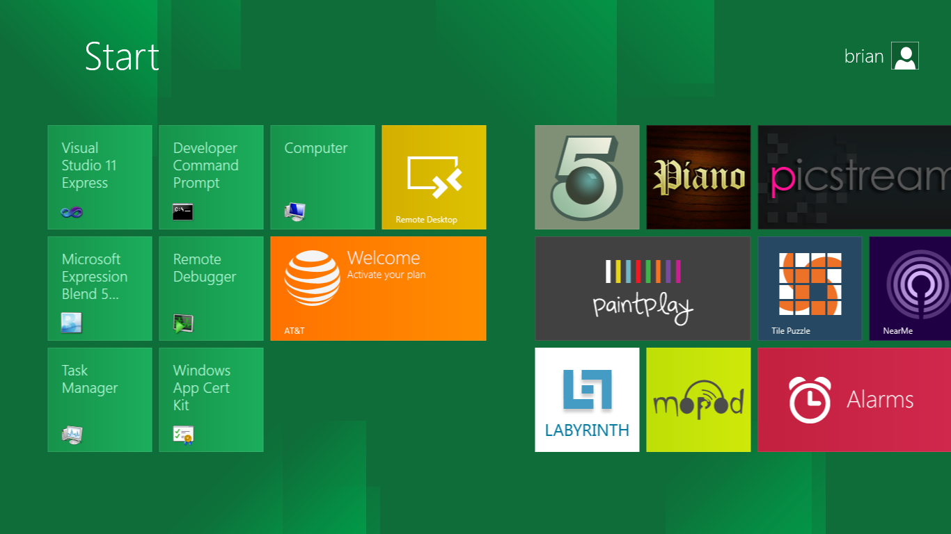
The tiles populate a horizontal strip that can be scrolled back and forth, and tiles can be rearranged accordingly. There are a few new gestures here over what we’ve seen before in WP7, including a swipe up to select a tile, and multitouch scrolling plus tile repositioning. Swipe up on tiles, and you can select them to convert size, uninstall, or unpin from the home screen.
The new start menu is more than a user experience oriented at tablets, it’s also the design language Microsoft has adopted for the entire new Windows 8 experience.
The thing to realize is that this modality isn’t so much a view as it is a combination of both new start menu, new interface for making Windows usable from a mobile perspective, and a completely new interaction paradigm. The interface is designed to perform and behave in the same way across multitouch, active digitizer, and keyboard+mouse combinations.
There’s another set of gestures and features as well which make use of the four edges of the display. The top and bottom are reserved for application-specific functions, the left and right are reserved for two Windows 8 specific tasks.
Sliding one’s finger from the left edge onto the display allows for both fast application changes, and the multiple-window snap functionality that’s been demoed already. The split is roughly 1:4 and divides horizontal real-estate between two applications views at once. The narrower of the two requires some additional development support, but the aim is to create a workable touch interface without sacrificing multitasking.
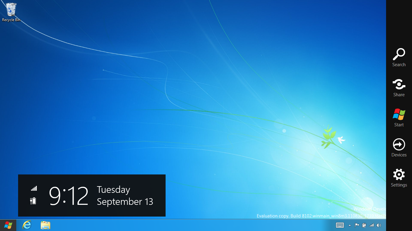
Swiping a finger from the right edge of the display towards the center brings up what Microsoft calls charms. This is a view that includes status indicators, and functionality like search, share, start, devices, and settings.

These respective shortcuts then bring up panes that occupy the same area on the right, and do what you’d expect. Settings for example is a place each application to build out a preferences area, so that each application has a common place users will go to control things.

Likewise, share acts like an intelligent copy paste, sharing working elements between applications. Finally search can either look through files and applications or dive into strings surfaced by other third-party applications.
These left and right based gestures exist across not just the Metro-infused start screen, but the entirety of Windows.
Moving around and getting back to the home screen is accomplished by pressing the Windows button, which on the tablet we were loaned is its own physical button analogous to iOS’ home button. Pressing the keyboard windows button performs the exact same action and summons the start menu.
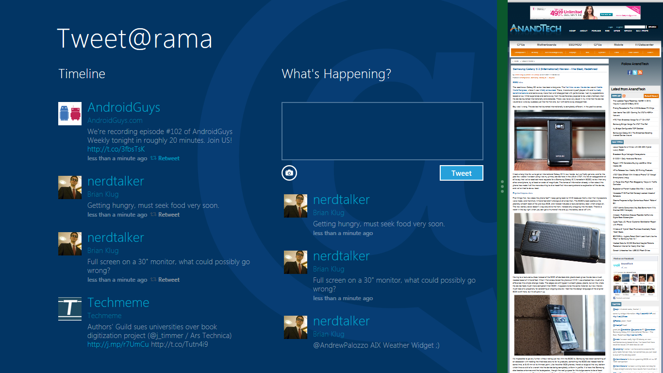
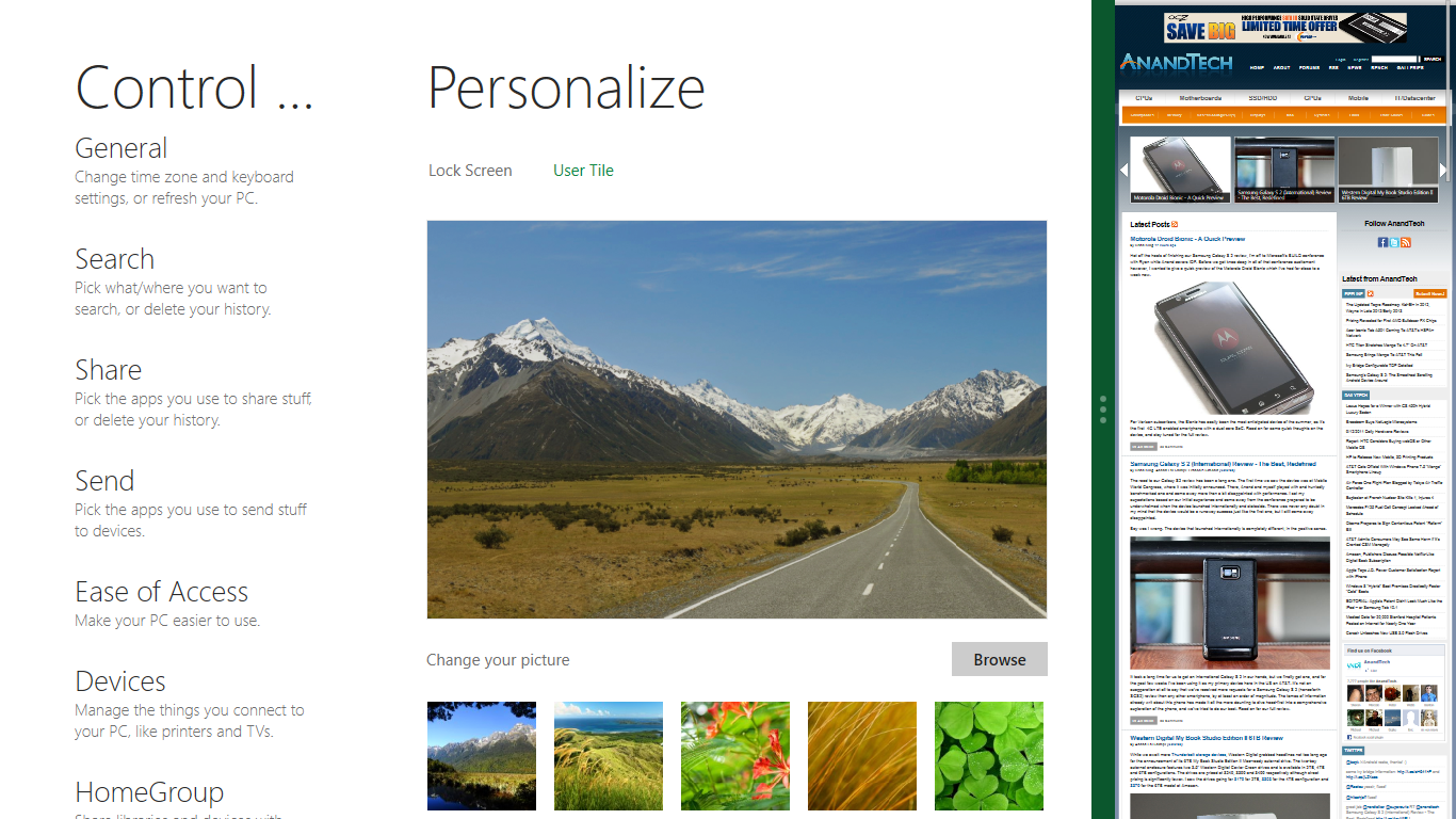
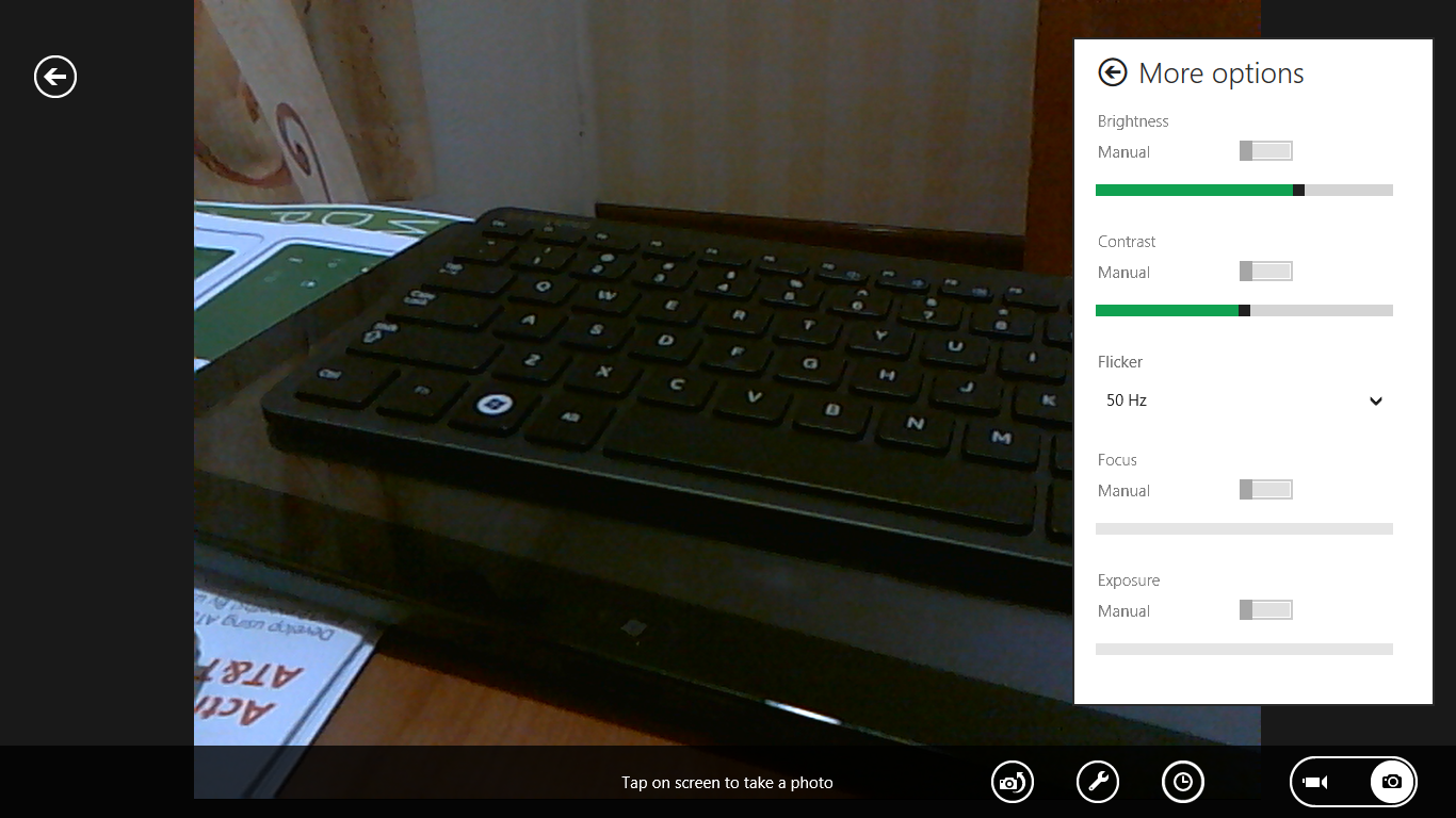
The current set of first-party applications is pretty spartan. There’s no maps, mail, or camera application, though Microsoft has already bundled a set of its own internally-created applications. These are entirely Metro themed as well. I mention camera because the sample hardware includes a front facing and rear facing camera, and at present the only way to access them is through the change user tile picture function, which can capture a photo from the front or back webcam.
Throughout the entire OS is a very WP7-like virtual keyboard, which supports a full size and thumb keyboard mode. There’s also a handwriting recognition mode which has two lines of handwriting input and is styled similarly to Windows 7’s tablet input keyboard.

The keyboard can be docked to the bottom of the display or detached and dragged around as well. I find that the split keyboard accommodates typing with thumbs and holding the device midair quite well.


235 Comments
View All Comments
Booster - Tuesday, September 13, 2011 - link
Exaclty. MS needs to get rid of Julie Larson-Green, the infamous inventor of the wretched ribbon and I suspect this abomination.BioTurboNick - Tuesday, September 13, 2011 - link
The ribbon is great. I'm sorry that you love trudging through menus to find the things you want.frozentundra123456 - Tuesday, September 13, 2011 - link
I agree with Booster. I absolutely hate the ribbon in Microsoft Office. It may add a lot of things that menus didnt have, but most of them are worthless. It requires considerably more steps to do simple tasks.The ribbon may be OK for someone who uses Office all day, every day, for business tasks. But I use it in a scientific setting, and just want to use the basic commands as quickly and easily as possible. For this kind of use, I really, really hate the ribbon.
ph0tek - Wednesday, September 14, 2011 - link
How did you manage to post that on DOS?Anyway... I bet the vast majority of people making the kind of comments as yourself are pretty old. Either that or just stupid. The Ribbon is better. Not debatable. New users of Office all agree it's better and do far better using it, thats a fact.
On Win 8 you can even customise the ribbon, or make a quick access bar with your own most used ribbon buttons. Instant access. You can get more quicker or efficient than that.
cjs150 - Wednesday, September 14, 2011 - link
No the ribbon is not better. I am a power user of word, our documents often run to 100 pages, with tables of contents, multiple level headings and paragraphs, track changes, charts and tables. When we get board we throw in columns as well.Let me take a simple example that happens all the time. Your document has track changes on it but is formatted incorrectly (for example you need to use keep with next). Right clicking the mouse will not bring up paragrpah settings because according to MS the context is tracking changes, so you go up to the ribbon, which is of course stuck in review mode because that was the last time you used it to switch track changes on, now scroll back to the home section of the ribbon, Where are the paragraph settings? - Not obviously there, you have to click on the little arrow in the bottom right of the paragraph tile on the ribbon and finally you have got what you needed.
And they call that an improvement?
The ribbon is fine for people who write a letter once every few days, but a complete waste of effort for business
BioTurboNick - Thursday, September 15, 2011 - link
That sounds like an imperfect implementation, not a problem with the interface style per se.quanta - Tuesday, September 13, 2011 - link
Since the introduction of Windows XP themes, the usable screen spaces have been on the decline.First of all, the default XP themes wasted more spaces by creating bigger margins/paddings between interactive screen elements just to fit pretty effects instead of making more efficient use of the same UI margins found in Classic theme while dressing up the visual.
Then came Windows Vista's Aero, which wastes even more space by switching to Segoe UI, where in its default configuration, has a bigger font sizes than the already inflated XP theme. Worse still, Segoe UI is one of the later ClearType-optimized fonts that looks blurry even after tuning, and ClearType itself isn't even designed for alternate subpixel layouts like non-aperture grille CRTs and Sharp Quattron (ClearType is only defined for 3-subpixel array, not 4-subpixel), making the default Vista UI look even worse on old and new monitors. Shrinking Segoe UI may have saved some screen estate, but the ClearType-tuned fonts are optimized for larger point sizes than the venerable Tahoma or even Microsoft Sans Serif, so it trades one compromise with another. The screen margin wastage is even worse than the XP themes. With all these new-fangled update, one would expect it the Aero UI will be more customizable, but it is not. You may be able to adjust the theme colours of Aero, but if you want to switch the colour of single elements such as (in)active menu bar or title, or switch the Aero font, YOU CAN'T! Well, at least not without hacking the system libraries[1], or going through the pain of editing the features with tools not supplied with the operating system, or use the Windows Classic theme. Windows 7 may have the mean of using the UI to build custom theme[2], but there is still zero method for conserving screen estates using Aero theme unless manually editing .theme files[3].
In this next Windows iteration, the incorporation of ribbon just add more clutter to the desktop. While the ribbon is needed for touchscreen uses, the way it is organized is far from most efficient. Does the ribbon really need text description over a button group for the buttons that already have descriptions on them? Desktop aside, the Metro fails to reuse the ribbon on the desktop UI, which would have provide a more consistent experience when switching between Metro and desktop, and even with the already bloated Windows 7-based UI, the ribbon layout still uses screen space more efficiently than Metro.
[1] http://www.howtogeek.com/howto/windows-vista/how-t...
[2] http://windows.microsoft.com/en-US/windows7/create...
[3] http://msdn.microsoft.com/en-us/library/bb773190%2...
Impulses - Tuesday, September 13, 2011 - link
Anyone else concerned that Win 8's multiple display support will be pretty hobbled? I'm already iffy on the whole Metro style, switching back to Metro to open unpinned apps when working on the traditional desktop seems horribly inefficient... But I don't see how that's gonna scale across multiple displays, I guess ideally you could leave the start panel with it's live tiles on a second screen, but MS has a history of ignoring multiple display users...We still rely on 3rd party tools to extend the taskbar or fine tune wallpapers across three displays... It's a shame too because after multiple cores and SSDs, multiple displays has been the biggest productivity boost I've gained thru hardware in the last 10 years.
BioTurboNick - Tuesday, September 13, 2011 - link
http://www.winsupersite.com/article/windows8/windo...Multiple monitor support is improved. Though this is just the desktop, not Metro.
CSMR - Tuesday, September 13, 2011 - link
That was fast. Thanks for the info Anand!