Microsoft BUILD: Windows 8, A Pre-Beta Preview
by Brian Klug & Ryan Smith on September 13, 2011 12:05 PM EST- Posted in
- BUILD
- Windows
- Microsoft
- Windows 8
- Trade Shows
The Metro UI
The best way to describe Windows 8 is a cross between the Metro UI from Window Phone 7 and the desktop architecture of Windows 7. In fact, virtually everything but the desktop gets a Metro treatment in Windows 8.

The Windows home screen starts initially hidden behind a lock screen virtually identical to WP7’s - slide up on a large edge-to-edge background to unlock. Inside is the Metro start screen, which is comprised of a grid of live application tiles that behave almost identically to those in Windows Phone 7. Two sizes of tiles serve as both application launch shortcuts and notification areas that can be populated with notifications, graphics, and other status indicators.
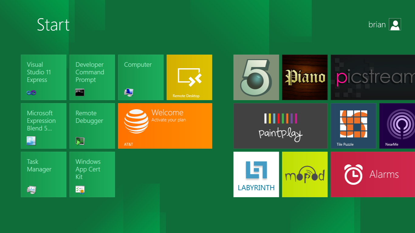
The tiles populate a horizontal strip that can be scrolled back and forth, and tiles can be rearranged accordingly. There are a few new gestures here over what we’ve seen before in WP7, including a swipe up to select a tile, and multitouch scrolling plus tile repositioning. Swipe up on tiles, and you can select them to convert size, uninstall, or unpin from the home screen.
The new start menu is more than a user experience oriented at tablets, it’s also the design language Microsoft has adopted for the entire new Windows 8 experience.
The thing to realize is that this modality isn’t so much a view as it is a combination of both new start menu, new interface for making Windows usable from a mobile perspective, and a completely new interaction paradigm. The interface is designed to perform and behave in the same way across multitouch, active digitizer, and keyboard+mouse combinations.
There’s another set of gestures and features as well which make use of the four edges of the display. The top and bottom are reserved for application-specific functions, the left and right are reserved for two Windows 8 specific tasks.
Sliding one’s finger from the left edge onto the display allows for both fast application changes, and the multiple-window snap functionality that’s been demoed already. The split is roughly 1:4 and divides horizontal real-estate between two applications views at once. The narrower of the two requires some additional development support, but the aim is to create a workable touch interface without sacrificing multitasking.
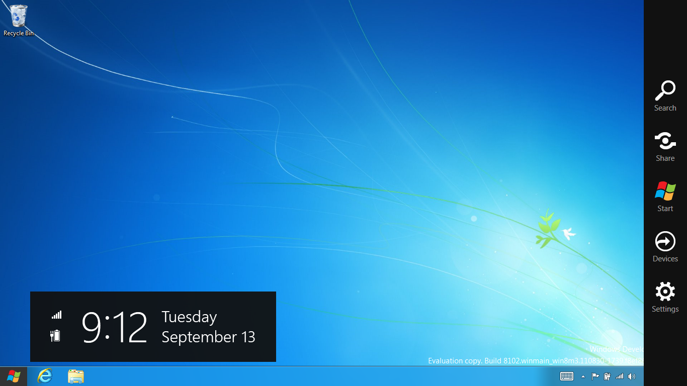
Swiping a finger from the right edge of the display towards the center brings up what Microsoft calls charms. This is a view that includes status indicators, and functionality like search, share, start, devices, and settings.

These respective shortcuts then bring up panes that occupy the same area on the right, and do what you’d expect. Settings for example is a place each application to build out a preferences area, so that each application has a common place users will go to control things.

Likewise, share acts like an intelligent copy paste, sharing working elements between applications. Finally search can either look through files and applications or dive into strings surfaced by other third-party applications.
These left and right based gestures exist across not just the Metro-infused start screen, but the entirety of Windows.
Moving around and getting back to the home screen is accomplished by pressing the Windows button, which on the tablet we were loaned is its own physical button analogous to iOS’ home button. Pressing the keyboard windows button performs the exact same action and summons the start menu.
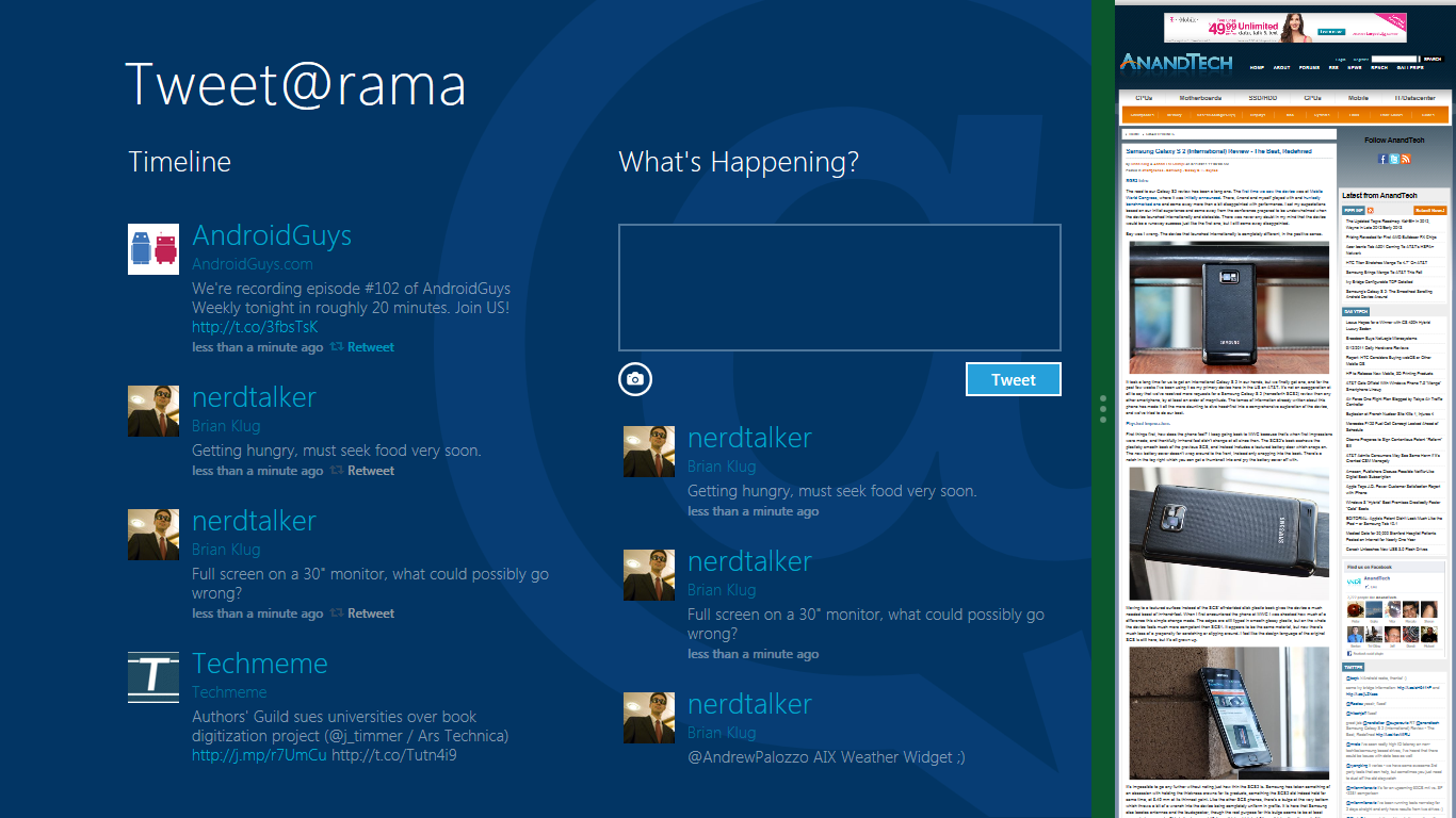
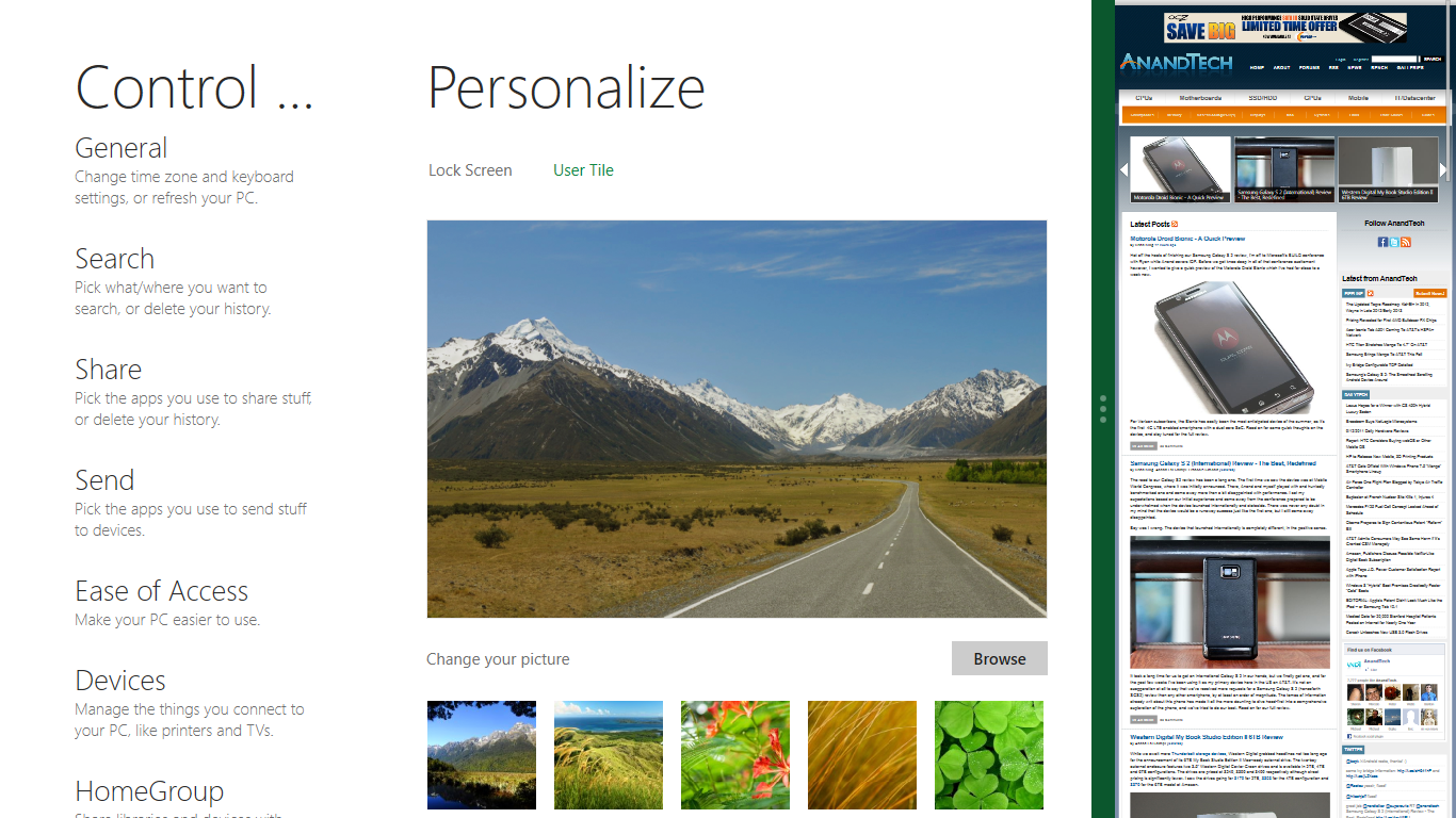
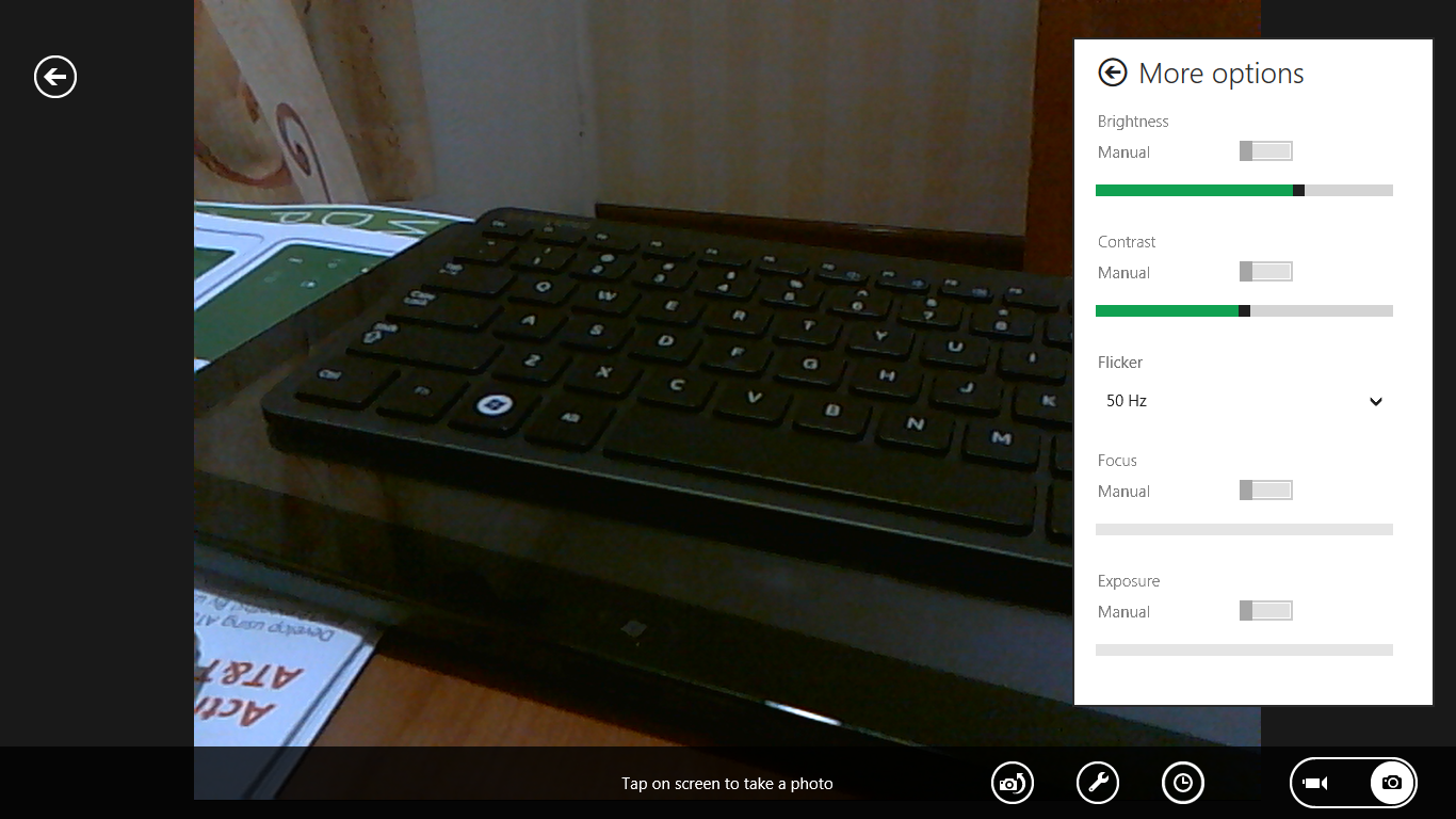
The current set of first-party applications is pretty spartan. There’s no maps, mail, or camera application, though Microsoft has already bundled a set of its own internally-created applications. These are entirely Metro themed as well. I mention camera because the sample hardware includes a front facing and rear facing camera, and at present the only way to access them is through the change user tile picture function, which can capture a photo from the front or back webcam.
Throughout the entire OS is a very WP7-like virtual keyboard, which supports a full size and thumb keyboard mode. There’s also a handwriting recognition mode which has two lines of handwriting input and is styled similarly to Windows 7’s tablet input keyboard.

The keyboard can be docked to the bottom of the display or detached and dragged around as well. I find that the split keyboard accommodates typing with thumbs and holding the device midair quite well.


235 Comments
View All Comments
A5 - Tuesday, September 13, 2011 - link
If you think the only difference between Win95 and Win7 is the UI and "convenience functionality" (and I love how make this sound like a bad thing), then you are sorely mistaken.Exodite - Wednesday, September 14, 2011 - link
For the end user there's no discernible differences aside from those noted.Sure, we've gotten higher versions of APIs such as DirectX or whatever but in the end that matters very little.
UMADBRO - Tuesday, September 13, 2011 - link
Have fun with that. Let us all know what happens when you try and even get that outdated, abandoned POS online, much less being able to do anything even remotely useful, other then playing old, shitty games.Exodite - Wednesday, September 14, 2011 - link
I used my '92 Amiga as my primary computer until '04, at which point I built my first Wintel machine - mainly due to gaming.The Amiga still works, were connected to the Internet with a 10Mbit PCMCIA Ethernet adapter, had an excellent browser for the time, and still offers a better desktop experience than any version of Windows.
I realize most people familiar with the platform only ever used A500's with Kickstart 1.2 or 1.3 and never actually saw the OS due to using it as gaming console. That's unfortunate, as AmigaOS 3.x remains unmatched in performance, simplicity, power and convenience when put up against any modern desktop OS.
UMADBRO - Wednesday, September 14, 2011 - link
That must have been interesting. Ill admit, I also use older stuff for specific things, like my old P4 box running Win98SE for DOS and older Windows games. But I also realize that its usefulness is limited, at best. Eventually we all need to move on. Anyway, sorry for the hostility. The overall tone in these messages when I was reading last night just annoyed me to no end. The majority of people have made up their mind before even trying things out. I cant stand close minded people like that.Exodite - Wednesday, September 14, 2011 - link
No offense taken, I do see your point.For me personally I suppose the disappointment is two-fold;
The distinct lack of technical innovation, which I consider current iterations of Windows to be in desperate need of, and the hodge-podge UI design.
The latter will hopefully improve until release at least.
I'm personally not a fan of metro in any way, though for WP7 devices I have no problem acknowledging that it's a very functional design with it's own distinctive style.
Unfortunately I can't see an upside to its introduction on the desktop. Someone likened it to a 'consoleization' of the desktop and I can only think about how how apt that statement is.
Still, final judgment must be reserved for the release version.
Booster - Tuesday, September 13, 2011 - link
Looks like another 9 years on Windows 7 to me. There's no way I'm ever installing this crap.Booster - Tuesday, September 13, 2011 - link
I mean, how can you even multitask on this ridiculous garbage? I normally have like 10 browser windows open, 4-5 word and excel docs, plus a handful of Explorer windows. And I need to switch between all this really fast, copy and paste and so on. What am I supposed to do with this?!dagamer34 - Tuesday, September 13, 2011 - link
Stick to the normal desktop?ph0tek - Wednesday, September 14, 2011 - link
LOL. Exactly. Some of these people commenting are so thick i's truly amazing.