Microsoft BUILD: Windows 8, A Pre-Beta Preview
by Brian Klug & Ryan Smith on September 13, 2011 12:05 PM EST- Posted in
- BUILD
- Windows
- Microsoft
- Windows 8
- Trade Shows
The Windows Store
As we mentioned previously, the Windows Store will be the Metro carrot for developers. At the same time it will be a significant change for end-users, double-so for Windows users who move to ARM.
Fundamentally the Windows Store is as you’d expect: it’s Microsoft’s rendition of the application stores we see on Mac OS X, iOS, Android, Ubuntu, etc. It will have a prominent place in Windows 8 (currently it’s the 2nd tile) and Microsoft would be very happy if all of their developers distributed applications through it. For x86/x64 users it will be just another source of applications; Metro applications can be sold through it, while for Win32 applications it will act as a listing service directing users to the owner's website. For ARM users however the Windows Store will be the only place users can get applications from, thereby not only requiring they be Metro, but that the entire experience for ARM users will be a walled garden like iOS.
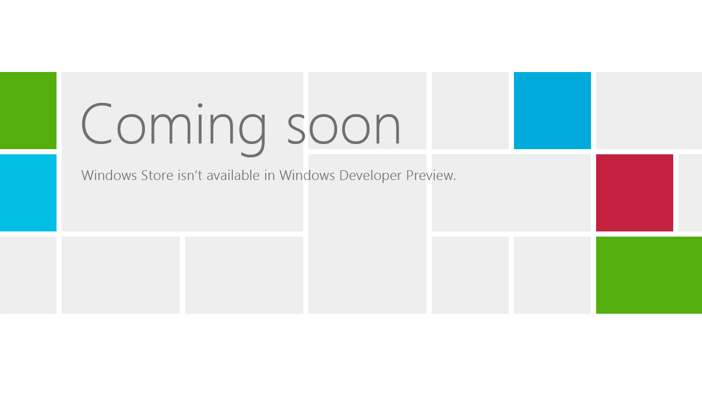
Unfortunately the Store is one of the few features Microsoft showed off during the press event that was not enabled on our tablet. Right now Microsoft is still working on what their content standards will be, a Terms of Service agreement, pricing/developer cuts, etc.
As it stands the store itself looks like functions exactly how you’d expect a Metro based application store to behave. The store will only be accepting and selling Metro applications, so non-Metro applications will continue to be installed via traditional methods.
The Windows Store alongside Metro’s APIs will serve as a two-pronged approach for security for Microsoft. Metro applications will have a fine grained permissions system similar to Android, and as a result most applications will have even fewer rights than today’s applications running with user level permissions, as applications will only be given the permissions they ask for and the user approves. Meanwhile the Store’s content approval process will further weed out bad applications. As such we’d expect Microsoft’s pitch to end-users to be something along this line: so long as you stay in the walled garden, you’re guaranteed to be secure.
From an end-user perspective one big thing differentiating the Windows Store from Apple’s Mac App Store is that Microsoft will also be allowing developers to offer time limited trials through the store, by building on top of Microsoft’s existing DRM/licensing technologies. Along these lines Microsoft will also be offering the now obligatory ability to make in-application purchases, allowing developers to sell application features beyond just the application itself.
We’re still waiting to see how software updates are handled, but at this point it’s reasonable to expect that they will become part of the Windows Update process as low-priority updates.
The layout/categorization of the store hasn’t been finalized, but it’s going to be of great interest from developers and end-users alike thanks to its significant status on ARM devices. Microsoft has gained a lot of experience from the Xbox Live Store, and at the same time developers have gained a lot of experience living and dying by the Xbox Live Store. As it currently stands Microsoft will have a curated “Spotlight” category, while other categories such as “Games” will be semi-to-fully automated.
From a development standpoint Microsoft is pitching the Store not only as an easy to access storefront for their wares, but as a source of analytic/telemetry information. Developers will have access to sales data (including sales relative to category leaders), crash reports, certain usage statistics, and other types of information commonly seen in other application stores.
Finally for developers, Microsoft is also looking at what they can do to beat Apple when it comes to application submission and approval. The Windows Store will of course have content restrictions and technical requirements, and Microsoft is looking to capitalize on making those mechanisms transparent versus Apple’s black box process. The Store’s terms have not been finalized yet, but Microsoft is promising that they’ll clearly outline what will be acceptable for the Store. For applications already submitted to the Store there will be a status page developers can access that will tell them which stage their application is currently at: pre-processing, security testing, technical compliance, content compliance, signing and publishing, and finally release. Microsoft’s technical compliance requirements will be public, and developers will have access to the tools needed to test technical compliance ahead of time to confirm compliance before submitting it to Microsoft.


235 Comments
View All Comments
Booster - Tuesday, September 13, 2011 - link
Exaclty. MS needs to get rid of Julie Larson-Green, the infamous inventor of the wretched ribbon and I suspect this abomination.BioTurboNick - Tuesday, September 13, 2011 - link
The ribbon is great. I'm sorry that you love trudging through menus to find the things you want.frozentundra123456 - Tuesday, September 13, 2011 - link
I agree with Booster. I absolutely hate the ribbon in Microsoft Office. It may add a lot of things that menus didnt have, but most of them are worthless. It requires considerably more steps to do simple tasks.The ribbon may be OK for someone who uses Office all day, every day, for business tasks. But I use it in a scientific setting, and just want to use the basic commands as quickly and easily as possible. For this kind of use, I really, really hate the ribbon.
ph0tek - Wednesday, September 14, 2011 - link
How did you manage to post that on DOS?Anyway... I bet the vast majority of people making the kind of comments as yourself are pretty old. Either that or just stupid. The Ribbon is better. Not debatable. New users of Office all agree it's better and do far better using it, thats a fact.
On Win 8 you can even customise the ribbon, or make a quick access bar with your own most used ribbon buttons. Instant access. You can get more quicker or efficient than that.
cjs150 - Wednesday, September 14, 2011 - link
No the ribbon is not better. I am a power user of word, our documents often run to 100 pages, with tables of contents, multiple level headings and paragraphs, track changes, charts and tables. When we get board we throw in columns as well.Let me take a simple example that happens all the time. Your document has track changes on it but is formatted incorrectly (for example you need to use keep with next). Right clicking the mouse will not bring up paragrpah settings because according to MS the context is tracking changes, so you go up to the ribbon, which is of course stuck in review mode because that was the last time you used it to switch track changes on, now scroll back to the home section of the ribbon, Where are the paragraph settings? - Not obviously there, you have to click on the little arrow in the bottom right of the paragraph tile on the ribbon and finally you have got what you needed.
And they call that an improvement?
The ribbon is fine for people who write a letter once every few days, but a complete waste of effort for business
BioTurboNick - Thursday, September 15, 2011 - link
That sounds like an imperfect implementation, not a problem with the interface style per se.quanta - Tuesday, September 13, 2011 - link
Since the introduction of Windows XP themes, the usable screen spaces have been on the decline.First of all, the default XP themes wasted more spaces by creating bigger margins/paddings between interactive screen elements just to fit pretty effects instead of making more efficient use of the same UI margins found in Classic theme while dressing up the visual.
Then came Windows Vista's Aero, which wastes even more space by switching to Segoe UI, where in its default configuration, has a bigger font sizes than the already inflated XP theme. Worse still, Segoe UI is one of the later ClearType-optimized fonts that looks blurry even after tuning, and ClearType itself isn't even designed for alternate subpixel layouts like non-aperture grille CRTs and Sharp Quattron (ClearType is only defined for 3-subpixel array, not 4-subpixel), making the default Vista UI look even worse on old and new monitors. Shrinking Segoe UI may have saved some screen estate, but the ClearType-tuned fonts are optimized for larger point sizes than the venerable Tahoma or even Microsoft Sans Serif, so it trades one compromise with another. The screen margin wastage is even worse than the XP themes. With all these new-fangled update, one would expect it the Aero UI will be more customizable, but it is not. You may be able to adjust the theme colours of Aero, but if you want to switch the colour of single elements such as (in)active menu bar or title, or switch the Aero font, YOU CAN'T! Well, at least not without hacking the system libraries[1], or going through the pain of editing the features with tools not supplied with the operating system, or use the Windows Classic theme. Windows 7 may have the mean of using the UI to build custom theme[2], but there is still zero method for conserving screen estates using Aero theme unless manually editing .theme files[3].
In this next Windows iteration, the incorporation of ribbon just add more clutter to the desktop. While the ribbon is needed for touchscreen uses, the way it is organized is far from most efficient. Does the ribbon really need text description over a button group for the buttons that already have descriptions on them? Desktop aside, the Metro fails to reuse the ribbon on the desktop UI, which would have provide a more consistent experience when switching between Metro and desktop, and even with the already bloated Windows 7-based UI, the ribbon layout still uses screen space more efficiently than Metro.
[1] http://www.howtogeek.com/howto/windows-vista/how-t...
[2] http://windows.microsoft.com/en-US/windows7/create...
[3] http://msdn.microsoft.com/en-us/library/bb773190%2...
Impulses - Tuesday, September 13, 2011 - link
Anyone else concerned that Win 8's multiple display support will be pretty hobbled? I'm already iffy on the whole Metro style, switching back to Metro to open unpinned apps when working on the traditional desktop seems horribly inefficient... But I don't see how that's gonna scale across multiple displays, I guess ideally you could leave the start panel with it's live tiles on a second screen, but MS has a history of ignoring multiple display users...We still rely on 3rd party tools to extend the taskbar or fine tune wallpapers across three displays... It's a shame too because after multiple cores and SSDs, multiple displays has been the biggest productivity boost I've gained thru hardware in the last 10 years.
BioTurboNick - Tuesday, September 13, 2011 - link
http://www.winsupersite.com/article/windows8/windo...Multiple monitor support is improved. Though this is just the desktop, not Metro.
CSMR - Tuesday, September 13, 2011 - link
That was fast. Thanks for the info Anand!