Microsoft BUILD: Windows 8, A Pre-Beta Preview
by Brian Klug & Ryan Smith on September 13, 2011 12:05 PM EST- Posted in
- BUILD
- Windows
- Microsoft
- Windows 8
- Trade Shows
The Metro UI Continued
Next up is the control panel, which doesn’t entirely supplant Windows’ traditional control panel, but instead offers high level features in a Metro-friendly interface. The left side scrolls up and down and exposes categories, the right side serves as the interaction area for playing with all the toggles.
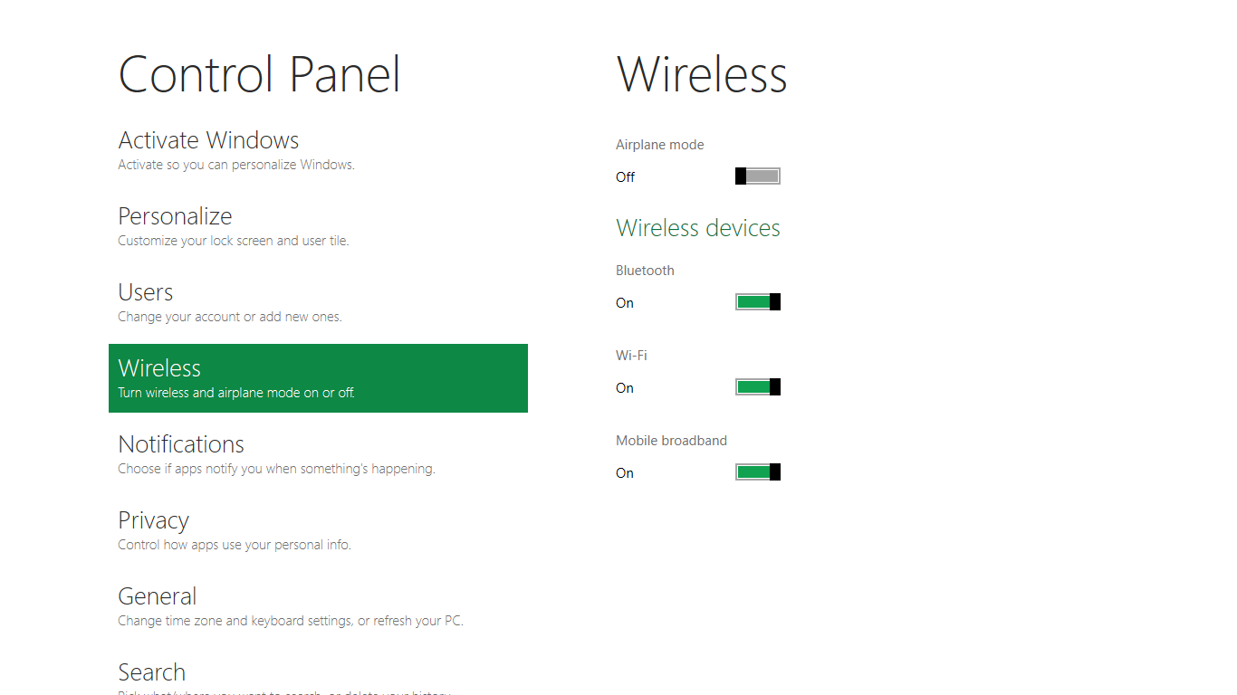
Interesting settings inside the control panel are things like privacy toggles for location services, which is akin to what we’ve seen on virtually every mobile platform, notifications through the push notification service which no doubt bears similarity to WP7, toggles for the onscreen keyboard (more on that later), and more. Under General are two new features - Refresh your PC, and Reset your PC.
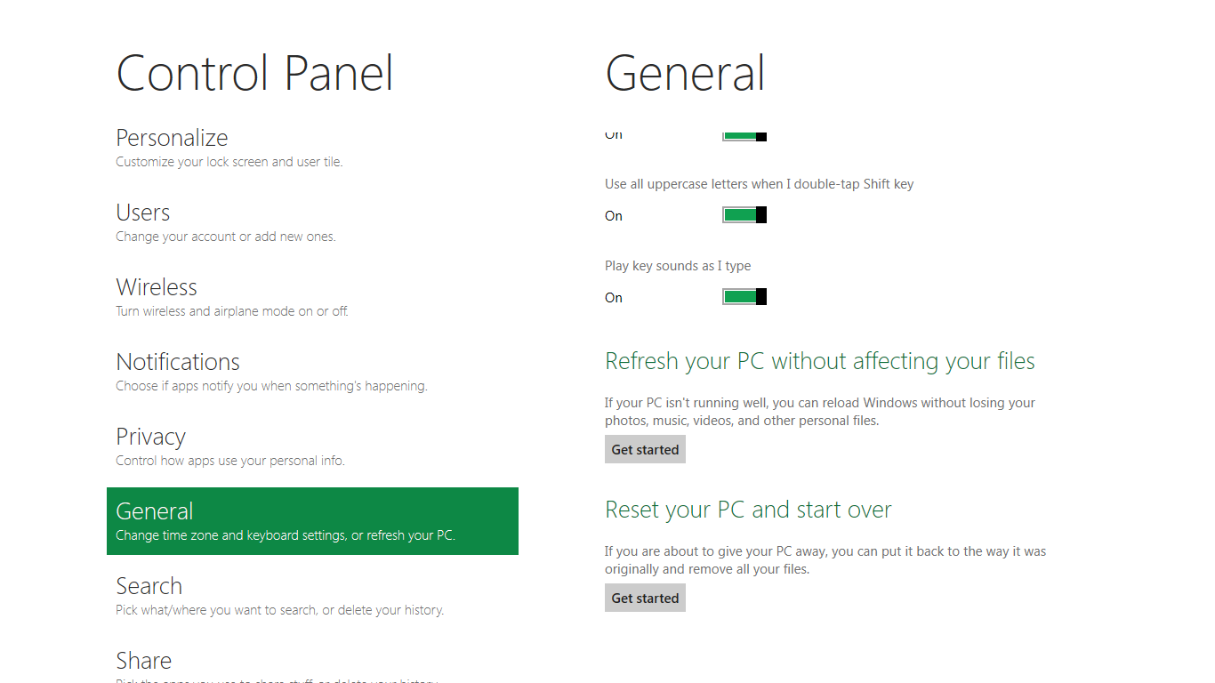
The second is reasonably self explanatory, it resets the entire OS to its original shipping state using a built-in recovery partition part of the install. The first is a bit more interesting, as it restores Windows and configuration settings while leaving user-specific files like photos, music, and videos intact. Microsoft has noted that this option leverages the management tools used for imaging PCs in an enterprise environment, but now in a desktop setting.
There’s also a category marked ‘devices’ which is the settings pane for controlling peripherals like printers, human interface devices, and TVs. It doesn’t replace the device manager, but acts in practice as a high-level one for the devices that are used by the Metro/Start interface. At the very bottom is ‘more settings’ which literally takes you back to the old Windows 7 control panel.
This is the start menu, so just like in Windows 7 and Vista, you can simply start typing to get an immediate list of files and applications that match the string. Results are categorized into one of three bins - apps, settings, and files. Of course you can also just type the application name and hit enter like previous editions of Windows.

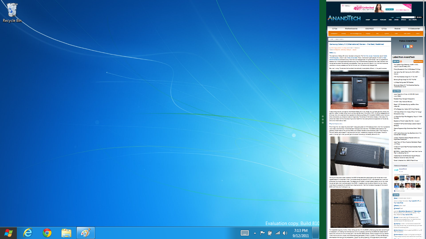
That really brings me to where the real windows desktop “lives” in Windows 8 right now, and there are a couple ways to invoke it. The first is that when a traditional desktop application is launched, either through a tile or search result, the Metro UI disappears and gives way to a Windows 7-esque desktop environment. The second is either by using the Windows Explorer or Desktop tiles, and the third is by good-ol Windows+D. Any of these get you to the desktop so to speak, which at this point looks almost exactly like Windows 7. There’s a good chance this isn’t finished yet and is going to change soon, but for now things look very familiar.
Down in the bottom left is the Start button, which gets a new look, and tapping or clicking here brings you back into the Metro start screen. It was at this point that things really occurred to me - the new start screen completely replaces the Windows 7 start menu in its entirety.
I’m reminded after seeing a lot of Windows 8 of two things. It’s almost like Windows Origami experience for UMPCs, but crossed with Windows Phone 7’s Metro design language and fluidity, all while retaining the desktop layer underneath. The question is whether Windows can successfully tailor itself to so many different form factors and retain the desktop power that users need and expect.
The last new UI elements we’ve been shown belong to the desktop part of the OS. These two features are the freshly included explorer ribbon and new queued copy dialogs.
The new Windows 8 explorer window includes two modes. In collapsed mode, the window is essentially the Windows 7 explorer pane, with the inclusion of an up a directory button and simplified bottom pane.

With the window expanded however, the ribbon appears. It’s starting to make sense that the ribbon really accommodates a touch-centric workflow, where right click is cumbersome or impossible. In its stead, controls in the ribbon are the one stop shop for file management.
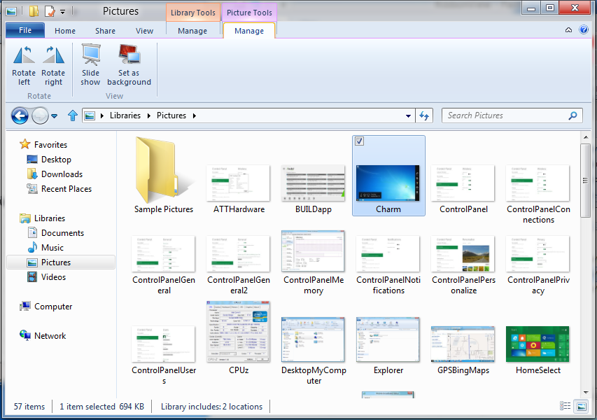
There are also some contextual elements that pop up as well, for example when dealing with a .zip, compressed folder tools appears, and when photos are selected, picture management tools appear. For now the Ribbon isn’t mandatory, and the ability to collapse it up and retain valuable horizontal space should assuage the concerns of hopefully at least some of its critics.
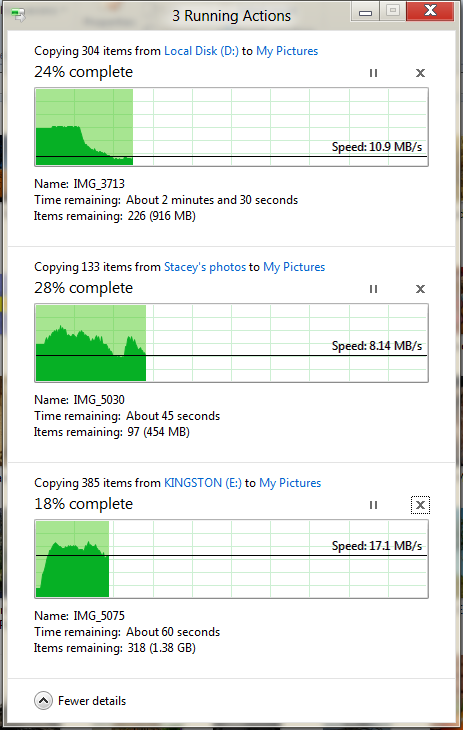
The next major explorer change is the new and improved file copy dialog, which gives an optional detailed graph of copy throughput, and the ability to pause, resume, or stop file copy actions. We've only just started using this build and need more time to really play with larger file copies, but thus far the functionality does work and is welcome.


235 Comments
View All Comments
Booster - Tuesday, September 13, 2011 - link
Exaclty. MS needs to get rid of Julie Larson-Green, the infamous inventor of the wretched ribbon and I suspect this abomination.BioTurboNick - Tuesday, September 13, 2011 - link
The ribbon is great. I'm sorry that you love trudging through menus to find the things you want.frozentundra123456 - Tuesday, September 13, 2011 - link
I agree with Booster. I absolutely hate the ribbon in Microsoft Office. It may add a lot of things that menus didnt have, but most of them are worthless. It requires considerably more steps to do simple tasks.The ribbon may be OK for someone who uses Office all day, every day, for business tasks. But I use it in a scientific setting, and just want to use the basic commands as quickly and easily as possible. For this kind of use, I really, really hate the ribbon.
ph0tek - Wednesday, September 14, 2011 - link
How did you manage to post that on DOS?Anyway... I bet the vast majority of people making the kind of comments as yourself are pretty old. Either that or just stupid. The Ribbon is better. Not debatable. New users of Office all agree it's better and do far better using it, thats a fact.
On Win 8 you can even customise the ribbon, or make a quick access bar with your own most used ribbon buttons. Instant access. You can get more quicker or efficient than that.
cjs150 - Wednesday, September 14, 2011 - link
No the ribbon is not better. I am a power user of word, our documents often run to 100 pages, with tables of contents, multiple level headings and paragraphs, track changes, charts and tables. When we get board we throw in columns as well.Let me take a simple example that happens all the time. Your document has track changes on it but is formatted incorrectly (for example you need to use keep with next). Right clicking the mouse will not bring up paragrpah settings because according to MS the context is tracking changes, so you go up to the ribbon, which is of course stuck in review mode because that was the last time you used it to switch track changes on, now scroll back to the home section of the ribbon, Where are the paragraph settings? - Not obviously there, you have to click on the little arrow in the bottom right of the paragraph tile on the ribbon and finally you have got what you needed.
And they call that an improvement?
The ribbon is fine for people who write a letter once every few days, but a complete waste of effort for business
BioTurboNick - Thursday, September 15, 2011 - link
That sounds like an imperfect implementation, not a problem with the interface style per se.quanta - Tuesday, September 13, 2011 - link
Since the introduction of Windows XP themes, the usable screen spaces have been on the decline.First of all, the default XP themes wasted more spaces by creating bigger margins/paddings between interactive screen elements just to fit pretty effects instead of making more efficient use of the same UI margins found in Classic theme while dressing up the visual.
Then came Windows Vista's Aero, which wastes even more space by switching to Segoe UI, where in its default configuration, has a bigger font sizes than the already inflated XP theme. Worse still, Segoe UI is one of the later ClearType-optimized fonts that looks blurry even after tuning, and ClearType itself isn't even designed for alternate subpixel layouts like non-aperture grille CRTs and Sharp Quattron (ClearType is only defined for 3-subpixel array, not 4-subpixel), making the default Vista UI look even worse on old and new monitors. Shrinking Segoe UI may have saved some screen estate, but the ClearType-tuned fonts are optimized for larger point sizes than the venerable Tahoma or even Microsoft Sans Serif, so it trades one compromise with another. The screen margin wastage is even worse than the XP themes. With all these new-fangled update, one would expect it the Aero UI will be more customizable, but it is not. You may be able to adjust the theme colours of Aero, but if you want to switch the colour of single elements such as (in)active menu bar or title, or switch the Aero font, YOU CAN'T! Well, at least not without hacking the system libraries[1], or going through the pain of editing the features with tools not supplied with the operating system, or use the Windows Classic theme. Windows 7 may have the mean of using the UI to build custom theme[2], but there is still zero method for conserving screen estates using Aero theme unless manually editing .theme files[3].
In this next Windows iteration, the incorporation of ribbon just add more clutter to the desktop. While the ribbon is needed for touchscreen uses, the way it is organized is far from most efficient. Does the ribbon really need text description over a button group for the buttons that already have descriptions on them? Desktop aside, the Metro fails to reuse the ribbon on the desktop UI, which would have provide a more consistent experience when switching between Metro and desktop, and even with the already bloated Windows 7-based UI, the ribbon layout still uses screen space more efficiently than Metro.
[1] http://www.howtogeek.com/howto/windows-vista/how-t...
[2] http://windows.microsoft.com/en-US/windows7/create...
[3] http://msdn.microsoft.com/en-us/library/bb773190%2...
Impulses - Tuesday, September 13, 2011 - link
Anyone else concerned that Win 8's multiple display support will be pretty hobbled? I'm already iffy on the whole Metro style, switching back to Metro to open unpinned apps when working on the traditional desktop seems horribly inefficient... But I don't see how that's gonna scale across multiple displays, I guess ideally you could leave the start panel with it's live tiles on a second screen, but MS has a history of ignoring multiple display users...We still rely on 3rd party tools to extend the taskbar or fine tune wallpapers across three displays... It's a shame too because after multiple cores and SSDs, multiple displays has been the biggest productivity boost I've gained thru hardware in the last 10 years.
BioTurboNick - Tuesday, September 13, 2011 - link
http://www.winsupersite.com/article/windows8/windo...Multiple monitor support is improved. Though this is just the desktop, not Metro.
CSMR - Tuesday, September 13, 2011 - link
That was fast. Thanks for the info Anand!