The Apple iPad 2 Review
by Brian Klug, Anand Lal Shimpi & Vivek Gowri on March 19, 2011 8:01 PM ESTThe UI & Honeycomb Comparison
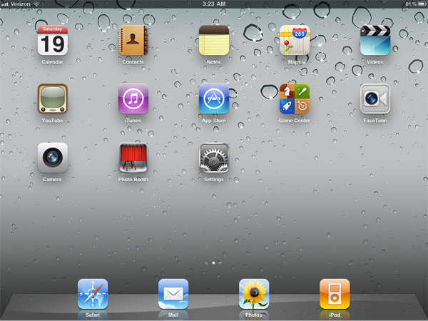
The iOS UI hasn't changed much at all since the iPad launched last year. Apple eventually added folders and multitasking but this is still the same basic iOS we were introduced to with the iPhone 2G. On the plus side it keeps things simple. If you're an iOS user you're likely to feel right at home on an iPad. You can then pick up an iPhone or iPod Touch and get the same experience and even run many if not all of the same apps. Apple has always done a good job of taking care of its users that don't stray from the ecosystem and the iOS universe is no different.
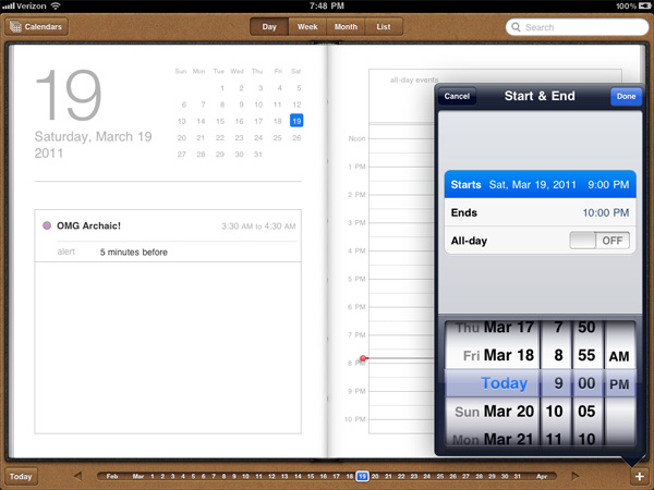
There are still elements of iOS that I believe are unmatched in the industry. Apple does a great job focusing on how something should work and doing its best to implement that. To date I enjoy setting alarms/reminders more on iOS than any other mobile OS I've used.
Unfortunately, the iOS UI remaining relatively constant isn't always good. The multitasking UI is still not what I'd consider ideal. Switching between apps still requires a double tap of the home button, scrolling through a horizontal list of icons and tapping again once you found what you wanted. It's basically a less convenient alt-tab.
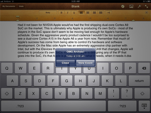
Notifications are also horribly obnoxious. When there was no support for 3rd party notifications in iOS it didn't really matter and the simplicity of the notification system was actually a benefit. However now all apps have the ability to send you notifications and many of them will actually attempt to do so. This results in an experience-breaking barrage of popups front and center on the iPad. While multitasking allows you to switch between an IM app, your email and a web browser, if you're casually talking to someone over IM you'll find yourself interrupted by popups as you try to simultaneously read email or browse the web.
The multitasking and notification limitations in iOS are actually two significant barriers that prevent the tablet experience from actually evolving.
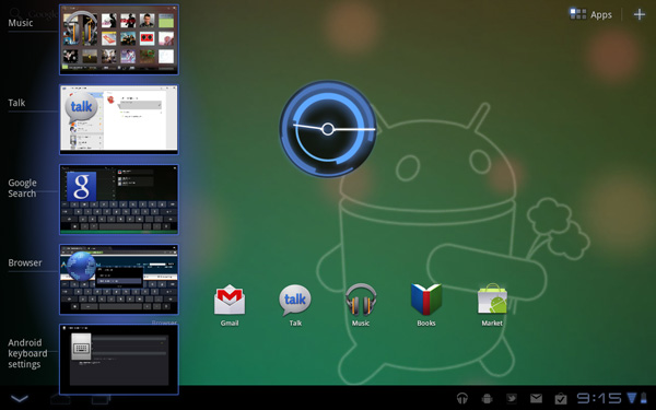
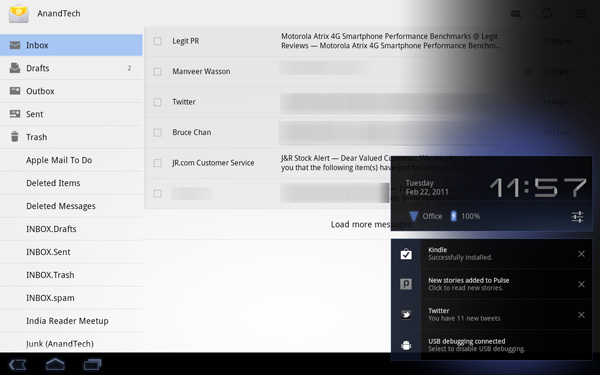
In contrast we have the Motorola Xoom running Honeycomb. You can argue that the Honeycomb UI isn't nearly as smooth or consistent as iOS 4.3, however Google is experimenting with more productivity oriented UIs. Notifications in Honeycomb pop up in the lower right hand corner in a manner similar to what you'd expect from a desktop OS. Multitasking isn't perfect under Honeycomb either but you have an easily accessible list of the five most recently used applications that you can get to via a single tap. Google also took a very desktop-OS-like approach to navigation in Honeycomb - the nav/notification bar at the bottom always occupies screen real estate. It may fade out when you're in certain apps (e.g. watching a movie) but otherwise it's a permanent fixture. While not quite as invasive as the menu bar in OS X or the taskbar in Windows, the Honeycomb nav/notification bar is of the same family.
While Apple has definitely stepped up its ergonomics and performance with the iPad 2, the UI remains dated. I must point out that today, two years after the introduction of webOS, Apple still has yet to offer a multitasking experience that's anywhere close to what Palm did with significantly less resources. I'm not sure if this is a pride thing or a fundamental difference of opinion. If Apple keeps up its release schedule maybe we'll be surprised this summer with iOS 5.




189 Comments
View All Comments
synaesthetic - Sunday, March 20, 2011 - link
Touchscreens are the very antithesis of good ergonomics. Unless haptic feedback can defy physics or we get some deformable/flexible screens, devices with actual buttons will always be superior.The human brain simply reacts better to physically pushing a button. Touchscreens have horrible ergonomics--a tiny bit of vibration is not really much haptic feedback. It feels like a lot to us (and it certainly helps me on my phone) but it only feels like that beccause a touchscreen is so far away from any semblance of "natural use."
Touchscreens should be used when they are REQUIRED--such as on smartphones, where the number of controls, commands and options far outstrip the physical size of the device and the physical space to place buttons.
I don't think tablets will ever stop being a toy.
stephenbrooks - Saturday, March 19, 2011 - link
Page 2, final picture. The iPad 2 is on the BOTTOM not the top there.Anand Lal Shimpi - Saturday, March 19, 2011 - link
Fixed! Thanks :)Omid.M - Saturday, March 19, 2011 - link
"There's also the idea of synergy among devices. Even if you play within the Apple universe and own a Mac, an iPhone and an iPad, there's no magical way of sharing data and applications between them. I should be able to work on my Mac, step away and have my apps/data come with me. Your best bet is something like Dropbox but that's no where near the type of cohesive solution I'm talking about. Think HP's webOS touch-to-share but on steroids and you're on the right track."Anand/Brian/Vivek:
I'm sure that's what Apple is planning with NFC-enabled iOS devices, but then wouldn't that require a saved state to be stored in the cloud and then re-downloaded on demand on the next device used? I would imagine that "lag" in the UX would be a problem. How long would you feasibly have to wait for stuff to download the first time you sit down with a new device (new as in rotation) ?
Also, would this be limited to stock-Apple stuff only? It would be a bear for Apple to save the state of arbitrary 3rd party software from one device to the next (assuming both devices have the client installed). Right?
Next...
"So if you're actually torn between the iPad 2 and the Xoom my best advice is to wait. Apple needs to update iOS in a major way and Honeycomb needs a hardware update. Whichever gets it right first should get your money."
This is really the money statement of the review. I think Android tab makers need to NOT simply look at the iPad 2 to figure out their next move, but to pave their own path, not for the path to be a RESPONSE to the competition. The Xoom should have higher quality display for sure, and Honeycomb needs faster incremental updates. I really liked it but it just lacks so much in terms of functionality and compatibility, at least if we're considering it for productivity.
None of the tabs on the market right now are really meant for editing/creating content--even if you're able to with a handful of apps--but simply consuming existing content (iTunes music streaming, sharing videos, social networking--and I think that's the biggest issue with tablet to replace netbooks or become devices taken seriously.
Please, please cover the WebOS tablet when it comes out.
Thanks for the review, guys. Great work. The technical section on glass, for instance, is one reason with AT does the best reviews.
Worth the read. Will tweet for others to check it out!
-Omid
clb - Monday, April 4, 2011 - link
I agree on both, but the point on #1 is missed. It is not the need for the cloud on NFC, but the fact that you cannot actually sync the device:>I should be able to work on my Mac, step away and have my apps/data come with me.
Even if you are going from a Mac to the iPad (1 or 2), there is no sync feature that covers everything. A note created on the iPad has to be emailed to your Mac; Apple will not let you read a note created on the iPad on a Mac unless you email it to yourself! And there is no way to get a note into the Likewise, using DropBox is great, but now files have to be loaded up, then you must reconnect, then load down. You cannot simply have the Mac send to the iPad or vice versa.
This is because unlike the early iPods, the iPhones and iPads do not allow the user to move files. Early iPods could be treated as FireWire drives. Not the iOs devices. Everything must go through iTunes or via the cloud (i.e., third-party sites). If I'm at a beach house with no cloud connection, and want to move content from my PC/Mac to my iPad, I'm SOL in many cases.
This is bad.
Adam Chew - Saturday, March 19, 2011 - link
Judging from your review of the iPad, its competitors will stand no chance of ever gaining traction in everyday use.So get a Macbook Air.....LOL
The problem is the everyday user is not a tech blog blogger, the iPad is ideal for consumption of everything of the net and not like some tech blogger who needs to blog unnecessarily with a laptop when an iPad is at hand.
nickdoc - Sunday, March 20, 2011 - link
Loved your contribution! The geek talk was getting really boring and repetitive. Hello! Normal people have needs, too. This is what the reviewers often forget. Not everyone needs to create content to be consumed by other creators of mostly the same content. Lol!stephenbrooks - Saturday, March 19, 2011 - link
OK, why where you joining *two iPads* together with magnets and buying a "smart vase" from Apple? :D"The iPad aligns and attaches to the body of the iPad 2 using six magnets along its side that line up with a similar set of magnets on the device. When I acquired the smart vase at launch, I [...]"
Anand Lal Shimpi - Saturday, March 19, 2011 - link
Fixed again :)tipoo - Saturday, March 19, 2011 - link
How the f does it work?