The Apple iPad 2 Review
by Brian Klug, Anand Lal Shimpi & Vivek Gowri on March 19, 2011 8:01 PM ESTThe UI & Honeycomb Comparison
The iOS UI hasn't changed much at all since the iPad launched last year. Apple eventually added folders and multitasking but this is still the same basic iOS we were introduced to with the iPhone 2G. On the plus side it keeps things simple. If you're an iOS user you're likely to feel right at home on an iPad. You can then pick up an iPhone or iPod Touch and get the same experience and even run many if not all of the same apps. Apple has always done a good job of taking care of its users that don't stray from the ecosystem and the iOS universe is no different.
There are still elements of iOS that I believe are unmatched in the industry. Apple does a great job focusing on how something should work and doing its best to implement that. To date I enjoy setting alarms/reminders more on iOS than any other mobile OS I've used.
Unfortunately, the iOS UI remaining relatively constant isn't always good. The multitasking UI is still not what I'd consider ideal. Switching between apps still requires a double tap of the home button, scrolling through a horizontal list of icons and tapping again once you found what you wanted. It's basically a less convenient alt-tab.
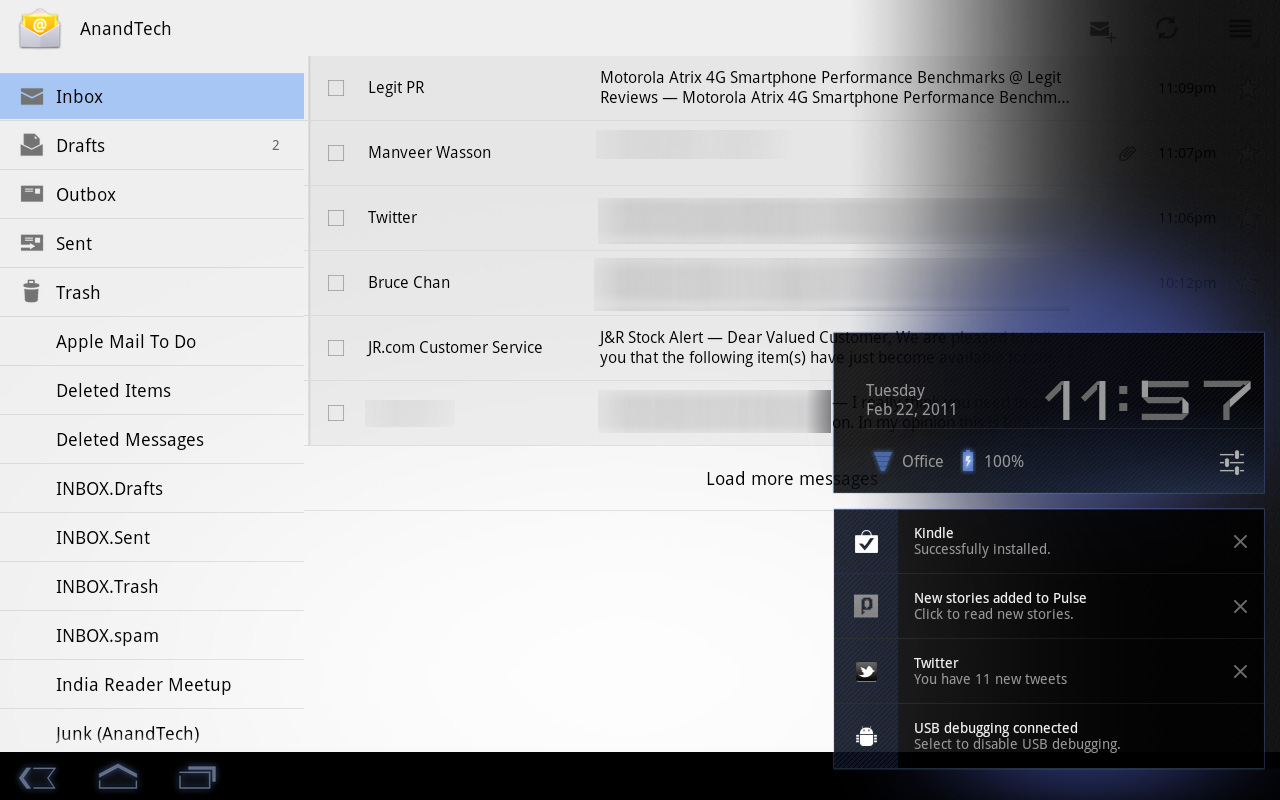
Notifications are also horribly obnoxious. When there was no support for 3rd party notifications in iOS it didn't really matter and the simplicity of the notification system was actually a benefit. However now all apps have the ability to send you notifications and many of them will actually attempt to do so. This results in an experience-breaking barrage of popups front and center on the iPad. While multitasking allows you to switch between an IM app, your email and a web browser, if you're casually talking to someone over IM you'll find yourself interrupted by popups as you try to simultaneously read email or browse the web.
The multitasking and notification limitations in iOS are actually two significant barriers that prevent the tablet experience from actually evolving.
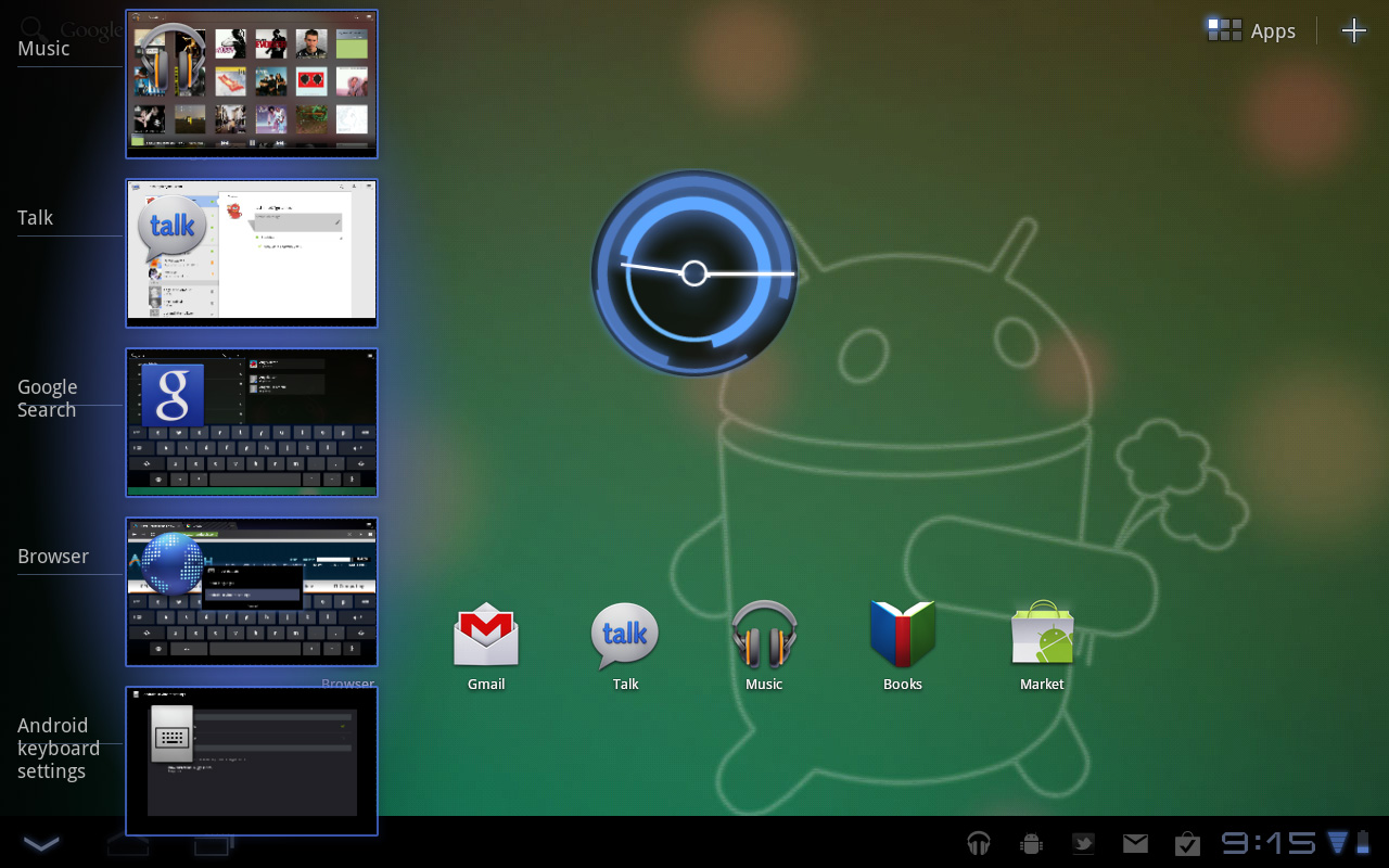
In contrast we have the Motorola Xoom running Honeycomb. You can argue that the Honeycomb UI isn't nearly as smooth or consistent as iOS 4.3, however Google is experimenting with more productivity oriented UIs. Notifications in Honeycomb pop up in the lower right hand corner in a manner similar to what you'd expect from a desktop OS. Multitasking isn't perfect under Honeycomb either but you have an easily accessible list of the five most recently used applications that you can get to via a single tap. Google also took a very desktop-OS-like approach to navigation in Honeycomb - the nav/notification bar at the bottom always occupies screen real estate. It may fade out when you're in certain apps (e.g. watching a movie) but otherwise it's a permanent fixture. While not quite as invasive as the menu bar in OS X or the taskbar in Windows, the Honeycomb nav/notification bar is of the same family.
While Apple has definitely stepped up its ergonomics and performance with the iPad 2, the UI remains dated. I must point out that today, two years after the introduction of webOS, Apple still has yet to offer a multitasking experience that's anywhere close to what Palm did with significantly less resources. I'm not sure if this is a pride thing or a fundamental difference of opinion. If Apple keeps up its release schedule maybe we'll be surprised this summer with iOS 5.


189 Comments
View All Comments
shangshang - Sunday, March 20, 2011 - link
but if you enough fanatic hipsters, +1 device can become a primary fashion must-have.And it's not just yuppies. There are so many geeky engineers at my work place that have an iPad so they can just put it next to there desktop PCs. Worst, there are some managers who use an iPad right along side their laptops in meetings. Baffling to me. I can only chuck it down as fashionable. I mean it's the same reason women pay $2000 for an LV purse that most men would deem god ugly.
kasplat99 - Sunday, March 20, 2011 - link
Last fall there was a discussion of a limitation of 16GB on photos in the iPad.http://discussions.apple.com/thread.jspa?messageID...
I haven't been able to find out whether this was resolved with an iOS 4.x update or the problem persists. This probably is not a limitation of the camera connector kit itself, but rather the photos app, either for total number or data size of photos, but regardless it is a serious limitation if trying to use the iPad for photo work or backup on a long trip.
Testing should be done on 32GB or 64GB iPad if anyone wants to check on this.
BlendMe - Sunday, March 20, 2011 - link
While reading the section on the cameras and the camera UI, I was wondering if you couldn't have saved yourself 1/2 page of writing by just switching on rotation lock? I see that the rotating controls are annoying, but isn't that what the rotation lock switch is for? To keep the UI from rotating?dagamer34 - Sunday, March 20, 2011 - link
That's a pretty bad hack for a problem they should have realized themselves if they ever tried to take a picture with the iPad 2.BlendMe - Sunday, March 20, 2011 - link
How is that a hack? That's what the switch is for (unless you set it to be a mute switch). If you use it to lock the rotation in a browser it's considered a feature.Theoretically (I don't have an iPad 2 and won't be able to try one for at least a week) this switch should allow you to place the capture button on any side of the screen.
I'm kinda surprised Anand/Brian/Vivek didn't even mention it, given that most of their reviews are very thorough and in-depth.
Azethoth - Monday, March 21, 2011 - link
I second that notion. My default is to have rotation locked. I loves me some landscape mode and when reading with it flat it freaks out without some rotation discipline.Now that its on the external switch again there really is not much issue.
Still, it was a major UI oversight. I think they got "lucky" that Jobs was sick and didn't see that rubbish and chew someone a new one. Heck, even Gates would have noticed such UI incompetence.
Bosh - Sunday, March 20, 2011 - link
Yes, you can wait and wait and wait and...........WaltFrench - Sunday, March 20, 2011 - link
Aw, cut @geekfool a break: he's waiting because by then, Flash 10.3.0173 will actually have watchable 720 framerates on a quad-core Tegra.There's geek and there's geek. Perhaps geekfool has drunk the Adobe jizz bigtime. With that list of priorities, he's absolutely doing the right thing.
LauRoman - Sunday, March 20, 2011 - link
Great review but it doesn't hold a candle to Charlie Brooker's 3 and a half minute insightful dissection of the differences between the two devices.http://www.youtube.com/watch?v=qNSn6AtdSGM
kube - Sunday, March 20, 2011 - link
Great review.I have an iPad 1 and plan on upgrading.
The review says that the principal use is email and web-browsing. Like most my use focuses on a few uses. But the most important is reading.
1. books. I use the Kindle app most, but sometimes ibooks. I share lots of books with my daughter, who uses a kindle device. Ebooks have probably doubled my book reading.
2. journal articles. For me, this is revolutionary. I'm a scientist, and over the past decade journal articles have migrated from print to pdf. With applications like "good reader" and especially "papers", my reading experience has changed. Reading a journal article pdf off of a computer screen is a second-rate experience. Reading off of the ipad, for me, is as good or better than reading print. As pdf applications have matured, the ability to high-light or write notes on the pdfs has gotten better. Really terrific.
3. Other pdfs. Viewing pdfs of slide presentations or theses or other stuff is great.
4. Instapaper. Can't believe its legal. While saving standard web pages is nice, it really shines at saving things like extended magazine articles. Things like the NY Times book review or NY Review of books articles. Extremely comfortable reading experiences, and easy to share with friends via email.
Another comment. My college-student daughter has an 11-inch macbook air. Its her only computer and is a terrific device. it seems to be a better device for students. It overlaps the function of the iPad making it hard to justify both.