Motorola Xoom Review: The First Honeycomb Tablet Arrives
by Anand Lal Shimpi on February 23, 2011 11:57 PM ESTMultitasking on Android: Done Right
Android has had multitasking since the start. Fire up an app and it can continue to execute even after you’ve shifted focus to another app (or the home screen) until you run out of memory. Once you reach a certain threshold of memory usage Android will automatically unload the least recently used app from memory.
The iOS 4 Task Switcher
What Android hasn’t had since the start is a good way of switching between apps. On iOS you double tap the home button to bring up a list of apps in memory, which you can use as a task switcher. Windows Phone 7 currently relies on a very powerful back button to switch between recently used apps, and eventually will implement a webOS-like card system. Android however did it the simplest way possible: tap home and run what you want to run next (Update: as well as tap and hold on home to bring up a list of recently used apps).
Honeycomb builds upon this. The third fixed button on the lower left brings up a list of up to five of your previously run apps/tasks (tap n hold home is gone). Each item has a text label telling you what it is as well as a visual preview.

The Honeycomb Task Switcher
For the most part it’s actual apps that will appear in this list (e.g. Twitter, Browser, Talk, etc...) however settings pages can appear here as well.
Unfortunately the task list is limited to five items - you can’t scroll to reveal more. I feel like this is a pretty big limitation as I do find myself going back to the Apps launcher screen more than I’d like given the functionality here. There’s also no way to force quit apps from this list, which would’ve been another nice addition.
New Notifications & Widgets
Honeycomb offers you more options to switch between apps than just heading back to the home screen. There’s the new multitasking UI, but there’s also the new notification area. Instead of having to pull down a shade to reveal notifications they simply pop up in the lower right corner of the screen and remain as icons to the left of the clock. Tapping on any of the notification icons brings up the full notification and also lets you clear it. If you tap on the signal/battery strength indicators you’ll reveal a stacked list of all of the notifications. If you have more than 6 notifications the stack will grow a scroll bar to show more.
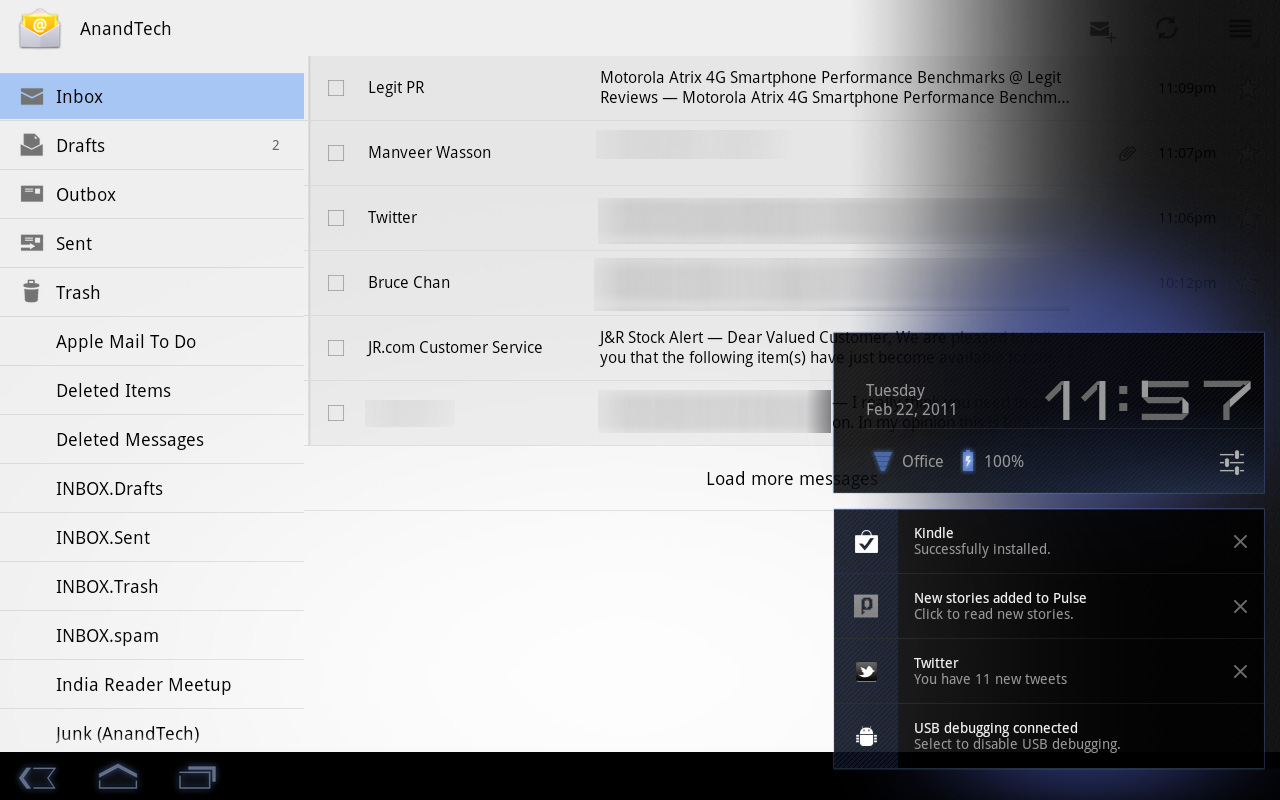
Tap once more, this time on the full notification, and you’ll fire up the associated app. The combination of the new notifications and the task switching UI means that switching between apps in Honeycomb is more like your desktop PC. It’s not quite perfect yet, but we’re getting there - and in my opinion it’s better than what’s currently available on the iPad.
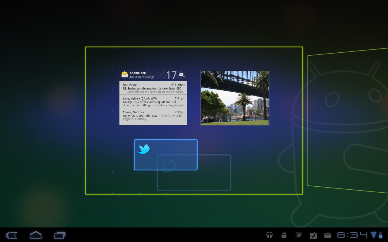
Google seems sold on the use of widgets as a major feature of Android. Personally I feel like widgets are more of a placeholder until we get full blown application windows that we can toss around our tablet desktop. If you subscribe to that thought process then what Google has done with widgets in Honeycomb will make a lot of sense. In Gingerbread and prior version of Android, widgets were fairly constrained and two dimensional. You could display information within the widget but there was no depth and no concept of scrolling.
Take a look at the email widget from Honeycomb:
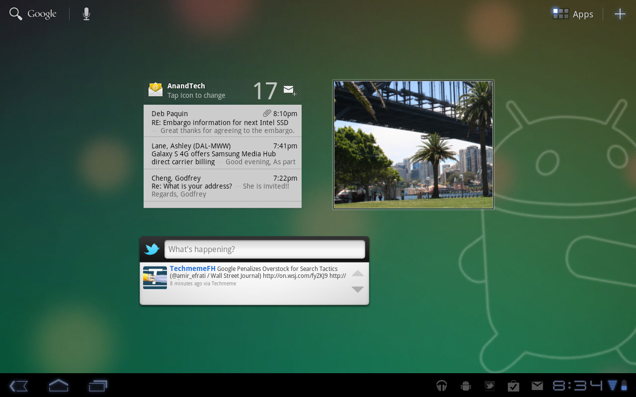
It’s basically a mini inbox viewer. You can scroll to view emails in your inbox or even tap the top of the widget to switch between viewing all emails and just those you haven’t read. You can’t read messages, delete or reply from within this widget, but tapping any email will open up the email app itself. As I said earlier, we’re just one step away from widgets becoming full blown apps that simply expand in place when we need them.
Honeycomb also provides some functionally decorative widgets, such as the picture frame which simply shows you a portion of one of your images. Tapping on the picture frame widget will open up the full sized photo it’s framing.
Stacks are also supported in Honeycomb widgets. Take the YouTube widget for example:

Here you get a stack of featured YouTube videos. The Books widget is also stacked, however it shows you covers of books you've loaded onto the Xoom. Tapping anything in a stack launches the associated app.
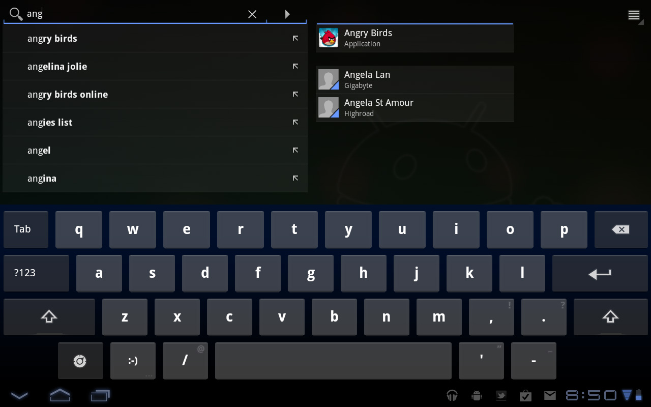
The Honeycomb Google search widget simultaneously generates web search queries as well as searches your local apps and contacts for your search string. There’s no Google Instant integration, but the UI is clean.
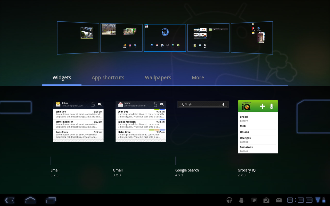
Adding widgets is as easy as hitting the + icon in the upper right of the screen. The default Honeycomb UI has five home screens - you can drag widgets and app shortcuts to any of them from the widget adder UI.
All of these widgets echo the same basic message in Honeycomb: giving you access to content and data in ways other than just going to the Apps launcher.
Apps Launcher
If the multitasking UI and the new notifications don’t get you to where you need to go, there’s still the old fashioned apps launcher. Located in the upper right of the screen (talk about turning Android on its head) tap the word Apps to reveal a more familiar looking grid layout of apps.
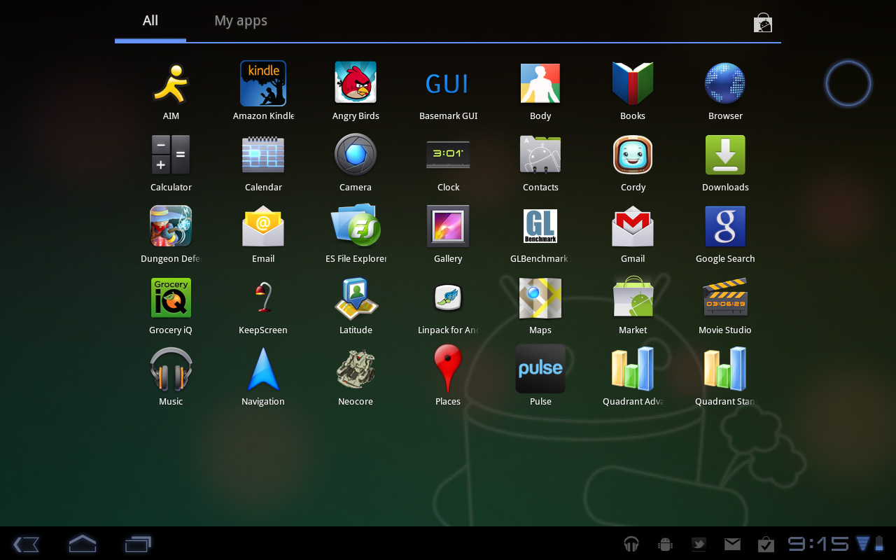
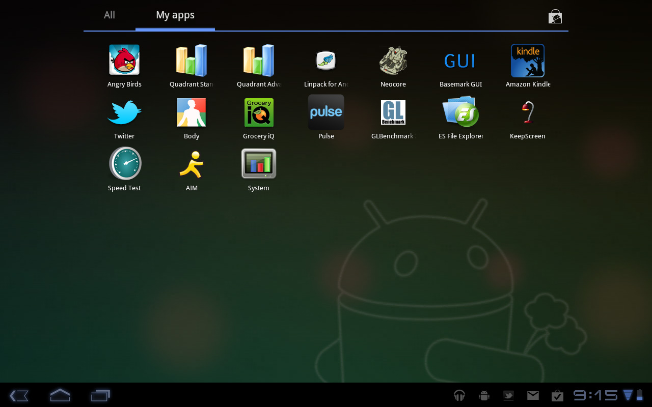
The apps are organized into horizontal pages instead of a vertical list. Google has also added a My apps tab to show just the apps that you’ve downloaded, not the apps that come as a part of Honeycomb.
I’d love to see a quick search field here so you could just start typing to find the app you’re looking for but perhaps we’ll see that in a future version of the OS.


112 Comments
View All Comments
Impulses - Friday, February 25, 2011 - link
Yeah, heh, I use ADW and every single one of my widgets is a scrolling widget (save for the weather widget). This is where I think a lot of people reviewing Android devices miss the mark... They're too focused on the stock software experience, yet one of Android's strengths is how customizable that experience is. You don't have to hack your device or be a geek to install an alternate launcher and a couple of widgets...On my home screen I have a 2x2 SCROLLING widget with my to-do list and immediate appointments, flanked on the right by a 2x2 music player widget w/album art, some shortcuts on the bottom and weather up top. On a different screen I've got a 2x4 SCROLLING widget w/my facebook/email feed (super customizable), elsewhere another 2x4 SCROLLING widget w/a grid calendar, and finally a 3x4 SCROLLING widget w/my news feed.
Those widgets even employ some basic pop-up windows when you interact with them... Hell, they're so well coded they scroll smoother than almost anything else on my phone (though they don't update instantaneously to reflect changes, fast enough tho). Stuff like this is very real and very widely used on Android, but nigh impossible on any other mobile OS, and it's just not taken into account during almost any reviews.
Slap LauncherPro or ADW on many of these phones and half the experience changes dramatically... To review Android devices as if these things don't exist is kind of weird imo.
strikeback03 - Friday, February 25, 2011 - link
While I agree that an article covering some of the customizations available (without rooting) would be useful, I think the bulk of the reviews has to carried out on primarily stock software. A lot of general consumers just want to use the device as is, not be configuring everything.Jinded - Friday, February 25, 2011 - link
This is true to an extent, but if one of the often-quoted advantages of iOS, for example, is the plethora of downloadable apps, then the advantages of Android, such as widgets, especially scrollable and interactive ones, should be pointed out as well.rwei - Thursday, February 24, 2011 - link
Embargoes, not so much3DoubleD - Thursday, February 24, 2011 - link
The third image on the Google Video Chat page says it all... (I like how you squeezed that in there Anand)@ $799, who would buy this?!? The Motorola Execs were smoking some strong stuff to come into the market a year late AND priced above the dominant player, Apple. If everything was perfectly executed on this device and it put the upcoming iPad2 to shame, the price would be justified. This isn't the case though as the lackluster screen, annoying charger, and (current) general instability leaves Apple ample room to upset Motorola's "attempted" market position. Upon release of the iPad2, the Xoom price must fall.
$499 for the Wifi and 3G (with contract) would make more sense. There is simply no room in today's market for a company to compete with Apple on who can sell the highest margin products! On the other hand, perhaps Motorola expects their sales to eat their production capacity whether they are competitive with the iPad2 or not.
Chudilo - Thursday, February 24, 2011 - link
Shame on MOTO for disabling Misro-USB charging. If they wanted to provide a faster charge option, fine. I should still be able to charge it via a standard plug. If it takes 10hrs to charge over microUSB , so be it. It's still better then lugging an extra power adapter around (I just want the option) . If it's an open OS , you've gotta follow through with the hardware. This just made this thing a lot less portable. You can not carry it as a magazine anymore(you can't do it with an iPad either, but again, you shouldn't be trying to match them, you should be trying to beat them).Ideally leaving it plugged in overnight would give it enough juice to run for a decent amount of time. Since this isn't a productivity centered device, it will most likely be plugged in through the night, then be used for a few minuted in the morning to check latest news/weather/music, then be plugged in again for the rest of the day until evening. If you forgot to plug it in then you can always use the fast charger to charge it while you're using it.
I'm going to have wait to see what the docking options will be.
RLMb - Thursday, February 24, 2011 - link
Great review. Very objective and detailed.It's funny how the dynamics of blogs playout. Sites like Engadget, Techcrunch, etc. have their writers write shallow, opinionated, many times with plain false statements. These articles draw hordes of commenters, half calling on the article, the other half defending the article because it "proves" the point they want to make. Other than that they tend to be Apple biased.
I am going to buy the Xoom, the subsidized version with 3G.
I am not a big fan of 2y contracts in general, but I think this one is worth it. The total cost over 2 years is 600 + 480 = 1080 and That gives me 3g access, albeit limited.
If I could buy the same $20/1GB plan for the Ipad, that would cost me $730+480 = 1210 If I used 3g every month. This is $130 more than the Xoom price, so even if I did not use the contract for 6.5 months on the ipad (say vacation, etc.) the Xoom would still be cheaper.
Of course, if you do not plan to use the 3G you should but the Wifi only version.
Impulses - Friday, February 25, 2011 - link
Buying any of these under contract is inane if you're already paying for a smartphone ('cept maybe if you're on AT&T and shackled w/a 2GB data cap)... Just tether them to your phone and use the data connection you're already paying for. If you're gonna be using it for hours on end chances are you're near WiFi anyway (or you can find an outlet to charge your phone and offset the power usage tethering incurs).darckhart - Thursday, February 24, 2011 - link
Pricing on these tablets is all out of wack. I don't argue the functionality and convenience, but the price puts it in the tier of low to mid notebook. How is what amounts to smartphone processing capability, form factor, and touch equal to a notebook? It just isn't. Unfortunately, the ipad set the bar for pricing and people were willing to pay, thus ushering in another sorely mispriced gadget. With the current specs of tablets, they should have debuted in the 250-450$ range.strikeback03 - Thursday, February 24, 2011 - link
Remember, unsubsidized prices on high-end smartphones are generally in the $450-700 range as well. Add a bigger screen and battery and you end up with the unsubsidized prices we are seeing.Devices which try to pack lots of power in smaller spaces have always cost a premium relative to the amount of silicon inside.
That said I think the Xoom would make a lot more sense with a $100-150 price drop in both subsidized and unsubsidized form.