Motorola Xoom Review: The First Honeycomb Tablet Arrives
by Anand Lal Shimpi on February 23, 2011 11:57 PM ESTMultitasking on Android: Done Right
Android has had multitasking since the start. Fire up an app and it can continue to execute even after you’ve shifted focus to another app (or the home screen) until you run out of memory. Once you reach a certain threshold of memory usage Android will automatically unload the least recently used app from memory.
The iOS 4 Task Switcher
What Android hasn’t had since the start is a good way of switching between apps. On iOS you double tap the home button to bring up a list of apps in memory, which you can use as a task switcher. Windows Phone 7 currently relies on a very powerful back button to switch between recently used apps, and eventually will implement a webOS-like card system. Android however did it the simplest way possible: tap home and run what you want to run next (Update: as well as tap and hold on home to bring up a list of recently used apps).
Honeycomb builds upon this. The third fixed button on the lower left brings up a list of up to five of your previously run apps/tasks (tap n hold home is gone). Each item has a text label telling you what it is as well as a visual preview.

The Honeycomb Task Switcher
For the most part it’s actual apps that will appear in this list (e.g. Twitter, Browser, Talk, etc...) however settings pages can appear here as well.
Unfortunately the task list is limited to five items - you can’t scroll to reveal more. I feel like this is a pretty big limitation as I do find myself going back to the Apps launcher screen more than I’d like given the functionality here. There’s also no way to force quit apps from this list, which would’ve been another nice addition.
New Notifications & Widgets
Honeycomb offers you more options to switch between apps than just heading back to the home screen. There’s the new multitasking UI, but there’s also the new notification area. Instead of having to pull down a shade to reveal notifications they simply pop up in the lower right corner of the screen and remain as icons to the left of the clock. Tapping on any of the notification icons brings up the full notification and also lets you clear it. If you tap on the signal/battery strength indicators you’ll reveal a stacked list of all of the notifications. If you have more than 6 notifications the stack will grow a scroll bar to show more.
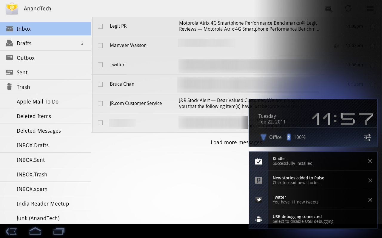
Tap once more, this time on the full notification, and you’ll fire up the associated app. The combination of the new notifications and the task switching UI means that switching between apps in Honeycomb is more like your desktop PC. It’s not quite perfect yet, but we’re getting there - and in my opinion it’s better than what’s currently available on the iPad.
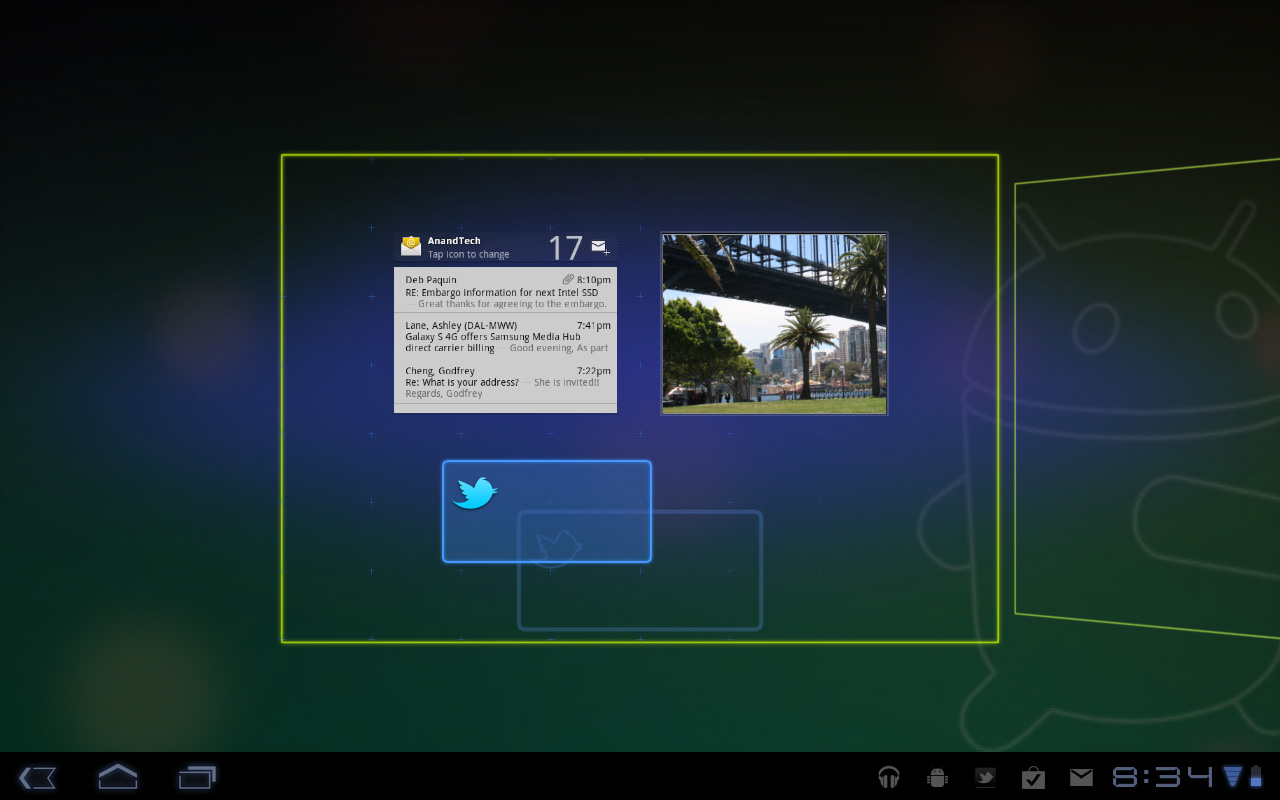
Google seems sold on the use of widgets as a major feature of Android. Personally I feel like widgets are more of a placeholder until we get full blown application windows that we can toss around our tablet desktop. If you subscribe to that thought process then what Google has done with widgets in Honeycomb will make a lot of sense. In Gingerbread and prior version of Android, widgets were fairly constrained and two dimensional. You could display information within the widget but there was no depth and no concept of scrolling.
Take a look at the email widget from Honeycomb:
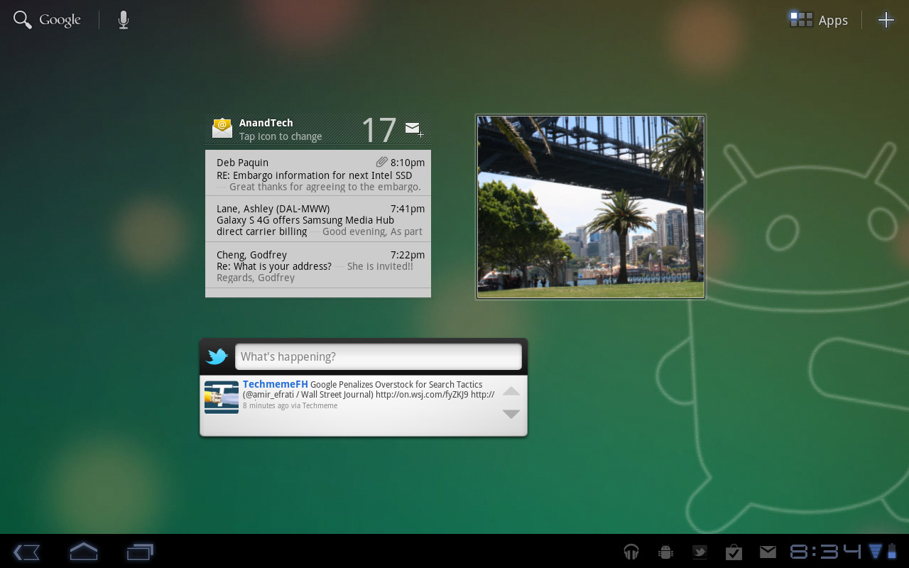
It’s basically a mini inbox viewer. You can scroll to view emails in your inbox or even tap the top of the widget to switch between viewing all emails and just those you haven’t read. You can’t read messages, delete or reply from within this widget, but tapping any email will open up the email app itself. As I said earlier, we’re just one step away from widgets becoming full blown apps that simply expand in place when we need them.
Honeycomb also provides some functionally decorative widgets, such as the picture frame which simply shows you a portion of one of your images. Tapping on the picture frame widget will open up the full sized photo it’s framing.
Stacks are also supported in Honeycomb widgets. Take the YouTube widget for example:

Here you get a stack of featured YouTube videos. The Books widget is also stacked, however it shows you covers of books you've loaded onto the Xoom. Tapping anything in a stack launches the associated app.
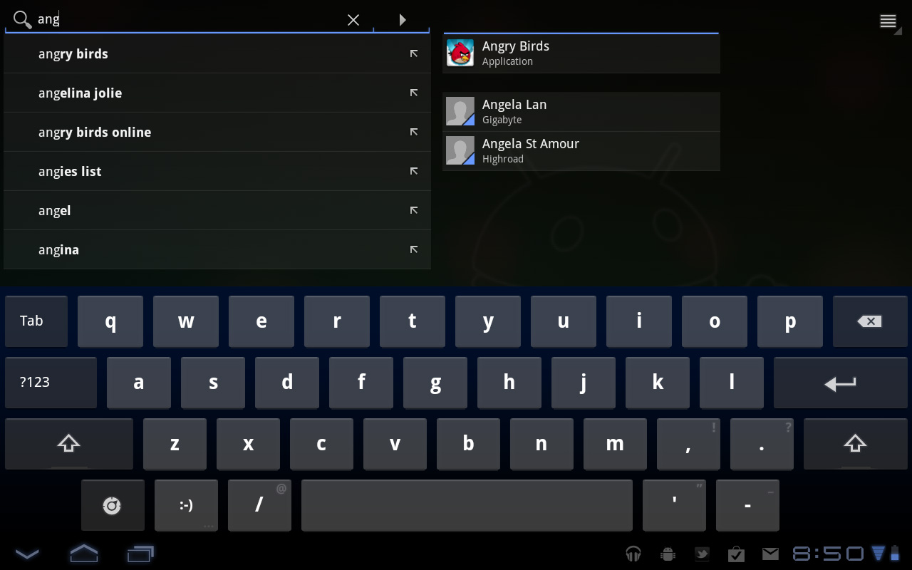
The Honeycomb Google search widget simultaneously generates web search queries as well as searches your local apps and contacts for your search string. There’s no Google Instant integration, but the UI is clean.
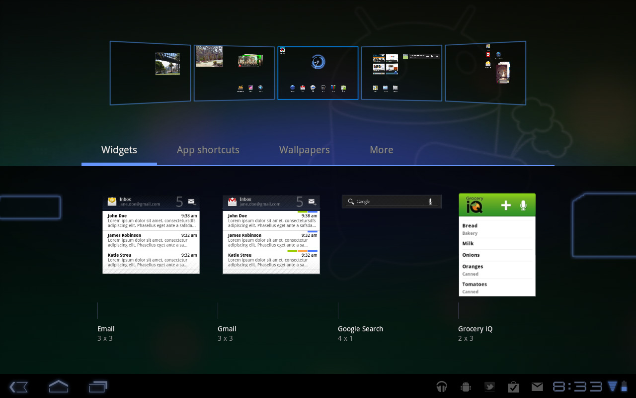
Adding widgets is as easy as hitting the + icon in the upper right of the screen. The default Honeycomb UI has five home screens - you can drag widgets and app shortcuts to any of them from the widget adder UI.
All of these widgets echo the same basic message in Honeycomb: giving you access to content and data in ways other than just going to the Apps launcher.
Apps Launcher
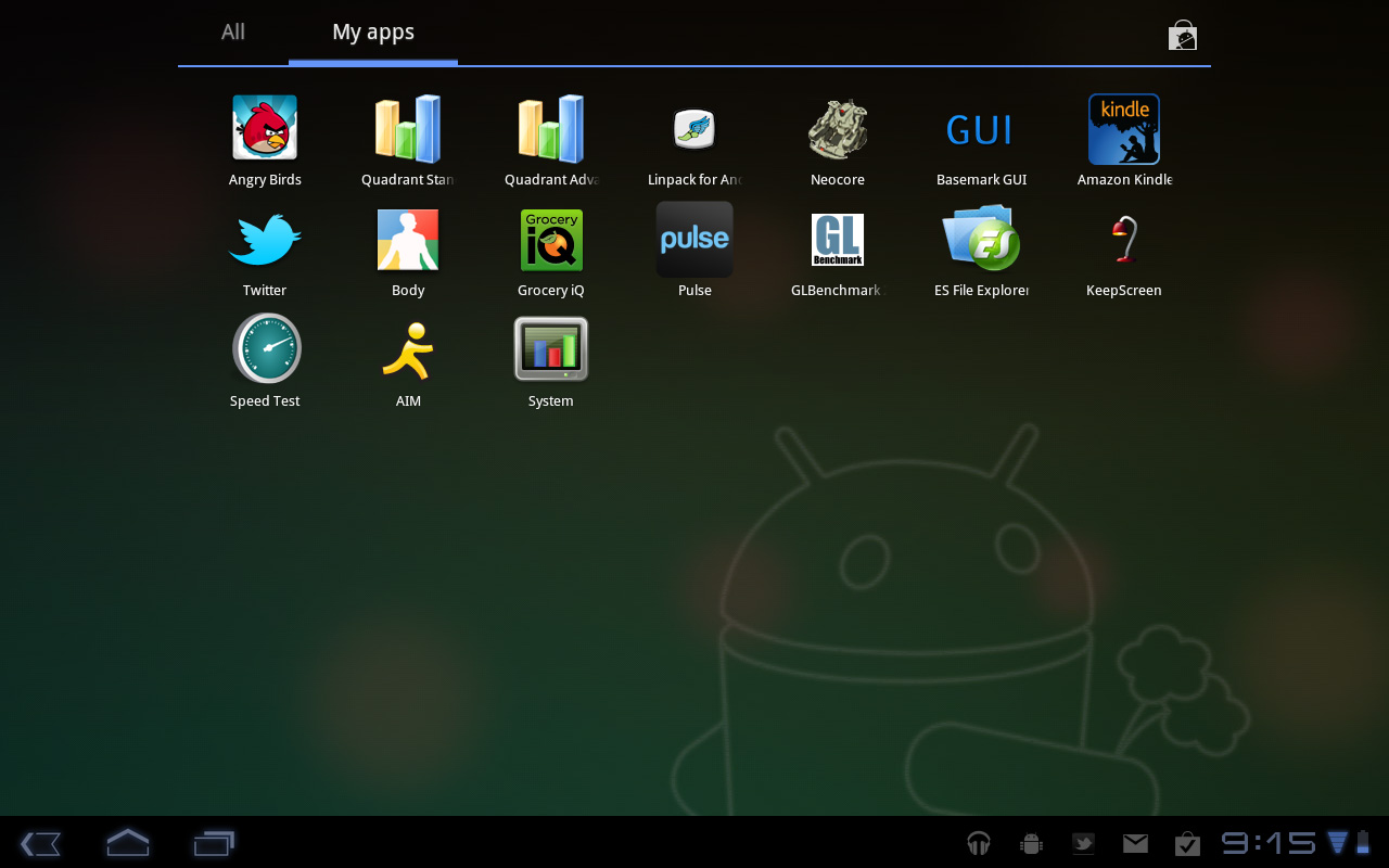
If the multitasking UI and the new notifications don’t get you to where you need to go, there’s still the old fashioned apps launcher. Located in the upper right of the screen (talk about turning Android on its head) tap the word Apps to reveal a more familiar looking grid layout of apps.
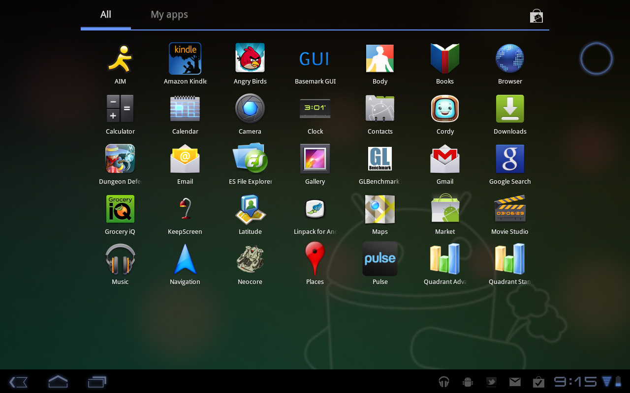
The apps are organized into horizontal pages instead of a vertical list. Google has also added a My apps tab to show just the apps that you’ve downloaded, not the apps that come as a part of Honeycomb.
I’d love to see a quick search field here so you could just start typing to find the app you’re looking for but perhaps we’ll see that in a future version of the OS.


112 Comments
View All Comments
Impulses - Thursday, February 24, 2011 - link
You know, if this were almost any other site I'd agree... But I actually like the way Anand constantly puts things in context by looking at the big picture and comparing products to their competition in the market.Impulses - Thursday, February 24, 2011 - link
Oh and just for the record, I'm a big fan of Android, my phone's an EVO, and the only Apple product I've ever had is an iPod touch (16GB - 2nd gen)... I liked it as a music/video player, and a gaming device; but I don't see myself buying anything Apple in the foreseeable future.Azethoth - Thursday, February 24, 2011 - link
Ugh. Please do not ever stop comparing a product against its competitors. I want to know that some feature sux / kills vs the corresponding feature for competitors.tiredad - Thursday, February 24, 2011 - link
Compare Anand to Engadget. Engadget compare things to Apple products in a condescending way that i find patronising. It probably comes from their desire to wip up the pro and anti camps and thus sustain interest. Anand, on the other hand, compares products in an appropriate way that is informative to the reader. Comparison gives context and without context, value judgements are meaningless; done right, comparisons are essential.I love this site because it seems to simply love good technology irrespective of who makes it. I especially love that there is no arbitrary scoring system - you can read something and make your own judgement.
wumpus - Monday, February 28, 2011 - link
As long as Apple is the competition, Anandtech should compare to it.What I'm missing (gave up on, didn't see it in the long list for battery life) is the Nook Color. Since you can replace the software with honeycomb, this is pretty much the best deal for wifi-only tablets around. I guess the question is: "how far do you want to carry it, anyway?"
Sam125 - Thursday, February 24, 2011 - link
These tablets or as I like to call them: Smartphone 2.0 is looking pretty attractive but I'm still left wondering if a tablet would be better served by using an Atom+Ion or Ontario SOC.peastham - Thursday, February 24, 2011 - link
Sure it can...works for me with a stock cable. (HDMI just passes right through the dock.)Anand Lal Shimpi - Thursday, February 24, 2011 - link
Hmm it doesn't seem to be working for me - can you share your configuration (what display/other items in the HDMI chain)?Take care,
Anand
RHurst - Thursday, February 24, 2011 - link
I actually can use my iPad outside. It's obviously not a kindle, but it's surprisingly good. The iPad is actually better than my transflective Tablet PC (Motion LE 1700), exactly because it has tons of contrast and great viewing angles.The color shifting on the Xoom depicted in the review is shockingly bad. That it performs so bad outdoors tells me one thing: I won't buy it. I can't wait to see the LG and the Galaxy Tab 10.1.
Thanks for the review, great reading!
tekzor - Thursday, February 24, 2011 - link
moto has shocked me with the quality of this product.this is reviews reminds me of a similar experience I had on the samsung galaxy tab. The UI is updated for the tablet user but the experience is still not there yet. I will just have to stick to my ipad and if I want tegra 2 I have the viewsonic gtab and the good folks at XDA. Yes the screen is garbage on the gtab, however for the price($375), you get a tegra 2 and flash!! I feel the xoom should of costed $150 more than the gtab.