The Windows Phone 7 Review
by Anand Lal Shimpi & Brian Klug on October 20, 2010 7:00 PM EST- Posted in
- Smartphones
- Windows Phone 7
- Microsoft
- Mobile
Notifications
Notifications are still a sore spot for iOS users. Thankfully, Microsoft did a good job with notifications in Windows Phone. In general WP7 uses a small slice of the top of the screen real estate to deliver both the kind of information about phones that users need (signal, battery, and status), and also deliver ‘toast’ notifications.
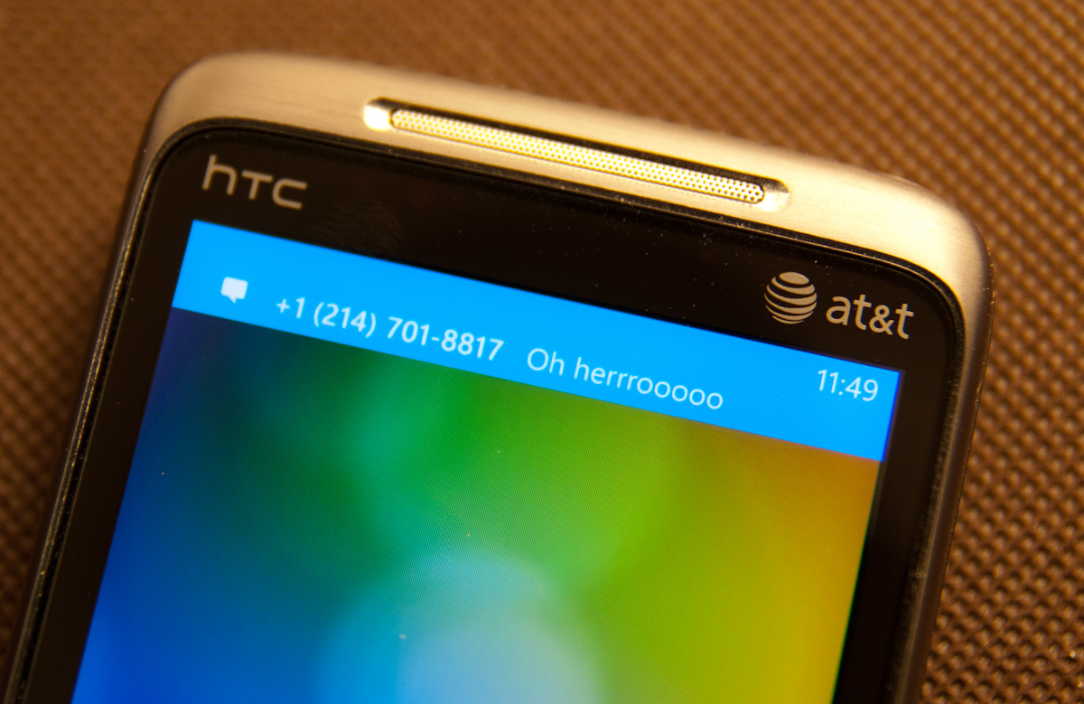
I’ve shown some of that before already. Incoming messages show up and have the contact’s name or number (depending on whether you have a contact card for them), and a snippet of the message. You can tap on that and dive into the messaging application, or swipe the message off to the side and ignore it:
It’s sort of a hybrid combination of WebOS’ notification system. The only small concern I have is that after a toast fades away, there’s no way to see it again. If you’re browsing and want to finish reading a paragraph before responding, you’ll probably miss the message toast. Then you’re forced to hop out of IE, hop into messaging, and get back. You end up missing out on the otherwise excellent IE -> messaging -> back to IE workflow enabled by the back button. It’s a tremendously minor gripe, but it’s important to differentiate that WebOS keeps those notifications at the bottom until they’re dismissed, WP7 dismisses them for you after a few seconds.
Voicemails also result in a notification the same way, popping up a simple new voicemail toast when something is incoming:

On WP7, there really are about 4 different ways to get notified about messages, missed calls, and voicemails. With toasts directly like I’ve already shown, with tiles on the start page that change and show a simple counter, and at the bottom of the lock screen:

Push notifications from applications will also show up as toasts, and there’s an in-application notification system as well. I’ve yet to encounter either of these two, but they’ll definitely be leveraged at one point or another.
I’d say in general that WP7 has struck a balance with its notification system that puts it some place inbetween the competition. iOS either freezes whatever you’re doing and pops up a big bubble right in the middle of your screen, or you can turn that off and get nothing at all. Android sticks everything in the notifications bar at the top and expects users to check that by dragging down. The result is that one gives you a ton of information at the cost of being annoying, the other keeps it all hidden away. Again, it’s obvious that WP7 takes nods from WebOS.
As we already mentioned, the top of the screen isn’t just used for toasts however. WP7 still needs to deliver basic information critical to the operation of the phone. Information like signal strength, network status, vibration status, and battery level. WP7 will drop down status indicators as appropriate, but only when it’s relevant. In a call, signal bars will drop down, but nothing else. When you’re hopping on or jumping off of WiFi, the wireless indicator will animate appropriately. It’s an interesting way of keeping the interface clean. I still prefer seeing all this information all the time, but I understand what the WP7 team was going for here.
Tap volume, and you’ll bring up another toast-like notification where you can toggle vibrate/ring and change the current volume level:

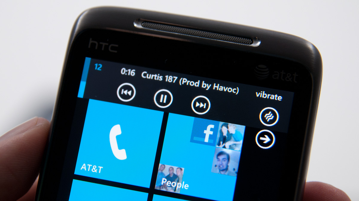
When playing music, there’s a similar kind of notification toast, except now you can skip tracks and pause:
There’s also a black on white version of all these if you change your theme settings:
Though the toasts remain the solid accent color set in themes.


125 Comments
View All Comments
Crono - Thursday, October 21, 2010 - link
A lot may not have been taken from the Kin One and Kin Two, but the square, multi page Start is the same concept that was implemented in the Kin phones.Looking forward to moving from my Kin One to the Surround. Microsoft is offering 3 months free Zune Pass for those who sign up to be notified about preorders.
heelo - Thursday, October 21, 2010 - link
You might be the only owner of a Surround.That thing has a "value proposition" that I'm really struggling to relate to.
peter7921 - Thursday, October 21, 2010 - link
I have to give recognition to Anandtech for another great review. I have been looking for a detailed review on WP7 and you guys delivered. Not only is it extremely informative but it's also very well written. I read through it all, not once feeling bored or skipping ahead.These types of articles are the reason Anandtech is my first source for all things tech!
Keep up the great work guys!
Confusador - Thursday, October 21, 2010 - link
OK, wow. I mean, even by Anandtech's unusually high standards that was intense. Just one thing I'm not clear on, though... am I reading this correctly?"WP7 calls presents its browser user agent as “Mozilla/4.0 ...""
If that's correct we've come a long way from the days I had to have Firefox masquerade as IE to be effective.
Guspaz - Thursday, October 21, 2010 - link
IE has *always* done this, including on the desktop. IE6 reports as as Mozilla/4.0 too. IE2 also did it (a different version of Mozilla, though). A quick search didn't turn up IE1 user agent strings, but I assume it also did.Spivonious - Thursday, October 21, 2010 - link
Remember back when IE was introduced, Netscape was king. Netscape is based on Mozilla. That's the only reason it's in there - so pages made for Netscape would load correctly in IE.arturnowp - Thursday, October 21, 2010 - link
IT seems strange that WP7 cannot pass test, has very slow JavaScript engine but still pages are fluid and displayed porperly. Maybe Microsoft renders pages remotely and serves them to the phne?UCLAPat - Thursday, October 21, 2010 - link
Wow! After reading this review, it makes all the other reviews look like previews. Definitely going to be considering WP7 when it's time to upgrade my phone. Still have time to burn on my current 2 year contract. By the time it's up, LTE should be up and running and Verizon will probably have a WP7 device for us to consider as well.Apps will come. But they're not a huge part of my life anyway. I want a rock-solid core experience for a phone. A smartphone has to nail the basic experiences first (calls, messaging, calendar, etc). I never liked the main screen completely filled with app icons. That reminded me too much of my old desktop computer before I cleaned up the desktop.
Belard - Thursday, October 21, 2010 - link
But very detailed... tells us pretty much everything anyone can ask.Thanks...
While I'm not exactly PRO-MS... its good to see good design.
I still like Google's a bit more and its shortcoming are easy to spot. Hopefully Android 3.0 will improve on its weaknesses.
The icon / naming is well thought out and is used by others... including Apple, but not on a phone.
silverblue - Thursday, October 21, 2010 - link
"...displays up to 8 tiles of people you’ve either recently communicated with or whose profiles you’ve viewed/stalked."LOL.