The Windows Phone 7 Review
by Anand Lal Shimpi & Brian Klug on October 20, 2010 7:00 PM EST- Posted in
- Smartphones
- Windows Phone 7
- Microsoft
- Mobile
Rebuilding a Brand: IE mobile
If there was anything to take away from Windows Mobile, it’s that building a platform with a slow, glitchy browser doesn’t sell. Likewise, if there’s one thing Apple deserves credit for, it’s bringing truly smooth desktop-like browsing to the handheld with Safari. Google and BlackBerry alike can speak to just how important mobile browsers are to platform success, and to woo users from any smartphone platform, WP7 needed to have a fast mobile browser.
When I first heard at MIX10 that WP7’s browser would be built around IE 7 with components from IE 8, I wasn’t sure what to think. That’s right, WP7 is running a mobile port of IE 7’s Trident layout engine - but it isn’t bad. Actually, far from it - it’s quite usable.
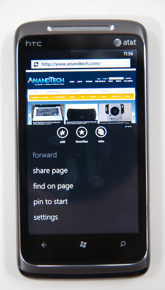
First up, Internet Explorer is given its own tile on the home screen. Note that there’s no “mobile” here or insinuation that this is the “pocket” version like it was formerly known by on WinMo, it’s straight up IE. On the first launch, you’re brought to an AT&T captive portal, but ironically enough there’s technically no home page on WP7, future launches bring you to a blank start page.
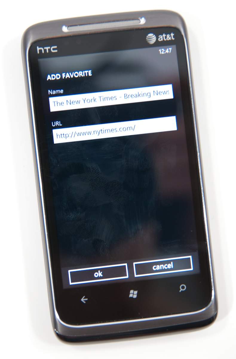
At the bottom are three buttons - add to favorites, favorites, and tabs. Tap the settings ellipsis and you’ll expose more settings - forward ,share page, find on page, pin to start, and settings.
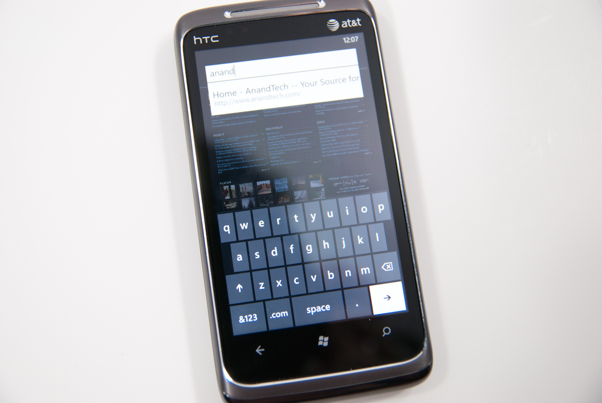
There’s a URL bar up top, but other than that the interface is very minimalist, true to Metro UI standards. Tap on the URL bar and start typing, and all the usual magic bar aides work - addresses from your history are suggested, Bing suggestions below them, and entries from favorites. Hit go, and a narrow progress strip appears just above the URL as the page loads.
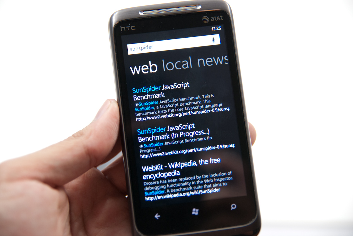
You can enter search terms in the URL bar, but are instantly transported to WP7’s Bing search application for the actual search and results. Clicking on the results brings you back to the browser. It’s a bit jarring to get yanked out of the browser and then transplanted back (and there’s no way to change your search preferences to Google, either), but it does work. More on WP7’s ubiquitous Bing search later.
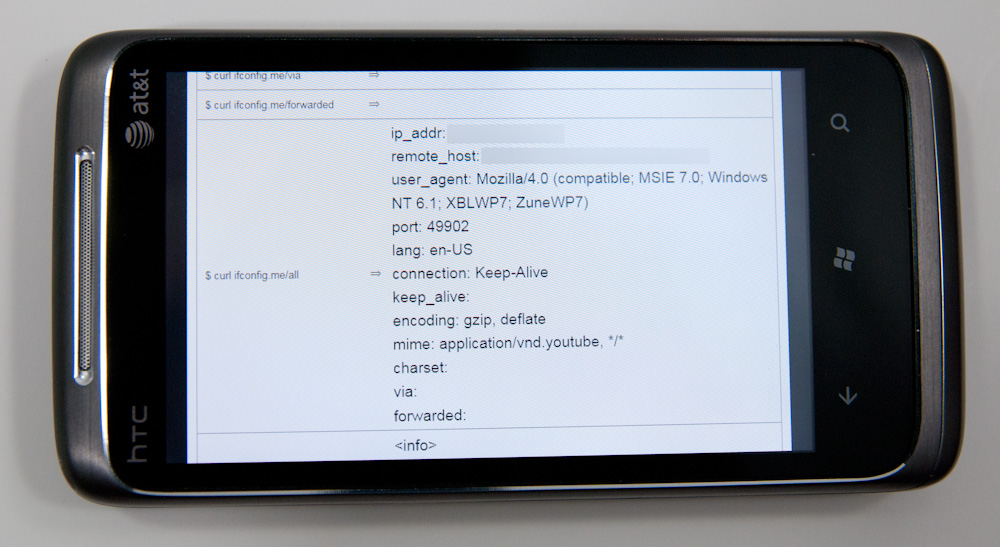
The settings pane for WP7 IE is a bit minimalistic, but gets the job done. There’s a button for clearing all the local data on the phone, but no granularity if you want to just clear history but leave cache intact, or some combination. It’s all or nothing. What’s very useful however is inclusion of a user agent switcher - Mobile version or Desktop version. For sites that support mobile user agent detection and shoot differently formatted content based on that, this is useful.
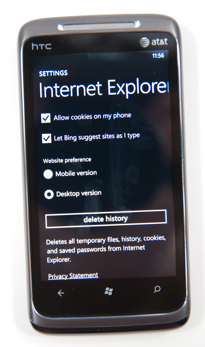
WP7 calls presents its browser user agent as “Mozilla/4.0 (compatible; MSIE 7.0; Windows NT 6.1; XBLWP7; ZuneWP7)” in desktop mode, and “Mozilla/4.0 (compatible; MSIE 7.0; Windows Phone OS 7.0; Trident/3.1; IEMobile/7.0; HTC; T8788)” in mobile mode. While there aren’t many sites right now that identify the phone in mobile view and send appropriately formatted content, that’ll change as detection includes those new WP7 entries. What’s interesting is the inclusion of XBLWP7 and ZuneWP7 in the desktop view - could a browser for Xbox be somewhere on the distant horizon?
Moving on is the tabbed view. IE will let you open a maximum of 6 tabs - the current number of open tabs is displayed atop the logo itself. Though Microsoft calls them “tabs,” they really work in principle a lot more like (and bear more resemblance) to windows. There’s no tabs to be found anywhere. There’s a very smooth 3D animation switching between tabs and opening/closing them. What’s interesting however is that you can open pages in all six tabs in quick succession, and the pages themselves will keep loading and update the tile thumbnail once the page is done:
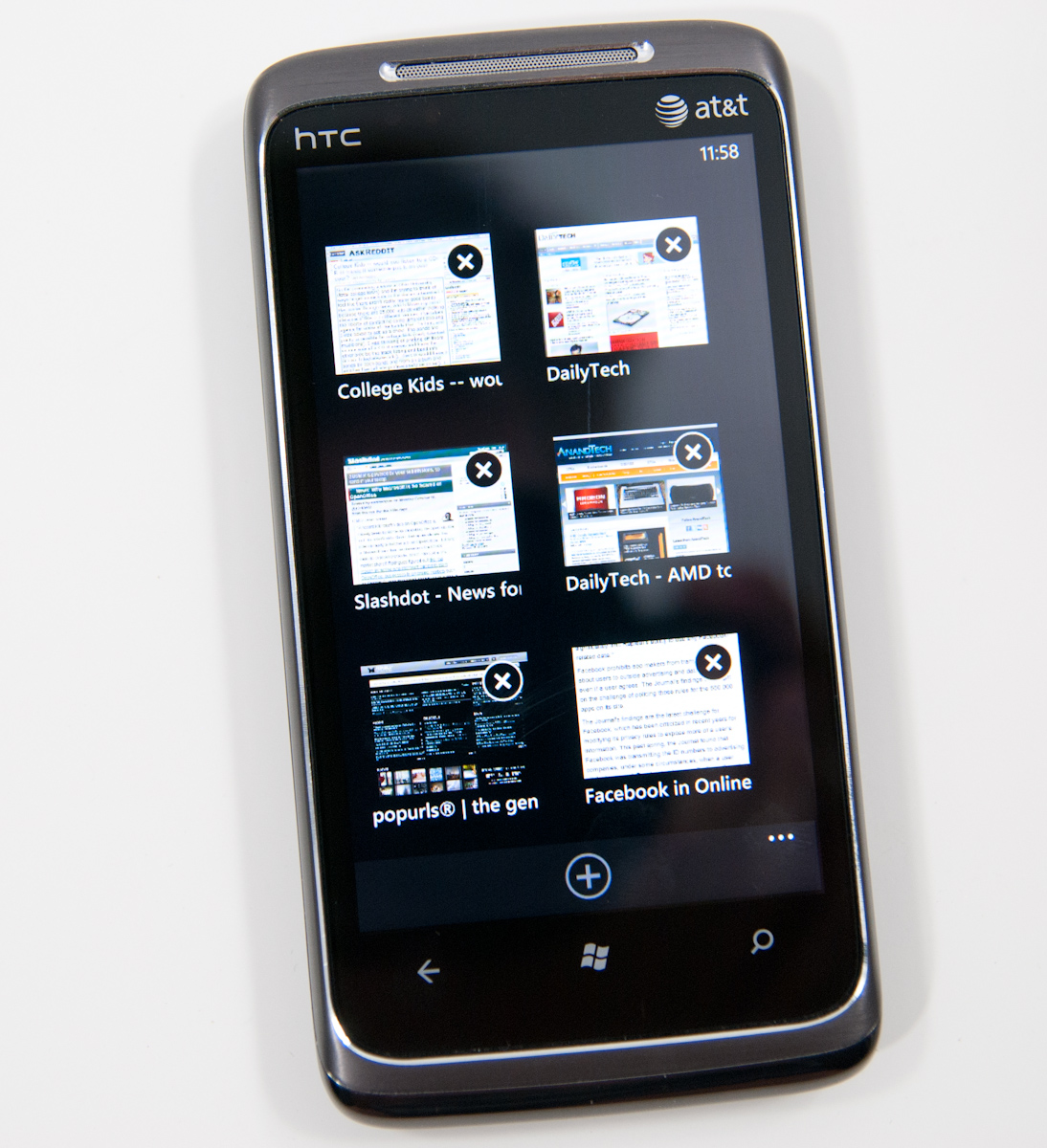
In practice, switching between tabs is very fast, as is closing many windows. It happens all with a very 3D feel and a steady framerate. It’s hard to argue that WP7’s tab switching interface isn’t as good or better than the competition’s. Pages also continue loading if you close the browser and go do something else.
The inclusion of find in IE is a nice addition, something Android has that iOS still lacks in mobile safari. Enter a search term, and you’ll get highlighted matches throughout the browser and next/previous buttons at the bottom that cycle through instances. You don’t get the number of matches like Android provides, but find on page is at least there.

Similarly, you can pin any page to the start screen. Tap that, and a screenshot of the page shows up on the start screen in a tile of its own:

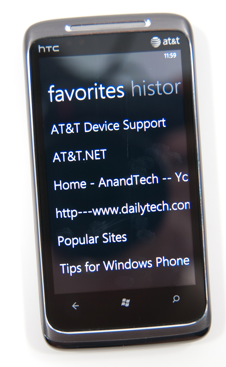
It’d be nice to see the tile reflect a current version of the page rather than the appearance it had when the tile was created - similar to how desktop browsers cache thumbnails of frequently visited pages - but this works. The favorites list is a bit spartan, consisting of a simple list of entries. Long press and you can edit or delete entries, but not change their order. Swipe left or right, and you’re at history.
One of the most common copy and paste workflows I find myself using on other platforms is simply sharing URLs. While there’s no copy paste support on WP7 yet, “share page” from the expanded menu does let you dump the current page’s title and URL into an email or SMS. You’re still somewhat out of luck if you want to share something on Twitter or another application, but copy and paste is coming soon.
There’s landscape support in IE, but you lose all of the UI elements and the browser window fills the entire screen. On one hand, you get the most possible browsing area this way, but sacrifice the URL bar, status bar, and all of the other controls. The downside to this layout is that every time you want to enter a different URL, you’ll have to rotate to portrait, enter it, and then swap back. Same if you want to change tabs or use a favorite. That can get a bit frustrating if you’re used to viewing pages in landscape, but not totally killer. There’s an impressively fluid rotation transition between portrait and landscape, however.

So how is the browser in actual use? Extremely usable and speed up dramatically since last I saw it, but there are definitely a few rough spots. It’s completely usable as it stands.
First off, panning and translating around pages is incredibly fast. It’s iOS level fast if not faster. That includes moving around pages, pinch to zoom, double tap to zoom, and inertial scrolling way down a page. IE does an impressive job keeping up with even extremely fast scrolling up or down a page. No doubt this is due partially to GPU accelerated UI. Android has some serious work to do here, as translating around on pages and multitouch zoom frequently feel choppy.
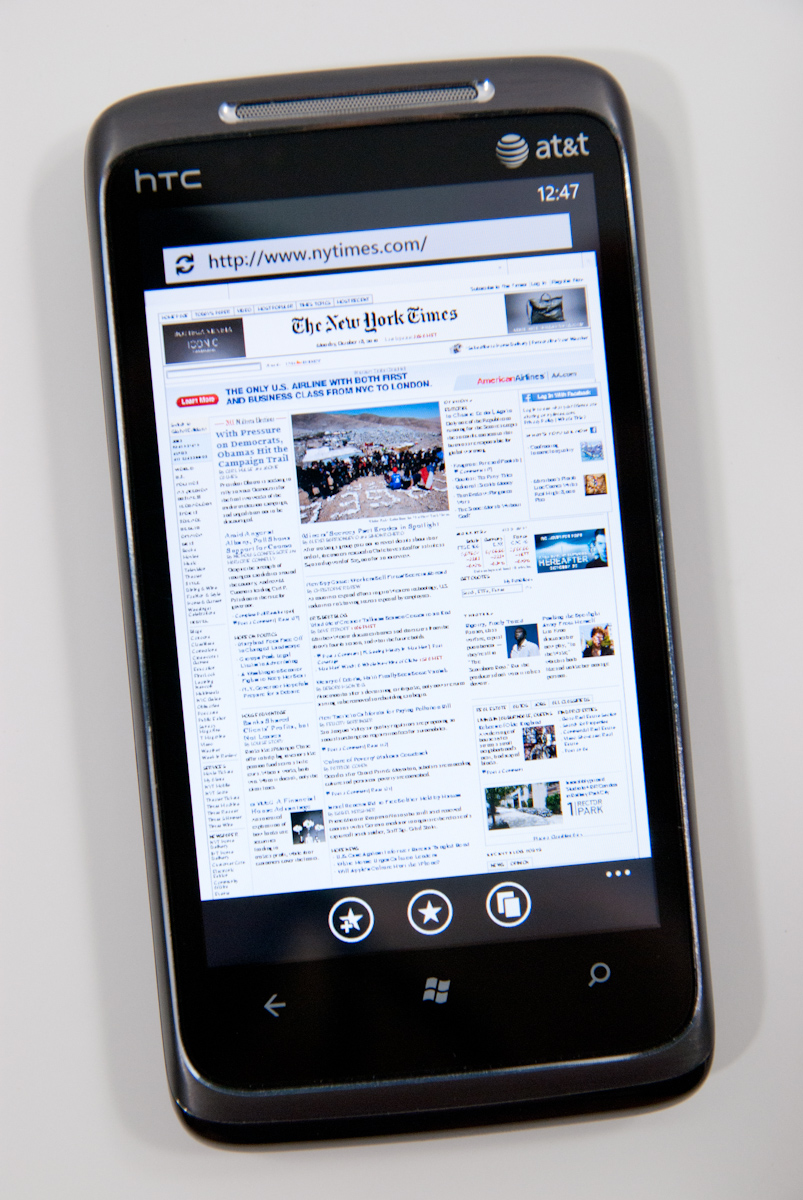
I spent an entire week with WP7’s browser visiting every site I could think of, and have yet to run into a site that doesn’t render properly. Apple showed off the New York Times homepage in some of its earliest iPhone ads, and Microsoft briefly showed off WP7 rendering the NYT homepage at MIX10. Here it is again:
What’s a bit strange is how small fonts are rendered when one is zoomed completely out. Check out the AnandTech homepage, for example:

Click to enlarge
Up close, small text appears aliased and blocky, like a bitmap. The problem isn’t that text isn’t readable zoomed all the way out (it can’t be), it’s that it lacks the antialiasing larger text gets. If you quickly zoom in, that texture is enlarged and there’s a second long pause (or more sometimes) before text is re-rendered smoothly.
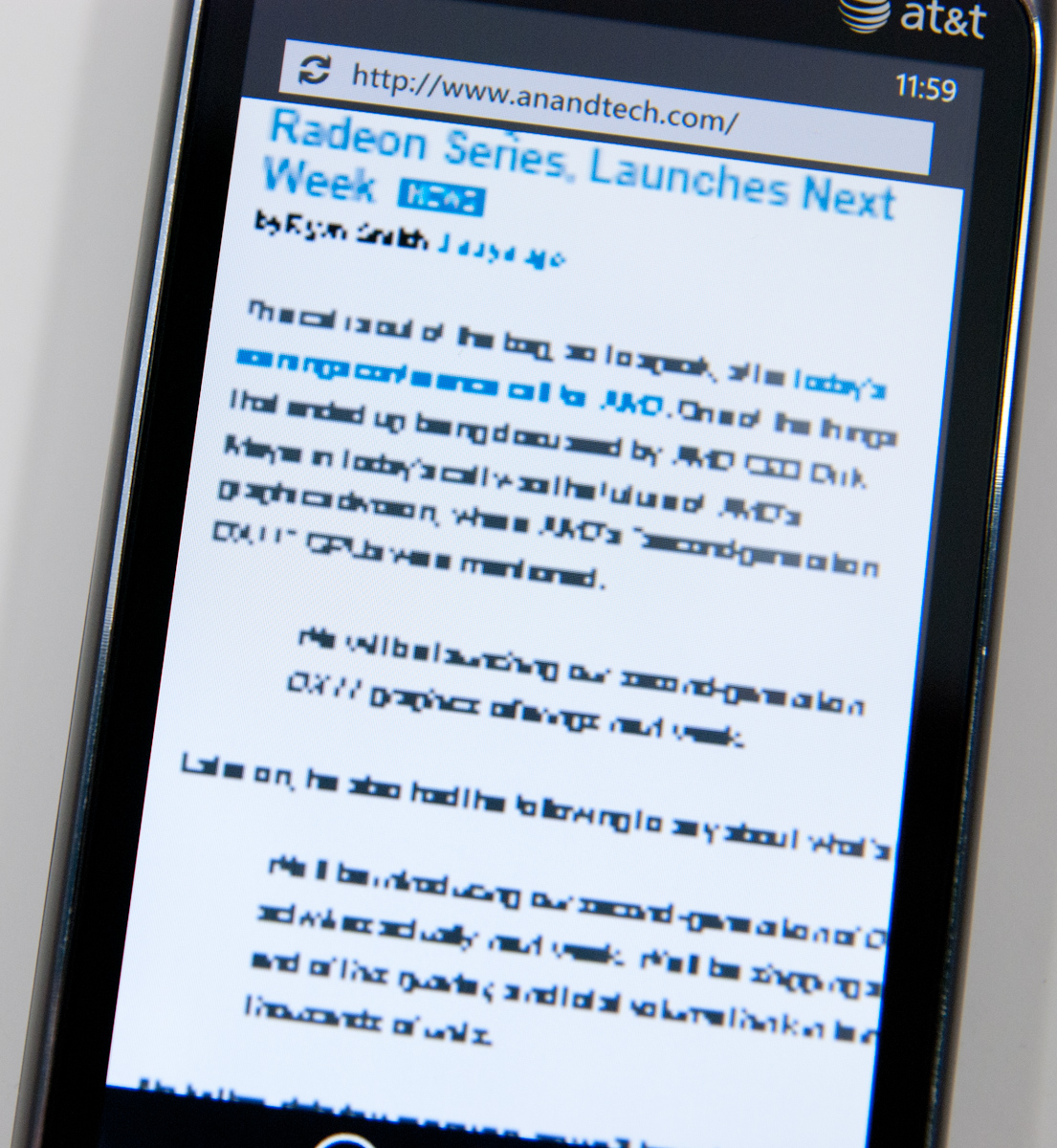
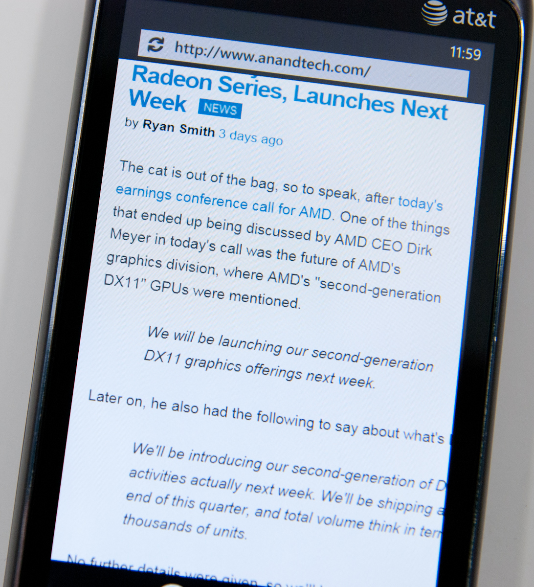
It’s clear that what WP7’s mobile browser is doing is rendering a large texture with the webpage, and then using a translate transform and clip (two inexpensive GPU accelerated operations) to pan the window around so smoothly. The downside is that if you zoom in a lot, you’ll blow that texture up and see the above while the browser re-renders at the new zoom level. What’s strange is that after a certain size, text is nicely anti-aliased - look at the after photograph above and it’s obvious that WP7 is doing subpixel font smoothing just like it should be.
It’s a minor nitpick, but still there. It isn’t quite the level of cheating that Opera mobile does with small text when zoomed out fully (it renders what look like grey boxes after a certain level), but some more font smoothing would be awesome.
There’s also an occasional texture flash when switching between tabs. Change the tab and you’ll go from placeholder image icons to the actual photos after a very brief pause. It’s subtle, but noticeable. Take popurls for example:
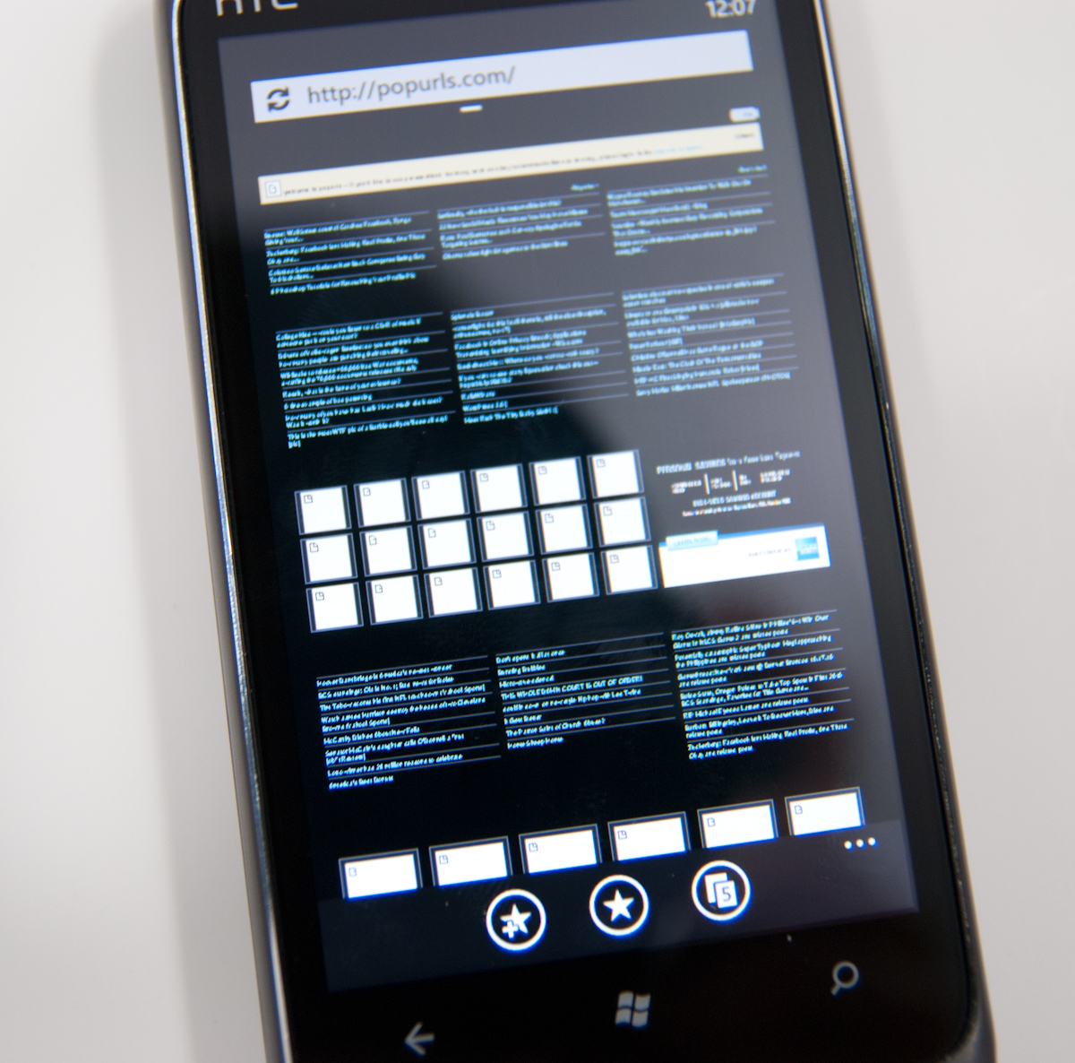

It isn’t quite as bad as how iOS will completely dump a page and completely load then render it again (effectively double loading pages occasionally - which is admittely nice way to increase apparent browser market share), but it is there. This quick texture load happens more often when you’ve got lots of tabs open, but what’s strange is that not all images do the flash - only some. Then the reason occurred to me.
We’ve talked briefly about how WP7 strongly leverages the GPU for rendering the entire UI. Almost every transition and animation is carefully comprised of a few actions which are essentially fast, GPU-accelerated primitives, and there are just a few of them: translate transforms, perspective transforms, opacity, and rectangular clip. Interestingly enough, WP7 also has a few GPU accelerated media decoders, including for stills, but only JPEG gets GPU accelerated rendering, PNG is done entirely in CPU.
The textures that seem to flash most often on the AnandTech homepage at least are PNG in nature. But it still does happen to JPEGs like on the popurls page.
It isn’t that big of a deal, but it does lend some insight into how the browser window can feel so fluid panning around.
It’s really amazing how fast and capable WP7’s browser feels, and having a competent, modern browser is of huge importance for any modern smartphone platform. Microsoft has done a great job making Trident feel snappy, but where it falls short are some of the popular web standards compliance tests.
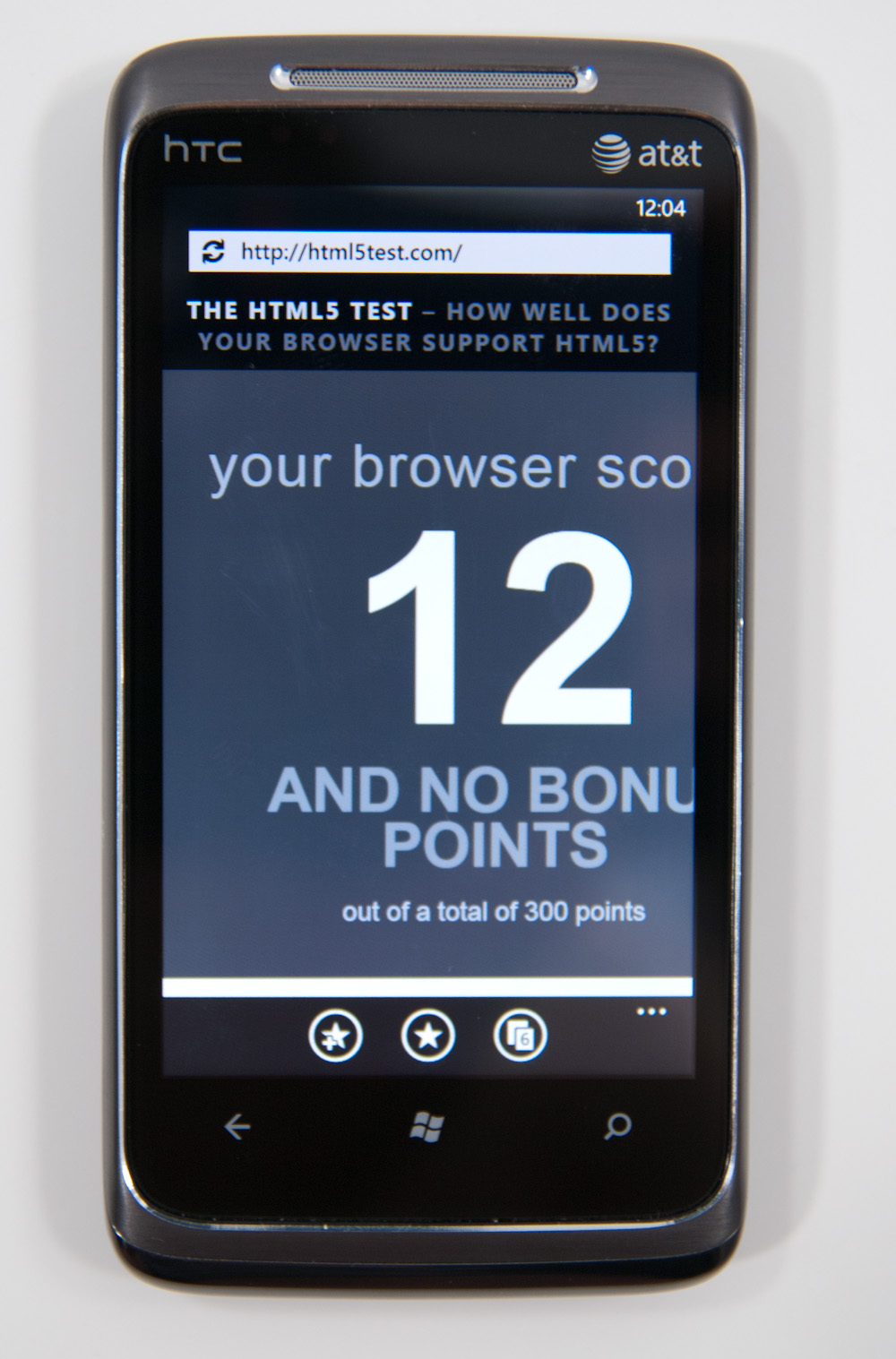
WP7’s browser just doesn’t do very well at Acid 2, Acid 3, or the HTML5 test. The results are pretty self explanatory:
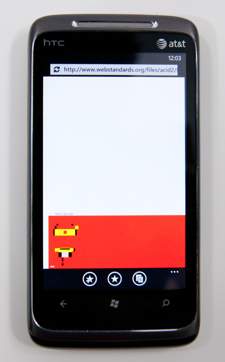
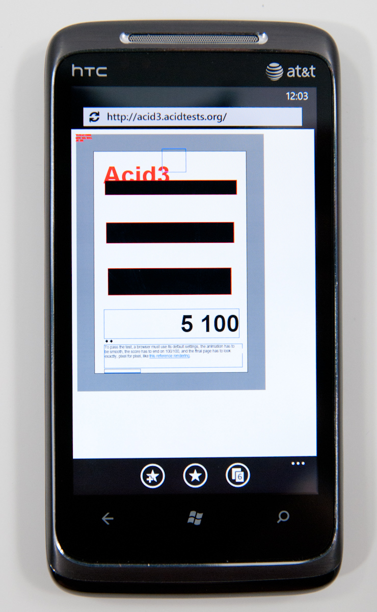
What’s shocking however is that, so far, it hasn’t really mattered. I’ve spent a week using WP7’s browser, testing every page I can think of that I visit on a daily basis, and have yet to encounter anything that doesn’t render properly or crashes the browser. Never once have I been want for more in fact, outside of the font rendering qualms we noted prior.
Obviously, better HTML5 support is the future, but it’s pretty shocking just how usable the browser feels otherwise while still scoring so poorly on these tests.
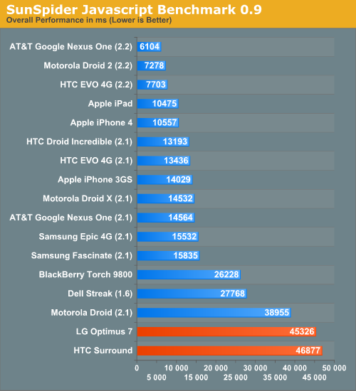
Unfortunately, JavaScript performance isn’t WP7 IE’s high point either, nor is BrowserMark, both of which it scores pretty abysmally in.
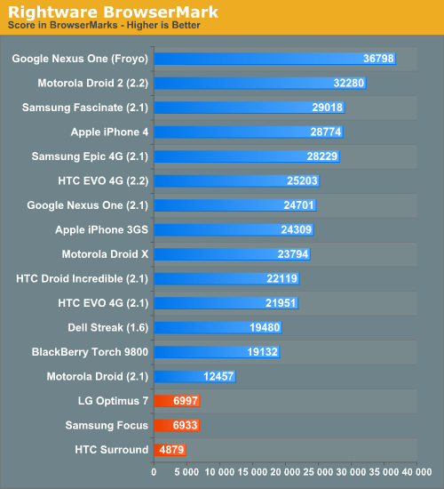
This is one area where Android holds a huge lead, and where Microsoft still needs a faster JavaScript engine. Same for actual page loading times, which are just longer than everyone else’s no matter how you spin it:
What’s surprising is that in spite of all this, the WP7 browser feels fast. It’s amazing just how much extremely fast UI can change one’s perception entirely. Slower page loading times aren’t as big of a deal anyways, since you can leave the browser and go do something else entirely while the page keeps loading. It’s obvious that WP7 makes a WebOS-like tradeoff here, sacrificing snappiness in some places for the ability to go do other things while pages are loading.
There’s no flash support in WP7’s browser right now, but it’s already on Adobe’s radar for the near future. A faster JavaScript engine and faster loading times would definitely be nice, but the browser as it is at launch feels extremely fluid in its current version.
Microsoft has done a lot with Trident and IE8 code in WP7’s browser - they claim that it lies somewhere between IE7 and IE8 in reality, but it’s hard to not argue that still more must be done. WebKit definitely remains the reigning champ in the mobile browser space, now powering essentially every smartphone platform: iOS, Android, BlackBerry 6, WebOS, Symbian, and MeeGo all use it. The irony of the situation of course is that IE9 made its earliest debut at MIX10 the same time WP7 did, and thus the improvement path is obvious. WP7 needs to eventually get IE9 code onboard and deliver much improved HTML5 compliance and JavaScript performance.
My final parting remark about IE on WP7 is that Anand and I both found ourselves occasionally confused by the back button. It sounds simple, right? You can be browsing along, and as long as you don’t leave the browser, back does what you’d expect it to do - take you back. However, if you hit home and leave the browser, then come back in and hit back, you’ll just get taken outside again. The result is that you essentially lose your back history whenever you leave the browser. Not a killer deal, but there should at least be session preservation so that back always works like a browser’s back button should, not like WP7 contextual navigation does.


125 Comments
View All Comments
bplewis24 - Thursday, October 21, 2010 - link
Check out page 26. It's dedicated completely to how the "update" process works. In short, it's more like iOS than Android....which is sounds like you'd prefer.ishbuggy - Thursday, October 21, 2010 - link
Yeah I accidentally skipped that page :PI really hope it works out as well as Microsoft hopes it will
Voldenuit - Wednesday, October 20, 2010 - link
Will AT be reviewing the Nokia N8 and E8 Symbian phones? Nokia is pretty obscure in the States (since they mainly sell direct from their website, with no carrier subsidy), but are pretty big in Europe and Asia.epyon96 - Wednesday, October 20, 2010 - link
Anand,With such a glowing review from you, it's almost enough to bump Windows 7 above my initial choice of getting a blackberry. I need a physical keyboard. I'm very picky about it. You are simply a very engaging writer.
I really hope Windows 7 mobile comes up with a superior keyboard version
VashHT - Thursday, October 21, 2010 - link
The Dell phone coming out looks like it will have a really nice keyboard, I think it is called the venue pro. Also ATT is supposed to have a keyboard phone by LG I think.heelo - Thursday, October 21, 2010 - link
The Venue Pro *looks* great, but it's somewhat of a monster in size and weight.If I weren't stuck on a T-Mobile family plan, I'd probably opt for that LG Quantum. Like Anand said, WP7's interface is extremely usable on smaller screens, and the reasonable form factor and physical keyboard likely make for a very convenient real-world user experience. The drawback is that the looks and (supposedly) build quality are sub-par.
EarthwormJim - Wednesday, October 20, 2010 - link
OMG a screenshot of me in action is on the Xbox Live page!! Woo-hoogstrickler - Thursday, October 21, 2010 - link
That's the ugliest and least interesting home/start screen I've ever seen on a smartphone. It may be functional, but even a 6 year old crackberry looked better (and I don't like the BB). The rest of the UI doesn't look too bad, but the start screen needs some work.bplewis24 - Thursday, October 21, 2010 - link
I couldn't agree more. I find it funny that people are claiming this UI is "100% right" as if everybody is going to like it. Obviously it's a matter of preference, but I just cannot see the overwhelming majority of people getting into this UI. I find it appalling to look at and couldn't imagine using it every day.Brandon
B3an - Thursday, October 21, 2010 - link
Dont know what you're smoking but most people prefer an easy to use simple looking UI thats functional rather than cluttered eye candy.From the vids i've seen it seems to be the smoothest running, most functional, fastest, and natural UI on any phone to date.