The Windows Phone 7 Review
by Anand Lal Shimpi & Brian Klug on October 20, 2010 7:00 PM EST- Posted in
- Smartphones
- Windows Phone 7
- Microsoft
- Mobile
Putting the Phone in Windows
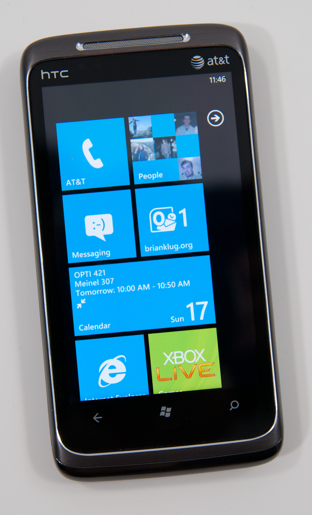
Though Windows Phone 7 doesn’t have a dedicated phone button, there is emphasis placed on calling as evidenced by the Phone tile being top left on the start screen. The tile - like others - displays a number corresponding to the number of missed calls or voicemails. The carrier string is relegated to the bottom left of the tile - the same size and style as other text.
Phone’s tile does change as you miss calls and get voicemails:

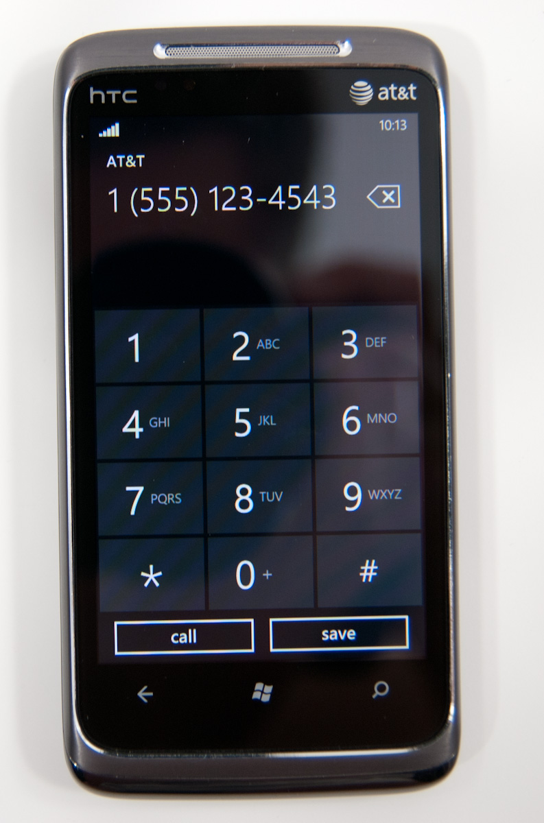
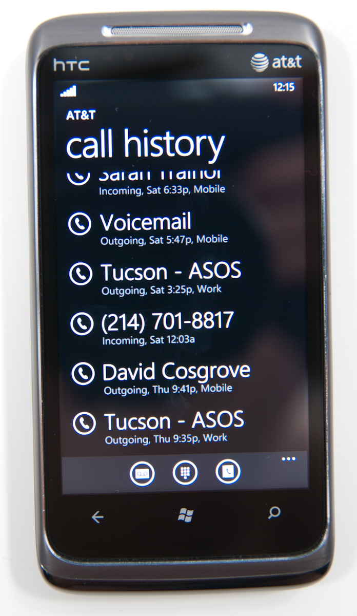
The dialer itself is very spartan. The application opens up to the call history pane by default. Opening the dialer pad requires tapping on the keypad icon at the bottom. To the left and right are links to voicemail (there’s no visual voicemail support, this just dials your voicemail number), and people tile respectively. Expanding the option pane brings you into phone settings or lets you delete all the call history.
The call history list itself is again very basic. Tapping on the phone symbol to the left of entries immediately dials the last called number, and tapping on the item itself just brings up the contact entry in the people tile. What’s missing here is the ability to see individual call duration, or break down your contact history with a specific number. The only information you get is when the call started, whether it was incoming or outgoing, and whether the number was associated with work, home, e.t.c.
The keypad interface itself is probably one of the most simple I’ve seen before - dialing a number doesn’t get you smart dialing abilities or contact lookup. You’re just entering numbers. It’s clear (rightfully so) that Microsoft expects most calls to happen from contact entries or the call history. You can also pin contacts to the start screen.
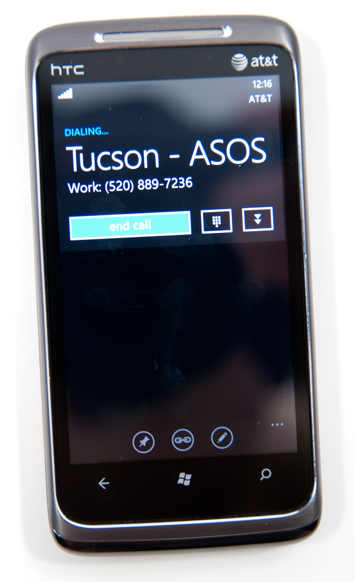
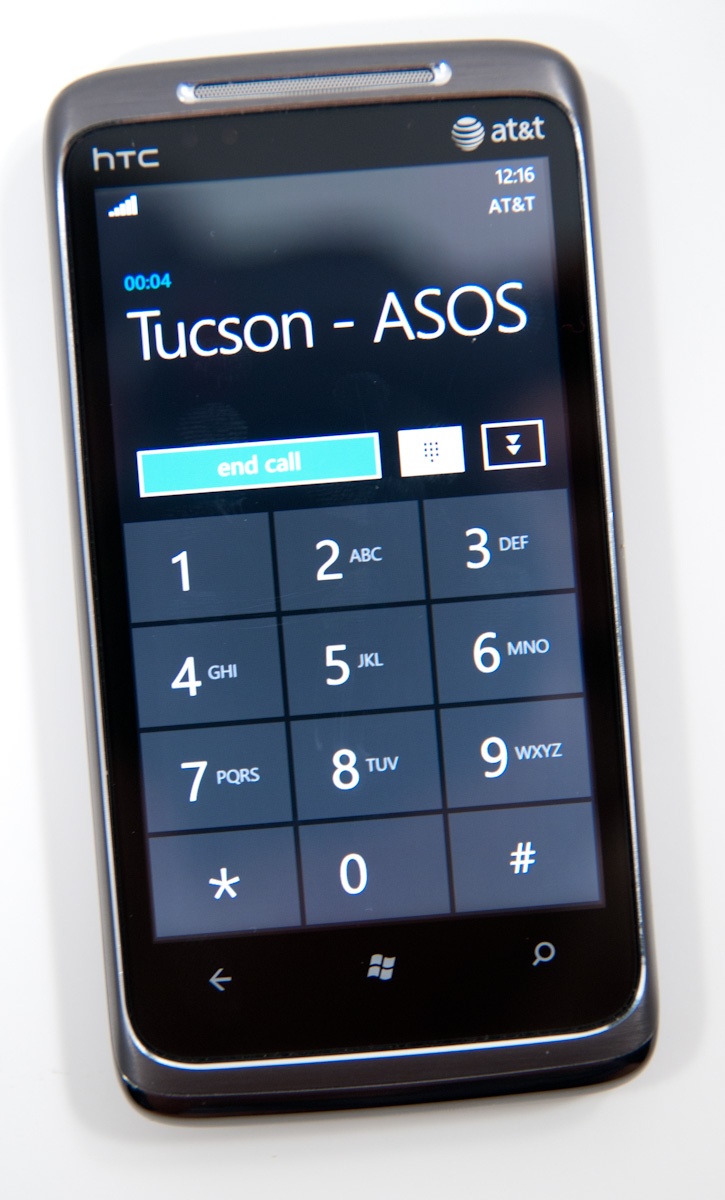
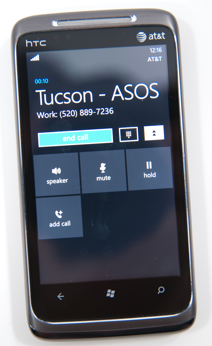
Where WP7’s core phone functionality differs from others is how it transports the dialer UI basically anywhere. Fire up a call, and you’ll get an overlay with the call duration, name, and number. At right are buttons to bring out the keypad, and expand a shade with options for call management.
Hit the windows button, however, and everything rolls up into an accented notification strip just like we see for incoming messages. The text alternates between tap to expand, and the current contact’s name and call duration. What’s even more interesting is the way the notifications bar shows you the signal bars when you’ve got a call in progress - most of the time everything is hidden unless you tap on the top of the screen, then status indicators elegantly drop down.
Tapping on this brings down the dialer overlay again - the best part is that the window underneath goes transparent. It’s slick in practice and nicely animated with Metro 3D transitions.
What’s nice is that again the dialer UI is basically transported anywhere on the phone - it isn’t just relegated to a standalone application but instead is inherently a part of the phone from any perspective.
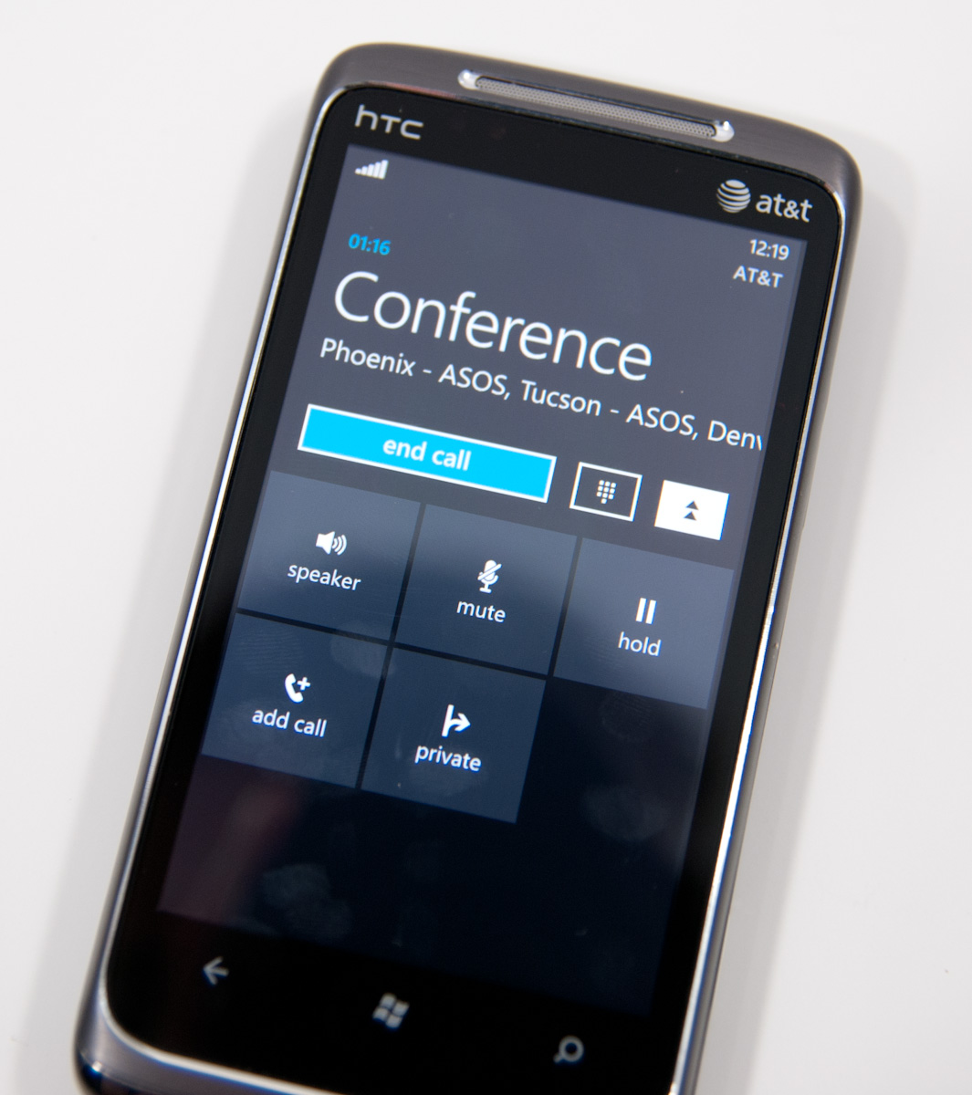
There’s conference support as well if your carrier and plan support it. I tossed a ton of ASOS numbers into a conference. Tapping on the conference title brings up a new window with a more readable itemized list of each line that’s going. If you’re just juggling many calls without doing a conference, the status notification at top changes to “tap to swap.” It’s obvious that someone really thought about getting this right.
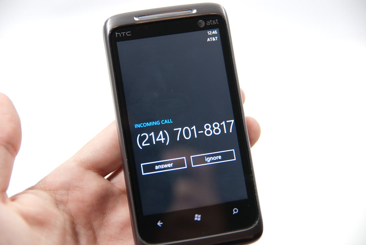
Finally, incoming calls are handled with a full screen overlay with answer and ignore buttons. If the incoming caller has a contact photo, the entire background is that photo.
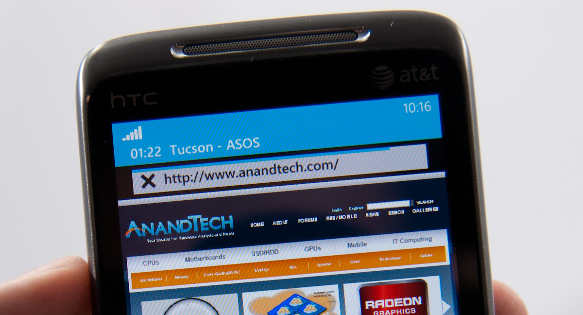
While WP7 has done a good job making the notifications bar blend in and rotate appropriately in landscape, I did catch one edge case that seems strange. In the browser, I pointed out that you can get messaging notifications in landscape, dive in, reply, and emerge back where you were with the back button. Look where that notification comes up:
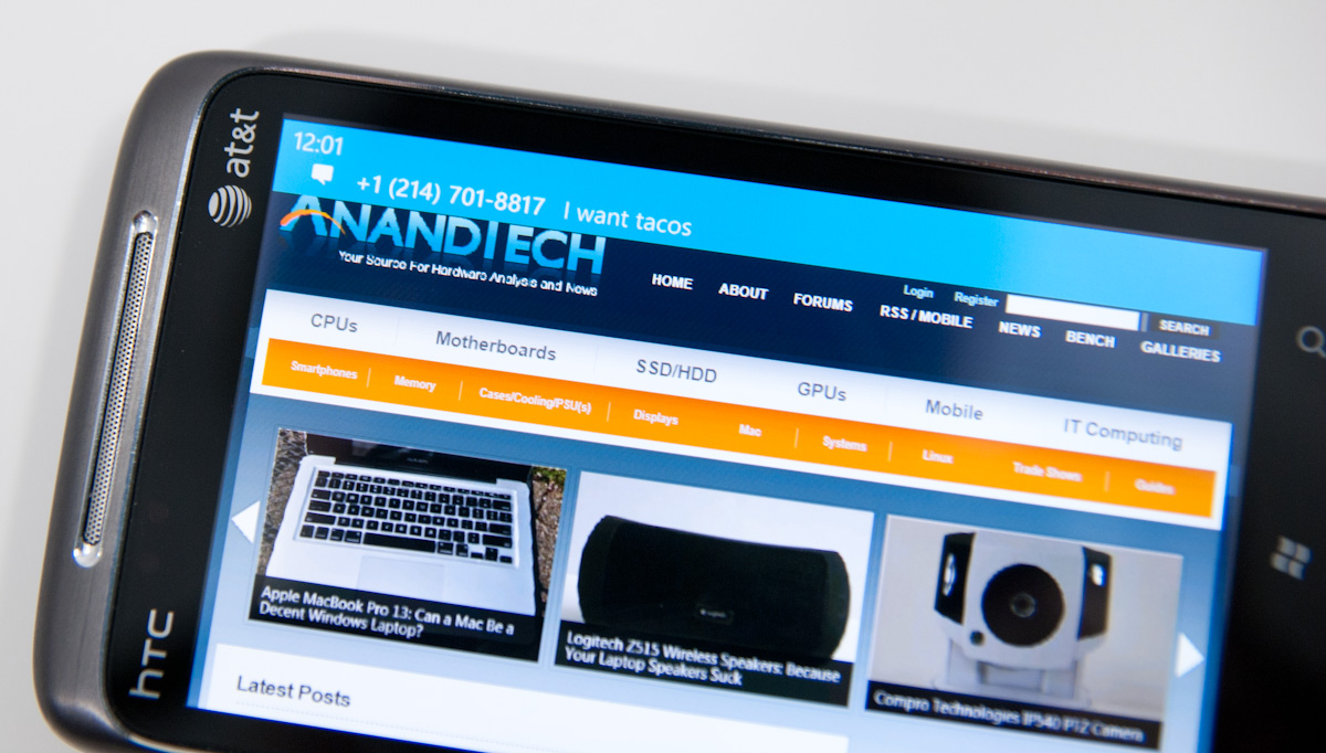
Now look at where the call in progress strip is in the browser when in landscape:

I think this is just a minor inconsistency that was overlooked, otherwise I’ve only found two more occurrence of WP7 mixing landscape view with portrait elements. More on those two in a second.


125 Comments
View All Comments
Crono - Thursday, October 21, 2010 - link
A lot may not have been taken from the Kin One and Kin Two, but the square, multi page Start is the same concept that was implemented in the Kin phones.Looking forward to moving from my Kin One to the Surround. Microsoft is offering 3 months free Zune Pass for those who sign up to be notified about preorders.
heelo - Thursday, October 21, 2010 - link
You might be the only owner of a Surround.That thing has a "value proposition" that I'm really struggling to relate to.
peter7921 - Thursday, October 21, 2010 - link
I have to give recognition to Anandtech for another great review. I have been looking for a detailed review on WP7 and you guys delivered. Not only is it extremely informative but it's also very well written. I read through it all, not once feeling bored or skipping ahead.These types of articles are the reason Anandtech is my first source for all things tech!
Keep up the great work guys!
Confusador - Thursday, October 21, 2010 - link
OK, wow. I mean, even by Anandtech's unusually high standards that was intense. Just one thing I'm not clear on, though... am I reading this correctly?"WP7 calls presents its browser user agent as “Mozilla/4.0 ...""
If that's correct we've come a long way from the days I had to have Firefox masquerade as IE to be effective.
Guspaz - Thursday, October 21, 2010 - link
IE has *always* done this, including on the desktop. IE6 reports as as Mozilla/4.0 too. IE2 also did it (a different version of Mozilla, though). A quick search didn't turn up IE1 user agent strings, but I assume it also did.Spivonious - Thursday, October 21, 2010 - link
Remember back when IE was introduced, Netscape was king. Netscape is based on Mozilla. That's the only reason it's in there - so pages made for Netscape would load correctly in IE.arturnowp - Thursday, October 21, 2010 - link
IT seems strange that WP7 cannot pass test, has very slow JavaScript engine but still pages are fluid and displayed porperly. Maybe Microsoft renders pages remotely and serves them to the phne?UCLAPat - Thursday, October 21, 2010 - link
Wow! After reading this review, it makes all the other reviews look like previews. Definitely going to be considering WP7 when it's time to upgrade my phone. Still have time to burn on my current 2 year contract. By the time it's up, LTE should be up and running and Verizon will probably have a WP7 device for us to consider as well.Apps will come. But they're not a huge part of my life anyway. I want a rock-solid core experience for a phone. A smartphone has to nail the basic experiences first (calls, messaging, calendar, etc). I never liked the main screen completely filled with app icons. That reminded me too much of my old desktop computer before I cleaned up the desktop.
Belard - Thursday, October 21, 2010 - link
But very detailed... tells us pretty much everything anyone can ask.Thanks...
While I'm not exactly PRO-MS... its good to see good design.
I still like Google's a bit more and its shortcoming are easy to spot. Hopefully Android 3.0 will improve on its weaknesses.
The icon / naming is well thought out and is used by others... including Apple, but not on a phone.
silverblue - Thursday, October 21, 2010 - link
"...displays up to 8 tiles of people you’ve either recently communicated with or whose profiles you’ve viewed/stalked."LOL.