BlackBerry Torch 9800 Review: Keeping RIM's Flame Alive
by Brian Klug on September 1, 2010 7:00 AM EST- Posted in
- Smartphones
- Torch
- BlackBerry
- Mobile
Rest of Platform
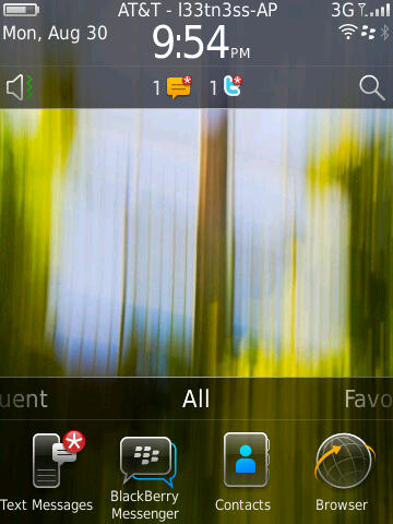
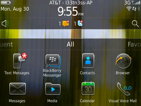
The other big change on BlackBerry 6 is the home screen, which is definitely an evolution of BlackBerry OS 5. If you’re coming from there, this is going to feel like largely familiar territory. By default there’s one row of applications in the navigation bar.
|
Left: Home - Portrait, Right: Home - Landscape
|
||||
 |
 |
|||
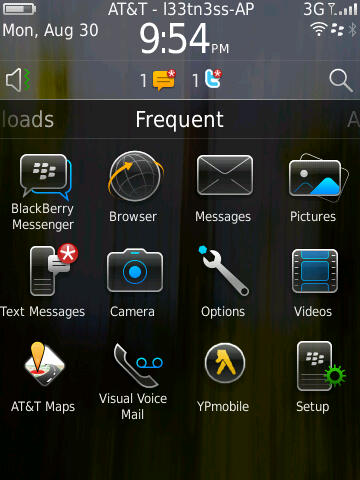
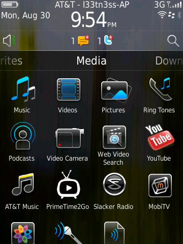
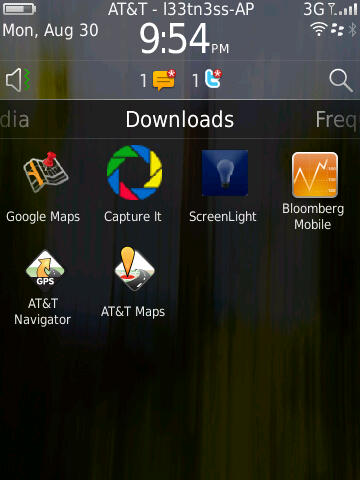
What’s different is that you can now drag the panel left and right, from all to favorites, media, downloads, and frequent.
|
BlackBerry 6 - Application Launcher Panes
|
|||||
 |
 |
 |
|||
Press and hold, and you can drag the navigation bar up to show one, two, or three rows of applications. Tap the top, and you’ll cycle between showing the bar, and not showing the bar. What makes the platform feel a bit slow is that there seems to be some built in delay between when you swipe from panel to panel, and when the transition takes place.
|
Left: No Rows Shown, Right: Move Options - Long Press
|
||||
 |
 |
|||
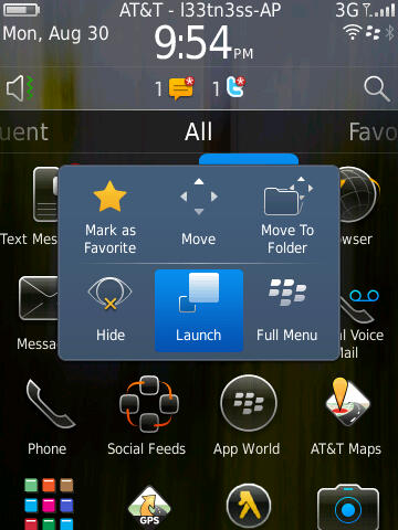
You can also long press on icons in the launcher and either move them around, or organize them. What’s a bit strange here is that after you’ve tapped and selected move to rearrange icons, the trackpad is then used for actually moving icons - you can’t use the touchscreen. This is just a bit confusing, and probably the only glaring part of the OS that shows a touchscreen/trackpad disparity.
There’s also nothing you can do with the blank unused space when you’ve closed the navigation bar. This would be an otherwise ideal place for some Android-like widgets.
|
Left: Notifications Expanded, Right: Connections Manager
|
||||
 |
 |
|||
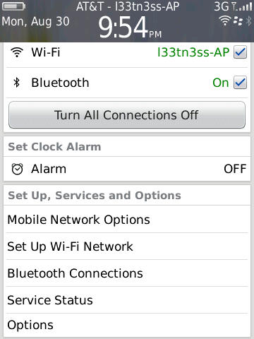
Up at the top is what RIM is calling the quick access area. Tap in the upmost portion, and you’ll bring down a window for managing active connections, alarms, and status. It makes sense - tapping on the region with the clock, signal status, and date should bring you to a pane where you can manage it.
I’ll also note that up at the top is the carrier string, and after the dash is the SSID of the active WiFi network you’re connected to. I don’t really know why RIM chose to present you with the name constantly, but there it is.
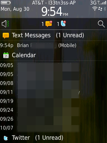
Down below that is the notifications bar, which populates with new notifications - things like new messages, BBMs, email, twitter replies, and even calendar alerts. Tap on it, and the bar swings down revealing a detailed and itemized look at what’s going on. Tapping on an individual alert brings you directly to whatever triggered it. What’s frustrating here is that there isn’t any quick way to clear everything - for that, you have to either manually read everything, or go in messages, shift select everything, and mark opened.
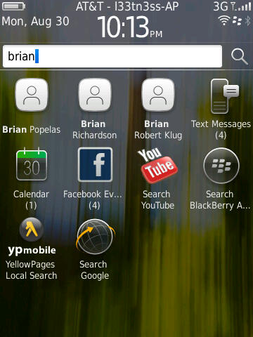
Likewise, tap on the speaker symbol, and you can change the sound and alert policy. Start typing or tap the magnifying glass, and you’re using universal search.
|
Left: Universal Search, Right: Search Options
|
||||
 |
 |
|||
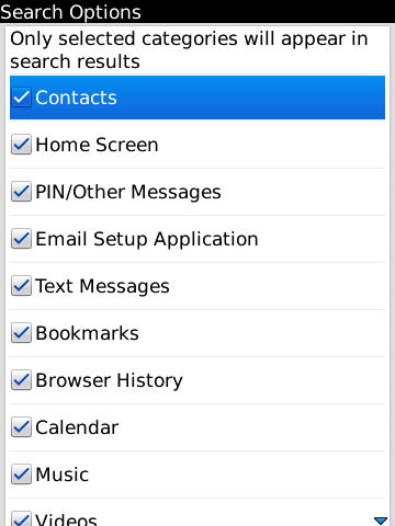
I found myself using universal search quite a bit, as it does a good job. By default, it searches everything, including BBM, but doesn’t quite search inside conversation text itself. Thankfully you can enable and disable searching basically anything on the device by tapping menu and selecting search options while in the search bar.
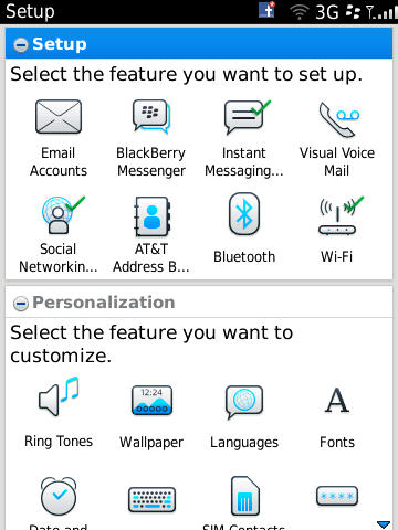
Before I go any further into the preinstalled applications, I want to make mention of BlackBerry 6’s completely revamped options and setup windows. Smartphones are no doubt still complicated to many, and getting everything configured on a brand new device for a first timer is no doubt still daunting. Device manufactures and carriers often look at return rates as an important measure of device success. It’s obvious with this feature that RIM wants to both make initial setup straightforward, but also make sure it’s got the low return rate metrics to back up how usable their devices are.
The setup screen does look nice. Right after you power on the device for the first time, you’re essentially dumped here. It makes sense really, probably the first thing I always do on a device is setup my email accounts and sync calendars and contacts. True to form, all of that is here.
Further down are related personalization options, and then tutorials. Even though I might not need features like this, it really does help make the setup process and initial getting started learning curve less of a brick wall for your average device shopper.
|
Left: Options, Right: Setup
|
||||
 |
 |
|||
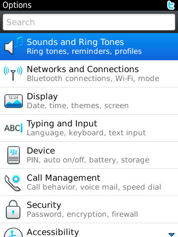
The only downside is that right next to ‘Setup’ is ‘Options.’
Options is what it should be - all the controls and settings are listed under 9 different categories, or you can start typing and find something fast not unlike System Preferences on OS X. Everything in here is nicely organized, and searching for specific things gets you around pretty speedily as well.


It’s admittedly a bit confusing to have two different settings applications next to each other, though I understand why RIM did it here. There’s some duplication of functionality - for example, you can ‘setup’ WiFi or get to the menu from Options, both of which get you to the same place.


41 Comments
View All Comments
Kamen75 - Wednesday, September 1, 2010 - link
Rim needs two different BB lines to meet the needs of the two different types of customers they are selling to. They should have a BlackBerry Professional version of there os for corporate clients and then a "fun" version to sell to the average consumer. These two os's only need differ on a few security points and each gets a different ui, one to look business like and one to look flashy and bright. Underneath they would be the same os and run the same apps. Their current middle of the road, one size fits all approach is turning all customers away.Add in some decent hardware and you would have a competitive BB again. Two year old hardware specs impress nobody.
Zensen - Thursday, September 2, 2010 - link
that's what themes are for...RIM just needs to work on better tools for developers since what they've managed to do on the business level is second to none and I feel the overall improvement of OS 6 has done just enough to grab enough of the spotlight to be fresh yet familiar without being burdened by the lower specs that have dogged it since the its release.
There are still quirks in the OS 6 model that needs addressing such as in the social feeds but nothing that can't be solved via updates and UI changes. OS 6 has thrown away utilitarian menus and brought it up to speed with the other Operating systems. It hasn't leaped over like a triple axel but it's more like a combination of moves that will culminate in a much more successful Blackberry phone in the eyes of the average consumer, hopefully dispelling some of the noise that RIM can't do a touchscreen phone to save themselves.
I'm glad anandtech have finally covered this phone. Good or bad you can rely on these guys for great technical review without putting in ridiculous remarks or bias towards a product that reviews like engadget have seemingly perfected.
zorxd - Wednesday, September 1, 2010 - link
I am disapointed that Acanac fell into the Apple marketing trap which is PPI. Who cares about PPI? Do you really think that it's better to have a 1" 320x480 display than a 4" 480x800? The first one have higher PPI.Apple started to talk about PPI (even before pixel count) when they realized that the competition was going with larger displays. Larger display, with the same resolution, means lower PPI, even if it's better.
What looks sharp is not PPI. It's pixel count. Just hold your 4" 480x800 farther away if you think that pixels are too big. A 1x1 pixel 1000000000000 PPI display is useless.
So please, stop making graphs about the useless metric which is PPI and start comparing what we actually care about: brightness, size, resolution, etc.
raulr - Wednesday, September 1, 2010 - link
Have you actually looked at the iPhone 4 display. It really is quite fantastic. And especially since this review is about the Torch, your display size argument is pointless since the torch is both physically smaller and lower resolution. The point they were making is that the Torch display, while not bad, really doesn't stack up with the current generation of devices.zorxd - Wednesday, September 1, 2010 - link
The iPhone 4 display is one of the best, I agree. Why? Because it has the highest resolution. The PPI have nothing to do with that. The iPhone display would be even better if it was larger, even if that would mean lower PPI.Of course, the phone would probably get larger too, which is a downside.
What I mean is that the highest PPI is never, or at least should never be an priority for any consumer.
The iPhone display would suck if it was 2" instead of 3.5".
MacTheSpoon - Wednesday, September 1, 2010 - link
He is right, though -- nobody cared about PPI before Apple started their marketing. Now suddenly it's the standard by which screens are judged. Weird.I have looked at the iPhone4 screen and while it's nice, it's nowhere near as nice as all the marketing and buzz make it out to be. I cannot read all that sharp yet incredibly tiny web page text without a magnifying glass. I'd say it's about 20% as nice as all the hype. A large screen that lets you see more of your web pages in an actually readable way is certainly nice, too, probably a little bit nicer -- and yet for some reason the iPhone4 gets a pass on this readability issue from all the reviewers, just as Apple hoped. Honestly, having seen the iPhone4 screen, its main benefit is in browsing photos, which look really smooth, but who uses their phone mainly for browsing photos? Not that many people, I'm sure.
I believe that the whole PPI thing came about because Steve Jobs realized his 320x480 screen was getting long in the tooth compared to other phones but a) didn't want to change the dimensions of the current iPhone and b) wanted to make the existing iPhone layout and apps easy to port by simply doubling the screen resolution. So he pushed the PPI angle hard and zombie reviewers got in line.
bplewis24 - Wednesday, September 1, 2010 - link
Great post.Brandon
synaesthetic - Friday, September 3, 2010 - link
Lots of people care about PPI, just not so much on smartphones.I hope Apple's obsession with PPI and the Retina Display pushes the trend into *laptops,* so I can finally stop seeing 15.6" laptops with 1366x768 horrible LCDs.
Jabroni444 - Wednesday, September 1, 2010 - link
I'm confused by conflicting statements in this review. Half way through the conclusion he says, "I’ve described the Torch as anywhere from a quarter to a half generation behind - I think that’s the best way to describe performance." But, the last sentence is, "The Torch is what RIM should have launched years ago in their stead."Combined with the fact that the Torch both statistically and measured performance wise is no better than the iPhone 3GS or other last-gen phones I don't get the quarter to half generation behind comment.
I'm not sure whether even hardcore RIM users are going to be able to accept weak attempt at getting up-to-date.
tech6 - Wednesday, September 1, 2010 - link
A very balanced review. This device isn't for techno snobs or people who like to show off apps - it's still a business communication device. While anecdotal, I know a number of BB users which looked at Apple and Android but decided to go with the Torch instead. Without exception they are happy as it gives them the new functionality they wanted but without leaving the BB strengths and advantages behind.