Anand's Google Nexus One Review
by Anand Lal Shimpi on April 3, 2010 3:40 AM EST- Posted in
- Smartphones
- Mobile
It’s Mac vs. PC All Over Again
Until Windows Phone 7 arrives, Palm fixes its issues or MeeGo starts shipping in earnest, the inevitable comparison is between Android and the iPhone OS. And in my weeks of using Google’s Nexus One, I can honestly say that the differences really boil down to much of the same things that separate PC and Mac users.
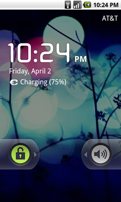
The Mac vs. PC analogy starts as soon as you look at the unlock screen for the phone. Here’s what you see on Apple’s iPhone vs. Google’s Android:
|
Google Nexus One
|
Apple iPhone 3GS
|
 |
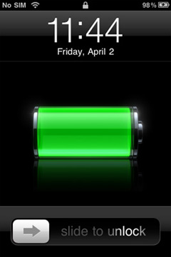 |
The iPhone allows for a single interaction: unlock the phone. The Nexus One gives you two: unlock or toggle sound on/off. The divergence continues once you unlock the phones:
|
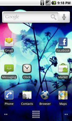
Google Nexus One
|
Apple iPhone 3GS
|
 |
|
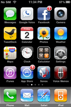
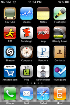
Apple’s home screen is a structured list of icons. Each swipe reveals another page that looks the same. You can customize placement of the app icons, and control what appears in the bottom row of four, but ultimately you’re flipping through a virtual index of your applications.
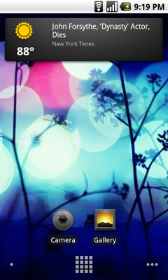
The Nexus One’s home screen is much more configurable/versatile. You start out with a u-shaped arrangement of icons. At the top, a Google search widget. Your home screen starts in the middle, you can swipe two screens to the right or left. On the iPhone you’re basically reading a book, on the Nexus One you’re navigating a field.
Swipe right to left and you’ll see a Gmail and Gtalk icon. Swipe left to right instead and you’ll see a weather widget and some more icons. The weather widget tells you the weather wherever you’re currently located (GPS/cellular network triangulation ftw) as well as gives you the latest news headlines all updated in real time.
 |
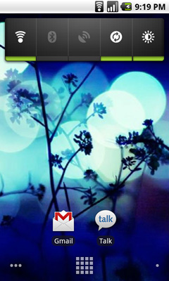 |
Apple’s predictable UI allows no room for quick ways to disable things like Bluetooth or 3G. The Nexus One ships with a Power widget that lets you quickly toggle WiFi, Bluetooth, GPS, auto syncing and auto brightness control. The only thing that’s missing is a quick way to disable 3G.
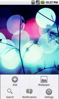
The remaining pages ship barren. It’s up to you to add items to them. You can do so by hitting the Nexus One’s contextual menu button and then clicking Add. You can add shortcuts to applications or interactive widgets. On the iPhone the only way you get something onto one of the home screens is by downloading/installing the app. There are no widgets, no concept of shortcuts, Apple abstracts all of this from the underlying software. As far as the user is concerned you install apps to the home screen and that’s how you access them. That’s your file system. Point, touch, access.
 |
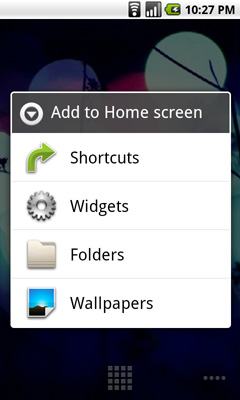 |
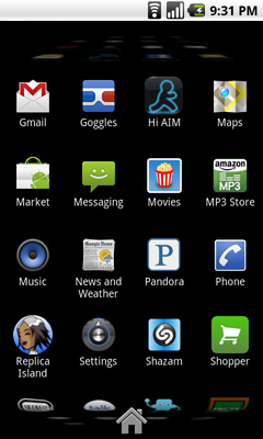
In Android it’s all a little less abstracted. Your home screens are like virtual desktops. True, you don’t run applications on them, but the widgets are similar enough. You create shortcuts to applications for easy access. If you want a list of all of the apps on your phone, just click the virtual button at the bottom of your home screen:
This is more of the traditional iPhone presentation, except instead of swiping to see more pages of apps you scroll down. As you scroll the vanishing list wraps around an imaginary cube to give the UI more depth.
|
Google Nexus One
|
Apple iPhone 3GS
|
 |
 |
The fundamental difference in approach to UI really shows how Google and Apple view the smartphone. Apple views it as a passive extension to the desktop/notebook. You use it when you want to make a call or quickly access a program or application. Your primary sources of information consumption are in other forms (e.g. desktop, notebook, tablet).
Google’s view is a bit more ambitious. Not having a desktop/notebook platform (yet) to rely on, Android’s role is understandably more pronounced. You get more customization and personalization options. The focus isn’t on simplicity, but rather customizable functionality. The sort of flexibility you’d expect out of a larger computing device, but on your smartphone. Again, it makes sense because Google doesn’t currently offer a larger computing device.
Those who cried foul when Apple tied everyone’s hands with the iPhone OS, those who listed everything that Windows Mobile could do that Apple couldn’t, if you are one of these people then Android is a far more natural fit. Those who wanted the focused simplicity the iPhone offered on the other hand, will probably feel a bit uncomfortable with Android.


95 Comments
View All Comments
Chloiber - Sunday, April 4, 2010 - link
Sorry for repeating myself, but I really look forward to a test of the HTC Sense UI with either the HTC Desire, Legend (slower though) or Evo. I read several reviews and in every single one they were really impressed by the onscreen keyboard.ol1bit - Sunday, April 4, 2010 - link
I love the android platform. Now my last smart phone was the first Palm ever, so I could be thrilled with anything.The kicker for me was buying my android at Amazon for $49 (3 weeks ago), and now it's only $19!
It's hard for me to grasp how much power is in my hands for $19. Sure I have to have a 2 year contract, but I'd have that anyway.
As far as difference between mine and Goggle's? there's some, but the core functionality is present in both, just like an HP and a Dell computer with their built in thingy's.
Cheers on a great review!
LongTimePCUser - Sunday, April 4, 2010 - link
Today on Amazon the Motorola Droid is $19.99.Amazing. I bought mine about 3 weeks ago at $49. I thik that it is great and a bargin at the price I paid.
They are practically giving it away now. That tells you how profitable their $30/month data plan is.
naalex - Sunday, April 4, 2010 - link
Wow, I've got to say: Super Job! Not only did you review the Nexus One, but you managed to simultaneously review Android, review the iPhone OS, compare the two's strengths and weaknesses, and describe ARM's role in the smartphones and microprocessor business (which I never understood). Long yes, but every page was well worth it.After reading all the hyperbolic tech news coming from Engadget, CNET, and PhoneArena, I was under the mistaken impression that Snapdragon was a clear smartphone platform champion, so I found it rather interesting that Snapdragon's integrated GPU was inferior to the PowerVR solution on the iPhone 3GS. If I'm not mistaken, this is the GPU that is used in the TI chip in the Droid, so does this mean that my Droid may be able to keep up with Nexus Ones/Snapdragons with 3D gaming apps, or will there be too much hardware and OS fragmentation for any app developer to create any optimized 3D gaming app for Android.
This is going to be my go-to resource to provide to people who ask, "What is that strange object pressed to your face that isn't an iPhone? Does it cure cancer like the iPhone?" Trying to explain to my clueless tech friends that there are other viable smartphone options out there is an uphill battle, but one that may go a little easier now.
ExodusC - Sunday, April 4, 2010 - link
Anand, I'll admit, this is the gist of what I expected from your article (I don't mean that in a bad way, mind you--). I own an iPhone 3G, and have for almost a year now. I like it, but I don't particularly love it. I imagine the 3GS would be a more fluid (and therefore more enjoyable) experience. For some reason, tech reviewers tend to not want to get rid of their iPhones for some reason. Even with a device like the Nexus One at their fingertips. I type this from a Motorola Droid right now, and I love it.I agree, I love the fluidity of the iPhone compared to Android devices (why must they be so powerful, but so choppy? That's my biggest complaint), but I love the feature set of Android even more.
I also really want to know, why do you feel Android's pull-down notification menu is awkward? The first time I picked up an Android device and used it (never knowing about the feature), I felt it was very intuitive and a wise design choice.
I completely agree with your general consenus that Android needs some polish, however.
I absolutely love your website, reviews, and attention to detail. Keep up the good work! I just thought I'd share my honest opinion with you. Hopefully you'll have time to respond.
ExodusC - Sunday, April 4, 2010 - link
Excuse my extra "for some reason" in that post. I was a bit distracted while typing up my reply...Anand Lal Shimpi - Thursday, April 8, 2010 - link
It's just an odd construct in my opinion. It's the only place in the entire OS that you pull something down to reveal more notifications. If anything I'd expect a tap to expand sort of deal, but the pulldown seems strange to me.I will say that after using it for a while, it has lost it's weirdness in my opinion :)
Take care,
Anand
DukeN - Monday, April 5, 2010 - link
Love the slide out keyboard - if only this was like the original G1 but with all the new horsepower.The G1 is the first phone that has tempted me away from a blackberry (well...almost) in 5 years.
EazyVG - Monday, April 5, 2010 - link
I have been a WinMo user for past 3-4 years, but I have to agree that Android, not WinMo7, is the replacement for Windows Mobile 6.5, and hence I will be jumping to Android phone (as of today I like the HTC Desire, but want QWERTY) from my current HTC Touch Pro 2.Pitne - Monday, April 5, 2010 - link
wow I cant believe how biased this article is towards apple. Almost every word you used when talking about the Nexus One had a negative connotation. Most of your 'negatives' towards the nexus one are completely false.The notification area for one--this implementation is 100% better than apple or palm and you think its a poor way of handling it? Wtf are you smoking.