Dell UltraSharp U2711: Quality has a Price
by Jarred Walton on January 22, 2010 2:00 AM EST- Posted in
- Displays
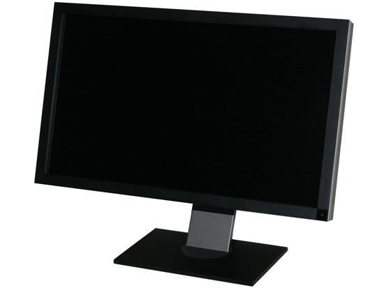
Dell U2711 - Near Professional Quality at a Pro-Am Price
If you're a professional image or video editor, it's possible that the U2711 will fall a bit short. Specifically, we've seen better color accuracy, especially after calibration. For the price, we'd recommend looking at HP's LP3065, or one of the other 30" S-IPS displays. However, the U2711 does win out in quite a few areas. If you want a fine dot pitch, there's no better desktop LCD right now. The U2711 also supports 30-bit deep color with 12-bit internal processing; most displays with 30-bit color output cost twice as much! Look at the HP DreamColor LP2480zx for example: $1800 online and it's a 24" 1920x1200 LCD. (Note that we haven't tested that particular LCD; for the price we would hope color accuracy is better than the U2711, but we can't say for sure.)
Since the U2711 uses an IPS panel, viewing angles are a non-issue. Off-angle viewing isn't perfect, but it's far better than what you get from any TN panel and as good as any LCD on the market. Color quality and accuracy on IPS panels are also very good, and given the various compromises you can make we feel IPS is the best overall solution for LCDs right now. Very likely we won't get anything better until OLEDs, SEDs, or some other display technology takes over, and right now the cost of larger OLED solutions is prohibitively high.
Another great feature on the U2711 is the large number of video input options. HDMI, DisplayPort, and two dual-link DVI connections will be the preferred method of connecting, but you can also use VGA, component, or composite video. The ability to handle lower resolutions very well is a definite plus, though with a decent GPU you can often let the graphics chip do the scaling and not worry about shortcomings in the LCD's scaler. The problem with LCD scalers is that they also add a bit of latency. We don't know how much, but we do know that the U2711 has about 15ms more latency than other IPS displays that we've tested in the past. The latency may also come from the 12-bit internal color processing, but that would be part of the scaling hardware. Having seven different video inputs is going to be overkill for just about every potential user, but we could certainly see situations where using two or three of the inputs is feasible, e.g. PC, HDTV, and gaming console. The U2711 supports an optional audio bar along with audio out, but in either case you'll be limited to 2-channel audio, so you might want to look somewhere else for an ideal home theater display.
Aspiring imaging or video professional looking for a capable display will find the U2711 is a great option. We've seen better color accuracy, true, but few displays offer out-of-box colors that are anywhere close to this good. Dell guarantees every U2711 will have a Delta E of less than 5.0 without any extra calibration, and our test unit delivered an extremely good result of 2.24 (average Delta E). Buying a separate colorimeter and software will set you back another $200-$300, though you could then use just about any IPS or PVA LCD. The U2711 also delivered very good color uniformity. I still like the larger 30" LCDs, but then I have access to a colorimeter, I only need one video input, and I prefer a larger dot pitch.
We suspect "true" professionals will still prefer more expensive solutions that can achieve a Delta E of less than 2.0 for every color patch, but that's a very small market. If you're wondering if you might notice the colors where the U2711 "only" scores ~4.0, then you likely don't need to worry about it. In fact, we think most professionals would only "see" the problem if they had access to a colorimeter; you really won't notice any problems with the uncalibrated results using your naked eye.
 |
Bottom line is that if you're looking for a large LCD with lots of features, a high resolution, great colors, and what we feel is the best current LCD panel technology, the Dell U2711 should be at the top of your list. $1050 isn't chump change by any stretch of the imagination, but you won't find quality like this in a sub-$500 LCD. In fact, the only real competition right now comes from the 30" S-IPS panels that have been around for several years. If you want something a little smaller, or if you have a need for 30-bit color support, the U2711 is a better buy than anything else currently on the market. This is a great high resolution display that delivers on the quality and features fronts, and we're pleased to award the Dell U2711 our Gold Editors' Choice award.


153 Comments
View All Comments
jmurbank - Saturday, January 23, 2010 - link
You explain DPI completely wrong. DPI is dots per inch or pixels per inch. It is the space between pixels on the screen that basically has no relationship how graphics is realistically being shown on the display. Lower then 0.28 mm DPI for the monitor is better for computers while higher is OK for TV.The DPI for your desire OS is different than the DPI for your monitor. Each DPI relates to something else, but the DPI you have to look out for is the value in the OS and not the display since you are dealing with formatting issues. The calculation of how fonts are sized includes operating system DPI, so you should not change the DPI at all if you are sharing your work to others. It is best to set to the standard what everybody is using which is 96 dpi for Windows. Then change the operating system font size.
If your eyes are not what they used to be, it is best to use lower resolutions instead changing the operating system DPI or referring to a monitor that has high DPI which can look like you are viewing through a sunscreen screen for your window. Of course lower resolution screens will lose your workspace, but you will not have to rely on high DPI. To gain the workspace back, use multiple displays. Of course lower the resolution and viewing it on a LCD monitor will look blocky, but you will have to live with a poor mans technology until there is something better.
CSMR - Saturday, January 23, 2010 - link
This is nonsense. Comparing non-native low resolutions to a change in dpi at the OS level, sizes of objects are the same, but with the OS change most things are sharp while with the non-native change everything is unsharp. Using non-native resolutions is just incorrect use of the monitor.jmurbank - Saturday, January 23, 2010 - link
It is not about what is sharp and what is not sharp. LCD are basically a poor mans technology and you have to give up quality if you can not see what is on the screen. LCD are designed for notebooks for their portability and not for their quality. If we go back to a better technology such as CRT, everything just works the way it is. Using a non-native resolution is not an incorrect use or a waste of the monitor's capabilities if you can not see anything what you are doing. Sure you can setup a panning which will make a virtual resolution be viewed at a native resolution, but with a sacrifice of panning.I do not recommend changing the operating system DPI just to make sure you can read at ultra high resolutions because it will create problems in the future.
strikeback03 - Monday, January 25, 2010 - link
The only CRTs worth using were the extremely high-end models. The vast majority of CRTs are absolute crap and just about any LCD is better.CSMR - Friday, January 22, 2010 - link
Text isn't smaller when the dpi setting is correct. Unless you want it to be smaller (you might now find smaller text more readable).Some apps do override the dpi setting, in my experience only browsers (and image software - fair enough). There you have to set a zoom level. That will zoom images and text (default on IE, firefox). Well I'm on Anandtech on FF now and it zooms correctly, as do all sites I have ever visited.
Now yes, images that were mapped pixel-to-pixel before are now not as sharp at a higher setting. That's mitigated by most popular software now storing icons at various dpi settings, but is a problem for web images and I usually return to 100% zoom for photographic images. However you get the same problem if you use a non-native resolution, except instead of just a few things being unsharp, everything is including text. So that is the worst possible option you can take.
If you like a 96dpi icon on a 96dpi screen (say), then you should like a 120dpi icon on a 120dpi screen even better. (Assuming the icon has been rendered at 120dpi, which most have.) So the icons comment doesn't make any sense.
You seem to be thinking about display of computer content at a very low level, each element separately. But everything has to have the right proportions and the key measurement is physical distance. Dpi settings allow you to have the right scale while preserving the right proportions.
JarredWalton - Friday, January 22, 2010 - link
When I changed the DPI on my system, all the icons look fine, but the spacing is all messed up. They look the same size as before, but there's now a bunch of empty space surrounding each icon. (This is looking at my desktop.) They look like they use 100x100 pixels instead of 75x75 (give or take).Really, my experience is that just about everything tends to be designed assuming users are running 96DPI... it's getting a bit better, but that's the short summary. There are a lot of screen elements that just run 1:1 mapping and ignore your DPI setting. Windows Vista seems to have done more than Windows XP at addressing this area, and Win7 may be even better than Vista, but no one has really nailed this IMO.
kmmatney - Saturday, January 23, 2010 - link
I don't have great eyes, so I was a fan of larger pixel sized monitors. That is until I upgraded to windows 7. One of the big problems with Windows 7 is that you can't turn off cleartype, or at least its extremely difficult to get rid of it. So, large pixel monitors look like crap. As an example, I was using a HannsG 28" LCD @ 1920 x 1200. This was fine with Windows XP, but absolutely horrible with Windows 7. I had to get rid of this LCD, and get one with smaller pitch, just to comfortably use Windows 7. My eyes are bad enough, I don't need cleartype making things even fuzzier...erple2 - Monday, January 25, 2010 - link
I'm assuming that:CPL\System\Performance Information and Tools\Adjust Visual Effects [sidebar], uncheck "Smooth edges of screen fonts".
Doesn't work? (This was from one of the first results of:
http://www.google.com/search?q=remove+cleartpye+fr...">http://www.google.com/search?q=remove+cleartpye+fr...
)
erple2 - Monday, January 25, 2010 - link
Awesome - Google figured out what I meant. The real URL ishttp://www.google.com/search?q=remove+cleartype+fr...">http://www.google.com/search?q=remove+cleartype+fr...
CSMR - Friday, January 22, 2010 - link
Not sure what's up with your system. XP was pretty awful at this, but on Vista/Win 7 it's a very strange problem to have.