Gateway AMD and Intel Laptops, a Platform Analysis
by Jarred Walton on August 12, 2009 2:00 AM EST- Posted in
- Laptops
Last week we posted an article comparing battery life using two different Gateway laptops - laptops that were essentially identical, with the exception of the motherboard, chipset, integrated graphics, and processor. This was a subject that we wanted to investigate closely for a long time, but acquiring laptops that are anywhere near "identical" when you are looking at two completely different platforms can be extremely difficult. Moreover, even companies that had very similar laptops didn't seem to have any desire to have us review their AMD models. Conspiracy theory, were they trying to avoid cannibalizing sales of more expensive laptops, or some other explanation… regardless of the cause, it took us many requests to finally have a mobile showdown between AMD and Intel.
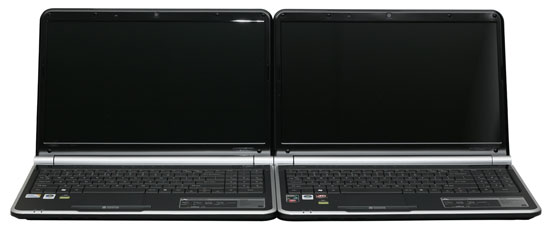
After the initial article went up dissecting battery life under a variety of situations, we have received numerous emails questioning our test methodology, complaining of bias for or against AMD/Intel, and offering other suggestions for how to improve the tests. The battery life article was always intended to be a short preview, and we are well aware of many of the differences between AMD and Intel platforms. This, then, is the rest of the story where we look at general application performance, graphics performance, and provide a full review of both laptops. First, let's start with a recap of the test systems - this time with full specifications.
| Gateway NV5214u Specifications | |
| Processor | AMD Athlon 64 X2 QL-64 (Dual-core, 2.1GHz, 2x512KB L2, 65nm, 35W, 667MHz FSB) |
| Chipset | AMD RS780MN + SB700 |
| Memory | 2x2048MB DDR2-667 |
| Graphics | Integrated ATI Radeon HD 3200 |
| Display | 15.6" Glossy LED-Backlit 16:9 WXGA (1366x768) |
| Hard Drive | 320GB 5400RPM |
| Optical Drive | 8x DVDR SuperMulti |
| Networking | Gigabit Ethernet 802.11n WiFi 56K Modem |
| Audio | 2-Channel HD Audio (2.0 Speakers with headphone/microphone jacks) |
| Battery | 6-Cell 10.8V, 4400mAhr, 47.5Whr |
| Front Side | None |
| Left Side | SD/MMC/MS/MS Pro/xD reader Microphone/Headphone Jacks (2.0 audio with S/PDIF support) 2 x USB 2.0 HDMI VGA Gigabit Ethernet AC Power Connection Kensington Lock |
| Right Side | DVDRW Optical Drive 2 x USB 2.0 56K Modem Power Button |
| Back Side | Heat Exhaust Port |
| Operating System | Windows Vista Home Premium 64-bit |
| Dimensions | 14.6" x 9.8" x 1.0"-1.5" (WxDxH) |
| Weight | 5.8 lbs (with 6-cell battery) |
| Extras | Webcam Alternate colors/models available Blue: NV5213u Black: NV5215u Red: NV5216u |
| Warranty | 1-year standard Gateway warranty Extended warranties available |
| Price | NV5214u available at Best Buy for $500 |
| Gateway NV5807u Specifications | |
| Processor | Intel Core 2 Duo T6500 (Dual-core, 2.1GHz, 2MB shared L2, 45nm, 35W, 800MHz FSB) |
| Chipset | Intel GM45 + ICH9M |
| Memory | 2x2048MB DDR2-667 |
| Graphics | Integrated Intel GMA 4500MHD |
| Display | 15.6" Glossy LED-Backlit 16:9 WXGA (1366x768) |
| Hard Drive | 320GB 5400RPM |
| Optical Drive | 8x DVDR SuperMulti |
| Networking | Gigabit Ethernet 802.11n WiFi 56K Modem |
| Audio | 2-Channel HD Audio (2.0 Speakers with headphone/microphone jacks) |
| Battery | 6-Cell 10.8V, 4400mAhr, 47.5Whr |
| Front Side | None |
| Left Side | SD/MMC/MS/MS Pro/xD reader Microphone/Headphone Jacks (2.0 audio with S/PDIF support) 2 x USB 2.0 HDMI VGA Gigabit Ethernet AC Power Connection Kensington Lock |
| Right Side | DVDRW Optical Drive 2 x USB 2.0 56K Modem Power Button |
| Back Side | Heat Exhaust Port |
| Operating System | Windows Vista Home Premium 64-bit |
| Dimensions | 14.6" x 9.8" x 1.0"-1.5" (WxDxH) |
| Weight | 5.8 lbs (with 6-cell battery) |
| Extras | Webcam Alternate colors/models available Black: NV5814u Red: NV5815u |
| Warranty | 1-year standard Gateway warranty Extended warranties available |
| Price | NV5814u available online starting at $580 |
In terms of core paper specifications, the systems really are as close to identical as we can get. There are no AMD chipsets for current Intel processors, and likewise Intel doesn't make chipsets for AMD processors. We could try to go the discrete graphics route, but virtually all current AMD-based laptops include integrated graphics and that's part of the features equation. We're looking not just at the difference in processors but what the mobile platform as a whole offers from each company. Those familiar with current trends should have an idea of what to expect: Intel has the better processor (faster and lower power), overall chipset features are similar, and AMD (courtesy of ATI) has the better integrated graphics. The question isn't so much who will be faster in various tests, but rather how much faster. That's what we're here to find out.


67 Comments
View All Comments
samspqr - Wednesday, August 12, 2009 - link
(I mean the one on page 5)JarredWalton - Wednesday, August 12, 2009 - link
As mentioned in the text, the graphs on pages 5 though 8 use a different format. I chose the format because I feel it provides a quick way of looking at relative performance. The percent labels aren't particularly meaningful, since the bars are not in actual percentages (though the bar sizes are).Spacecomber - Wednesday, August 12, 2009 - link
Although I found the article interesting, comparing the advantages of intel based laptops to amd based laptops, I have to agree that the choice of how to represent the data in the charts doesn't really work for me. I understand what the notion was, representing the data as a kind of tug of war between the two platforms, but the utility used to create these charts didn't provide the means to make this clear. I'm a strong believer that charts should be intuitively obvious and that you should be able to interpret them without looking at anything other than what is contained in the chart.These charts have an additional problem when it comes to the representation of the gaming data (or any data where the same measurement unit is being used). You can no longer easily compare performance for the same platform across different games (or whatever the instances being measure are). For example, it is not easy to see in these graphs that some games don't have playable framerates, regardless of the platform.
Anyway, while I'm sympathetic with the effort to try something different, I didn't find that it helped me to comprehend the data any better, and it seemed to be more of a hinderance, instead.
JarredWalton - Wednesday, August 12, 2009 - link
The problem is two-fold: I had a bunch of data to represent, and I didn't want a ton of small charts. I debated just putting in a table, but that seemed a poor way of doing things - especially since I can show the number labels and you get the chart plus table effect. The issue is compounded by units that are not easy to chart with each other - i.e. PCMark05 has some scores in single digits, some in the tens, and some in the hundreds. Do I break PCMark05 scores into 16 different charts, or does the "100% Stacked Bar" chart option provide all the necessary detail?I'm inclined to go with the latter as a reasonable compromise between the various options, and let people spend a few more minutes looking at the data to draw conclusions. It's great when a chart can be "intuitively obvious", but there are times when complex data requires a more complex chart. The net result is that I had a choice between more aesthetically pleasing pages and a single summary chart, or I could make dozens of smaller charts and get a cluttered page.
I understand some people won't like the representation, but I've been playing with the data for the past hour and there's really no option that's as succinct. Some graphs (gaming) lend themselves to other options, but the PCMark05 chart and Application Performance charts have to be split up, put in a table, or something else.
FWIW, I'll post alternative charts in a bit for those that really hate the current charts. However, I'm still a firm believer in requiring people to READ the text. I get the impression that many of the comments have only looked at a small portion of the text and are making a lot of assumptions - assumption which are, not surprisingly, incorrect.
Wellsoul2 - Wednesday, August 12, 2009 - link
The Chart is still backwards compared to the first article onbattery life. Idle is 111 minutes and DVD 242 minutes.
It's reversed from last article.
JarredWalton - Wednesday, August 12, 2009 - link
Sorry... not sure how that happened, other than sorting charts in Excel. For some reason, the top spreadsheet cell showed up on the bottom of the chart, and so I resorted. Apparently I missed the numbers at some point. I'll correct the chart shortly....mczak - Wednesday, August 12, 2009 - link
Hmm, what about the raw numbers which should show minutes runtime? Idle has lowest runtime, DVD playback largest. That definitely looks wrong...Wellsoul2 - Wednesday, August 12, 2009 - link
Yes...looks like you reversed the numbers.whatthehey - Wednesday, August 12, 2009 - link
Reading comprehension is a great thing!"We are using a different format for the graphing than we used previously.... For this chart, equal performance is denoted by the 50% mark in the middle of the chart. A larger bar means better performance, and the numerical results (in minutes) are available for those that prefer raw numbers."
Ah, yes, the percentage marks are entirely misleading! Shame on you AnandTech for making people read! (FWIW, I had no issues reading and interpreting the graphs, but then I'm a computer programmer.)
Ben90 - Wednesday, August 12, 2009 - link
" quit looking ahead and pay attention to this paragraph! " You should have added that to the page before, my screen was already down in the chart when i read this :)