AT 101: Understanding Laptop Displays & How We Test Them
by Brett Howse on July 10, 2018 8:00 AM ESTHow We Test Displays
There’s a lot of variables to test when objectively evaluating the performance of a laptop display, including brightness, black levels, color accuracy, and more. To test these, we use different tools depending on what’s being tested.
X-Rite i1Display Pro Colorimeter
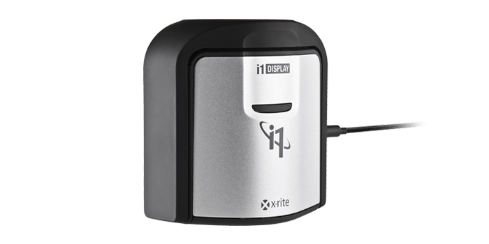
When measuring brightness levels and contrast, we utilize the X-Rite i1Display Pro colorimeter. Colorimeters measures the light from the display through three filters. At this point you shouldn’t be surprised to hear that the filters are red, green, and blue. Colorimeters measure light and color similarly to the way your eye would. The advantage to using a colorimeter for testing contrast ratios is that with just three filters, there’s less noise when measuring black, so the accuracy of the black level is higher than with a spectrophotometer.
X-Rite i1Pro 2 Spectrophotometer
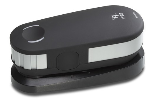
A spectrophotometer works in a similar way to a colorimeter, but instead of reading light in three bands, a typical spectrophotometer will have 31 filters to measure the entire color spectrum. They can measure a wider range of colors, generally with more accuracy. There are extremely good colorimeters on the market as well though, so as with most things, your mileage may vary. The disadvantage is less accurate readings on black, but we use the X-Rite i1Pro 2 spectrophotometer for all of our color readings including grayscale, saturations, and the Gretag Macbeth test.
SpectraCal CalMAN Suite

For the software suite, we leverage SpectraCal’s CalMAN suite, which is an incredibly powerful set of tools. We utilize a custom workflow to measure brightness, contrast, grayscale, gamma, gamut, saturation, and Gretag MacBeth. If desired the workflow can also be used to calibrate a display, and measure the display accuracy across the entire display, although we generally reserve that for monitor reviews.
Testing the displays
First, we measure the display’s brightness and black levels at both 100% brightness and 0% brightness. Contrast is presented with the display at 100% brightness, and a brighter display provides more options for use outdoors, but the brightness at 0% can be important too if you’re using the device in a very dark room, such as in bed. Some displays can go all the way down to less than 10 nits, while others bottom out much higher and would seem eye-searing in a dark room.
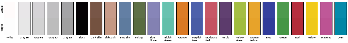
Next, the i1Display Pro is swapped out with the i1Pro 2, which is first calibrated and then placed on the center of the display. A 100% white image is shown and the brightness level is adjusted to 200 nits – or as close as can be had, since there’s not infinite steppings on the brightness levels. Once the brightness level is set, the display is run through the grayscale test which measures the accuracy of the white levels from 0 to 100% at 4-bit steps. Next, the gamut accuracy is tested, which is simply the 100% levels for red, green, blue, cyan, magenta, and yellow, along with white. We then do the saturation sweeps which measures all of the primary colors (red, green, and blue) as well as secondary colors (cyan, magenta, and yellow) with 4-bit steps between measurements. Finally, we test the Gretag Macbeth colorchecker which runs through colors that aren’t necessarily directly on the primary or secondary axis, and includes important colors such as skin tones.
The brightness and black levels are measured in candela per square meter (cd/m2) and because candela per square meter is a mouthful, we refer to it as the non-SI term nits, where 1 nit = 1 cd/m2. Contrast ratio calculation is the brightness level at 100% divided by the black level at 100%, and of course higher is better, since it means the LCD is doing a better job of blocking the backlight when the pixel is set to off.
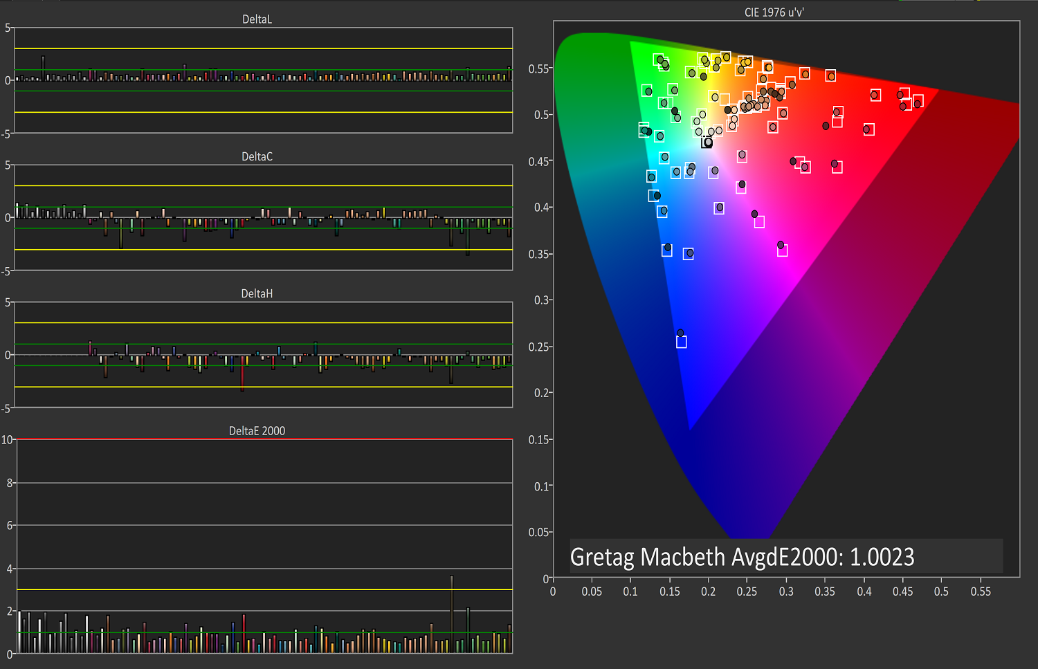 Gretag Macbeth results from the Microsoft Surface Studio in P3 D65 mode
SpectraCal CalMAN
The color accuracy measurements results are in Delta-E 2000 (dE2000), and Delta-E is a value that represents the distance between two colors. A dE2000 of 0 would mean that the colors are identical. A dE of 1.0 is the smallest color difference the human eye can see, but color is a complicated field and values above 1.0 aren’t necessarily noticeable either depending on where they fall in the spectrum. On our results, you’ll see a yellow bar at dE2000 of 3.0, and a green bar at 1.0. We’re generally looking for values under 3.0 to consider a display as accurate, but if it is under 1.0 it would be imperceptible.
Why we like manufacturers to calibrate displays at the factory
So we’ve gone over how we test displays, and what it means to be an accurate display. But, you may be wondering why one display is accurate and another is not, when both are IPS LCDs. The likely answer is that one of the manufacturers took the time to calibrate the display at the factory. The other possible answer is that one of them was just lucky in the panel lottery sweepstakes, but we’ve never run into a display that was accurate across the board that wasn’t calibrated.
There’s certainly a cost to calibrating the display on a laptop, but don’t assume that all premium devices have calibrated displays. The vast majority have no calibration at all. As of this writing, the only manufacturers who calibrated every display individually on every device they sell is Apple and Microsoft. We’ve seen other vendors offer calibration as well, such as Huawei and Lenovo, but not necessarily across their product lineup.
Sometimes manufacturers will do batch calibration, where they measure one or more displays from a batch, and calibrate them all with the same results. This is generally better than none at all, but obviously not as good as individual calibration.
There’s a couple of reasons why we prefer manufacturers to calibrate their displays at the factory. First, it saves the end user the cost and hassle of purchasing calibration equipment and creating their own profile, which is an obvious benefit. People who are doing color critical work may still want to calibrate, but their profiles should need to be far less aggressive than a device without hardware calibration. Second, creating ICC profiles to be applied to fix a display can cause banding, shade crushing, and gamma issues, especially in gaming. If the corrections are done in hardware, the software can’t interfere with it.
A factory calibrated display will offer an almost imperceptible level of error on colors like the MateBook X Pro
Professional monitors may have 3D Look Up Tables (LUTs) which allow the end user to calibrate it at the hardware level, and allow the display to render images in multiple color spaces, but laptops don’t have this hardware accessible to the end user. There’s a cost, but on a laptop that costs several thousand dollars, that cost should be paid for.


49 Comments
View All Comments
s.yu - Saturday, July 21, 2018 - link
So...no mention about what non-PWM screens use for dimming? Or do high frequency PWM screens don't count as PWM? And a lot of people seem to be complaining in particular PWM of OLED screens, so why do OLED screens (at least the RGB variety) all use low frequency controllers?Solandri - Saturday, July 28, 2018 - link
Very nice article. Some minor corrections/additions. (I'll post one at a time since the site is flagging it as spam)Light from our sun is actually about 5800K. 6500K is the combination of sunlight and blue sky on a sunny day. It's bluer than direct sunlight because part of the red light gets scattered by the atmosphere (and sent to regions experiencing sunrise/sunset). Daylight in the shade (lit mainly by the blue sky) is closer to 9000K. That combined with the 5800K direct sunlight produces about 6500K.
Solandri - Saturday, July 28, 2018 - link
Non-RGB subpixel arrangements can offer the same viewing experience as RGB while using fewer pixels. Your eyes have the best resolution in green, not so good in red, and absolutely terrible in blue. The non-RGB subpixel layouts take advantage of this, usually by using two green subpixels for each red and blue subpixel. This results in fewer total subpixels (a "lower" resolution), but no discernible loss of resolution to your eye. Older video standards like NTSC and even newer image encoding algorithms like JPEG and MPEG do the same thing to reduce storage space by decreasing the color resolution. So this isn't something new - every TV show you've viewed growing up had its colors mangled this way, and you've never noticed it. So it's silly to suddenly pretend that non-RGB is suddenly inferior.Solandri - Saturday, July 28, 2018 - link
Ah, it was the website link for this which was flagging the comment as spam. Google "your eyes suck at blue" and you'll get the site with a graphical example of how you can completely mangle the blue channel and the picture will still look the same.Solandri - Saturday, July 28, 2018 - link
The oddball RGB subpixel layout often used in OLED panels can actually be better for devices which are meant to be used in both portrait and landscape orientation. The RGB subpixels are usually arranged so the relative position of red, green, and blue are the same when rotated 90 degrees (though there might be a shift of one subpixel). In contrast, the traditional RGB stripe layout is completely different when rotated 90 degrees.Keeping the subpixel layout the same in both orientations allows you to do subpixel rendering in both orientations. Subpiexl rendering improves the apparent resolution of the screen without increasing the actual resolution. So if you're rendering a diagonal white line, instead of rendering it as (capital letters are lit, lowercase are black):
rgbRGB
rgbRGB
RGBrgb
RGBrgb
You render it as
rgbRGB
rgBRGb
rGBRgb
RGBrgb
And you've tripled the screen's apparent resolution without adding any new pixels. This trick is most often used with fonts (ClearType in Windows). But the RGB subpixel layout means apparent resolution can only be increased in one direction, and fonts designed for subpixel rendering will only work in one screen orientation. If you rotate the screen 90 degrees, suddenly the subpixels don't fall the way you expect, and your subpixel rendering breaks. Not so with the subpixel layout used in some OLED screens. If you turn the screen 90 degrees, the RGB layout remains the same, and your subpixel rendering still works.
Solandri - Saturday, July 28, 2018 - link
You forgot to mention the RGBW subpixel layout, which I wish would die but keeps coming back. That's where they add a white subpixel to increase the apparent brightness of the screen. The R, G, and B subpixels generate those colors by blocking 66% of the light. So when you display a white pixel (R, G, and B lit), you're actually only seeing 33% of the backlight brightness. Someone came up with the idea of adding a white subpixel, so when displaying white you see 3*(33%*25%)+(100%*25%) = 50% of the backlight brightness. So the screen can appear brighter at the same power level, or the laptop will use less power at the same image brightness.Unfortunately this comes at the cost of muting colors, since your colors are now only transmitted through 75% of the subpixels instead of 100%. And you end up with pale red, green, blue, and mustard yellows and lavender purples.
Solandri - Saturday, July 28, 2018 - link
The solution many vendors came up with to customers complaining about poor colors is to create a mode where the white subpixel is always off. But if you do that, now your whites are generated by only letting 3*(33%*25%)+(100%*0%) = 25% of the backlight through. And now your screen will either be dimmer than RGB, or will use more power when at the same brightness as RGB. In other words, you've defeated the purpose of using RGBW subpixels in the first place. If you see a review mention the screen is RGBW, that's a big red flag and should be avoided.HappyTechKnow - Tuesday, July 31, 2018 - link
2. ASUS ZenBook Flip 14 UX461UA-DS51T
best laptopsbest laptops
Asus Zenbook series originated as thin and light. UX310UA kept the proud heritage, featuring a timely elegant all-new design with a profile which is only 0.5-inch thickness. It took many manufacturing steps to architect the design into a sleek shape. Solid aluminum alloy has been used to keep the weight down to1.4 kg. Superb 8th generation Intel core up to i7 processor with 8GB LPDDR3 2133MHz RAMfor smooth video to be run.
14-Inch wide-view Full-HD nano-edge bezel touch display in 13.3” chassis with Stylus pen and Windows 10 Pre-installed display will give your eyes a soothing treat whether you are viewing photos, reading a text and video editing much easier than you can imagine.
An ultra-storage capacity of 256GB SATA SSD and the built-in fingerprint reader with one-touch login via Windows Hello feature A full size backlit keyboard is constructed for an outstanding experience. This best budget laptop is surely going to value your money by providing you the best.
https://happytechknow.com/2018/07/03/best-laptop-a...
rannyjohns - Monday, November 5, 2018 - link
Best work you have done, this online website is cool with great facts and looks. I have stopped at this blog after viewing the excellent content. I will be back for more qualitative work, here some like you https://tinyurl.com/y8f94w2l