The Microsoft Surface Studio Review
by Brett Howse on January 20, 2017 8:00 AM EST- Posted in
- Desktop
- Microsoft
- Surface
- Surface Studio
Color Modes: sRGB, DCI-P3, and Vivid
Next up, let’s take a look at the color gamut accuracy on the three different display modes. sRGB is the one that most people are going to want to use most of the time, because most applications do not have any color management, but in the images below you can see just how much larger the P3 gamut is. It appears P3 is making its way to being the next gamut for computers, but without color management, it is going to be a messy transition.
sRGB
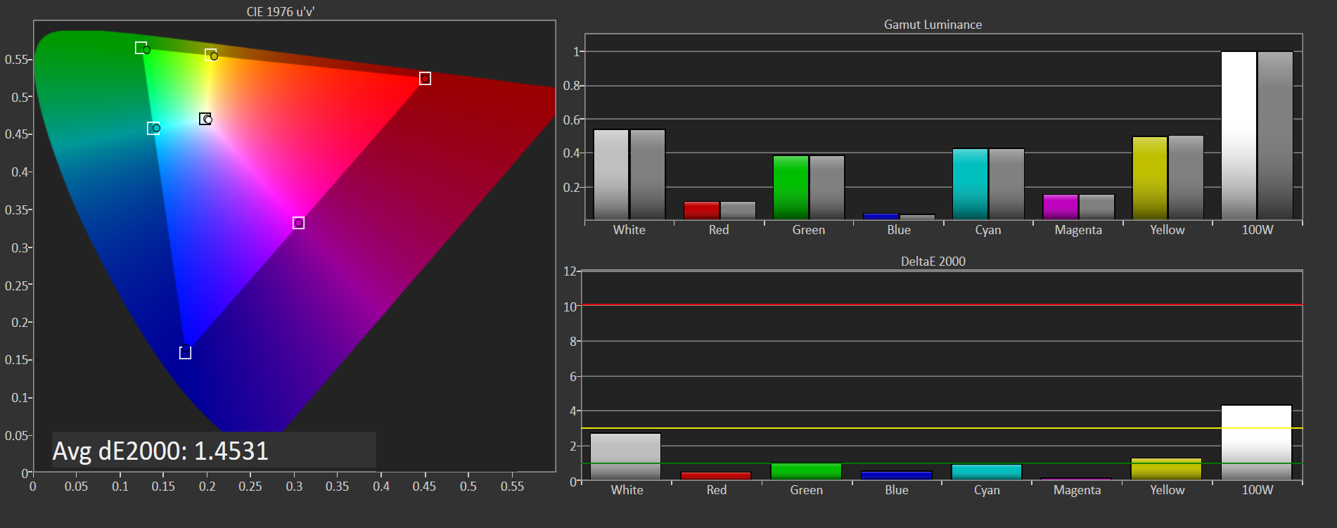
sRGB is still the default target for almost everything, so it is important to get this one right, even more than the others. You can see that the Surface Studio easily covers the sRGB gamut, and it is almost perfect at doing it. Really only the white levels bring the error levels up, with the colors almost perfect for this gamut.
DCI-P3

The sRGB gamut coverage was good, but the DCI-P3 is even better, with a much more accurate white point for this color space really helping the average error level here. But take a good look at the actual white point in the image, which is the square inside the triangle. On this color space, the white point shifts much higher into green, and away from the pure white you would expect of sunlight, which we call D65. The DCI-P3 gamut does not use D65, and is therefore not really going to be used much on the Surface Studio.
Vivid
Although called Vivid, this color mode is the correct P3 color space for computers, which is P3 D65. The gamut coverage is the same as DCI-P3, but the white point moves to the D65 point which is sunlight at noon. The Surface Studio is somehow even more accurate hitting this gamut than the two that are correctly named. Using the name Vivid is a poor choice in naming this when the other two color spaces are named correctly, so if you do own or buy a Studio, and you do want to look at P3 gamut content, Vivid is the correct color space to choose for this.
Color Accuracy
Now that we’ve looked at the various color spaces, it’s time to examine each one individually to see how the Surface Studio performs when set to each color space.
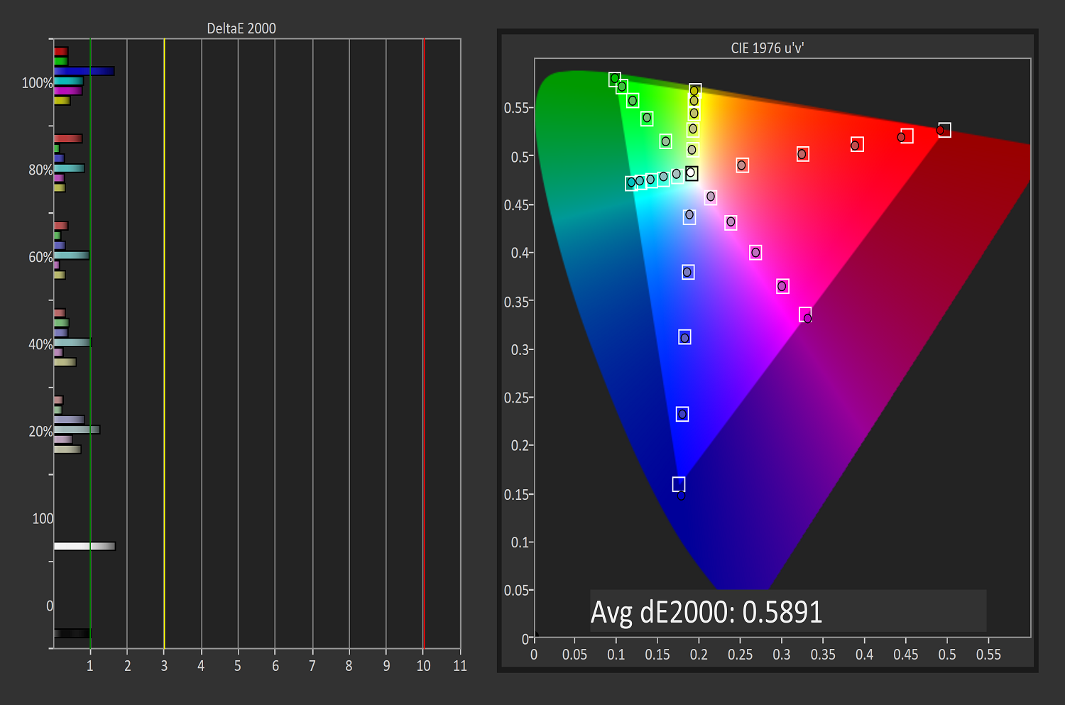
sRGB
On the sRGB tests, the grayscale and saturation tests were done to the new 2017 standard of 4-bit steps rather than 5% and 20% steps respectively. This gives a better picture of what the display is doing, and a much more accurate gamma result.
Grayscale
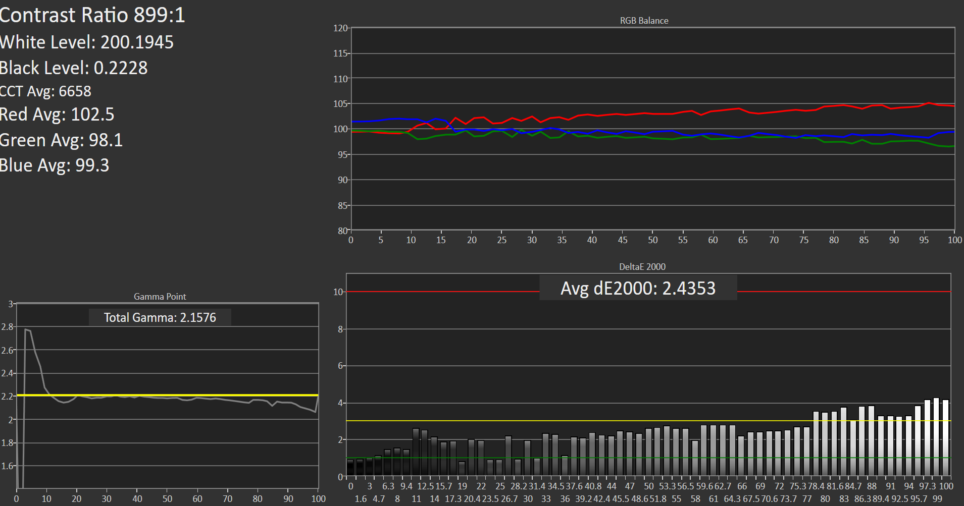
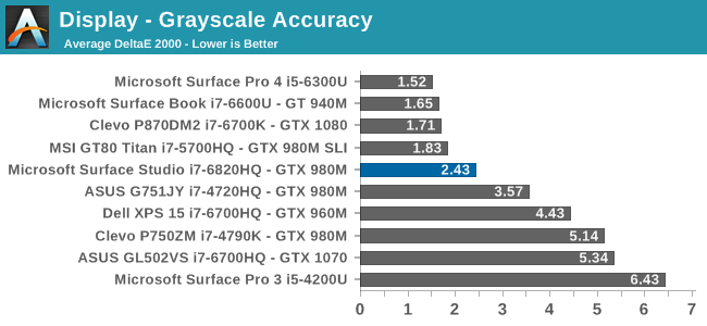
Microsoft nailed the gamma, which should be 2.2, and it very nearly is. However some errors creep up in the grayscale as the image gets closer to 100% white, with the red levels too high, and green a bit low. Overall, it’s still a very good average result, but not perfect. Notice how far they have come since the Surface Pro 3.
Saturation
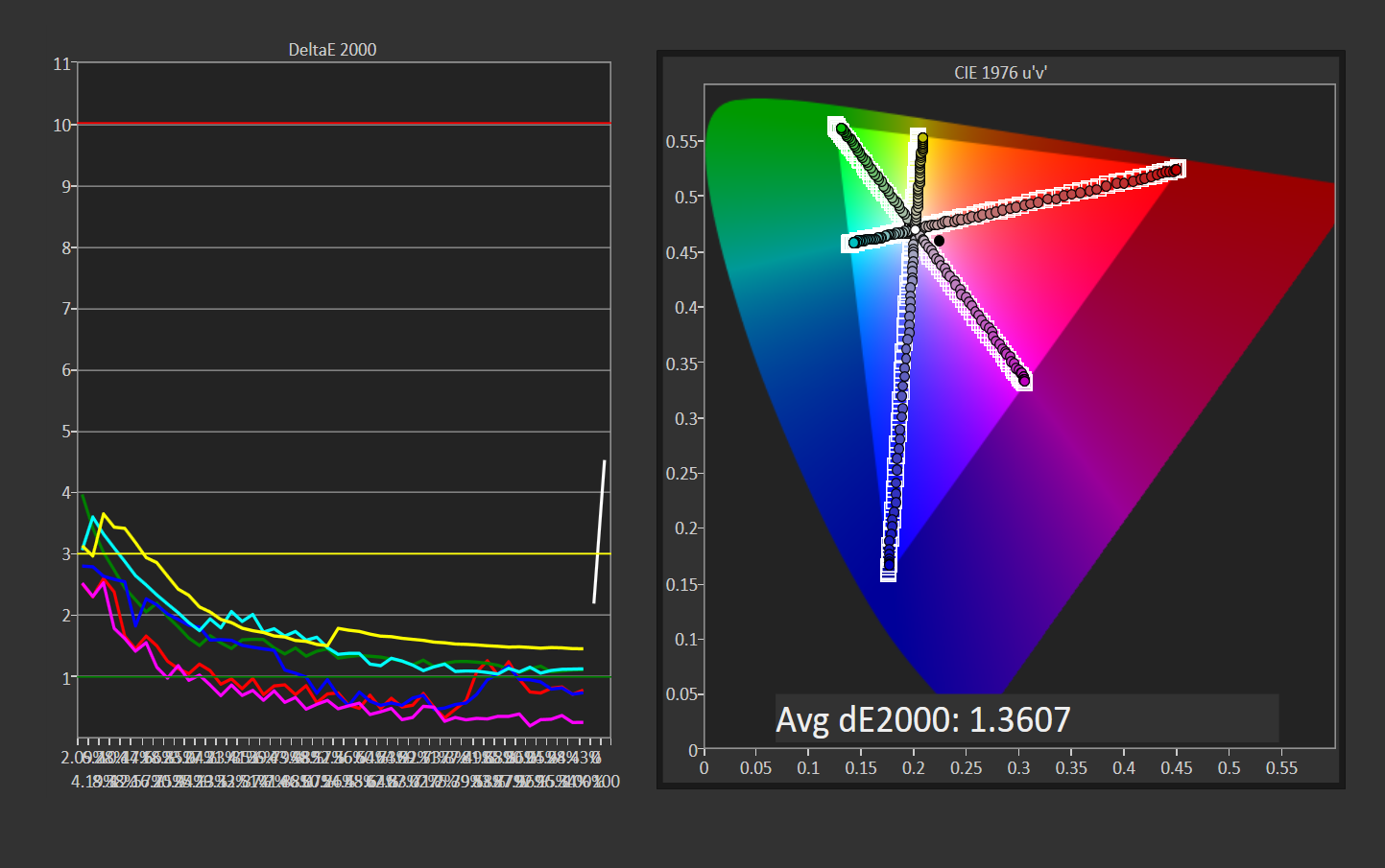
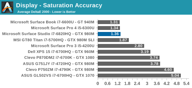
Once again, other than the white level errors at 100% white, the saturation result is fantastic. An overall error level of just 1.36 is very strong, and the individual color traces show that there are no real issues with any of the primary or secondary colors when set to sRGB.
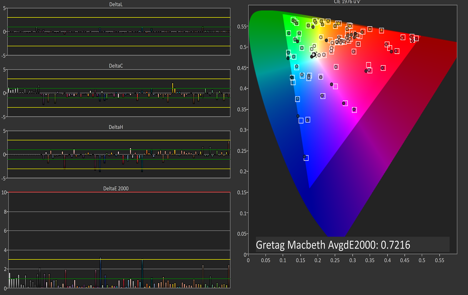
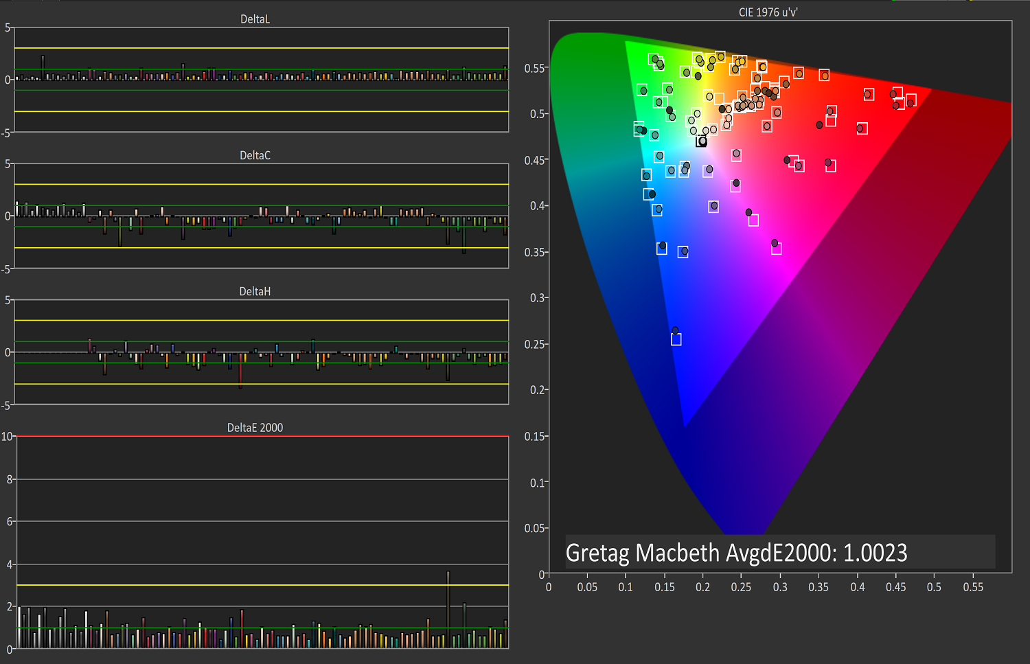
Gretag Macbeth

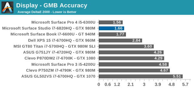
This test is the most comprehensive test, covering a large number of color points, including the important flesh tones. Here, again, the Surface Studio ends up with a fantastic result, and other than a single color, most of the errors are less than two, with many much closer to one. The sRGB results have started off very strong.
DCI-P3
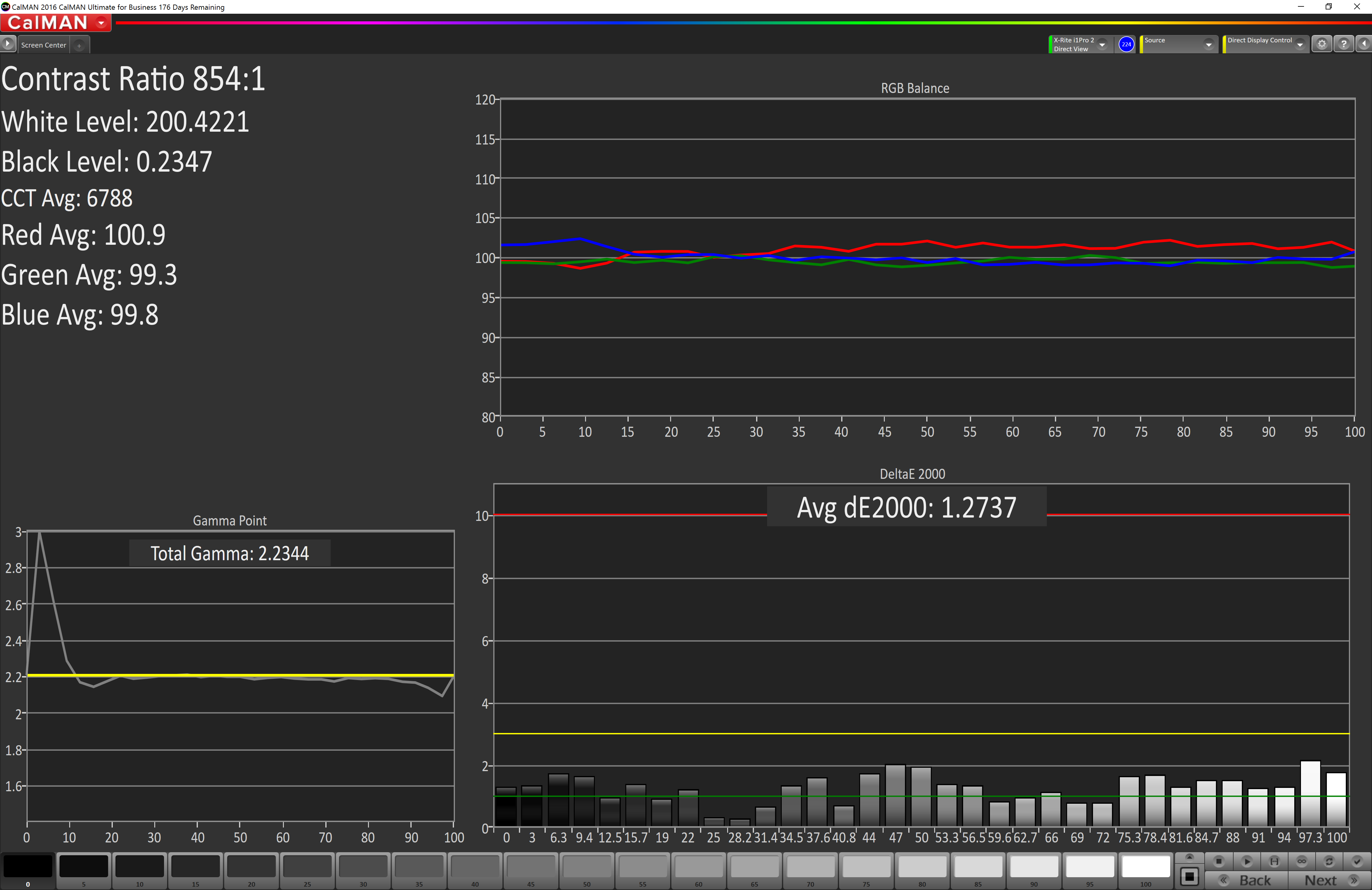
Grayscale
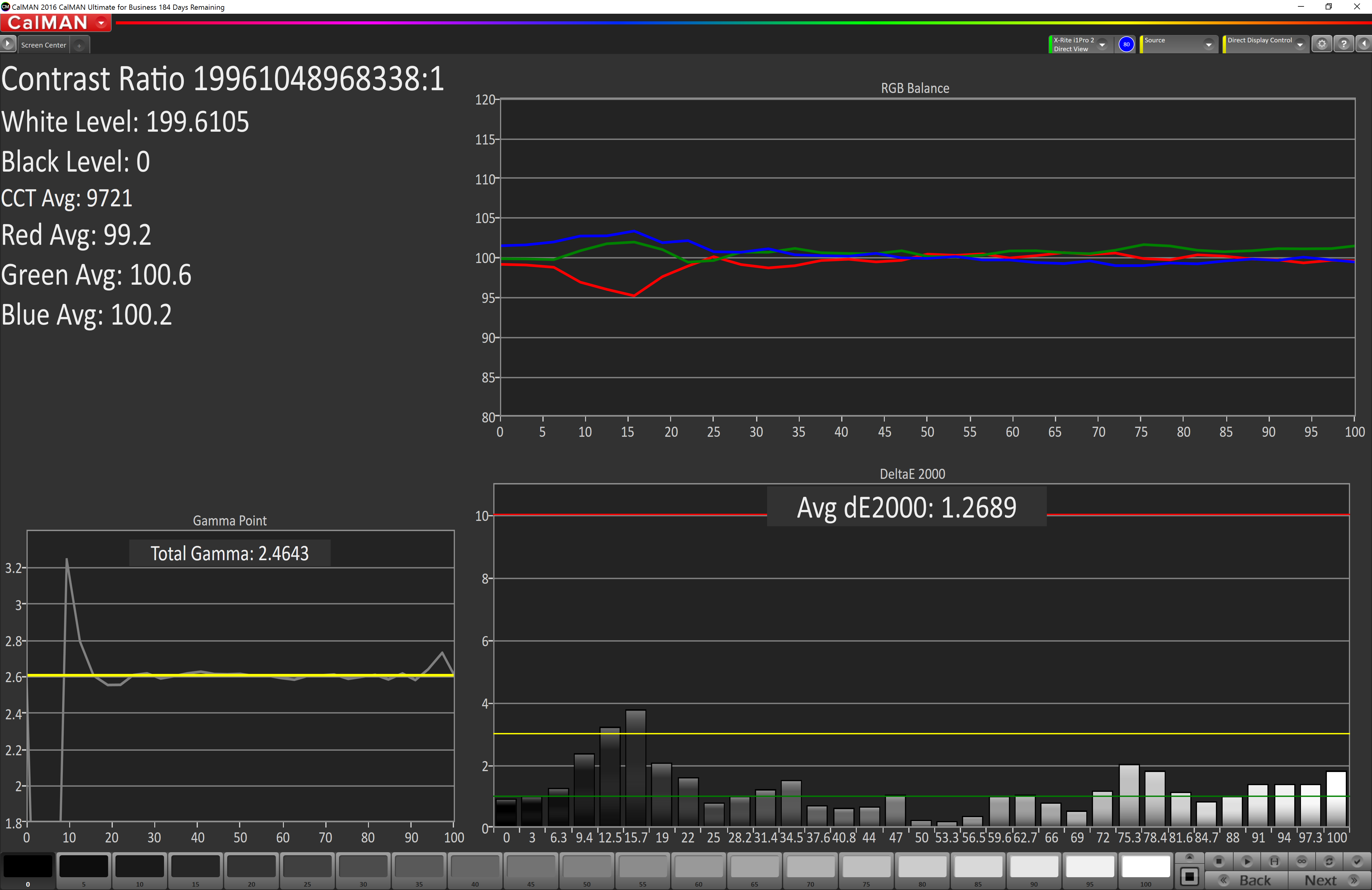
When testing for the DCI-P3 color space, the gamma changes to 2.4, and the Surface Studio correctly hits this gamma as well. Across the entire grayscale sweep, the red, blue, and green levels are very consistent, and the average error level is just 1.27, which is outstanding. The display hits this new gamma and white point almost perfectly.
Saturation
Continuing its impressive results, the Surface Studio is practically perfect on the DCI-P3 saturation sweeps. The blue results and 100% white are the only real issues, but neither of them are really much of an issue at all.
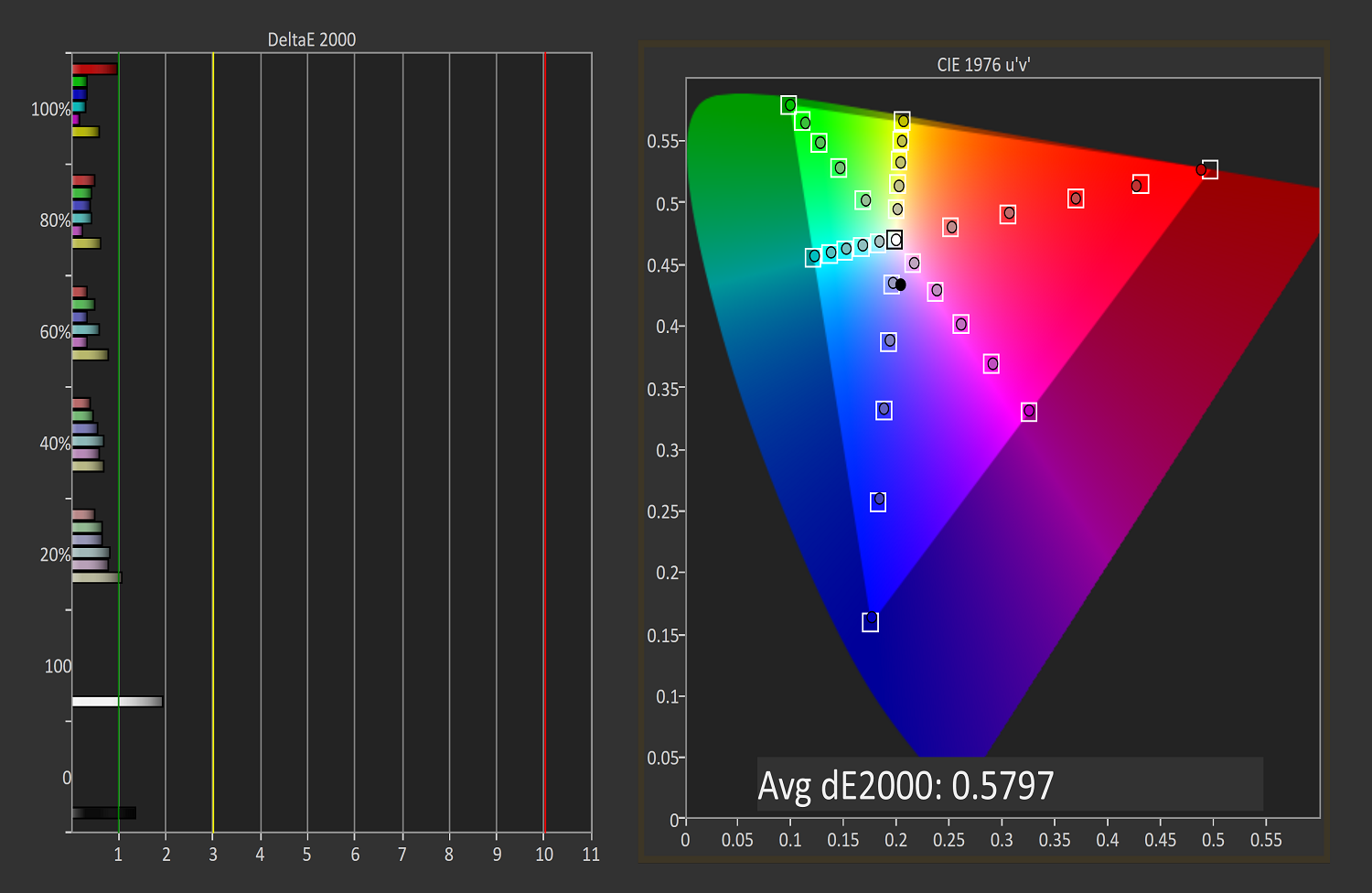
Gretag Macbeth
An average error level under one is a great result again, and although there are a few individual colors that jump up to dE 2000 of three or so, almost every color tested is well under one.
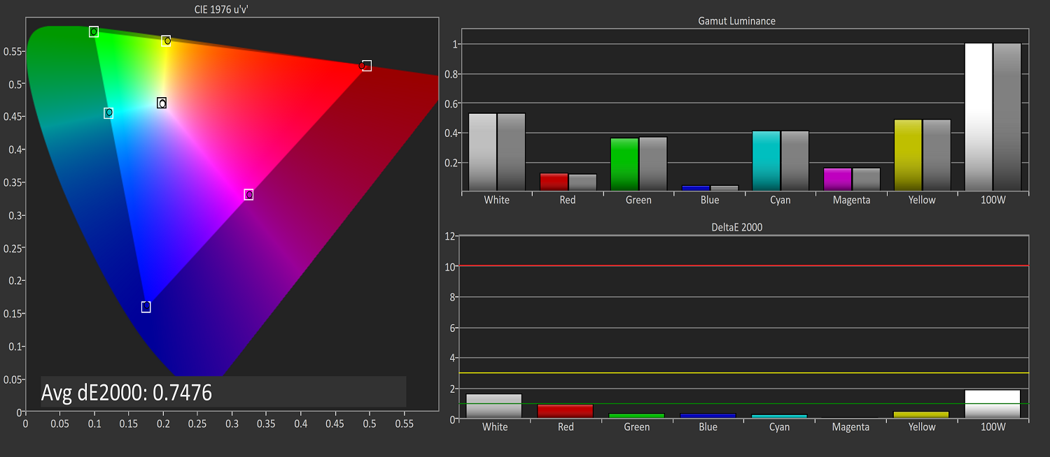
Vivid (P3 D65)
Grayscale
The P3 D65 gamut moves back to a gamma of 2.2, and the Surface Studio nicely hits that. The error levels on the grays are all very low, with only 97.3% white jumping over the two line. The D65 white point is also almost perfect, with the red just a bit higher than it should be, but not to a level that would be very noticeable.
Saturation
The saturation graph is amazingly accurate. Only 20% yellow even crosses the one mark, outside of white and black.
Gretag Macbeth
Finally, the Gretag Macbeth test continues the trend of fantastic display calibration on the Surface Studio. Just a single color tested has an error level over three, with pretty much the rest of the tested colors showing an error level of under one. It is a pretty fantastic result.
Display Conclusions
It’s difficult to not be impressed by the work put into the Surface Studio’s display. Here we have a display with an ICC profile for sRGB, DCI-P3, and P3 D65, and in every gamut, the accuracy levels are near, if not the best, that have ever been tested on this site. It is a fantastic achievement, and a testament to what can happen if a company decides to focus on quality. There is no doubt that the Surface Studio’s display is the stand-out feature on this PC, and Microsoft has taken the time to individually calibrate each display to one of the highest levels of accuracy possible.
The fact that this display also features ten-point multitouch, and pen support, as well as having accuracy that is top-notch, makes the Surface Studio arguably the best computer display targeted towards consumers and prosumers. Combine that with the excellent 3:2 aspect ratio, the high pixel density, and practically perfect display scaling, and it would be hard to find any faults with this display. It truly is a masterpiece.


197 Comments
View All Comments
jlabelle2 - Monday, January 23, 2017 - link
if you have a wide gamut screen (wider than sRGB), then yes.That is why on Android, every screen with a wider gamut than sRGB is very bad.
Even on Windows, it is really a chore as most of the time is spent in web browser (some are color managed though like Firefox) or Windows app or standard programs which are not color managed.
Really, this toggle switch on the Studio is really the best solution so far on Windows (short of Microsoft implementing a system wide color management) and I wish they would allow that on any machine and let us store the ICC profile we want inside.
fanofanand - Monday, January 23, 2017 - link
"So, for example, what is a proper white point? Well, we really don't know. "In other words you are complaining that the author wasn't accurately describing true white point when you say yourself that nobody knows. Why do I get the feeling you just wanted a place to brag about your extensive understanding of color management? Why did you feel the need to cite the cost of your incredible monitor that no other monitor can touch? If you feel the need to lord your incredibly vast knowledge of sunlight please go find a digital photo community that might be more receptive to your ramblings and musings.
id4andrei - Friday, January 20, 2017 - link
You can switch colorspaces on the fly. Not ideal, as the review already mentioned, but good enough for now. Furthermore this isn't exclusively targeted towards color sensitive work. Even simple document work benefits hugely from the form factor. Not to mention sketching/drawing.melgross - Friday, January 20, 2017 - link
It's not actually useful when doing precise color work, because you need both images on the screen at the same time, often enough. You do need to see how an Adobe RGB/HSB/Hex image looks after if been either converted to sRGB, or assigned an sRGB profile. No systemwide color mange,Win 10 means you can't do that. Well, not easily.jlabelle2 - Sunday, January 22, 2017 - link
If you are using a color managed application (like Photoshop), you can see both images (one in rRGB and the other in whatever color space), side by side.Your comment makes no sense. It is true that not all programs (and none of modern Store app) are color managed but for the one that are, there is no issue.
Brandon Chester - Friday, January 20, 2017 - link
It's not good enough for now, it's useless for a plethora of circumstances where wide color would be beneficial alongside existing sRGB content.jlabelle2 - Thursday, January 26, 2017 - link
Your wording is not precise enough Brandon. You can have sRGB content that is correctly displayed if it is from a color managed application.What you should say is that it is an issue for all apps and programs which are NOT color managed (irrespective of the content color space -except if it is by chance exactly matching the one from the screen-).
That is why, with this current limitation, at least, this switch on the Action Center is just the best solution I have seen on this, ever. Once you are done working with various gamut content en color managed applications (Photoshop, Lightroom, Capture One Pro, Irfanview, various video editors...) that display properly the content, you can switch to sRGB for web browsing, email, or other tasks using non color managed application.
vLsL2VnDmWjoTByaVLxb - Friday, January 20, 2017 - link
> "Windows 10 is the first Windows OS to have a working color management system built-in, but it comes turned off, because turning it on at this late stage screws up everything else in Windows, and it's very buggy."It isn't working, if it's buggy.
lilmoe - Friday, January 20, 2017 - link
I have three major issues with this PC:1) The base model. At that price they should have opted for the middle specs (6820HQ, 16GB of RAM), a 512GB NVMe SSD and non of the hybrid BS. Also the graphics card should have been the equivalent pro-grade Quadro which works better, and more reliable with the pro software this PC is aimed at. They should have also offered Mobile Xeon SKUs with ECC RAM.
2) Really? No USB-C and Thunderbolt 3? I mean, this IS the type of PC you'd want to connect an external GPU to, and/or other high performance peripherals. I mean, it IS dedicated to pros, right?
3) No HDMI/DP in. No matter how good this screen is, it's nothing more than junk 3-4 years later when the hardware in the base is obsolete.....
No good, Microsoft. The negatives far outweigh the positives.... It wont get any recommends from me to anyone who isn't interested in burning $$$$$.
Michael Bay - Saturday, January 21, 2017 - link
If last three years in CPUs is anything to go by, it will be just fine three years in the future.