The Microsoft Surface Studio Review
by Brett Howse on January 20, 2017 8:00 AM EST- Posted in
- Desktop
- Microsoft
- Surface
- Surface Studio
Outfitting the Surface Studio: Keyboard, Mouse, Pen, and Dial
The Surface Studio is the first desktop that I have used which is designed to have only the power cord running to it, and even the power cord is well thought-out and has a very solid friction fit into the base. The rest of the peripherals all connect over Bluetooth for a cable-free experience. This is somewhat important on the Studio because when you want to use it in drafting mode, the peripherals need to get out of the way, and not having cables to deal with makes this a much easier task.
Keyboard
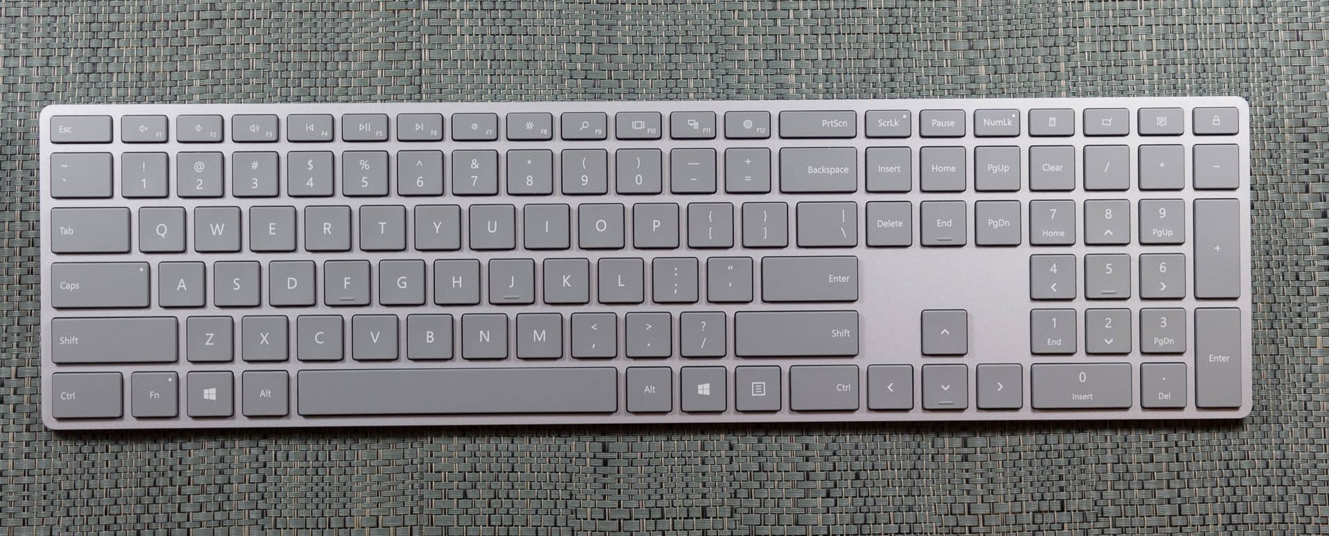
Microsoft ships the Studio with a Bluetooth keyboard and mouse, both finished in the same gray color as the Studio and other Surface devices. The keyboard is a full keyboard with number pad on the right side, and the top row of function keys are half-height. The key travel and feel is very similar to the Surface Book laptop keyboard, with short travel and a clicky feel. The shallow height of the keyboard does allow it to be tucked up against the base of the device when the display is tipped down, but there is a bit of interference with the display at it’s lowest angle, so it should be moved out of the way when used like that. It has two AAA batteries, and Microsoft says they can last up to twelve months on a charge. As a standard keyboard, it works well, but it would be nice if it held additional batteries to allow for some backlighting. People who prefer mechanical keyboards are not going to love the design, but it fits in well with the design and feel of the Studio. For those wondering, it does come paired with the Studio in the box, and you just have to pull a tab to have the included batteries power it up.
Mouse
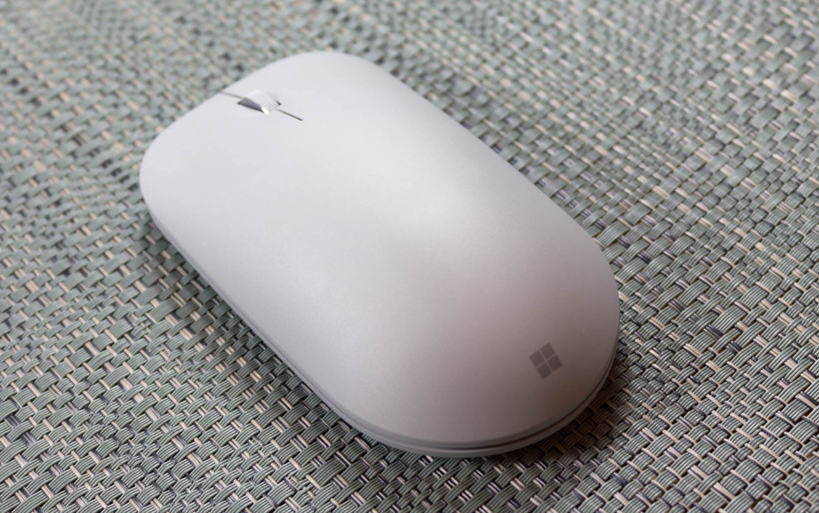
The mouse is similar in design and feel, and also comes paired out of the box. It is small, light, and features a blue light for tracking. It seems to track very well even without a mouse pad, which is not surprising since Microsoft has a lot of experience designing mice. The overall fit and feel is a bit too flat for my liking though, and I would prefer a mouse with more buttons to increase the functionality. It is a rather simple two button mouse with a scroll wheel, but luckily there are plenty of other mice to choose from if you prefer something else.
Surface Pen
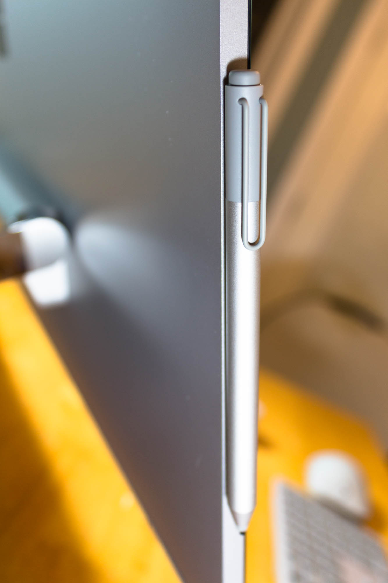
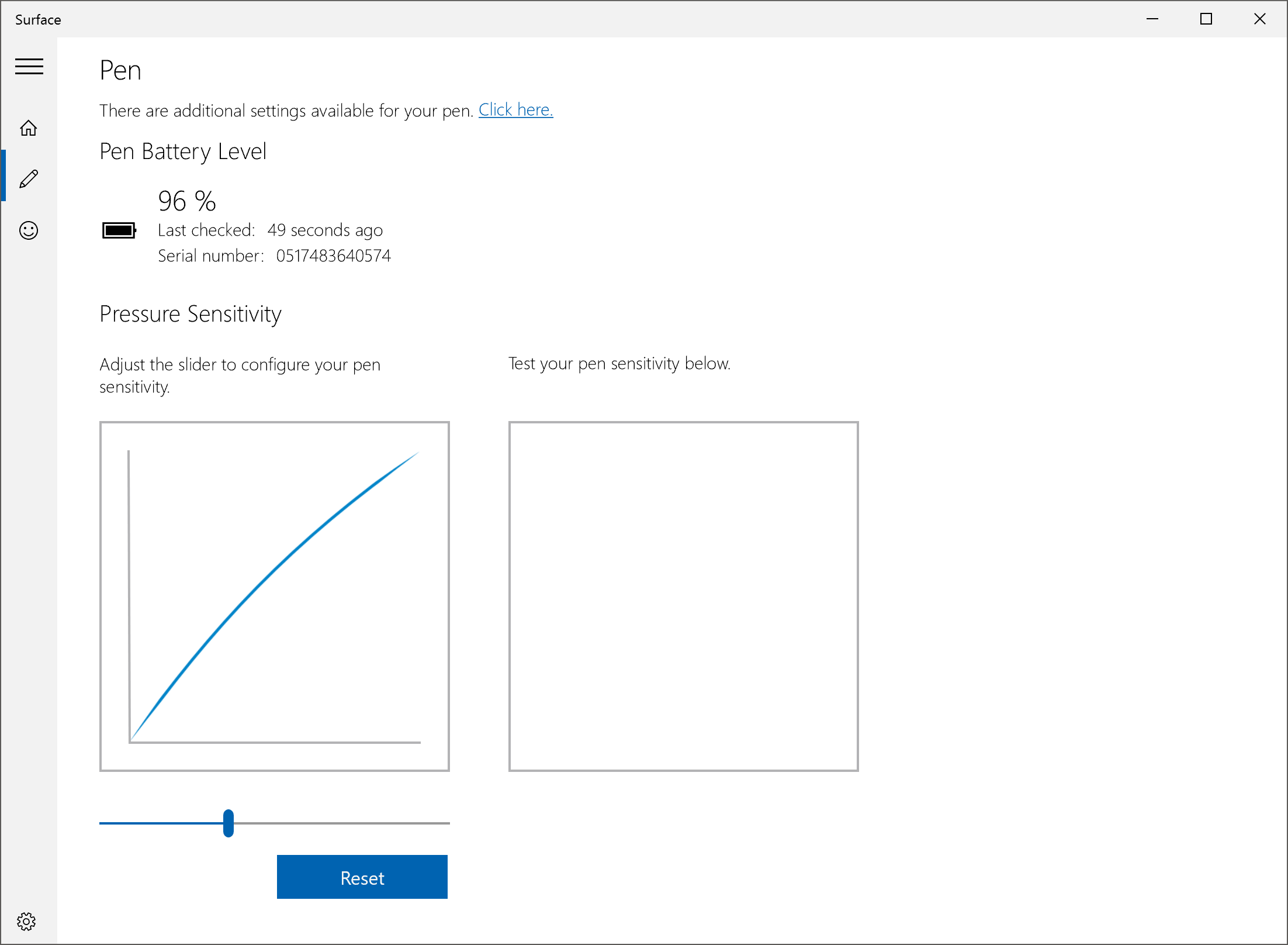
The final piece that comes in the box is the Surface Pen. Talking to Microsoft, they made it very clear that they wanted to ensure that the same pen could be used across the Surface Pro, Surface Book, and Surface Studio. That sounds simple enough, but with the much larger screen on the Surface Studio, it can be difficult to have precise accuracy without increasing the voltage on the pen itself. With some engineering, they were able to avoid this issue, allowing them to keep the same pen design across their consumer products, with only the Surface Hub pen having a different design. Microsoft even stated that the Surface Studio further increases the accuracy of the pen experience, which is something they have continued to work on since the Surface Pro 3 switched from Wacom, used on the first two generation devices, to N-Trig. And while the pen “only” supports 1024 levels of pressure sensitivity, it can quickly and easily be adjusted in the Surface app on the device to make it suit your own preferences.
I have always enjoyed the Surface Pen, and especially the latest model which first shipped with the Surface Pro 4. Microsoft has really nailed the friction level between the pen and the display, and the pen has just the smallest amount of drag which makes it feel like you really are writing with a real device, and not just sliding across the screen like on the older models. There is an eraser on the top, which also houses a button you can configure to do different tasks based on a single click, double click or click and hold.
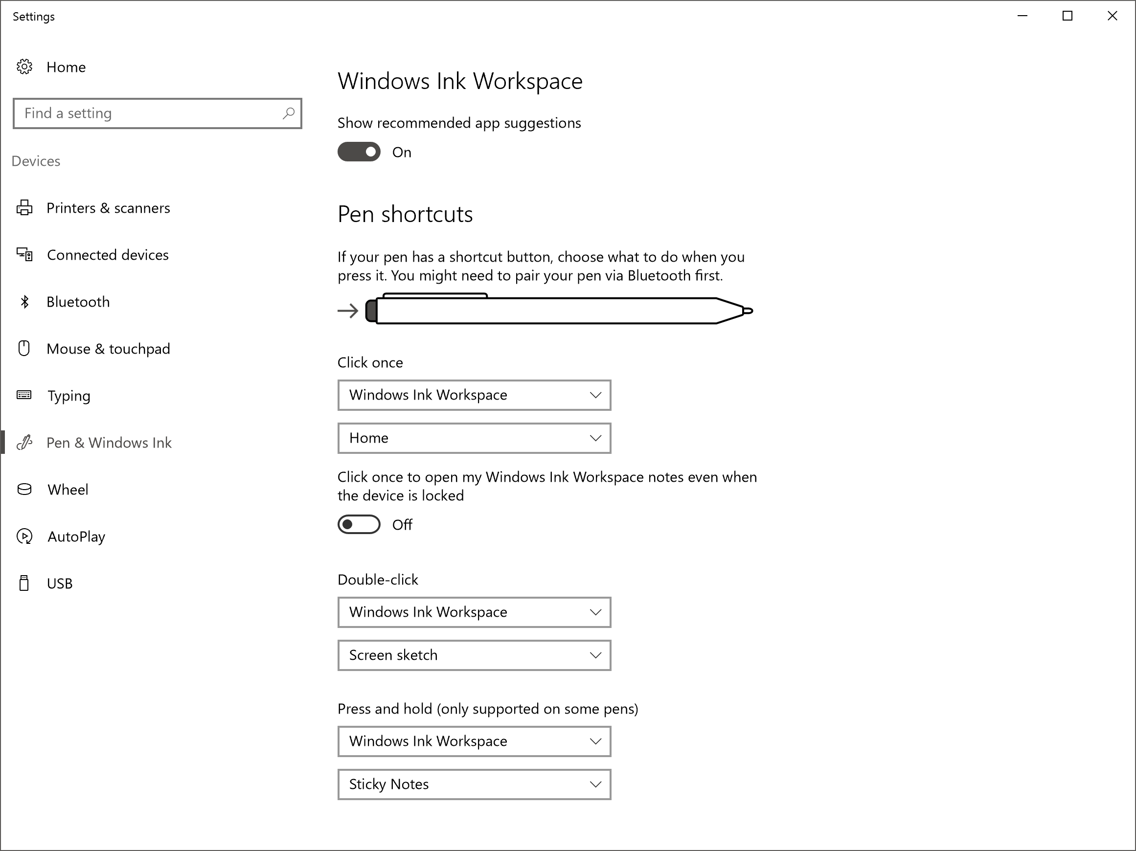
Some of the issues with the pen, especially being able to draw extremely straight lines, have been fixed, not through a hardware change, but through software. The introduction of rulers built into Windows 10 may seem like a small thing, but they are incredibly useful when drawing, and it’s kind of crazy they didn’t exist from the start, but with the Windows 10 Anniversary Update, this software construct makes the hardware implementation even better. As someone who has actually tried to use a physical ruler on a tablet, having one built in that is much more flexible makes the experience even better. The pen continues to be a focus at the company, so hopefully they will improve the hardware as well as time goes on. Some digital artists love it, but others are still firmly in the Wacom camp. Wacom has been at this a long time, so it’s not a big surprise they have a technology advantage with precision, sensitivity, and features like tilt support.
That is it for accessories that come in the box. You get a keyboard, mouse, and pen, and all three are available to purchase on their own as well. Perhaps the most exciting accessory announced with the Surface Studio is the one that will cost an additional $99.99 on top of the already pricey Studio, and that is the Surface Dial.
Surface Dial
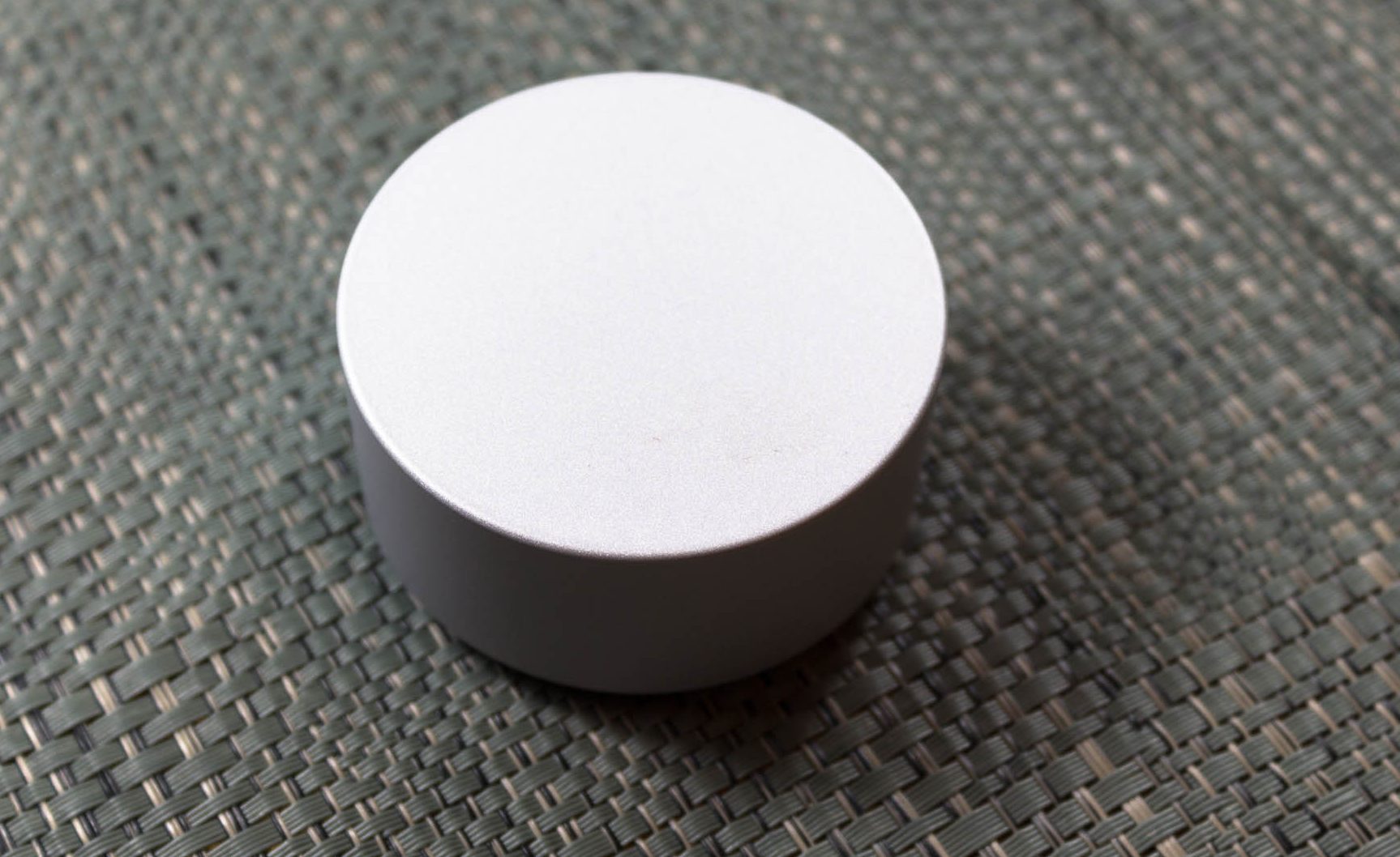
The Surface Dial is exactly what you would expect, and also so much more. It really epitomizes the collaboration of the Surface hardware team, and the Windows team, now that they all fall under the same group in the company. There are other features in the Surface Studio itself which demonstrate this as well, such as the ability to choose the color gamut in the Action Center, but having the Surface team develop a hardware accessory, and Windows not only supports it, but with a full API and customizability for developers, is really a great sign of the teams working together.
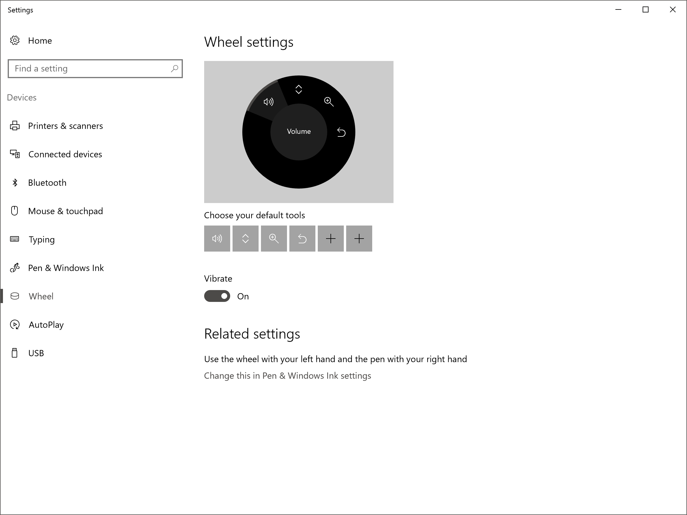
But let’s dig into the Dial. It connects over Bluetooth, just like all of the Studio accessories, and it can be used on any Windows 10 PC since the APIs and functionality is built right into the operating system. The difference on the Surface Studio is that it can detect the Surface Dial right on the display itself, allowing it to be used directly on a project, allowing for a more immersive experience. Microsoft looked at the experience of pen input, and designed a peripheral which works with the off-hand, which is normally doing nothing. Most people would use the pen with the same hand as they would use the mouse, and their non-dominant hand ends up not being utilized. The Surface Dial solves this problem, and with proper software support it can add a lot of functionality and usability to the drawing experience. It is important to note though that almost none of this requires the Surface Studio, since all the same functionality would be available off the screen. Using it on the screen is a bit more immersive, but that is it.
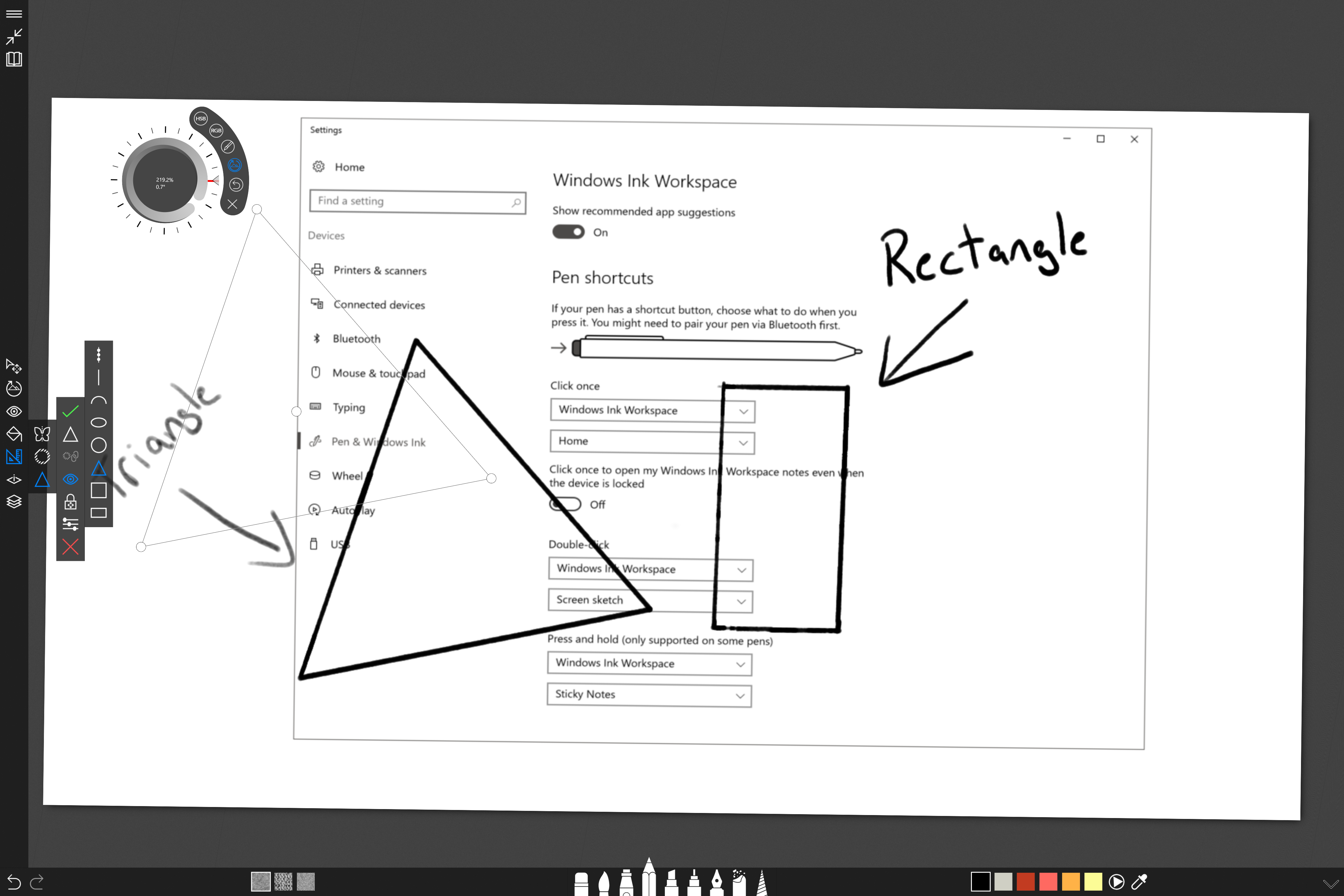
It's a simple device, with just a rotating dial with haptic feedback, and it can be clicked. It sounds almost too simple, but it can really expand what you can do. You can quickly use it to zoom or rotate. You can use it to set the color, or even adjust the color as you are using the pen. If you are using it just in Windows, you can use it to scroll or set the volume. Since the API is available for developers, it will be interesting to see how it is supported over time in professional apps. At the moment, it is supported in a handful of apps like Sketchable and Drawboard PDF with full support, and also works in almost any app as a scroll wheel and more. It is early days for the Dial, but it could easily become a powerful tool over time. Already at CES just a few weeks ago, Dell already showed off their own version of it. Simplicity is the key, and with just a clickable wheel, it’s surprising just how much you can already do with it through turns, clicks, or click and holds. It’s even made out of aluminum, so it feels great in the hand.
Surface Ergonomic Keyboard
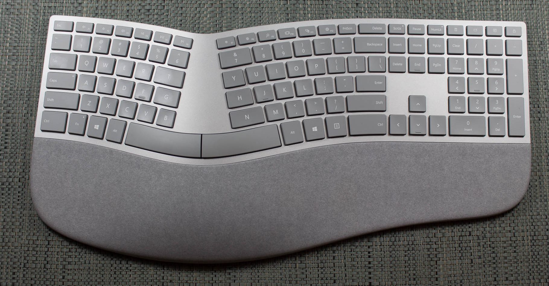
The final accessory announced at the Studio launch was a second keyboard. The Surface Ergonomic Keyboard is the latest ergonomic model available from Microsoft, who has been building ergonomic keyboards for what seems like forever. I switched to an ergonomic Microsoft keyboard well over a decade ago, and I find them much more comfortable to work with. The latest Surface Ergonomic Keyboard slightly changes the design from the most recent model in the Sculpt Ergonomic Keyboard, with the major change being adding the number pad back onto the keyboard rather than have it as a separate component. I prefer this, but there are people who are cramped for space that may prefer the Sculpt design.
The new keyboard features the same gray coloring as the Studio, although it’s made from plastic rather than the aluminum of the Studio, which is a disappointment only because of the cost of the keyboard at $129.99. As with the normal keyboard, it features laptop style keys, but they feel great to use if you like a short throw. It would be great to see backlighting on this keyboard as well, but that is also absent. The keyboard does feature an Alcantara wrist rest, which feels great to use.
Anyone used to Microsoft’s ergonomic keyboards will prefer this model, but as already said, it doesn’t come cheap.


197 Comments
View All Comments
warrenk81 - Friday, January 20, 2017 - link
what does this sentence mean? "It would be great to see backlighting as well, but that is also not missing."Does it have lights or not?
Ryan Smith - Friday, January 20, 2017 - link
One too many negations, it seems. Let's try this: "It would be great to see backlighting on this keyboard as well, but that is also absent"melgross - Friday, January 20, 2017 - link
About the review. There are a number of errors in areas in which the reviewer doesn't seem to understand,D65 is NOT daylight, the concept of what daylight is is very complex. For many decades, daylight has been standardized as 5.6K, not 6.5K. The reason why D65 was invented wasn't to simulate daylight, but because of practical graphics standards reasoning.
D5 has been the graphics standard going back a very long time. Every light box used for color was D5. So were print view boxes and such. The problem was that in the beginning days of computers entering the graphics space, a problem came up.
While my Barco monitors, in my place, that cost $16,000, could reach D5 calibration, no other could. The problem was that the monitors couldn't be made to display enough brightness. As a result, calibrating to D5 left us with a fairly dim, and very yellow screen. Since the red and green couldn't be brought up enough, the blue needed to be turned down, leaving that horrible screen. The barco was the only monitor that had enough brightness.
So there was much discussion, and as a result, D65 was decided upon as a compromise. It could easily be calibrated to using most high quality graphics monitors, and so that became the standard.
Now, we thing of D65 as daylight, but it isn't. Daylight varies from about D22 to about D20.0 in other words, about 2.2K to about 20K. Where you are in the world, at any given time of the day, or year, will determine what that point is, and it doesn't average D65.
It's why when a photo is taken with sunlight and open shade, the sun portion is very yellow, and the shade is mostly cyan.
This may seem to be a little point to make, but I see people misunderstanding this so often, it's frustrating. I ran a large commercial photo lab in NYC for many years, and we were one of the first to begin to go digital in 1988.
By the way, Windows has never had effective color management. Individual developers such as Adobe have had to write their own management software, which isn't usable systemwide. That means that if you have anything other than an image that is using the sRGB gamut, it won't be correct except when running in a color managed app.
Windows 10 is the first Windows OS to have a working color management system built-in, but it comes turned off, because turning it on at this late stage screws up everything else in Windows, and it's very buggy. Maybe someday, that will change. But for now, you can't view two images with differing gamuts side by side in Windows. Only one will ever show correctly.
This is one reason doing commercial color work on this will be a major headache.
Brandon Chester - Friday, January 20, 2017 - link
All CIE standard illuminants from series D are designed to simulate daylight. I believe by D5 you mean D50, which has a lower CCT than D65. The review is not incorrect in describing D65 as representing daylight. In fact, the actual spec states that D65 should be used for all colorimetric calculations requiring a value to represent daylight. I encourage you to read ISO 11664-2.You are correct on companies having to roll their own color management. However, Windows 10 still uses WCS, it is just as unusable as before, and neither Win32 nor UWP integrate it at all, so there is not some working CMM that is just turned off. This is why brand new UWP apps like Photos and Microsoft Edge still aren't color managed, which would be implicit in a system where the underlying graphics framework is color managed and thus any component that uses it for drawing is color managed.
melgross - Friday, January 20, 2017 - link
Yes, D50, but, hese color spaces do not actually represent daylight. They represent a convenient compromise that allows equipment to be made and maintained, while giving some "sort" of recognizable color while point.This is why the concept of daylight has varied so much over time. I know ISO 11664-2, because I was one of those who was consulted on this standard way back then. As I say, all of these various standards are mechanical approximations of something natural.
So, for example, what is a proper white point? Well, we really don't know. Should it be represented by something that supposedly looks something like "natural" light, whatever that is? Should it be represented by our own eye/brain combination which is most sensitive to yellow/green?
So when you look at the sky, it's about 20K. But that's not what's always reflected off an object, which could be closer to 3K, which is what we're looking at, and what our brain recognizes as "correct", with its ability to adjust its perception to various light sources.
I've undergone many permutations of these questions over the decades. And it will change again.
I did say that WCS is so buggy that it's still turned off. But that's not the only reason. Microsoft's customers don't care about color management in a large enough percentage for Microsoft to really care. They only added this, years ago, to satisfy those screaming for it, but without bothering to really work on it. Enough said, they think, that it's there.
You basically said what I did, it with more explanation. Yeah, it's always been a mess, and it's not likely to be fixed anytime soon. Android, by the way, has no color management whatsoever, and isn't likely to get any, which is why wide band screens on Android products are almost useless.
id4andrei - Friday, January 20, 2017 - link
I'm curious, in the case of something like a Samsung Galaxy phone, when you select the supposedly exceptionally accurate "basic" profile is that not akin to switching colorspaces on the Studio? I mean Samsung does not use pure Android which as you said is completely inept at color management, but a modified and skinned Android that might have some rudimentary color management. Is it not?Brett Howse - Friday, January 20, 2017 - link
How do I put this. If there was color management, it wouldn't matter what gamut the display was able to use, since the colors would be transformed to fit that color space, assuming the display color space covers both. So, as an example, if you were viewing a sRGB photo on a P3 D65 display, the colors would be correct because there is color management, and it knows the photo is sRGB, and it knows the display is P3 D65, so it can use some math to put the sRGB photo into the correct P3 D65 space.If you don't have color management, and something is 85% red in sRGB, but your display is P3 D65, it will appear as 85% of the larger space, and would be oversaturated.
We should really have Brandon write up a piece on this outside of the few times he's addressed it.
Some Windows apps do have color management, and some respect the color management in Windows, but most do not. For instance the old Photo Viewer does work, but the new UWP Photos app has no color management. Apps like Adobe Photoshop have written their own color management, so they generally work well.
id4andrei - Saturday, January 21, 2017 - link
Aha so viewing a random sRGB picture on your presumably AdobeRGB Android smartphone would look waaaay off. While an AdobeRGB picture would look right.Brett Howse - Saturday, January 21, 2017 - link
Exactly, and that's the case on Android. iOS has color management, so the P3 D65 displays they've started using don't suffer from this issue.Icehawk - Sunday, January 22, 2017 - link
I bet this is why colors were off viewing a file in the new Photo app (like way off) but using the old Photo Viewer it looked right.