The Apple Watch Series 2 Review: Building Towards Maturity
by Brandon Chester on December 20, 2016 8:00 AM EST- Posted in
- Wearables
- Apple
- Apple Watch
- Apple Watch Series 2
Designing Apps For watchOS
The Apple Watch is one of Apple’s newest development platforms, and the realities of the hardware as well as the nature of how a user uses a watch make it very different from developing for iOS or macOS. Much like iOS, watchOS quickly moved away from the development model that was introduced at launch. The iPhone launched without the App Store or UIKit, and developers were essentially told to make web apps. It only took one year for that plan to go out the window, with Apple introducing the iOS SDK for native apps, which has had a huge impact on the success of the iPhone.
With watchOS 1, Apple’s application model really treated the watch as a remote terminal. Building apps for the Apple Watch really meant building an extension of your iPhone app which would run on the iPhone but display on the watch. The inevitable outcome of this strategy was obvious even before developers started making apps, as there’s simply too much latency introduced when controlling the UI on one device connected via Bluetooth to another device that is actually executing code.
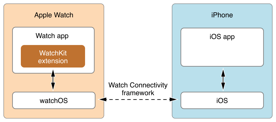
Fortunately, this app model was thrown out even more quickly than the original iPhone’s model of using web applications. The first Apple Watch was released in April of 2015, and two months later at WWDC Apple announced that watchOS 2.0 would support native apps when it launched in September of that year. Of course, supporting native apps was not a silver bullet to fix the issues with applications being slow and performing poorly, which should have already been clear based on Apple’s own applications suffering those same issues at times. However, moving away from the pure extension model did help to improve performance, especially when combined with the new application caching in watchOS 3.0. Essentially, the changes in the application model since the initial release have moved much of the burden for performance improvements onto the hardware, and I’ve already mentioned how much faster the whole experience is on Apple’s new dual core SiPs with their improved GPUs.
Having experience with iOS and Android development, and having been exposed to WatchKit by making our watchOS display testing application, I thought I’d share some of my thoughts on watchOS as a platform for developers. I'm not going to talk much about the API itself, as it wouldn't really make sense for anyone who isn't an existing iOS developer, and anyone who is doesn't need me to give them a watered down half page summary of things they can read in the developer docs. The only thing I will say is that Apple's main competition is an OS where the developer API is in pure C, so from an implementation perspective even the original system for making watchOS apps was years ahead of the competition.
One of the main things I found interesting about developing for watchOS is how interfaces are designed. In hindsight, the original decision to used fixed layouts for iPhone applications was an incredibly shortsighted and poor choice. No doubt many users remember letterboxed applications on the iPhone 5 due to fixed 3:2 layouts being shown on a 16:9 display, and even now there are iPhone apps and iPad apps that have to be upscaled to work on larger modern devices even if the aspect ratio matches, because their interfaces were designed for a single resolution.
The Apple Watch puts Apple in an interesting position. On one hand, they don’t really need to worry about people’s wrists getting larger, and so the size of the display isn’t going to change significantly. On the other hand, there needs to be some room to change things if needed in the future, and the Apple Watch already comes in two sizes with two different resolutions, which means there’s more variety in the displays now than there was for the first three years of iOS devices. The solution Apple has settled on is somewhere between the fixed layouts of early iOS applications, and the pure constraint-based layouts of modern iOS applications that use Auto Layout.
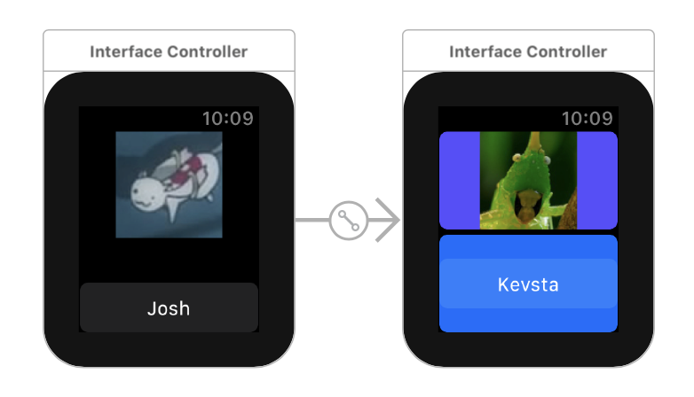
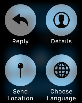
When positioning the UI elements in an Apple Watch application, you essentially get to choose the horizontal and vertical alignment, along with some attributes related to the size. You can set a fixed size, but this is generally only a good idea for images and other bitmaps where there really is an intrinsic size. For other situations, it’s best to just let the system size a control to fit the content, or if setting it directly, by sizing it relative to the size of the container to avoid the pitfalls of hardcoded sizes should the resolution or size of the display change in the future. Apple also provides groups, which allow you to divide the screen into sections that other controls can be positioned within. This can be helpful when trying to align something in a way that the standard top/left/right/bottom/center options for positioning relative to the entire screen don’t accommodate for, while still making a layout that works independently of the display size and resolution. On the right side of the image above you can see a case where the screen is split into two containers and objects are aligned relative to that.
Another interesting thing about UI design on the Apple Watch is that layouts have implicit vertical scrolling. Vertical scrolling has always been needed on mobile devices due to the limited space available, but this has always been something that you have to actively implement, generally through the use of a UIScrollView or the more structured UITableView and UICollectionView classes. Most mobile applications make use of these, even apps like the iOS weather application where the customization of the cells is so heavy that you don’t even see the UI as being a table. However, if you do not make use of these, the interface will not automatically allow for scrolling if you position views off the edge of the display.
Because the amount of space on the Apple Watch is so limited, Apple essentially treats every screen like a scrolling view if needed. A standard TableView API is provided for cases where you actually want to structure things in table form, but for all other cases you can simply place as many elements stacked vertically as needed to construct the interface, and the system will make it scrollable if needed. Xcode’s Interface Builder also makes this fairly obvious by extending the size of the preview to indicate that they can’t fit within the standard area. In addition to vertical scrolling on a screen, the process of implementing paging so users can swipe horizontally between screens involves zero lines of code and can be done within a few seconds in Interface Builder.
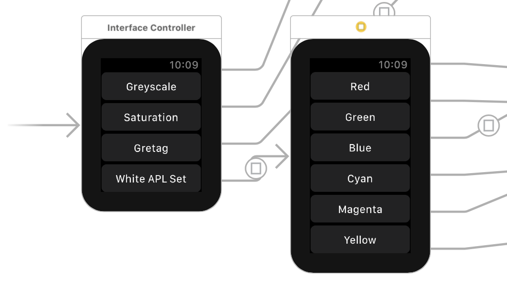
Of course, not everything about the watchOS interaction model is perfect. As I mentioned earlier, Force Touch often ends up being a way to implement mystery menus that the user won’t discover naturally. As long as you follow Apple’s guidelines of using Force Touch to implement navigation between sections or contextual commands you’ll generally be okay once users discover how Force Touch works in your app, but that doesn’t solve the problem of users having to consciously Force Touch in every single new app just to figure out if it’s implemented, and what function it performs if it is. The very nature of using Force Touch to bring up these menus leads to this situation, as there are no visual cues that allow the user to discover the menu through other means. This may just be one of the limitations when adding functionality to a device with such a small amount of space on the screen, but I still feel that there has to be a better solution than this.
Despite my misgivings about Force Touch introducing menus with poor discoverability, the interface and interaction models for watchOS are generally well suited to the Apple Watch’s small screen. Apple essentially gives you scrolling and paging views for free, which removes a ton of overhead that would exist if developers had to implement full TableView classes with their data source and delegate objects, and separate page view controllers to manage groups of Interface Controllers. The layout system itself also gives developers sufficient control over the placement of objects on the screen, while also being flexible enough to scale to both sizes of the Apple Watch, and any future watchOS devices that may come in new sizes or resolutions.


126 Comments
View All Comments
name99 - Tuesday, December 20, 2016 - link
Lumping together fitness bands and smart watches, and even lumping together other brands with the Apple Watch seems like a willful attempt to evade the issue when the Apple Watch fans are all saying "Look, it is NOT just a fitness band or a watch or whatever"...Your argument is like saying "I tried a Blackberry [or a RAZR]. Didn't see what the fuss was about. Obviously the iPhone is going to go nowhere".
osxandwindows - Tuesday, December 20, 2016 - link
Hate to say it, but this site's comment section is worse then BGR.Where are the interesting comments I used to see on every anandtech review?
BrokenCrayons - Tuesday, December 20, 2016 - link
Rather than bringing it down with criticisms, why not bring it up with thoughts you find constructive or useful? Quality according to your perception won't spring into being without collective positive efforts.The Garden Variety - Tuesday, December 20, 2016 - link
I think you're being generous. The reason to visit Anadtech is top-tier writing and deep-dive analysis. You (or I) may not always agree with the conclusions of that analysis, but that's OK. The data is in front of us, we can draw our own conclusions or compare against what's important to us.The comments are USA Today level stupidity and trolls. Basement Nerds who get their feathers all ruffled whenever consumer-oriented tech gets play, or when specs don't win out to design, convenience, or form. A "good" product (loaded word, I know) should work to balance these elements into a package that speaks to engineering, design, and business prowess. But there's an extreme subset of the geek/nerd population that cannot allow the idea of "balance" between specs and anything else to exist, any more so than someone on the extreme left or extreme right of the political spectrum can abide by anyone who believes differently. It's just the sad reality of the audience that visits sites like Anandtech. We're supposed to be "smarter," and instead we're as big a bunch of trolls and misfits as the people visiting CNN.com.
KoolAidMan1 - Thursday, December 22, 2016 - link
Maybe the troglodytes that used to live in the DailyTech comments migrated here?goatfajitas - Thursday, December 22, 2016 - link
Most people that used to come here for tech have moved on. It's now an Apple fan site first and tech as an afterthought. The user base just matches the site these days.hechacker1 - Tuesday, December 20, 2016 - link
I use my Apple Watch all the time. For me it's a glorified notification tool and it means I can leave my phone in my backpack while tracking some health parameter. The only other thing I use it for is controlling my music while driving (very handy for a car without bluetooth controls like mine).I think the biggest use case though is reminders and notifications for my business calendar and personal calendar. Seeing text and whose calling is also useful in letting me dismiss some things if they aren't important.
I see quite a few of them around my IT workplace. Series 2 was a nice improvement IMHO, but mostly that was WatchOS 3. Unfortunately what it lacks is more sensors, and better WiFi for things like WPA-2 E. It basically doesn't connect at my workplace unless the phone is in range. The range is pretty good though.
However, if the iPhone 8 / 9 isn't a major setup in hardware and iOS, I may go back to Android for the google integration. I hardly use the Apple stuff.
MonkeyPaw - Tuesday, December 20, 2016 - link
I agree. My first wearable was a Band 2. I loved the device other than build quality, so I tried a Fitbit Charge 2. It was then that I realized just how nice having notifications on your wrist can be, especially at work when you have other things going on all day. I find that I check my phone a lot less, especially during meetings or when I'm taking to another human being. I was a skeptic of wearable tech when it came out, but after a year of trying different devices, I've found that it can help you get through your day with less distractions, not more.serendip - Tuesday, December 20, 2016 - link
Email and WhatsApp triage, that's what I use my Pebble for. It saves a lot of time by letting me choose which notifications need urgent action and which can be left for later.name99 - Tuesday, December 20, 2016 - link
More important than any of the above, Brandon, where's the A10 article?Dead and gone forever? AnandTech decided to give up and wait until the A10X?