The iPhone 7 and iPhone 7 Plus Review: Iterating on a Flagship
by Joshua Ho & Brandon Chester on October 10, 2016 8:00 AM EST- Posted in
- Smartphones
- Apple
- Mobile
- iOS
- iOS 10
- iPhone 7
- iPhone 7 Plus
Still Image Performance
Now that we’ve discussed the basics of the iPhone 7 and 7 Plus camera we can start to get into how it actually performs relative to the iPhone 6s and 6s Plus as well the current competition on the market. While we normally run an ISO test to check spatial resolution this has been deferred to a future portion of the review. Unfortunately we don't really have the ability to do time-invariant testing here in a serious manner to the same extent that an OEM might, so we're effectively limited to tripod comparisons of real-world subjects.
| Daytime Photography |

In this kind of scenario the iPhone 7 and 7 Plus are directly comparable in the 1x mode. Because the primary camera has OIS and the secondary camera doesn't, it looks like it's fairly difficult for Apple to do an exact pixel to pixel correlation to the extent that the two outputs can be merged into a single image. As a result it's fairly obvious that the 1x mode has less detail than the 2x mode here. I can really see how this would be useful in general, as the longer focal length means more detail relative to anything else on the market but also allows for more interesting framing. The 1x camera is identical to the iPhone 7, and here it's definitely noticeable that the iPhone 7 can't quite keep up with the Galaxy S7 or HTC 10 in sheer detail in these kinds of shots.
| Daytime Photography 2 |

In the interest of trying to not just take a single landscape photo and declare it to be a representative sample for all photos ever taken of all time with a smartphone in daytime conditions, I went ahead and took another sample shot of a mostly static subject. Here the iPhone 7 Plus in 1x mode is pretty much comparable to the iPhone 6s and Galaxy S7 as far as detail goes. I would argue that the HTC 10 captures slightly more detail at the center, but this probably isn't a surprise when the sensor is significantly larger. It's also worth noting that the iPhone 7 Plus manages to show better dynamic range here as the highlights off to the right retain more color detail than most devices tested and the shadows contain more detail that what is found on the Galaxy S7 or the iPhone 6s Plus. Once again, at 2x the iPhone 7 Plus is really just ridiculously good at capturing the sheer amount of detail that the tree has which isn't really captured by the 1x mode as most of the detail has to be blurred away to avoid aliasing. It's truly impressive how the iPhone 7 and 7 Plus are actually capable of keeping up with the Galaxy S7 despite a smaller sensor, and we're really seeing the product of Apple's ISP lead here.
| Low Light Photography 1 |
It probably is worth mentioning here that in low light the iPhone 7 Plus doesn't actually use the secondary camera at all due to its smaller aperture and lack of image stabilization, which means that the iPhone 7 and 7 Plus are identical in low light performance. Interestingly enough detail is fairly comparable between the iPhone 6s Plus and iPhones 7, with some minor adjustment to favor more noise reduction. I'm inclined to say that the Galaxy S7 and iPhone 7 are basically comparable here but the oversharpening on the Galaxy S7 remains fairly obvious and I would expect it to outperform in detail here but it's just comparable to the iPhone 7 due to the rather smeary noise reduction. The HTC 10 is the clear winner here as far as detail goes but both the Galaxy S7 and HTC 10 really oversaturate the green shrubs while the iPhone 7 is much closer to what it should actually be. The oversaturated, smeary look that seems to dominate the Galaxy S7 output continues to be seriously off-putting for me.
| Low Light Photography 2 |

It's interesting to see how Apple's noise and noise reduction seems to have changed from the 6 to 6s to 7 here. Detail is functionality identical but the iPhone 7 and 7 Plus clearly handle shadows better here as there's more detail and noise is controlled noticeably better with better detail and less visible noise. It's really impressive what Apple's processing is able to pull off here when sensor size and sensor technology hasn't really advanced that much from the iPhone 6s to iPhone 7. This is especially obvious when compared to the Galaxy S7, which has comparable overall detail but the noise reduction used is much more splotchy and has obvious oversharpening if you look too closely. Again, relative to the HTC 10 the sensor size deficit is very obvious here if you try to read the text on the trash cans, but the HTC 10's gamma and noise reduction algorithms are just not competitive in the shadows and it's obvious that there are uncorrected optical distortions in the light flares. The HTC 10 also tends to feel like it has a filter over the entire photo that makes it look a little soft compared to the iPhone 7 even if it does have better detail in some parts of the frame.
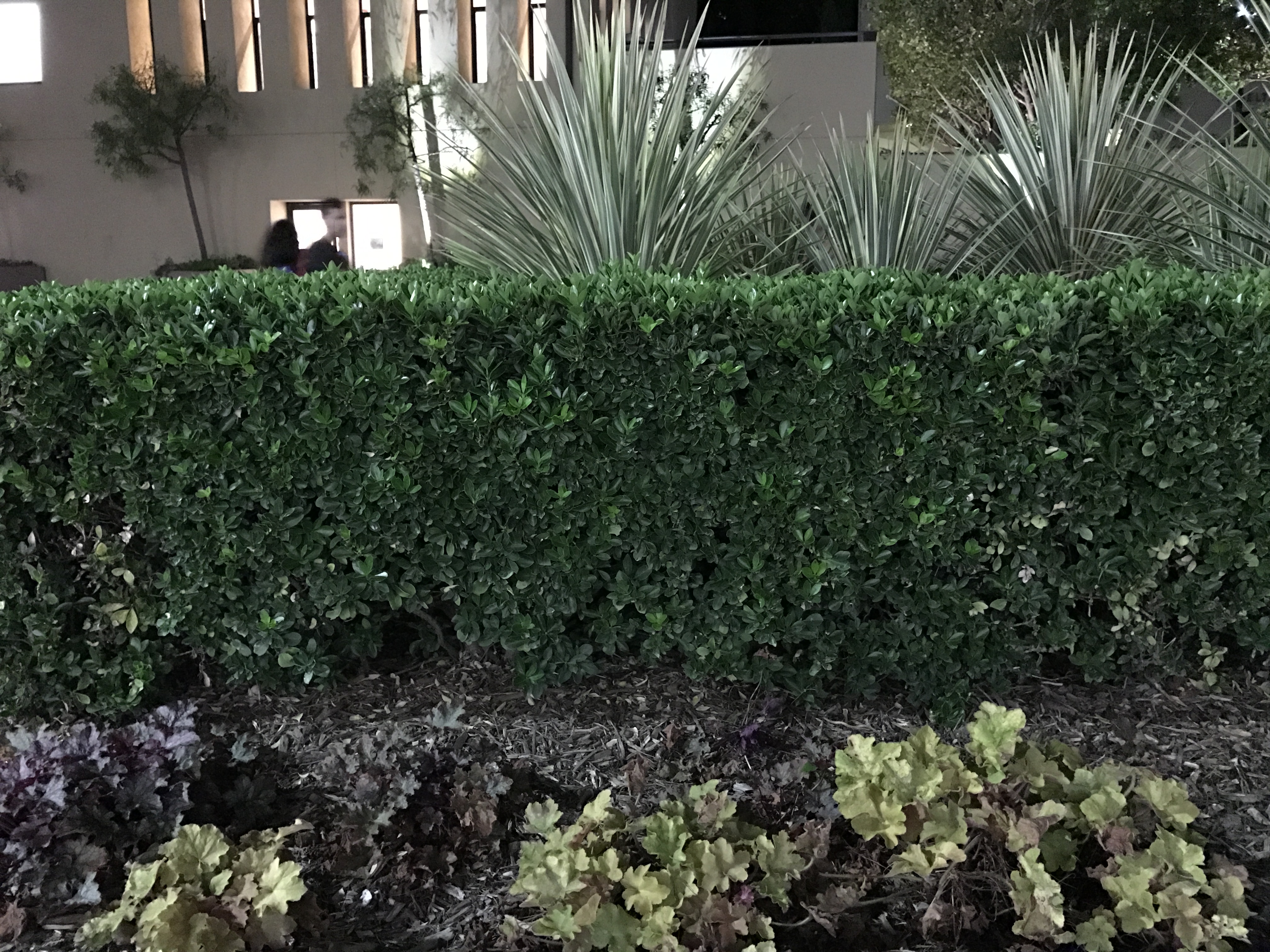
| Low Light Photography 3 |
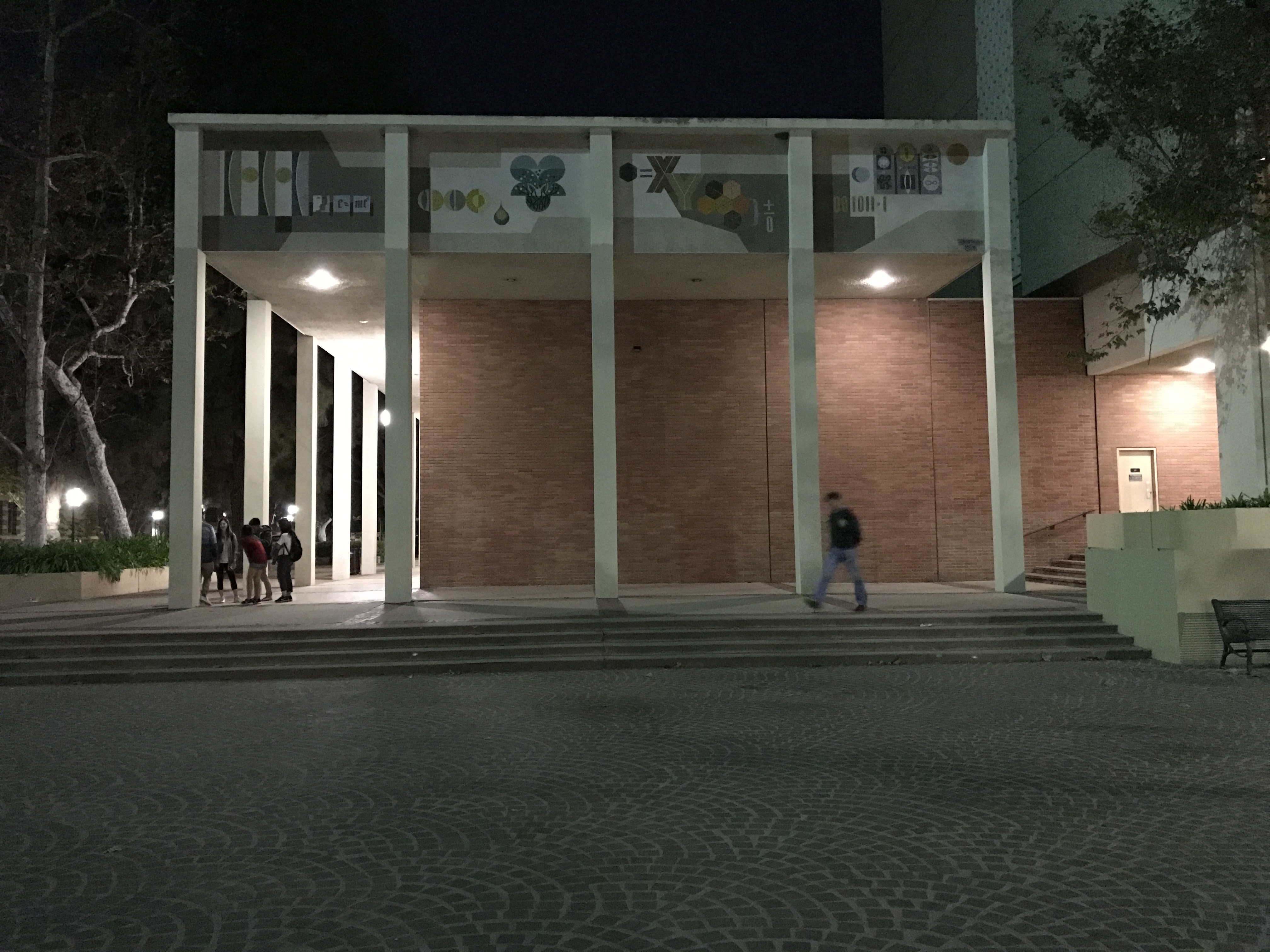
For whatever reason this scene always seems to at least mildly challenging. Here we can really start to see the softness that I'm talking about with the HTC 10, as the white pillar "bleeds" a bit into the brick wall exterior of Knudsen Hall. Detail on the iPhone 7 and 7 Plus remains comparable to the iPhone 6s Plus, but with noticeably less noise. The Galaxy S7 manages to deliver similar levels of detail to the iPhone 7, but it definitely oversaturates the red brick colors which might be appealing but really isn't accurate when you look at the RAW reference. The noise reduction on the Galaxy S7 is noticeably splotchier here and gets much worse if you look at the top right quarter of the photo. I would actually say the iPhone 7 outperforms just about everything here but the LG G5, which has better detail but a really strange color rendition.
Overall, the iPhone 7 camera is impressive and I would argue is holistically a better camera for still photos than the Galaxy S7 on the basis of more accurate color rendition, cleaner noise reduction, and lack of aggressive sharpening. It may not be as lightning fast as the Galaxy S7 or have as many party tricks, but what it does have is extremely well executed. The HTC 10 is definitely better than the iPhone 7 at delivering sheer detail when only comparing the 28mm focal length camera, but the post-processing has a tendency to bleed colors in low light which sometimes causes the images to look a bit soft. In daytime the iPhone 7 Plus' 56mm equivalent camera helps to keep it well ahead of the curve when it comes to sheer detail and really is a revelatory experience after years of using smartphone cameras that have focal lengths as short as 22mm and can't really capture what the eye sees. However, in low light the sensor size deficit really starts to become obvious. I suspect the Pixel and Pixel XL will make this especially clear. If there's really no room to go up the ladder in sensor size, Apple really needs to consider some radical approaches to improving sensor sensitivity such as RWB pixel layouts or using the dual camera for an oversampling scheme.


377 Comments
View All Comments
ycc - Monday, October 10, 2016 - link
Pretty much every updated program you use on a PC (Windows or Mac) will (should) be color managed, be in Chrome, Safari, Firefox, Edge, etc. In those cases the picture will just look a little less vibrant but the basic accuracy should be fine.The only issue is on mobile space, where Android devices don't support color management. I would imagine if you look at a jpg taken on an iPhone 7 with the DCI-P3 color space will look weird when Android tries to display it in its native color space without performing a conversion.
jlabelle2 - Wednesday, October 12, 2016 - link
"Pretty much every updated program you use on a PC (Windows or Mac) will (should) be color managed, be in Chrome, Safari, Firefox, Edge, etc"Absolutely not. NONE of the Windows Store app are for instance. The email applications / software or photo app (the default one) and Windows Photo Viewer are not. Also, IE has the issue of not applying the monitor ICC profile which create an issue for any wide gamut monitor.
Firefox was for a long time the only browser (with Safari on OS X) to manage properly the colors (assign sRGB to untagged image, read and convert image color space, use monitor ICC profile).
Because of that, wide color gamut screens on Windows (or Android) is still a huge problem making all the OS and applications colors appear oversaturated.
Ryan Smith - Tuesday, October 11, 2016 - link
It's something we're already working on as part of the deep dive.=)Bandur - Monday, October 10, 2016 - link
First page: "their first SoC with heterogeneous CPU cores"System Performance subpage : "this is not a heterogeneous design"
Is this meant to be like this?
Ryan Smith - Monday, October 10, 2016 - link
The hardware is heterogeneous, however the execution model is not. A heterogeneous execution model would have the system using all 4 CPU cores at the same time, instead of bouncing between the big and small cores based on power/perf needs.ikjadoon - Monday, October 10, 2016 - link
IMO, maybe this could've been clarified slightly. I had some trouble if the first page was a typo. 2 cents.Featherinmycap - Monday, October 10, 2016 - link
Fantastic review. I learned a great deal. I have been reading and enjoying this site for so long and the transition of the founders to Josh and Brandon has really gone smoothly. I am sorry the discussions have gone so far downhill from the early days of the site. This used to be an enthusiast site and now there seems to be so many people doing their upmost to pointlessly criticize how long it takes you to post something or what you decide to write about. I read many other tech blogs as well and these same people spew the same rhetoric on those sites as well. I am one loyal reader who says keep up the great work.mef - Monday, October 10, 2016 - link
Well said!techconc - Monday, October 10, 2016 - link
"While it’s not unusable by any means, you don’t need to have amazing vision to see the difference between 326 PPI and the 400-500 PPI of most Android devices and the iPhone Plus line."I realize this is the common mantra repeated by the spec conscious crowd, especially by Android fans. However, it simply isn't true. This can also be proven mathematically.... which is why I find random and unsupported comments like this to be rather disturbing on a respected technical site like Anandtech. Just a few points here....
1. If you understand the definition of normal (20/20) vision having the ability to discern 1 minute of arc, it can be mathematically proven that you can't see any signs of pixels at normal viewing distances.
2. This comment also assumes all things are equal between technologies. That is, take the Samsung Amoled displays that use Pentile based pixel arrangements. They use 1/3 less subpixels and need more full pixels in order to achieve the same level of sharpness.
3. Actual Apples to Apples comparisons.... I cannot see a quality difference between Apple's iPhone 6 (326 ppi) and 6 plus (401 ppi) screens. However, I can see a quality difference between these and the iPad's 264 ppi screen.
3a. I've seen people try to demonstrate a difference using text. They've mistaken a lighter font on an Android phone for higher resolution. You need to make a true comparison with the same programs, the same OS and the same font rendering systems to make the proper conclusion.
At the end of the day, nobody is looking at an iPhone screen and saying this is great.. I just wish it were sharper. This is only an issue for people counting specs who don't know what they're looking at.
grayson_carr - Monday, October 10, 2016 - link
Depends on your definition of normal viewing distance. At an arms length (2+ feet), I definitely can't tell the difference between a 4.7 inch iPhone and the 5.5 inch 1080p iPhone or a QHD Android phone, but when I bring the phone in to about 1 foot from my face, as I often do when sitting down or laying in bed, the difference is obvious.