The Huawei Honor 8 Review
by Matt Humrick on October 13, 2016 8:00 AM EST- Posted in
- Huawei
- Smartphones
- Mobile
- Kirin 950
- honor
Software: EMUI
Perhaps the biggest problem within the Android ecosystem today is timely software updates. This includes core Android updates as well as monthly security updates. The update policies of Chinese OEMs are particularly egregious, with some companies providing essentially no software support beyond their own apps. While not the worst offender, this is one area where Huawei needs to improve.
With the Honor 8, the company is “making a commitment to provide customers with access to new features (at least once every three months during the first 12 months) for at least 24 months following each product launch,” and “will keep providing access to security and software updates to fix bugs and enhance user experience in a timely manner.” This sounds like a small step in the right direction (it took 9 months for the Honor 5X to receive an update to Android Marshmallow), but it says nothing about an update to Android Nougat and does not set a timetable for security updates, just that they will be delivered in a “timely manner,” which is rather subjective. Since I received the Honor 8, it has received one security update, jumping from the July patch to the September patch, which is somewhat encouraging I guess; however, all Huawei is really committing to is providing quarterly updates for its own apps and EMUI skin. It’s a bit unfair to point our fingers solely at the OEMs and carriers, of course, because it was Google that created this mess and, ultimately, only Google can clean it up. Until then it seems quarterly security updates and one Android update arriving 9-12 months late is all that the OEMs can or are willing to do.
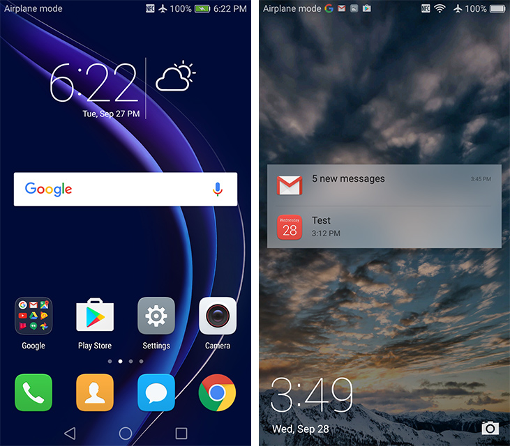
The Honor 8 comes with Android 6.0 Marshmallow with Huawei’s EMUI 4.1 skin on top. Like nearly all OEMs, Huawei uses software as a differentiator for its products, adding several features and completely restyling the user interface. For better or worse, Huawei completely disregards Google’s Material Design guidelines; EMUI looks more like iOS than AOSP, FWIW.
The lock screen cycles through some nice background pictures and shows the time and date in the lower-left corner and a shortcut to open the camera in the lower-right. What’s missing on the lock screen by default are notifications. To see them without unlocking the phone, you can either pull down the notification shade, or you need to manually enable lock screen notifications for each app individually. When notifications appear, they can be dismissed but not expanded to reveal additional information.
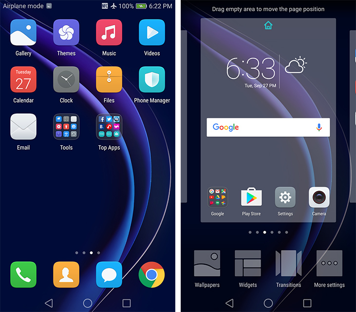
In an effort to simplify its interface, Huawei does not include an app drawer in EMUI. Instead, all apps live on the home screen. The icons can be repositioned anywhere on the screen or grouped into folders. The default app icons are squares with rounded corners, which do not match the style of Google’s icons, which do not match the style of third-party icons, but such is life on Android. It’s possible to tweak the appearance with theme packs, or you could go with a third-party launcher for different functionality.
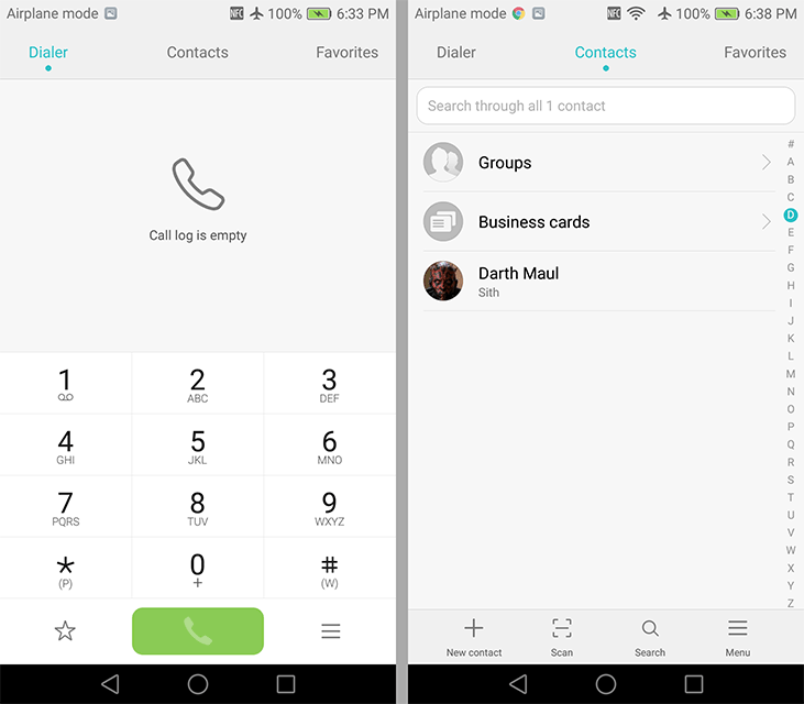
Sample of Huawei’s apps: Dialer, Contacts, and Calendar
Huawei includes several of its own apps that cover basic smartphone functions such as email, messaging, contacts, calendar, camera, dialer, music, gallery, etc. These are in addition to the usual suite of Google apps (except in China). I did not have time to use Huawei’s apps in depth (neither Google or Yahoo would allow me to sign in using the Email app citing security concerns), but they seem functional and look pretty, although they certainly do not follow Google’s design guidelines.
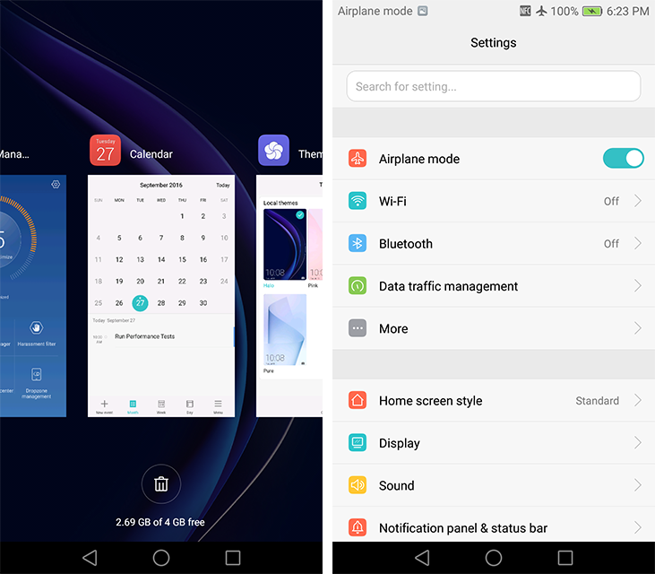
The recent apps screen uses a side-scrolling array of app preview cards instead of vertically scrolling cards like stock Android. Switching tasks works the same way as it does in Xiaomi’s MIUI, but unlike iOS, the cards do not overlap and you scroll from left to right to go further back in time. Entering and exiting the recent apps screen is almost instantaneous, because there’s essentially no transitional animation slowing things down.
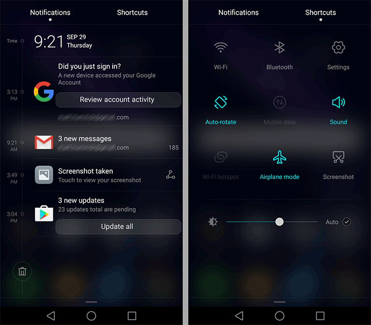
The notification shade is divided into two tabs, separating notifications from the quick setting toggles to reduce clutter, with a dark-frosted, semi-transparent background. On the notification tab, there’s a handy button to clear all notifications and a nice looking timeline. This latter feature is a little confusing because notifications are not always listed in chronological order, probably because of how multiple notifications from the same app are grouped together. Swiping down on a notification expands it to reveal more information—the sender and subject for each email instead of just the total number of new emails received, for example. The quick setting toggles on the other tab can be rearranged and swapped out, but only nine toggles can be shown on the screen at once, which is a silly limit considering the window still has empty space and there’s already a scroll bar next to the toggles.
There’s two user-selectable methods for pulling down the notification shade. The default behavior is to show the notification screen if notifications are present or the quick settings screen otherwise. The second method will show the notifications if you pull down from the left side of the screen or the quick settings if you pull down from the right side, allowing quicker access to the information you want.
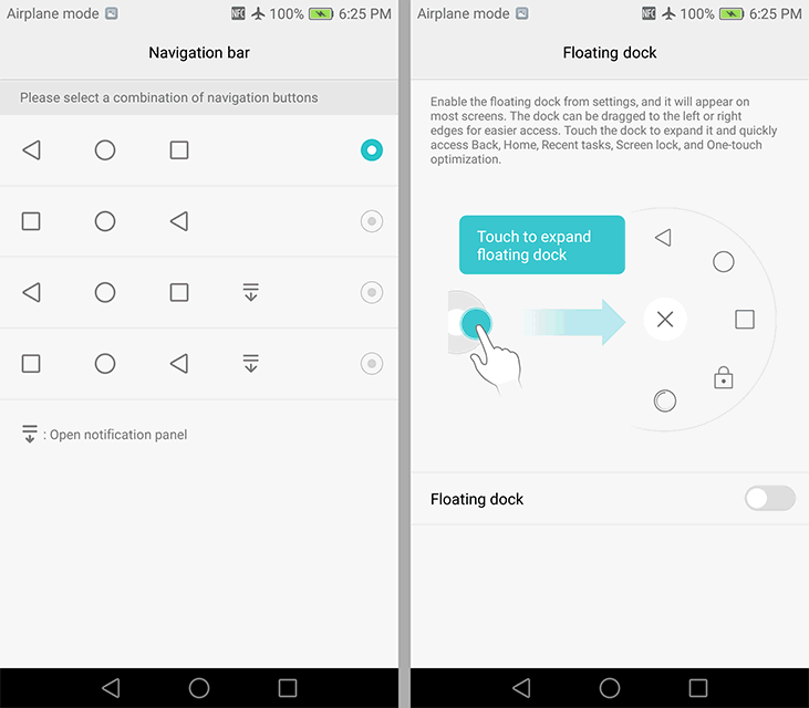
Customizable nav buttons and Smart key (left), Floating dock (right)
Jumping into the redesigned and more colorful settings menu reveals a handful of optional features. For starters, the standard back, home, and recents buttons in the navigation bar can be rearranged, and you can add an additional button to lower the notification shade like on LG’s phones. The “floating dock” feature adds a small circular button that hovers over window content and is visible on the home screen, within apps, and even full-screen games, which is a bit annoying. Tapping the button expands it into a circular menu that shows the standard Android navigation buttons, a button to clear all recent apps, and a button to lock the screen. This feature is similar to the SmartTouch feature in Meizu’s Flyme OS or AssistiveTouch in Apple’s iOS.
The Honor 8’s “Smart key” feature uses the fingerprint sensor on the back, which also functions as a clickable button, as a shortcut to start a voice recording, turn on the flashlight, take a screenshot, or open a specific app. Separate actions can be assigned to either a single press, a double press, or a press and hold of the button. This can be a useful feature, but it needs a longer list of actions to choose from to truly unlock its potential.
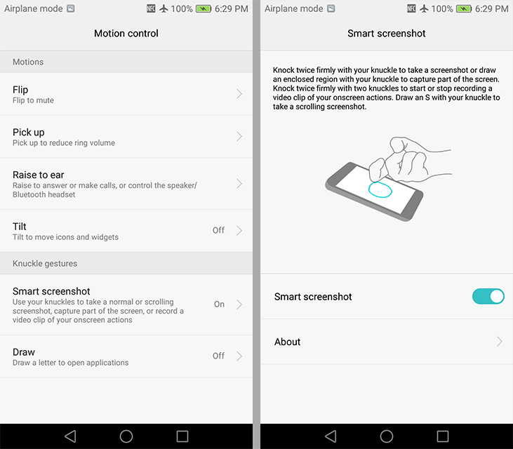
EMUI motion controls and knuckle gestures
The Honor 8 includes common motion controls, such as flip to mute and raise to answer a call, alongside Huawei’s less common knuckle gestures. Rapping the screen with the backside of a knuckle (the front side and top of the knuckle do not register as well) will take a screenshot, while the same gesture with two knuckles will start or stop recording what’s happening onscreen. Drawing the letter ‘S’ with a knuckle takes a scrolling screenshot. You can draw up to four other letters with your knuckle to open apps too. This works on both the home screen and the lock screen (but not with the screen turned off), although it’s difficult to get the phone to recognize that you’re drawing a letter instead of swiping to scroll. I’m not ready to become a knuckle dragger, but I’m sure some people will find this feature useful.
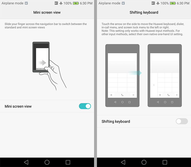
Huawei’s EMUI also includes a couple of features that improve one-handed use. Sliding a finger across the navigation bar at the bottom of the screen will scale the entire display to a smaller size, placing everything within a thumb’s reach. The mini screen will anchor to either the lower-left or lower-right corners depending on which direction your finger slides across the nav bar. This approach works very well, making it easy to pull down the notification shade regardless of hand size. The only drawback is that text becomes smaller and more difficult to read. Huawei also provides an option to shrink the keyboard and dock it to either side of the screen, but this only works within its own apps.
Huawei’s EMUI strays pretty far from the stock Android experience, both in terms of design and functionality. There are a few idiosyncrasies that I’ve pointed out, but overall I like what Huawei is doing. If you do not care for its design, you can always replace Huawei’s apps with Google’s or those from third-parties. Ditto with the launcher. All of the convenience features Huawei adds can be turned off too, but I find some of them quite useful.


95 Comments
View All Comments
Meteor2 - Thursday, October 13, 2016 - link
Argh, great hardware, crap software (and I'd include the display calibration in that).Why can't someone build a phone with hardware like this, calibrate the screen, and just put stock Android on it.
Meteor2 - Thursday, October 13, 2016 - link
Just read about the Axon 7. Sounds perfect! I would love to read an Anandtech review of it.tipoo - Friday, October 14, 2016 - link
The number of Axon 7 = 'perfect' comments is getting a bit suspect, when the reviews I looked up of it mention UI freezes and sluggish camera performance.negusp - Friday, October 14, 2016 - link
When I see your comments I is getting a bit suspect, you seem like the only person that is getting this problems.:p
evilpaul666 - Sunday, October 30, 2016 - link
The Axon 7 forums bemoan the software as glitchy and what ruins an otherwise "perfect" phone.evilpaul666 - Sunday, October 30, 2016 - link
Particularly the notification "Bell" on the lock screen.prku - Friday, October 14, 2016 - link
not only that. signal reception is apparently a problem in the Axon 7, which kinda beats the purpose of owning a "phone".fanofanand - Saturday, October 15, 2016 - link
The specs are there on the A7 but I too would like to see an anandtech level review of it.evilpaul666 - Sunday, October 30, 2016 - link
I read quite a bit about the Honor 8, One Plus 3, and Axon 7 before settling on the Honor 8.You can make any of the phones look much more stock with the Google Launcher and Google Keyboard.
If no app drawer is a problem or iOS-like look are a problem between those two and the VUI theme it looks pretty close to stock Android. The only significant difference at that point is the notification pull down menu and the app switching. Neither of which seem like a big deal to me.
greyhulk - Thursday, October 13, 2016 - link
I really don't understand the obsession with RGB. Displays that are set to RGB mode look really bland to me. I certainly don't see it as something to penalize an otherwise great device over. And that seems to be a common theme in all of these reviews.I was actually pretty happy with the Honor 8's display. My only complaint was that it wasn't my preferred size (5.5" or above), but I couldn't complain otherwise.