The Samsung Galaxy Note7 (S820) Review
by Joshua Ho on August 16, 2016 9:00 AM ESTSoftware UX: TouchWiz Redesigned
If you read the Galaxy S7 review it was probably fairly evident that I found the design of TouchWiz as well as the performance of the software in general to be fairly lacking. It seems that people within Samsung found this to be the case as well as with the launch of the Note7 it’s clear that they’ve significantly changed the design of TouchWiz.
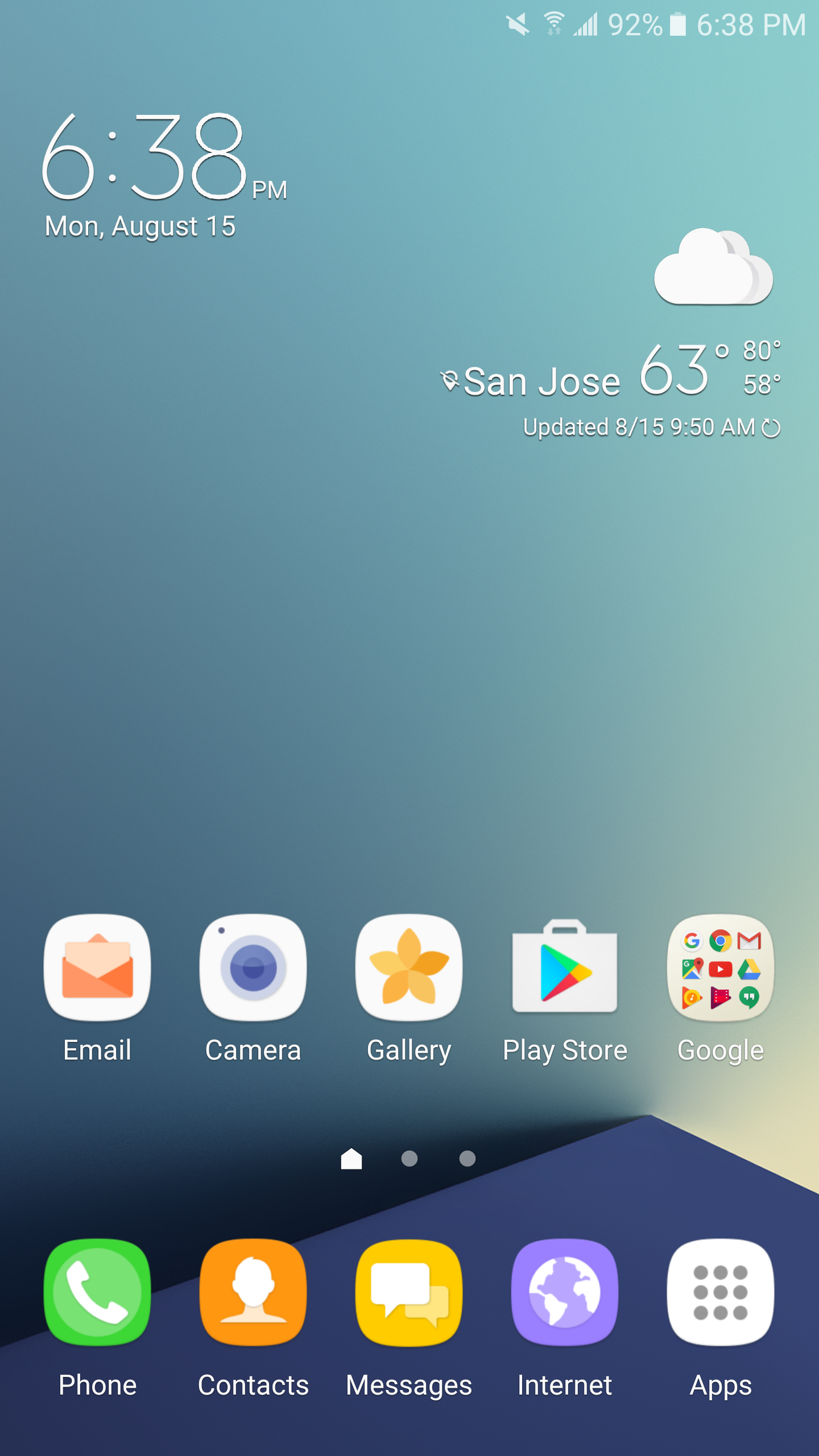
To start our examination of Samsung’s UI we can start with the homescreen. Right away it’s fairly obvious that the iconography is a lot better than it was before. Things like the camera application and email application no longer use strong, saturated colors. Instead we see more neutral pastel colors that fit in with Android icons in general and look a lot less out of place. The icons in general are just a lot less cluttered and have a cleaner look as well with the use of a simple envelope and letter instead of a letter sealed with an @ which complicated the design. The phone icon similarly no longer has random hatched squares that clutter the design which is great to see.
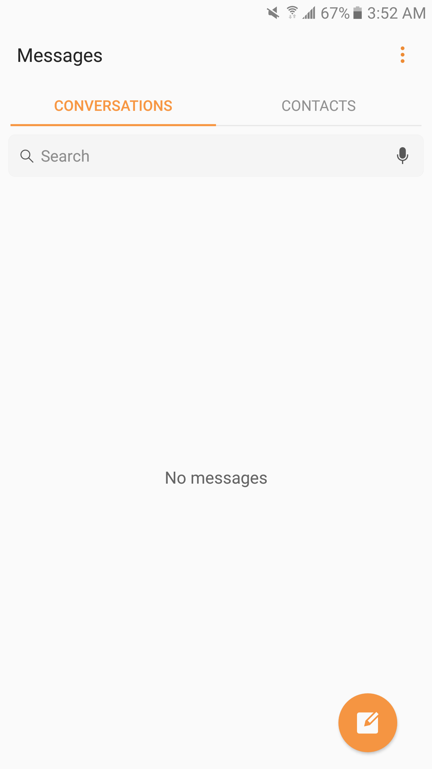
Moving past icons the applications themselves have been cleaned up somewhat and navigate in a more sensible way. For example, the messages application used to have search and “more” as physical buttons despite just being text. In the new version of the SMS application the “More” button has been replaced with Android’s standard overflow button and the search function has been placed into a bar that is clearly delineated similar to Google’s search bar. This sort of design flows a lot better which is great to see. However, I think that Samsung still has a ways to go here because if you look at something like the tabs Samsung still breaks with standard Android navigation convention because you have to tap on the tabs themselves rather than just swiping between conversations and contacts. Samsung users are probably used to this kind of thing but to every other Android user it’s a missing step of usability. Another weird usability issue is that going to the contacts portion of the Messages application has two distinct compose buttons which really does nothing but clutter up the UI.
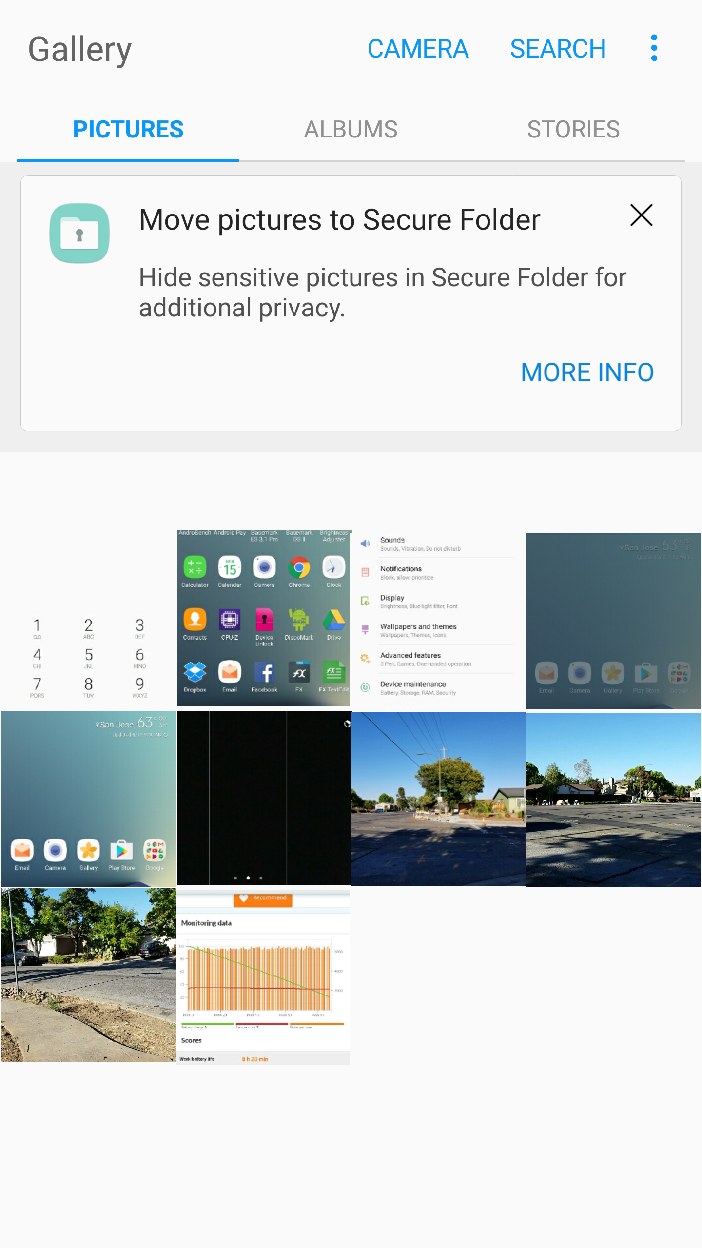
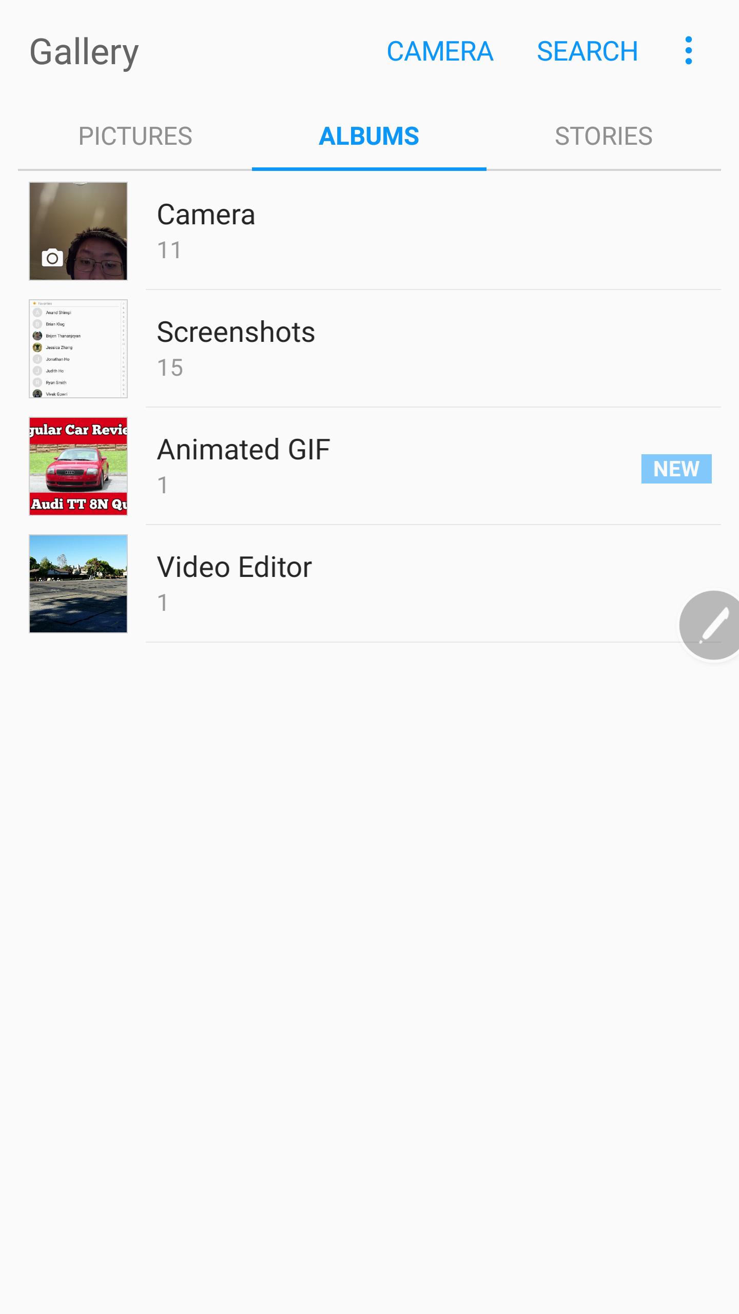
Looking at other applications like the Gallery, it’s actually possible to swipe from tab to tab which further adds to the strangeness of some of Samsung’s UI design decisions. It feels rather schizophrenic and while there’s progress here, Samsung hasn’t completely gotten over its past. The gallery application in general is great though, as it provides easy access to a general chronological picture stream as well as separating photos by albums for simpler navigation.
Other apps like the calculator and browser are also well-executed, with extra features like ad blocking although it isn’t necessarily 100% effective at doing this. Ads are generally a huge impact on battery life and data consumption so I would honestly recommend using Samsung Browser over Chrome at this point as there are also optimization benefits from using Samsung Browser due to the extra optimizations that Samsung uses here.

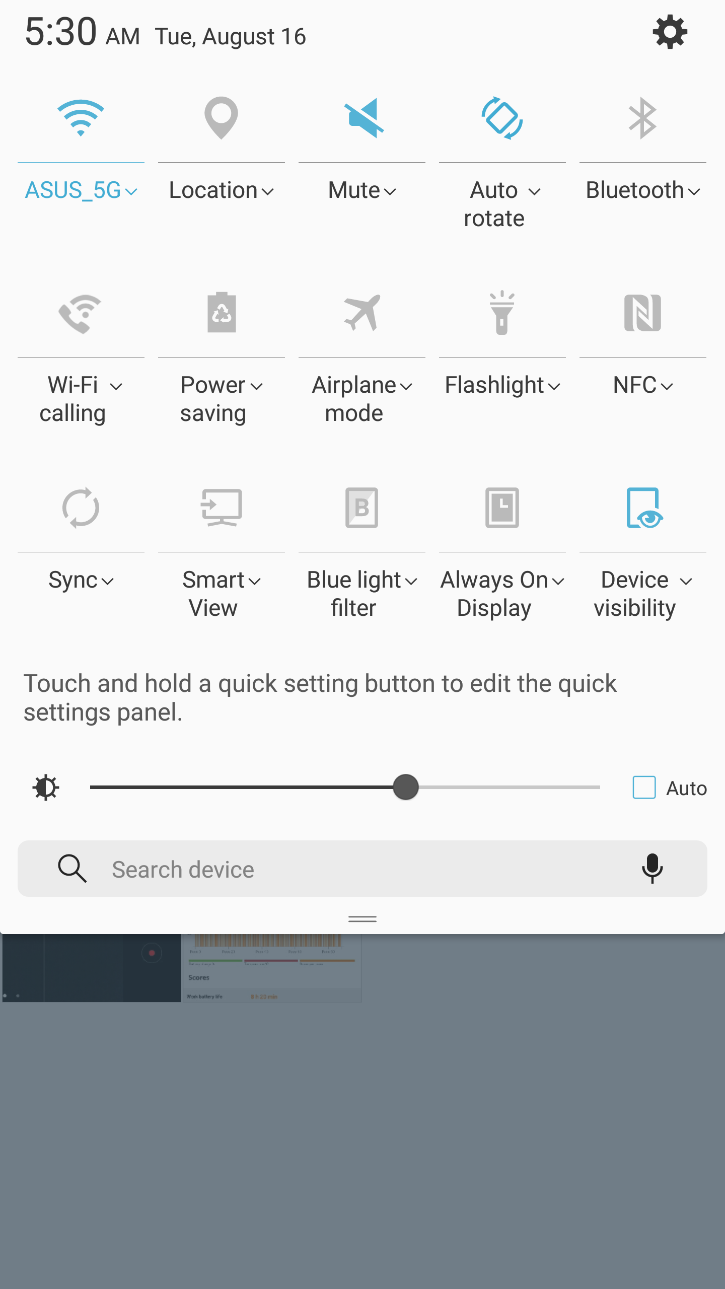
In addition to these changes things like the notification drawer are noticeably cleaner with only one row of quick settings unless you swipe again to get to the full quick settings drawer. The ability to access the flashlight in quick settings is nice as well. Tapping the settings icon leads to the settings application which has been cleaned up significantly and no longer has a bunch of tabs and frankly confusing navigation. Iconography here is also cleaner than what we saw from the Galaxy S7 but honestly I didn’t see a lot wrong with the Galaxy S7 here specifically. You can set up the secure folder here but honestly I didn’t use it seriously but it seems to work if you care about this feature.
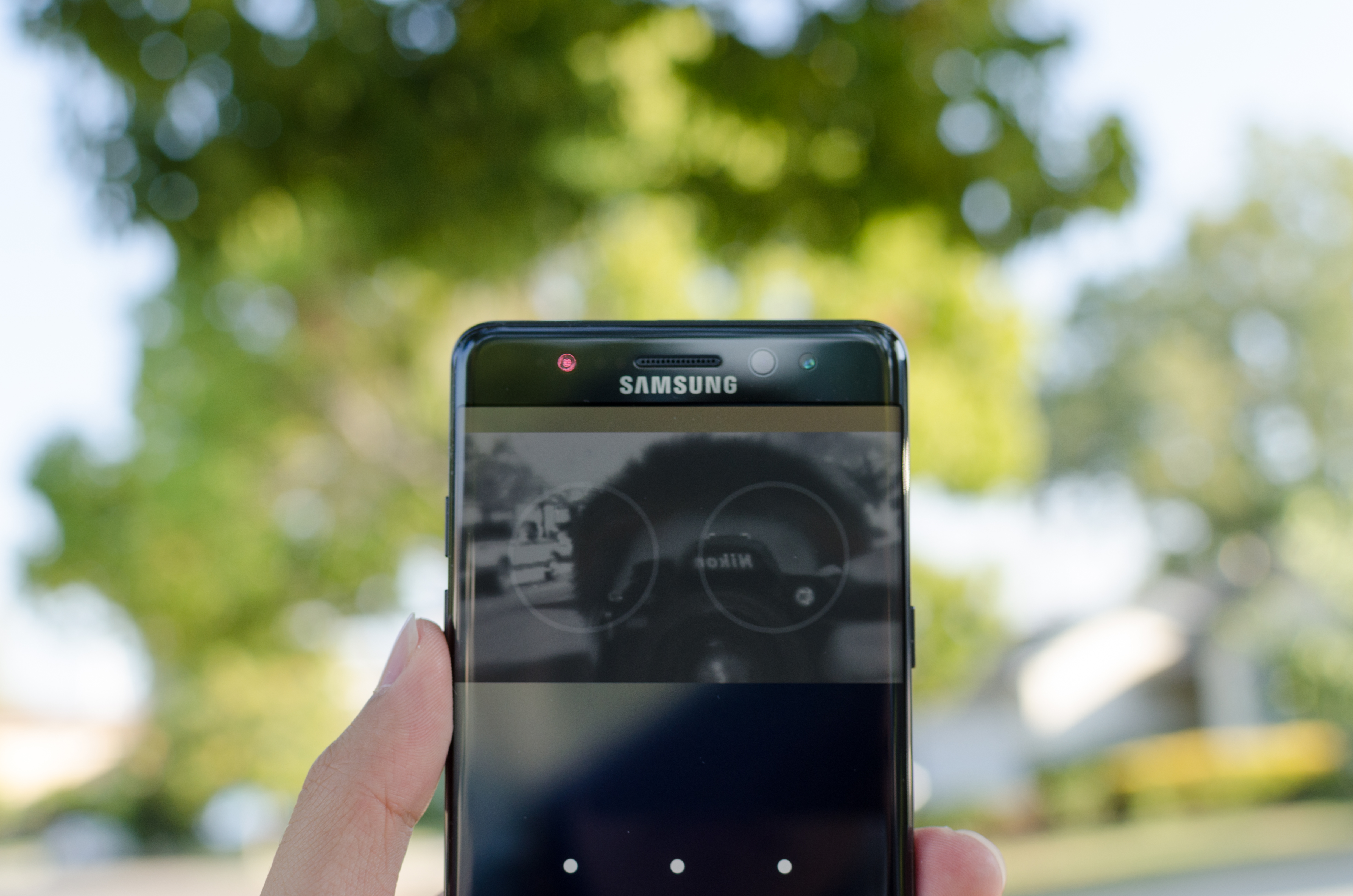
Another notable addition that you can set up in the settings drawer is the Iris scanner. While I normally write off features from Samsung like this as a gimmick this iris scanner actually works, but with a few caveats. Right away it’s very obvious that the iris scanner doesn’t have the highest frame rate, although it is good enough to work. It also only registers one set of eyes. But other than these caveats, it actually works fairly well and the lock screen allows unlocking with either fingerprint scanner or the iris scanner. Scanning seems to work in both low light and outdoors although depending upon glare conditions it may not work outdoors. The lock screen also requires a swipe in order to enable the iris scanner so in most conditions the iris scanner is slower than the fingerprint scanner although if you’re wearing gloves the iris scanner is likely to be much faster.


The other feature worth discussing that falls under the aegis of software is the S-Pen. This works, but for the most part there’s really nothing ground-breaking here. The two major features added are animated gifs and the ability to translate things on the fly. These things both work and they might be useful but honestly I did nothing but check to see that they worked because I just don’t really find myself needing single word translation or GIF creation tools. Usability for both is fairly good as animated gifs are just a matter of using Smart Select and enabling the GIF option and translate is just matter of selecting Translate in the S-Pen overlay. The only other change here as far as usability goes is merging a bunch of disparate note-taking applications like Action Memo and S-Note and merging it all into Samsung Note which is good to see. The S-Pen continues to work well although I very rarely have any use for it other than signing PDFs with my signature, which is a great feature but I’m not sure if I’d buy a phone just to do that.

Galaxy Note7 left/top, HTC 10 right/bottom
The final thing I want to discuss as far as the software experience goes is performance. While TouchWiz is generally performant I still find lag here similar to the Galaxy S7. To prove I’m not crazy I did a very simple scrolling test between the HTC 10 and Galaxy Note7 on the same application on the same pages doing a very slow scroll on content that had already been preloaded and without any notable transitions. The Galaxy Note7 consistently drops frames right as the scrolling stops while the HTC 10 stays fairly close to 60 FPS throughout this very simple test, which just highlights the kind of frustrations that I have with Samsung software. I’m fairly confident that Samsung has the engineering staff capable of resolving these issues so it’s frustrating to see how this kind of thing just never seems to get fixed. These kinds of issues make it easy to think that Samsung really only cares about things that can be easily marketed rather than things that make for a good user experience, and judging by how Samsung can quickly turn around and fix things like iconography they need to take smoothness seriously if they want to continue justifying their pricing structure.
Overall, I think TouchWiz is a pretty acceptable experience, but it’s still lacking the level of polish I’m expecting from a major high-end smartphone these days. Design is a lot better and things like collapsing multiple note applications into a single application are great, but Samsung clearly still has the impulse to add random features that don’t really have a discernable purpose other than marketing. The iris scanner is not a marketing gimmick at all, but things like the Translate function really don’t make any sense and shouldn’t involve the S-Pen at all. It might be nice to have a full page translation with the ability to select the words to be translated similar to Google Translate, but hovering over each word and waiting for translation is not a very good user experience. Similarly, things like not being able to swipe across tabs in some apps while being able to do the same thing in others is just inconsistent and not very helpful. The Note7 is not horribly choppy by any definition, but it still clearly drops frames in places that other high end smartphones don’t. I get that marketing gimmicks help to move a phone, but I would rather see developer time spent eliminating frame drops and improving touch latency rather than adding a half-hearted translation feature and animated GIFs.


202 Comments
View All Comments
Ratman6161 - Tuesday, August 16, 2016 - link
Don't like the icons? Does anyone really care (hint: I don't)? Don't like TouchWiz? Use a different launcher. Ditto with the built in apps. This is one of my reasons for using Android in the first place. If I don't like what the manufacturer supplied, its no problem. Just don't use it. I've got Nova launcher and a standard set of third party apps that I use across all my Android devices that makes them all look and function more or less the same for any thing I do. About the only exceptions are anything related to the S-pen.And refresh the design again? What for? Of course marketing people want constant change so they can convince the uninformed that its "new and improved". Just get rid of the gimmicks like curved screens and call it done. Within the next few years phones are going to be essentially commodities anyway.
polygon_21 - Tuesday, August 16, 2016 - link
Its too bad launchers only change the home screen and the app drawers... you are stuck with touchwiz for the rest of the stufflilmoe - Thursday, August 18, 2016 - link
The thing is, as trivial as the icon complaint is, if he dug just a tiny bit deeper, he'd realize that the new theming engine now supports icon-packs...jospoortvliet - Thursday, August 18, 2016 - link
Sadly I haven't figured out how to disable or delete many of the built in apps...TheCurve - Tuesday, August 16, 2016 - link
Really nicely done, Josh. Made my morning. Cheers!Cod3rror - Tuesday, August 16, 2016 - link
For some reason many modern cameraphones have a real problem rendering vegetation. They all make trees and grass look like it was oil painted. Here's an example from Anandtech's Moto G4 review, the left is OP3 and the right one is MG4+. The left one looks like it was oil painted. http://i.imgur.com/AlXPMap.jpglilmoe - Tuesday, August 16, 2016 - link
You can only do so much with sensors that small, and software that prioritizes speed of capture and processing (since that's what most users want). If you want more, go fully manual.3ogdy - Tuesday, August 16, 2016 - link
It's amazing to see Samsung continue with the same design language introduced with the S6 Edge. Finally a phone that looks different, among a slew of pieces of glass and plastic that look identical. Companies releasing phones that have the same old dog gamn design should be utterly ashamed to put such insults on the market. One could see more variance comparing two dog gamn stones than comparing two "oh-so-new-shiny-awesome-unbelievably-cool-my- s s a <-" smartphones.3ogdy - Tuesday, August 16, 2016 - link
Oh and I couldn't give one fraction of a damn about volumetric efficiency BS. The lack of a removable battery is not a smart choice Samsung has made.I shouldn't have to risk destroying my phone just because I'd like to replace my battery or simply force the phone to turn off if it freezes for whatever the reason. There is no excuse for not including a removable battery. Period.
zeeBomb - Tuesday, August 16, 2016 - link
Back to back phone reviews from anandtech... What a time to be alive