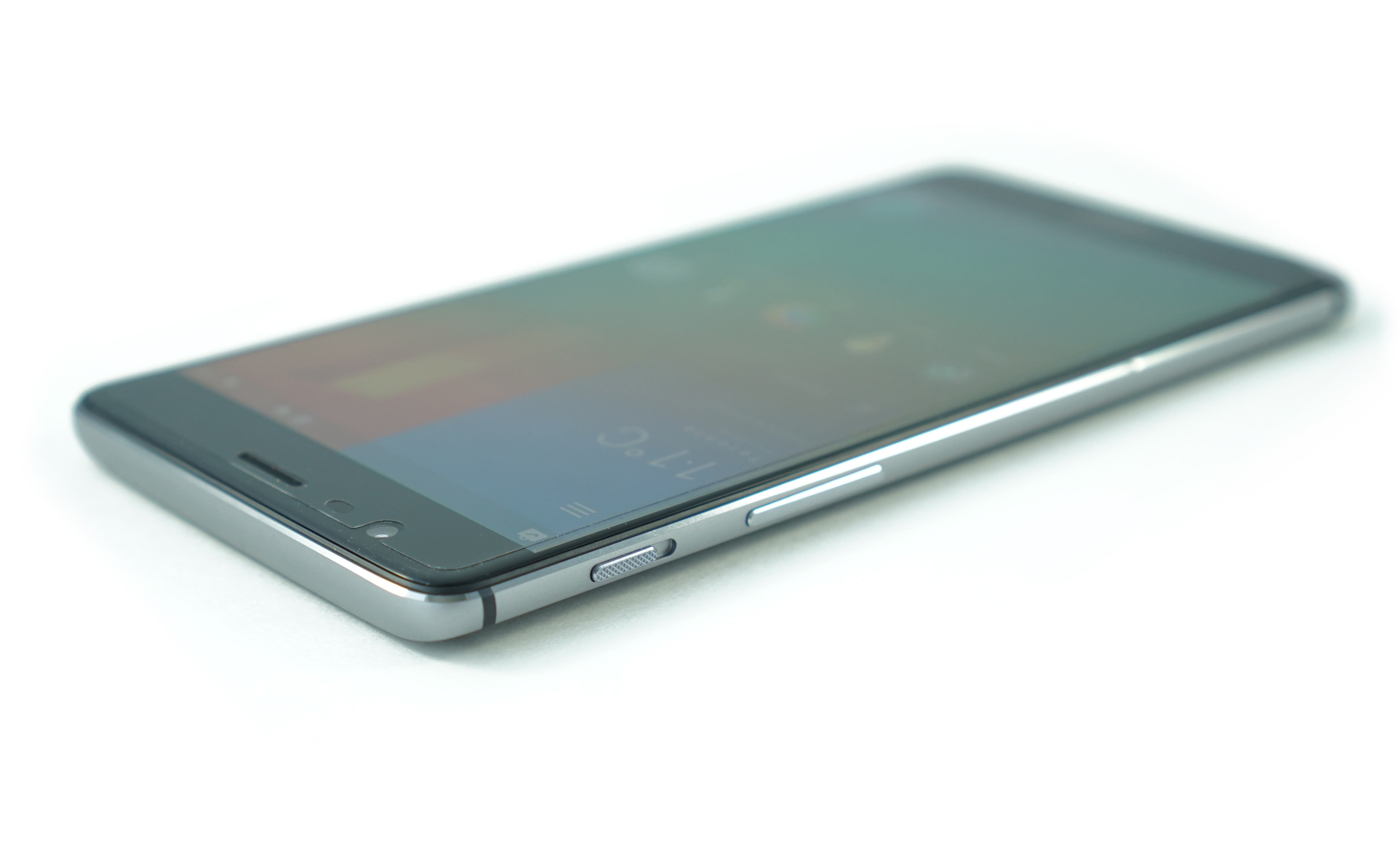
Revisiting The OnePlus 3: sRGB, Memory Management, & More
by Brandon Chester on June 30, 2016 3:00 PM EST- Posted in
- Smartphones
- OnePlus
- OnePlus 3
Final Words
As far as accuracy relative to the sRGB standard goes, the OnePlus 3 is now in a great position. The last questions that need to be answered are what the relevance of this is, and how it changes my opinion about the phone. I'll start with the question of relevance, as it has generated some interesting discussions in the time since I published my original review.
In my view, having your phone target the color space used for content on the web is an important feature. Clearly not everyone shares this view, and we're all welcome to have differing opinions on this topic. However, from an objective perspective there is no question that targeting an irrelevant color gamut which causes severe distortions to content is not a good thing. When looking at things from a more subjective point of view, the situation becomes much less clear. Many people enjoy the oversaturated colors that wide gamut displays provide when software isn't color managed. I have no issue with that, but users who want an accurate display should have the option to enable an sRGB color mode, and that was the issue with the OnePlus 3 when it launched.

What I do have to disagree with is the idea that sRGB accuracy is a niche feature. Many readers and other commentators have made that assertion since I posted my review, and OnePlus maintains that stance as well. I think people value display accuracy more than some may think, and it isn't spoken of much purely because if your display is accurate then there's no discussion to be had about it; it simply looks as it should. While this is by no means a definitive piece of evidence, it is worth noting that Apple, the company bringing in most of the profits in the smartphone market, values color accuracy quite highly across all their devices. When moving to a wider gamut they put a great deal of effort into updating their operating system to enable the use of a wider color space for designing applications and artwork, while maintaining accuracy and compatibility with older devices, and they are really the only vendor that has properly executed the transition to wide color.
Targeting a common color standard has benefits beyond simply being "accurate" relative to some arbitrary gamut. It means that what you see on one device will look the same on another device, and this means that you can rest assured that the people you share content with will see the same colors that you did. In the world of creative arts you have people who spend hours editing photos and videos, drawing artwork, and designing websites and apps. In all of these situations, someone spent a great deal of time choosing exactly the right colors to bring their content to you. I think they would all disagree with the idea that being able to view their creations as they intended is just some niche feature that isn't worth the effort. sRGB is certainly not the widest gamut, and things are finally moving away from it, but that transition needs to be handled properly. The important thing is not that everything targets sRGB, but that everything targets whatever color standard has been chosen to be used across all platforms, and for the time being that standard is sRGB whether we like it or not.
While not everyone feels that offering an sRGB mode matters, and seemingly not everyone at OnePlus feels that it matters, it is apparent that there are engineers there who do. After my review was posted they were exceptionally quick to publish an update for review units that included an sRGB mode, and as you've seen, they did an excellent job of bringing the display in line with the sRGB standard considering that there must be some degree of variance from unit to unit that prevents precise tuning. Creating, validating, and publishing updates takes considerable engineering effort, so it looks like sRGB calibration is not too niche to be worth it after all. I haven't gotten a firm answer on when this update will rolling out to every OnePlus 3, but I've heard that it should be happening quite soon.
Now for the second question: how does this change my view of the phone? I mentioned this on Twitter the other day, but with this update the OnePlus 3 has become my daily Android device, as I had originally hoped it would before the display accuracy disappointed me. OnePlus has addressed the only issue about the phone that I felt truly hampered my enjoyment of it. My original recommendation was conditional in that you needed to not really care about display accuracy for the phone to be worth buying. It's unfortunate that OnePlus can't fix the relatively low brightness or address the low effective resolution that a 5.5" 1080p PenTile display provides, but every phone has issues and these are ones that I can live with. My only other complaint about the phone now is that the video recording isn't great, but it's still functional and not a deal-breaker at all unless you record a ton of video. After this update I can safely say that if OnePlus leaves these settings as they are then the OnePlus 3 should be seriously considered by all smartphone buyers, and it's a phone that I would personally recommend based both on its technical merit and how I simply enjoy using it on a daily basis.


81 Comments
View All Comments
BenSkywalker - Thursday, June 30, 2016 - link
The issue at hand is they picked the MPEG of color standards- sRGB was so poor it was immediately replaced by the professional market for ARGB- in the 90s, yet Apple is just now getting around to supporting wider gamuts(Now that Rec2020 is out they move to close to the twenty year old standard).
Wanting things standardized across their product line I get- aiming for the lowest possible target I don't.
jlabelle2 - Friday, July 1, 2016 - link
- sRGB was so poor it was immediately replaced by the professional market for ARGB -I read this kind of claim all the time but people do not realize that having in real life colors more saturated than sRGB is very VERY rare. I champion every one to go out and try to take a picture where even a small area of the picture go beyond sRGB color space. It will not happen. Except if you are living maybe on a carribean island.
The reality is that what you call "poor" is still enough in 99,9% of the real cases (not speaking of artificial colors created in Photoshop).
Impulses - Friday, July 1, 2016 - link
I live in a Caribbean island... :(BenSkywalker - Friday, July 1, 2016 - link
Firetruck, eggplant- it isn't hard- tons of paints used on cars, I have a set of towels hanging in the bathroom right now- it's actually *very* easy to find objects that go outside sRGB. Even if the color is entirely inside sRGB- 256 gradients versus 1024- smoother and more realistic tones- for all pictures.
jlabelle2 - Monday, July 4, 2016 - link
- Firetruck, eggplant- it isn't hard- tons of paints used on cars. it's actually *very* easy to find objects that go outside sRGB-I take the bet. You think they go beyond but you would be surprised.
- even if the color is entirely inside sRGB- 256 gradients versus 1024- smoother and more realistic tones- for all pictures.-
Actually, it goes the other way around. Taking aRGB colors with 8bits coding (a JPEG) and transforming it in sRGB (still 8bits) means that you are potentially loosing a little bit of fine gradation info as the aRGB has to strech the 256 level with a wider range. Only if you work with TIFF or 16bits RAW files you are quite ok when manipulating / editing pictures between color spaces.
BenSkywalker - Monday, July 4, 2016 - link
JPEGs while discussing accurate calibration...... wow. That's like having a discussion about Formula 1 and you comparing it to your radio controlled car thinking that is a real comparison.http://ninedegreesbelow.com/photography/srgb-versu...
No, I wouldn't be surprised what exceeds sRGB even a little bit- *TONS* of things you see in every day life. Firetruck red and eggplants both do exceed sRGB- that isn't an opinionated statement, it is one of fact.
I brought up lots of colors cars are painted with as I'm familiar with exactly what is involved in that process- I am in no way speculating- sRGB is just trash. It is a garbage color space worthy of your JPEG format.
jlabelle2 - Tuesday, July 5, 2016 - link
- JPEGs while discussing accurate calibration...... wow -What JPEG has to do with calibration? You seem to confuse a lot of things. The encoding of the image (8bits or 16bits or more) has nothing to do with if the color is correct or not. You can have a scene with variation of colors that could be code on 2 bits and still have color completely off.
That is clear that those things are totally misunderstood by the majority of people, even "geek" people commenting on those kind of web site. It is good that Brandon is trying to educate and explain those things.
- sRGB is just trash -
Saying so does not make it anymore true. But if you are dealing regularly with that, can you provide me a picture of one of your car with a color widely beyond sRGB gamut? Should not be that difficult, isn't it?
- It is a garbage color space worthy of your JPEG format. -
This comment is showing the size of your ignorance.
JPEG is encoding in 8bits, which is the number of steps between the extreme colors (256 level on each channel).
Color space is defining the maximum color saturation of the maximum value (be it 256 on JPEG or 65536 on RAW or TIFF).
You are comparing how high is going a ladder (gamut on the color space) and how many steps it has (the encoding bits).
BenSkywalker - Tuesday, July 5, 2016 - link
JPEG as it relates to calibration is the crux of this discussion. The amount of color information in a JPEG is *extremely* limited- very easily displayed by taking any image with a range of 0-255 on any of the channels and looking at it. Very clear banding across the board. You talk about calibration- there are several billion colors that the human eye can see- the odds of you landing on exactly the right shade of any given color is akin to hitting the powerball. It may happen- but your odds of actually seeing the right color are minuscule.So what we are actually looking at is the perception of what people see based on what the image was supposed to portray. In that element, your assertion is that a very narrow color space using a very lossy file format can be calibrated to be acceptable to your standards. My assertion is quite simple- perfectly 'calibrated' sRGB showing JPEGs are laughably inaccurate- they aren't remotely close to being the actual colors- the perceived difference between them and what you want to see aligns with that particular combination. In no way comprehensible is this a matter of accuracy, we are dealing with digital information and sRGB JPEGs are close to 0% accurate when judged in absolute terms- they just are 'good enough' for your end of the discourse.
That isn't a matter of personal preference, these are binary operations- you are looking for good enough for you. That is a matter of what you are looking for- nothing is wrong with that, getting on a soapbox because your wrong way of looking at things is better then someone else's wrong of looking at things is laughable.
Fire engine red is outside of sRGB. It is one of the most common colors in widespread use for the last fifty years. I also provided you a link showing how a box of crayons fails in sRGB space.
As to your attempts at trying to differentiate that there are both issues with width and granularity in the color space- that is an elementary issue- I assume any child would understand this. Internal rendering of image spaces swapped to 128bit floating point color in many fields long ago- Adobe RGB isn't *close* to being 'good enough'- it simply is a massive improvement over the insanely poor sRGB.
My stance still stands- championing that your way of looking at horribly inaccurate images is the 'right' way and any other way of looking at horribly inaccurate images is wrong comes entirely down to perception.
jlabelle2 - Wednesday, July 6, 2016 - link
I see that you do not understand the notions developed by Brandon. I will try to explain one last time but it may be a subject to difficult for you to grasp (not trying to be pedantic but just my observation based on your feedback). So one last try:- The amount of color information in a JPEG is *extremely* limited -
What is the "amount" of information? JPEG is encoding in 8bits which means a given number of GRADATION of colors. But once again, if you have a ProPhoto or DCI3 JPEG, the level of saturation that you can code (and potentiall display) is the SAME as a 32 bits TIFF file.
- Very clear banding across the board. You talk about calibration- there are several billion colors that the human eye can see-
You are throwing a lot of different notion against the wall to see if it sticks.
First, what is your point? What do you try to say in the context of this article on constraining in the sRGB gamut a Android phone screen as Android is not color managed ?
Secondly, regarding the points you raised (for whatever reason) : yes 8 bits gives you less number of intermediate steps as more bits which means potentially more posterization when working on the image.
But generally, no, it is very difficult or impossible for the human eye to discern the difference between a 16 bits TIFF and 8 bits JPEG in term of color gradation. JPEG is allowing 16 millions discrete different colors. You are not just able to see any banding because of the limitation on 8 bits nor is able anyone on earth, despite your claim.
WHY is 16 bits important, it is because when you EDIT and CHANGE the image, then you can start to see posterization with extreme editing. So JPEG is not a problem for the display. 8 bits is a problem as a working space if you make serious editing.
I clarified this as you are confused on those notions.
- your assertion is that a very narrow color space using a very lossy file format can be calibrated to be acceptable to your standards -
It is not an assertion.
Let's not comment again on how narrow or large is the sRGB gamut. I asked you to provide a real example of a picture of yours exceeding the sRGB gamut and you are not able to provide so let's say that the burden of proof is still on yours.
JPEG can be more or less lossy depending on the compression ratio. I defy you or anybody to see the difference between a JPEG with a good quality compression ration (80 or 90%) and the original TIFF. This is like your claim that you can see in 16 millions different colors "very clear banding across the board". That is just bullsh...
And last, sRGB is not "my" standard. And yes, a LCD can be perfectly calibrated toward sRGB color space or another color space...or not. I do not even understand what you are trying to argue against?!?
- My assertion is quite simple- perfectly 'calibrated' sRGB showing JPEGs are laughably inaccurate-
This phrase does not mean anything. Either the display is perfectly calibrated and the colors it shows are accurate (by definition) or they are not.
You are basically telling me that you can have a tachymetre on a car that is perfectly calibrated to display the real speed of the car ... but the car of the speed is "laughably" inaccurate. I don't know if english is your mother tongue the phrase makes just NO sense.
- we are dealing with digital information and sRGB JPEGs are close to 0% accurate when judged in absolute terms-
you are going further in the ridicule. Claiming that you can distinguish more than 16 millions different colors and now even claiming that it you cannot code more than 16 millions, the image that you see is 0% accurate. What to tell...
I propose you a simple 2nd bet (as you declined the 1st one): you can give me any image that you want with any encoding bit size (16 bits, 32 bits), in any color space of your choice.
I will take it and make 2 versions of it: one reduced to 8 bits and saved temporarily in a 90% JPEG, and the other let at the original size.
I will then give you back both in TIFF (so you cannot tell which is which) and ask you to tell me which one is the JPEG. Please take my bet, it will be enlightening for you?
I know already that you will also refuse the 2nd bet because you must have realized by now how wrong you are but if you do not believe it still, take the bet, and you will learn something.
- I also provided you a link showing how a box of crayons fails in sRGB space.-
The link is showing in analysing the image what is going beyond sRGB. What is much more important for me is if someone is able to tell the difference. Thus my bet to you. Find me an image.
I will restrict one to sRGB, another to aRGB and send you back both in aRGB and you will have to tell which is which. Image should be yours.
- I assume any child would understand this-
I restrained myself, especially in forum, to make such comment. Although I am an engineer so those topics are for me quite elementary, I do realize they are not clear for everyone and you are a proof of it. Still, you are not a child and I understand that you could not grasp those notions.
- My stance still stands -
This is why I asked not to take my word and common knowledge for granted and propose you to realize how wrong you are by yourself. Take my 2 bets and you will have a more clear understanding how mistaken you are. If you really want to learn and progress. Otherwise, have a good day.
jlabelle2 - Friday, July 1, 2016 - link
- 30 degrees below zero pictures calibrated for sRGB white points look comically bad and insanely unnatural -Common confusion on white balance (what TrueTone on Apple devices is tackling) and the wider gamut than sRGB standard.
The issue with the OnePlus or every wide gamut screen used in unmanaged OS is that the web, 99% of the camera and pretty much most picture you received and see are done or targetting sRGB color space. Displaying them in wider gamut screen than sRGB will make them all appeared oversaturated. That is simply not good.
- every person I have asked liked the Vivid option the best -
Again a different story. you could perfectly have a screen, for which the gamut is constrained in the sRGB color space, and have an vivid option.
Let's not forget that in 99,9% of the case (in fact, on 70 000 aRGB pictures, I took, there was less than 5-6 so it is more 99,99% of the case), the images of natural things (not flashy designed logos or colors that do not exist in real life) never exceed the sRGB gamut. It is VERY rare to have in real life colors beyond. What it means is that, even in a perfectly color managed OS and workflow, the benefit of going wider than sRGB is impacting only small areas of a very tiny number of pictures.
And even on those small areas of those tiny subset of pictures, you probably cannot tell because the difference could only be spotted when seeing both side by side.
On the opposite, in the case of the wide gamut screen of the OnePlus used on non color managed OS, 100% of the pictures and the entire areas of those pictures would appear oversaturated. Always.
As such, a vivid option could still oversaturate colors, even if still constrained within the sRGB gamut. One is not mutually exclusive from the other. But at least, you give the choice to user.
For instance, i like adding some color saturation to my A7R photos. But the saturation still remains within level that exist in real life and everybody would find strange fluorescent green grass.