The 9.7" iPad Pro Review
by Brandon Chester on June 1, 2016 9:00 AM ESTDisplay Uniformity
With Apple billing the 9.7" iPad Pro as a professional device with individually calibrated displays, I felt it was relevant to bring our uniformity test over to mobile. While we usually just measure errors at the center of a display, there are also errors across the panel itself due to inconsistencies in the panel and the backlighting array. This means that a display can be accurate at the center, but the edges can have significant luminance dropoff or gain that makes the display unsuitable for any sort of image work due to the fact that there are visible color differences across the display itself. For this test we use an array of 25 points on the display and measure the accuracy of colors in the GretagMacbeth ColorChecker test, as well as the uniformity of the white and black levels at each spot.
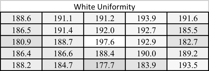
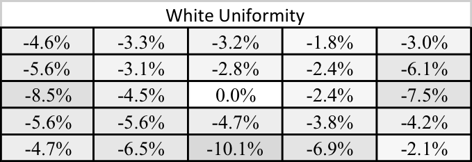
While I don't have any other mobile devices for reference, if I were evaluating the 9.7" iPad Pro as a professional monitor I would say that the white uniformity is decent, but not amazing in any regard. The central area of the display is fairly uniform, but there's noticeable dropoff on the left, right, and bottom edges. This is something I see on a number of phones and tablets, and maintaining uniformity probably hasn't been a concern for vendors until this point, but I'm hoping that a larger focus on it will make companies put more focus on it as a selling point for professional devices.
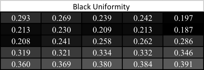
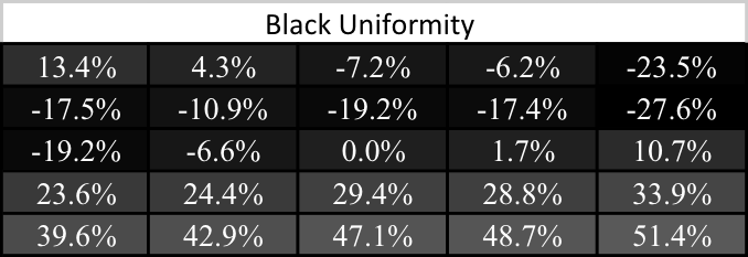
Black uniformity on the 9.7" iPad Pro isn't great. If you divide the display along its diagonal from the top right to bottom left corners you see that the in general the bottom section has higher black levels, while the top has lower black levels. In general, the black level isn't as dark at the edges as it is in the center. Black levels and contrast are the areas where Apple's LCDs really can't compete with Samsung's AMOLEDs, and with the 9.7" iPad Pro falling pretty far behind its bigger brother with black levels Apple should put more focus on at least keeping their blacks consistent across the display.
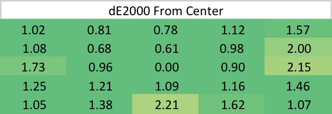
While the black uniformity isn't great on the 9.7" iPad Pro, and the white uniformity is just okay, the uniformity for colors is outstanding. There are a few hot spots on the edges, but in general the error relative to the center is well under two, and often near or even below one. I'm surprised that Apple has such uniform color rendition, as an uneven luminance level will usually throw off colors much more severely. Whatever the case may be, you can at least depend on even color rendering across the 9.7" iPad Pro's display.


144 Comments
View All Comments
Meteor2 - Thursday, June 2, 2016 - link
Unlike the commenter above, I did notice you say that. Would've been good to name a smartphones which are better though.hlovatt - Wednesday, June 1, 2016 - link
@Brenden,Which note taken app do you use? Is it OCR?
Thanks.
Brandon Chester - Wednesday, June 1, 2016 - link
I used to use Notability but now I use Goodnotes. It has OCR for searching but I don't think it can do translation to a text doc format.KPOM - Wednesday, June 1, 2016 - link
I love Goodnotes.hlovatt - Thursday, June 2, 2016 - link
Thanks for the Goodnotes suggestion, I will give it a try.Loved the review particular the display analysis.
Wolfpup - Wednesday, June 1, 2016 - link
Glad for the explanation of True Tone...quite simple/obvious when it's spelled out like that, and sounds like something we'll eventually take for granted everywhere.That said, don't be scared off of the 12.9" model! I personally don't understand an iPad at all for "productivity"-to me they're fancy eReaders. I bought the 12.9" model because 9.7" has always seemed too small to me for graphic novels and magazines. Like it's usable, but it's compromised.
The 12.9" model, while it's limited compared to like a Surface, is still pretty awesome at being an eReader. The screen's fantastic, and Apple really nailed the weight and size and whatnot. IMO that's not as important in a 10" tablet, but at nearly 13" it could get out of control if it weren't well done-but they've come close to the weight and size and "in hand feel" of my iPad 2 with a screen that can finally display a full sized page without compromise. I was tortured over the decision for ages, but finally decided to go for it, and am glad I did...everything just looks so much better and I don't feel like I'm squinting or compromising anymore.
Apple's scaling hardware or software or whatever seems to do a nice job too. I'm pretty sure that Marvel Unlimited supports the 9.7" screen's resolution, but NOT the 12.9" one yet, but it looks fantastic on the larger screen. Okay, I still prefer physical paper, and I'd prefer an eInk equivalent to this, but it's really good..
Meteor2 - Thursday, June 2, 2016 - link
That's a really good point. The 12.9 Pro, with its 3:2 screen, basically replaces paper. That said, I find the compromise that the 9.7 screen (in an Air for me) makes in terms of size v weight advantageous.arsjum - Thursday, June 2, 2016 - link
12.9 iPad Pro has 4:3 screen resolution, Surface tablets have the 3:2 one.andrejg - Thursday, June 2, 2016 - link
That is one expensive reader :-)trewtrew - Monday, June 6, 2016 - link
Agreed, iPad Pro 12.9" has been perfect for textbooks reading as well as note taking.