The 9.7" iPad Pro Review
by Brandon Chester on June 1, 2016 9:00 AM ESTDisplay Uniformity
With Apple billing the 9.7" iPad Pro as a professional device with individually calibrated displays, I felt it was relevant to bring our uniformity test over to mobile. While we usually just measure errors at the center of a display, there are also errors across the panel itself due to inconsistencies in the panel and the backlighting array. This means that a display can be accurate at the center, but the edges can have significant luminance dropoff or gain that makes the display unsuitable for any sort of image work due to the fact that there are visible color differences across the display itself. For this test we use an array of 25 points on the display and measure the accuracy of colors in the GretagMacbeth ColorChecker test, as well as the uniformity of the white and black levels at each spot.
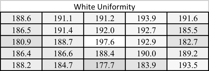
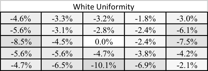
While I don't have any other mobile devices for reference, if I were evaluating the 9.7" iPad Pro as a professional monitor I would say that the white uniformity is decent, but not amazing in any regard. The central area of the display is fairly uniform, but there's noticeable dropoff on the left, right, and bottom edges. This is something I see on a number of phones and tablets, and maintaining uniformity probably hasn't been a concern for vendors until this point, but I'm hoping that a larger focus on it will make companies put more focus on it as a selling point for professional devices.
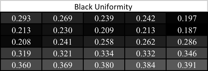
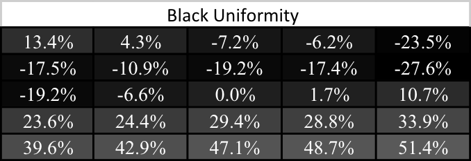
Black uniformity on the 9.7" iPad Pro isn't great. If you divide the display along its diagonal from the top right to bottom left corners you see that the in general the bottom section has higher black levels, while the top has lower black levels. In general, the black level isn't as dark at the edges as it is in the center. Black levels and contrast are the areas where Apple's LCDs really can't compete with Samsung's AMOLEDs, and with the 9.7" iPad Pro falling pretty far behind its bigger brother with black levels Apple should put more focus on at least keeping their blacks consistent across the display.
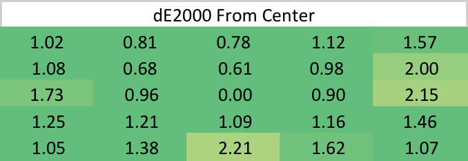
While the black uniformity isn't great on the 9.7" iPad Pro, and the white uniformity is just okay, the uniformity for colors is outstanding. There are a few hot spots on the edges, but in general the error relative to the center is well under two, and often near or even below one. I'm surprised that Apple has such uniform color rendition, as an uneven luminance level will usually throw off colors much more severely. Whatever the case may be, you can at least depend on even color rendering across the 9.7" iPad Pro's display.


144 Comments
View All Comments
ragingfighter - Wednesday, July 13, 2016 - link
If $1000 for a tablet is something you could afford that's fine but keep in mind $1000 can get you a good laptop as well I don't not your choice and this is not a criticism to what you chose for your workflow so I don't want you to take it as such it's just a general opinion.syxbit - Wednesday, June 1, 2016 - link
Google should be ashamed of themselves with those internal NAND (sequential write) results. The iPad is 10x the performance of the Pixel C...Wolfpup - Wednesday, June 1, 2016 - link
I wonder if that's with encryption on or off? I sure hope that's with it on :-OI love that iOS just comes with it on now, and users don't need to know anything, manage it, etc., NOR worry about performance.
I know my Android tablet was seriously dirt slow...well, dirt slow in general, and in storage performance specifically. (What blew me away was my equivalently speced Surface running close-to-full-Windows ran circles around it...which is like WHAAAAAT, the limited mobile OS is supposed to at least be faster LOL)
grayson_carr - Thursday, June 2, 2016 - link
New Android devices all come with encryption on as well. And while Apple does hold a huge lead in NAND performance, I haven't noticed the storage performance of Android devices negatively impacting day to day use since the Nexus 6.ragingfighter - Wednesday, July 13, 2016 - link
I think it's the cost of having a filesystem a more Advanced interaction with it all and having the full on options of tweaking and placement and so on that also can bog down an operating system. A lot of how we perceive a ui or user interface or operating system is in which the speed and workflow comes across such as finding what you're trying to work on how fast it comes on screen how much time you save. With iOS, either not have a file system as you just have apps apps that do specific things. Depending on what type of workflow you have this can be easier or harder you do not have to look through a lot of submenus to find a file or something you're working on. Is your work something that you can transferred to the cloud and just so you have access to other devices after it's done or do you work on a tablet at home and have a come up on your computer at work?When you start getting into the sub areas of an operating system terminal command lines and all types of other advanced features and code and stuff that is one in a way I believe the operating system gets perceived as cluttered. Even something as simple as removing programs and just drag them to the garbage can for being deleted is something common sense and I was amazed that is not implemented across all operating systems. The complexity of having to go to your ad and remove programs list on windows to delete something still is amazing to me that people would have to do such a thing for such a basic function Especially during the year 2016. The thing that makes iOS really good is also the same thing that makes it really bad for some and that is its basic simplicity iOS is at its greatest for young children for people that have a writing type of workflow for consumption, but especially for the elderly that do not have as much technical know-how as others have in life I know I have relatives that if it wasn't for the iPad they would still be thinking of 56K not know how to check their emails and truly enjoy the web. They are not great typists not nearly there not know what the Home row is. In this regard voice dictation gives them another way to interact with their tablets which are computers and allows them to use them much better than without.
Hemlocke - Thursday, June 2, 2016 - link
It shows in daily usage, too. My Pixel C went out the door to get my Pro 9.7, and after a few hours, I know I made the right choice. The Pixel was irritating, with hiccups and stutters when there is no reason for it. My Air 2 was a better tablet.lucam - Wednesday, June 1, 2016 - link
Hi Brandon,There is the new GFX Bench 3.1 available for IOS too; especially the new one 1440 resolution.
It's worth trying it.
Oyeve - Wednesday, June 1, 2016 - link
Would be nice if you actually FINISHED your S7 review to see those pic samples against this tablet. I own the 9.7 pro and the S7 and the S7 just blows the pro away. Hmmm, thats probably why you guys never finished the S7 review. It would crush your apple love.Brandon Chester - Wednesday, June 1, 2016 - link
I stated in the article that the sensor used in the 6s/SE/9.7" is not the best sensor in a smartphone. I would argue that the Galaxy S6 is superior, let alone 2016's Android devices. Your perception of bias is unfounded.KPOM - Wednesday, June 1, 2016 - link
Apple haters gonna hate. For whatever reason they can't accept a decent review of an Apple product, even one that points out its flaws.I like AT and am glad the new ownership doesn't seem to have affected its editorial independence. Kudos to Ryan and the whole team.