The HAVIT KB395L RGB Mechanical Keyboard Review: Marvelous Mechanical Minimalism
by E. Fylladitakis on March 1, 2018 8:00 AM EST- Posted in
- Peripherals
- Keyboard
- Mechanical Keyboards
- Kailh
- HAVIT
Per-Key Quality Testing
In order to test the quality and consistency of a keyboard, we are using a texture analyser that is programmed to measure and display the actuation force of the standard keyboard keys. By measuring the actuation force of every key, the quality and consistency of the keyboard can be quantified. It can also reveal design issues, such as the larger keys being far softer to press than the main keys of the keyboard. The actuation force is measured in Centinewton (cN). Some companies use another figure, gram-force (gf). The conversion formula is 1 cN = 1.02 gf (i.e. they are about the same). A high quality keyboard should be as consistent as possible, with an average actuation force as near to the manufacturer's specs as possible and a disparity of less than ±10%. Greater differences are likely to be perceptible by users. It is worth noting that there is typically variance among keyboards, although most keyboard companies will try and maintain consistency - as with other reviews, we're testing our sample only.
The machine we use for our testing is accurate enough to provide readings with a resolution of 0.1 cN. For wider keys (e.g. Enter, Space Bar, etc.), the measurement is taking place at the center of the key, right above the switch. Note that large keys generally have a lower actuation force even if the actuation point is at the dead center of the key. This is natural, as the size and weight of the keycap reduces the required actuation force. For this reason, we do display the force required to actuate every key but we only use the results of the typical sized keys for our consistency calculations. Still, very low figures on medium sized keys, such as the Shift and Enter keys reveal design issues and can easily be perceptible by the user.
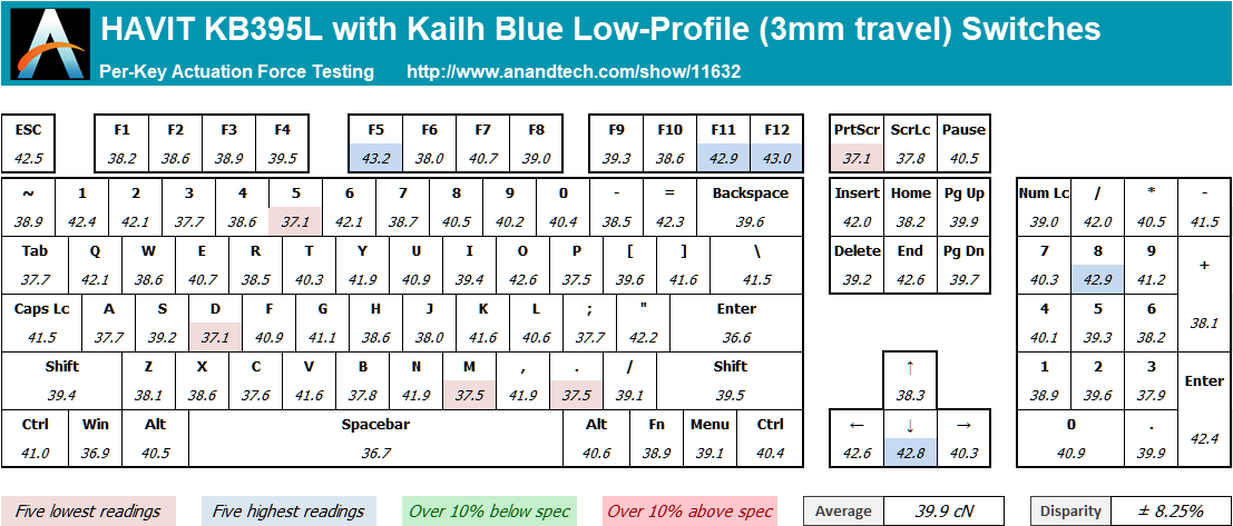
Kailh’s new blue PG1350 series low-profile switch has a 3mm travel is rated at just 45 gf (gram-force), and that’s the operating (maximum) force, not the actuation force. For reference, Cherry’s MX blue switches have an operating force of 60 gf and an actuation force of 50 gf. The disparity of the Kailh PG1350 switches on the HAVIT KB395L is high, at ± 8.25% across the main keys of the keyboard, yet still within acceptable limits. Considering the short travel and tactile nature of the switches, it is next to impossible for the user to actually feel the difference. The average actuation force is only 39.9 cN, which is one of the lowest that we have ever seen.
Hands-on Testing
I always try to use every keyboard that we review as my personal keyboard for at least a week. My typical weekly usage includes a lot of typing (about 100-150 pages), a few hours of gaming and some casual usage, such as internet browsing and messaging. I personally prefer Cherry MX Brown or similar (tactile) switches for such tasks. In theory, the tactile Kailh PG1350 blue switches of the HAVIT KB395L are too soft and short for comfortable typing in comparison to typical MX Blue/Brown switches. However, this theory is far from actual practice.
The HAVIT KB395L proved to be a marvelous keyboard to type with. It is very soft and responsive, while the audible tactile feedback is not too loud. The very low operating force has the switch resembling more of a chiclet key with an extended travel rather than a typical mechanical switch. After just a couple of minutes of use, my fingers were able to adjust to the very low operating force and I could softly press the keys. This makes the KB395L exceptional for long-term professional use. Moving to a keyboard with typical full-travel mechanical switches a few hours later will feel like a fingers workout session.
For gaming, the HAVIT KB395L can mainly offer long-term use comfort. The keyboard’s lighting profiles have been pre-programmed to help gamers by lighting up certain groups of keys each, but that is more of an aesthetic feature rather than an actual advantage. It is possible to program different layouts and basic macros, or call advanced macros launching files compiled using an advanced third-party software, but changing the profile currently requires opening the software and browsing to a file, which is an ordeal and hardly possible at all while in-game.


26 Comments
View All Comments
Elstar - Thursday, March 1, 2018 - link
I don't know how you define minimalism, but I don't think RGB lighting counts, nor a big branding logo, nor awkward key labels that smush the while-shift-is-held label into the superscript position (the underbar partially hovering over the hyphen-minus label is particularly ugly).dave_the_nerd - Thursday, March 1, 2018 - link
Meh. I've seen a lot worse. RGB lighting can be turned off, and it's a helpful visual aide for us hunt-and-peckers.Although I agree with you that the keycap font/design is terrible. Who thought the "____" on the space bar was a good idea? Or that the font on the Shift/Ent/Back keys should be larger? Or that they should read "Ent" and "Back" instead of "Enter" and "Backspace"?
On the other hand, a proper touch typist probably wouldn't spend enough time looking at the keyboard to be annoyed by those things.
Cellar Door - Thursday, March 1, 2018 - link
That is nitpicking on a ridiculous level - have you ever used a laptop? Look at the font on those.dave_the_nerd - Thursday, March 1, 2018 - link
Oh, yeah, they're all terrible too. ;-)notashill - Friday, March 2, 2018 - link
People that aren't ridiculously nitpicky probably don't even consider buying $80 mechanical keyboards in the first place.twtech - Friday, March 9, 2018 - link
It's actually surprising to me that more people aren't pickier about their input devices. If you work in a profession where you're going to sit there and type all day, I would think the keyboard you use, etc., is pretty important.I have several split mechanical keyboards, and those tend to start at around $200. The Kinesis Freestyle Edge, which is what I'm currently using, has key backlighting. At first, I thought it would just be a gimmick, and turned it off. I also turned it off because, before the latest firmware update, the backlighting was ridiculously bright and distracting even on the lowest setting.
But it turns out that very mild backlighting is actually pretty useful for quickly locating the home row in the dark. I can make out the keys just well enough out of the corner of my eye to be able to place my hand directly back on the home row after using the mouse without hesitation. The font on the keys doesn't matter a whole lot though.
Ukyo - Thursday, March 1, 2018 - link
I have the TKL version and love it... for a bit... but quickly moved back to my MS ergo type keyboard. And my co-workers thanked me for it... loltwtech - Thursday, March 1, 2018 - link
You should check out the Kinesis Freestyle Edge. Your coworkers might still hate it if you were to get it with MX blues, but you'd probably like it.philehidiot - Friday, March 2, 2018 - link
You just don't realise how loud those blues are until you start typing and the girlfriend has to turn up the telly... Downstairs.twtech - Friday, March 9, 2018 - link
The Freestyle Edge has materials that mute the sound a bit. It's still loud, but apparently not as loud as it would be otherwise.