The Windows 10 Review: The Old & New Face of Windows
by Brett Howse on August 25, 2015 8:00 AM EST- Posted in
- Operating Systems
- Microsoft
- Windows 10
Mail, Calendar, and People
In the days of Windows 7, the basic functionality of email, calendar, and contacts, were split out of Windows 7 and moved into Windows Live Essentials. The idea behind this was that by moving them out of Windows, they would be able to be updated more often. I’m not sure that ever really happened though.
Windows 8 brought new touch-first versions of all of these apps, and they could be tied to your Microsoft Account to allow mail, contacts, and calendar, to easily sync among devices. But the Windows 8 versions of the apps were very sparsely laid out, and although they worked on touch, the design and functionality was lacking. This improved, at least slightly, with Windows 8.1, but for Windows 10 Microsoft has once again overhauled these products to follow the Windows 10 design language, and all of them are Universal Windows Apps which means that they are not only updated through the store, they are also scalable and can work on small phones, all the way up to large desktop devices, with different layouts depending on what device type they are being used on.
Email is a staple of our lives now, and a quality experience is something that we have come to expect and rely on. In December 2014, Microsoft acquired Acompli, which was one of the highest ranked email clients on iOS. This acquisition was about more than just iPhone and Android though, and the design of their email client has certainly permeated into the Windows 10 mail client as well.
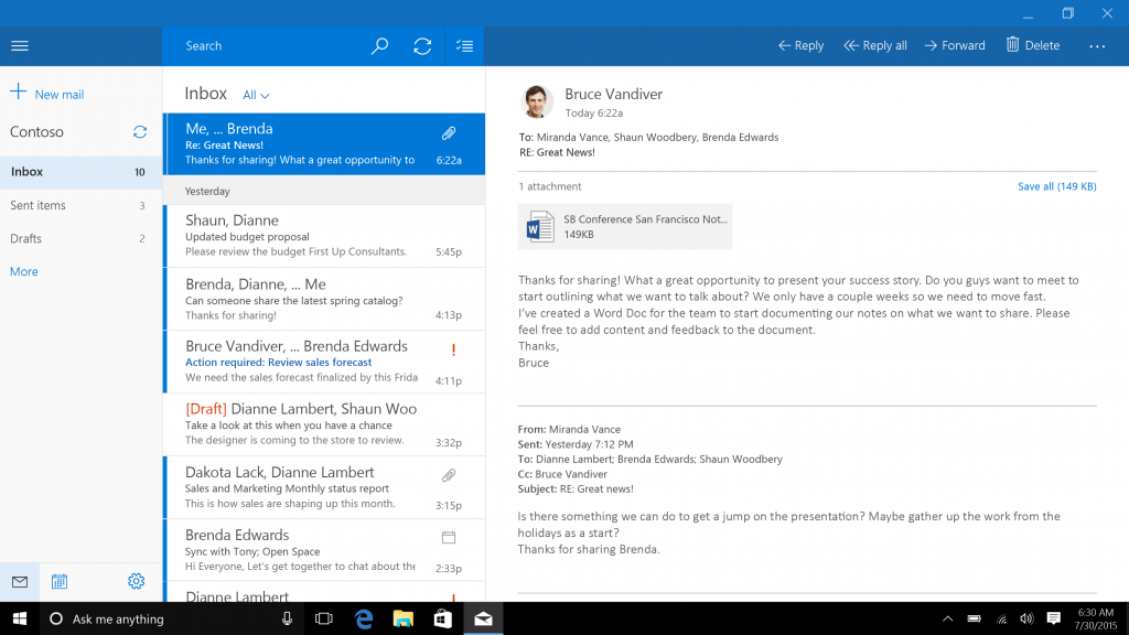
The basic layout is a list of accounts and folders on the left, with the current folder list in the center, and a reading pane on the right. When no email is selected, the right pane displays an image, which by default is an image of clouds. Like the mobile apps, the Windows 10 app now supports swiping the messages in the inbox to delete or flag the messages, which is a great way to deal with the mail when using touch. Swiping left deletes the message, and swiping right marks it as flagged. You can change what the swipes do in options as well.
As a basic mail client, it works fine, but there are some issues with it out of the box which may or may not get fixed over time. First, and I believe this is important for consistency in the operating system, the default action of swiping left to delete a message is the exact opposite of Action Center, where you have to swipe to the right to remove a notification. It’s a small thing, but I’ve gotten used to dismissing notifications, so you would think it would be the same action in email but it is not.
I also don’t love the giant image on the right. When you open Mail, the entire right pane has a picture of blue clouds. You can set it to whatever image you would like, but when I open the mail client, I would prefer an option to be able to display whatever message is the latest. This doesn’t need to be by default of course.
There is also no option to disable conversation view, and while many people like that, many people also prefer to have their email listed chronologically so they can find it. Update 2015-09-03: An update as of today lets you disable conversation view in settings.
One of the biggest issues for me is that there is no way to send as anything but the default email address. In Outlook.com, I can send and receive as a number of accounts, but in the Windows 10 mail app, there is no way to choose which email address to send from.
Considering Microsoft just bought Acompli in December 2014, perhaps some slack should be given considering how much works well out of the box, but as it stands now, the Mail client is just ok for light work, and is pretty easily surpassed in functionality by even Microsoft’s web based mail.
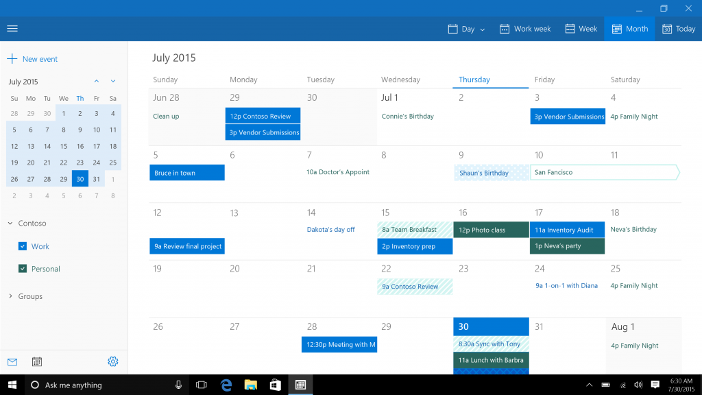
Taking a look at the Calendar app, once again we see a big departure from the Windows 8 version, which is a good thing. The new app is a very clean look, and it is easy to add new events, sort what events are seen, and which calendars are displayed. You can choose whether to start the week on Sunday or Monday, what your hours of work are, and colors for the various calendars displayed. You can choose a view of a day, week, work week, or month. It does what you would expect a calendar to do, and the layout once again can optimize itself to how much display it has to work with. However, like Mail, it’s not quite done yet. There is no way (that I have seen anyway) to create a new calendar, or share calendars from within the app. To do this, even if you are using an outlook.com calendar, you have to go to the web interface.
Moving to the People app, we see yet another redesign to a look that is a lot cleaner and easier to use. The contacts themselves have changed from square pictures to circles, consistent with the rest of Windows 10’s profile pictures which are now circles as well. It is pretty easy to add, edit, or remove a contact, and you can action the email or mapping to launch the respective apps for that.
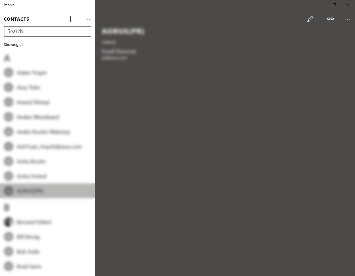
I feel like a broken record again, but the People app is also lacking things that were available in Windows 8.1. The app no longer pulls contact info or pictures from social networks, and you can’t action the phone numbers in a contact to launch Skype. However if you go into settings, social network integration looks like it is coming, but for the moment there are no results when you try to add one. In another inconsistency, the options for People are not found behind the gear icon like in Calendar and Mail, but behind an ellipse and settings.
You can open Calendar from Mail, and Mail from Calendar, but People has to be opened on its own. Typing in a person’s name for a new mail brings results from People, but there is no way to choose the recipient from People without starting type their name. All of it feels a bit disjointed at the moment.
The good news is that all three apps support multiple accounts from multiple sources, including Outlook.com, Exchange, Office 365, Google, iCloud, or even by manually setting them up with POP or IMAP. There is support for setting how your mail syncs, how far back to sync messages, and what notifications to display.
As a set, these three apps are likely fine for a lot of use cases, but they are clearly works in progress at the moment. Luckily all of these apps are Windows Store apps, and can be updated over time easily through that mechanism. Let’s hope they get some updates soon though.


293 Comments
View All Comments
Brett Howse - Wednesday, August 26, 2015 - link
Page 4 on Continuum. Overall it's a slight step back on touch.marvdmartian - Wednesday, August 26, 2015 - link
[from the last page of the article] "But is this going to be the upgrade to move people off of Windows 7? In my opinion, yes it is."Perhaps in your world. Not so much, in mine. Nor, in many people I've talked to, who are equally unimpressed with this latest version of Windows.
In fact, so far, what I've seen (though, I admit, not yet experienced) of W10, I'd label it more of a Windows 8.2.....maybe 8.25. Still blocky looking. Still looks like the icons were drawn by a 3rd grader (no offense to the average 8 year old). Still.....just plain UGLY.
I understand the reasoning for the postage stamp sized blocks, as it makes touch interface much easier. But if they want TRUE switch-ability between touch interface and mouse/keyboard usage, they need to change the look of things, to go with the 2nd choice. Then there's also the return to the 90's screen resolution. Necessary for touch interface, perhaps. But when a person has spent hundreds of dollars on a high resolution monitor, then "upgrades" to Windows 10 (8.25?), they do NOT want to have to dial back their resolution to that which was supported first by what? Windows 98??
And don't even get me started in on the privacy issues. Yes, some people might not have a problem with the information Microsoft is gathering. But I'm betting plenty more will, once they're made aware of it. And for MS to force you to opt OUT of information gathering, makes them somewhat "big brother"-ish, in my book.
Sorry, Brett, but in my book, Microsoft is quickly striking out with this operating system. As far as their support of Windows 7, don't be surprised if they don't extend it, just as they did with Windows XP, if the majority of 7 users don't bother upgrading to 10.
chrome_slinky - Wednesday, August 26, 2015 - link
Unfortunately, for people who think, we must realize that the average user IS stupid, and FREE is making them weak in the knees.I will be on Windows 7 until 2020 at least, and carefully removed the "updates" which install more telemetry from my list of updates.
BTW, you could always use the "illudium235 space modulator" to take care of things, couldn't you? <g>
uhuznaa - Wednesday, August 26, 2015 - link
I'm sick of repeating this over and over but you really shouldn't confuse "is not interested in how computers work" with "stupid". I've seen people who are really bright in their fields totally struggling with their computers because they're just not interested in nor care for how these things work.It's like calling you "stupid" because you are not interested in knitting your own sweaters. I bet there are thousands of things you don't care for and are not interested in which others who are not necessarily smarter than you are really good in.
On the other hand not understanding this may be reason enough to call you stupid.
Michael Bay - Wednesday, August 26, 2015 - link
So, it`s you and your two and a half friends. Such tremendous loss for MS, certainly, somewhere in some basement Nadella is crying crocodile tears.Da W - Wednesday, August 26, 2015 - link
I moved from the FRENCH version of windows 7 to the FRENCH version of windows 8 to the FRENCH update of windows 8.1, somehow it installed the ENGLISH version of windows 10.chrome_slinky - Wednesday, August 26, 2015 - link
Zut alors!Billy_Boy - Wednesday, August 26, 2015 - link
The most thorough, well thought out review of ANY product I have read in a long, long time.Bravo!
milkod2001 - Wednesday, August 26, 2015 - link
I gave it a try and got w10 installed on top of my w7. All took about 30 minutes. All applications/games are working which is great. But that got me thinking what is WINDOWS 10?It feels just like windows 7.1 upgrade. New graphic interface, better boot time and slightly faster copy of files. OK lets not forget dx12 and Cortana. It took MS 6 years since release of w7 to put together this massive update and call it w10. Now i get why MS gave it to us for FREE. It just could not dare to charge us for bunch of mediocre updates.
Happy w10 user here :)
azazel1024 - Wednesday, August 26, 2015 - link
Can I just say, if you are coming from Windows 7, Windows 10 is a fairly nice upgrade. If you are coming from Windows 8.1, especially if you have a touch interface, it is a serious reversion in almost every possible way. Most of the apps seems half finished at best. As eluded to in the story, the mail client is about 10 steps back from the one in 8.1. How basic is it to have the ability to change from conversation view? Photos app doesn't support the ability to view images by folder (which can be nice instead of seeing every single one of your pictures spread out by date). Edge can't download some file types, so you have to open them in IE11. If you want to change audio volume, there is no option to do that in the action center (plenty of room for a button for it). So for a tablet, you have to pull up the task bar to do it, which doesn't make sense. Want to change a wifi network? Oh, there is a button in the action center to do...oh, it only turns Wifi on and off...but, wait, there is an airplane mode button also in there to do that. Oh, you can long press on the wifi button, then go in to settings and then select a different wifi network. Want to change the brightness to anything other than 25/50/75/100%, long press again and go in to settings and then you can adjust it from 0-100% in 1% increments. But...why can't there at least be a 0% brightness on that short cut button? 25% is too bright in a dark room. WHY!Sooooooo much of Windows 10 from what I have seen is "why in the hell would you do it that way?" Sure, some stuff in 8.1 was non-intuitive and took awhile to get used to, but a lot of stuff was a quick gesture and done. Want to change the brightness or audio? Swipe in the charms bar, hit the button and adjust away. Now they are found in different places and one of them takes several extra actions to really be able to adjust where you want it. Many of the apps have lost functionality, even if they look a little nicer or have a few new and nice features. I love that Edge is faster, but it sucks for touch input now and a lot of features have been lost that were highly useful, even with keyboard and mouse input.
Windows 10 at best feels half finished as an operating system. I don't mean "they'll innovate the 'OS as a Service that is Windows 10'". I mean, they needed to have spent at least a few more months baking this thing before sending it out the door and if a lot of this stuff isn't "changed" or give the user the ability to customize (why not add more options that you can add to the action center? What about allowing the user to ELIMINATE options in the action center too, I don't need half the crap that is in there as a short cut) then frankly Win 10 is a big step backward in a lot of ways.
I am willing to give it a try for awhile, but I am itching every single day to reload Windows 8.1 on my Asus T100. I am certainly not going to load Windows 10 on any of my other machines for a very long time to come (either right before the 1 year upgrade period ends, or possibly never).