Analyzing Intel Core M Performance: How 5Y10 can beat 5Y71 & the OEMs' Dilemma
by Brett Howse & Ian Cutress on April 8, 2015 8:00 AM ESTDOTA 2 Results
DOTA 2 is a multiplayer battle arena game, and for this test we are using the same setup as our Mainstream benchmark, but this time with a full game. At 1600x900, all of the devices should be around 30 fps, and the overall test is about 45 minutes.
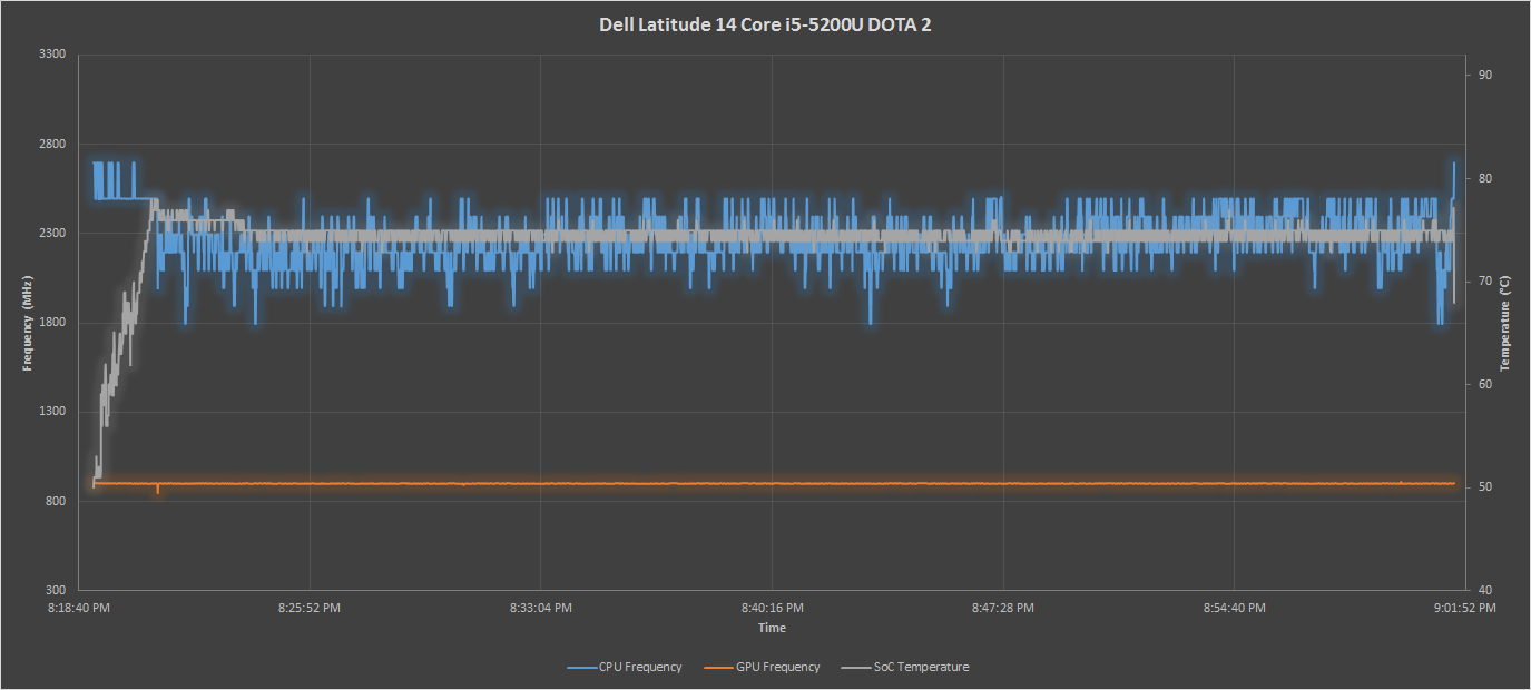
The Core i5 once again does a great job throughout this test. The CPU frequencies are dropped to keep the GPU running at full speed. The GPU basically runs at full speed for the duration of this test. The Venue 11 Pro is not so lucky, with it quickly heating up and being forced to throttle both the CPU and the GPU. The ASUS continues its amazing run, and showcases what can happen with a good passive cooling solution. The Yoga 3 Pro is not so lucky, with that pesky 65°C set point rearing its ugly head, which causes a big drop in overall frequency on such a long sustained workload.
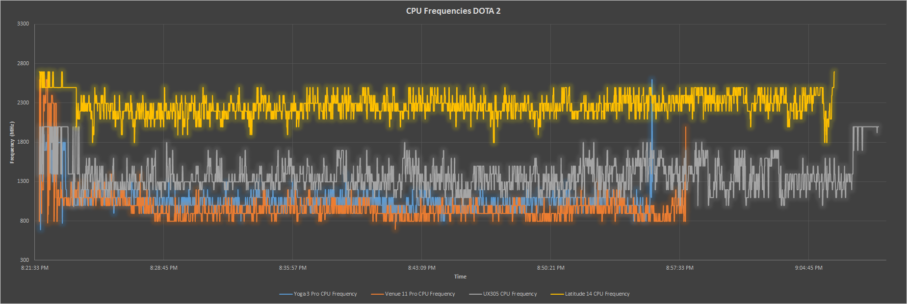
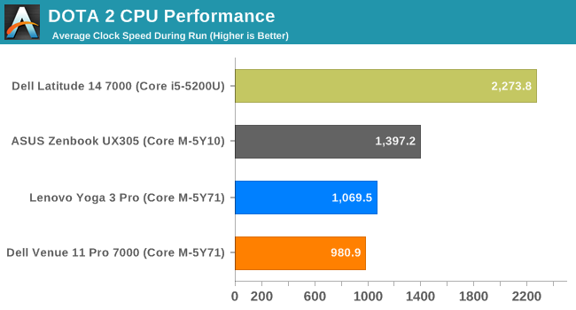
The average CPU frequency for this sustained real world gaming workload has even the Core i5 having to give up some CPU headroom to keep the GPU fed with power. The ASUS has a sizable advantage here, and both the 5Y71 devices drop well under their base 1.2 GHz CPU frequency when the GPU is running at maximum.
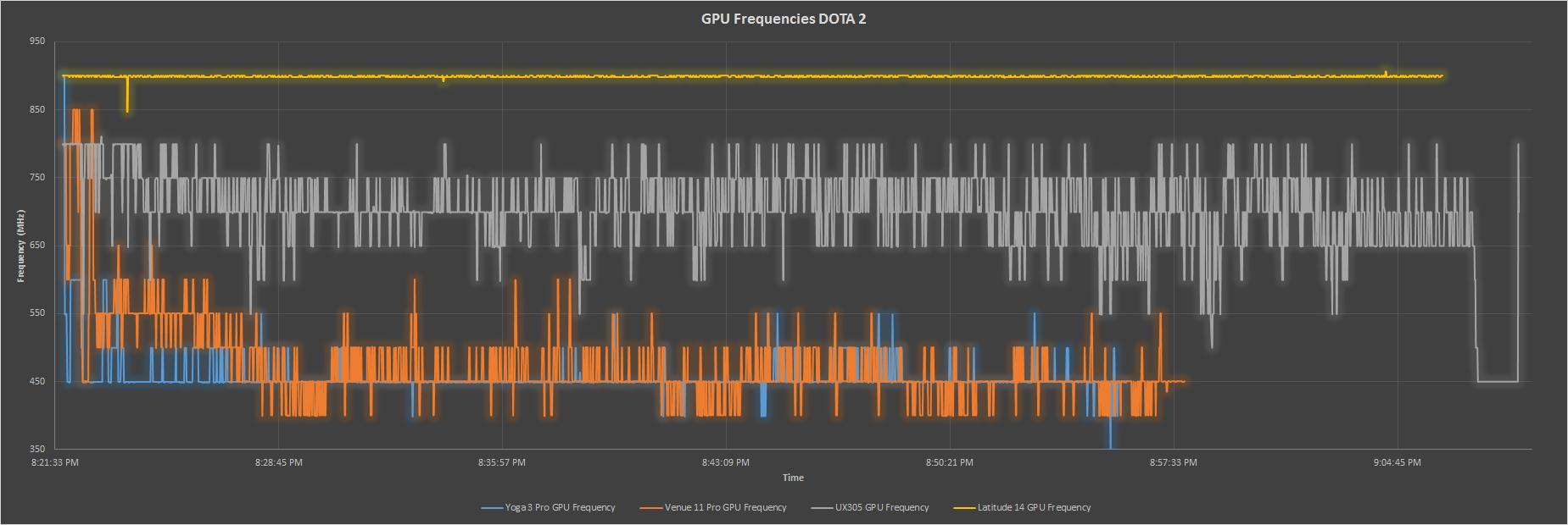
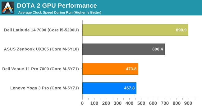
The GPU is really the story though, since this is a gaming workload. Amazingly the ASUS is only 100 MHz off of its maximum turbo frequency as an average for this 45 minute workload. Both the Dell Venue 11 Pro and the Yoga 3 Pro do not have enough cooling to keep these kinds of sustained GPU loads going.
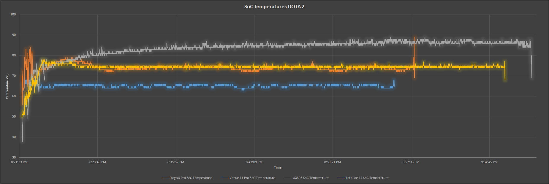
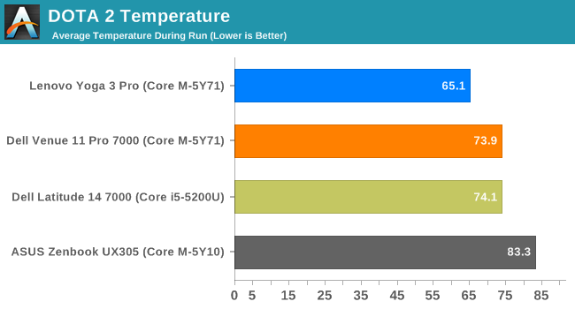
The Yoga 3 Pro is by far the coolest SoC in almost all of these tests, with its combination of active cooling and a 65°C maximum SoC temperature. The ASUS is far and away the hottest device in this test, but it also does a lot more work than the other Core M devices, and it is not getting any hotter by the end of the test, so the device cooling is doing its job.
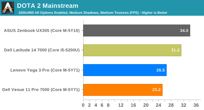
It is clear at this point that the ASUS can keep the GPU frequency much higher than the other Core M devices due to the nature of its cooling, and form factor. The DOTA 2 test is really dominated by it. It is much faster in this test than the other Core M devices, and once again due to the single-channel nature of the Core i5, the ASUS even outperforms the Core i5 in this test.


110 Comments
View All Comments
zodiacfml - Wednesday, April 8, 2015 - link
A long for this look at the performance Core M. Thanks. Like all nice, popular movies the end is pretty expected after a review from the Asus UX305. It's also good that the Dell is there to provide the scores for no limitation on cooling for long continuous loads.After all this, I don't see any problem. The performance of the Asus is pretty expected as well having a tradional notebook design which is fairly overkill for the SDP/TDP.
I was a PC overclocker many years ago and then realized that underclocking and overclocking at the same time would be ideal. I believe the race to wider CPU dynamic range has become mainstream.
dragonsqrrl - Wednesday, April 8, 2015 - link
"Each model comes with 4MB of L2 cache" On the first page.Shouldn't that be L3 cache?
dananski - Wednesday, April 8, 2015 - link
I love how the Asus tries to draw a piano keyboard in the PCMark 8 Creative graph. Very creative of it.DryAir - Wednesday, April 8, 2015 - link
The temperature x time graphs are all messed up. The lines goes "back" on many ocasions, indicating 2 different temperatures on a same time stamp. You should check the settings on whatever program you are using to generate these graphics.be_prime - Wednesday, April 8, 2015 - link
I just signed up to comment on the same thing -- the graphs are so clearly distorted by some (no doubt well-intentioned) spline/smoothing that much (even most?) of the data we see here may be the product of a spline or interpolation process, and not represent a data measurement. Where the line goes "back", as DryAir pointed out, it implies time travel.That's a very big miss for a site that I've considered to be thoughtful and authoritative. The approach you took here presents false and interpolated data and obscures the quality of your research. Don't let the goal of an attractive graph ruin the whole point of the graph: showing the data.
These graphs are obviously impossible due to the spline/interpolation used, and should be replaced by a scatter plot or normal line graph.
Brett Howse - Wednesday, April 8, 2015 - link
As I mentioned on the Devices and Test page, sometimes the devices were very heavily loaded and they were not able to log consistently. Sometimes they would log twice in the same second, but with slightly different values. One log would be time 0:00:01:05, and another would log 0:00:01:95 (for instance), but both would be truncated to the same second. Unfortunately that's just the limit of the software, since it only logs time to the nearest second. A second can be a lot of time for a CPU.be_prime - Thursday, April 9, 2015 - link
That's fine because those data points represent measurements.The problem here is you've used interpolated splines/curves which, in this case, actually show impossible or false information: the curve leaning "left" implies that the x-axis (time) is decreasing: that's time travel, and it'd be a bigger story than the Core M for sure, right?
Also recognize that if you're gathering data points, but drawing a line, you're always implicitly creating an interpolation between those points (at least in viewers minds). Usually, it doesn't matter so much. Here, the resulting lines are false, and I think Anandtech is a better publication than that.
As it stands, the interpolation/smoothing on your graphs implies time travel. Respectfully: please correct this (or, patent the relevant technology and profit!). If you're going to make your graphs look "pretty" and don't care if they're correct, I can't trust your results.
DryAir - Friday, April 10, 2015 - link
Sarcastic time travel jokes aside, I agree that you should change it somehow. Perhaps just change the data points to be connected to a straith line, instead of a smoothed one. Right now its looking very amateuristic, not matching an otherwise great and highly technical review.Brett Howse - Friday, April 10, 2015 - link
Ice Storm was the worst offender so I've re-generated the graphs with straight lines. There just was not enough data points on that one because it was so short.gw74 - Wednesday, April 8, 2015 - link
I am furious that OEMs are using Core M in ultrabooks. It is the solution to a problem which does not exist. The Samsung Series 9 / ATIV 9 Plus use full fat i5 and i7 ULVs and the 2 tiny fans hardly ever come on. when they do, they sound like mice whispering. and huge battery life.Core M is not progress when used in the ultrabook factor. it is a step backwards and a ripoff.