Nexus 7 (2013) - Mini Review
by Brian Klug on July 27, 2013 12:54 AM EST- Posted in
- Tablets
- Snapdragon
- Qualcomm
- Android
- Mobile
- APQ8064
- Nexus 7
- Android 4.3
The real highlight of the new Nexus 7 is of course the much higher resolution display. At 1920x1200 the Nexus 7 is now the highest resolution 7-inch tablet. This new IPS panel is made by JDI (Japan Display Inc) and boasts better viewing angles, 30 percent more gamut than the previous one, and of course better dot pitch of 323 PPI. Alongside that the new Nexus 7 also doesn’t have the always-on dynamic brightness and contrast (NVIDIA Prism / smartdimmer) that many including myself found frustrating with the original Nexus 7. On the new version the equivalent functions are enabled only during full screen video playback. This is a huge improvement since with the feature enabled on the previous Nexus 7 I always felt that greens were undersaturated and some dynamic range clipped.
I did a lot of asking around about how Google calibrates its panels, and was told that in the case of the Nexus 7 there are two stages. The first is the calibration done by JDI on the panel at a high level, the second is an additional calibration at time of manufacture, per device. This sort of thing is relatively standard, but I’ve always been curious about what stages cost extra money – certainly it’s a baseline expectation for the panel supplier to supply a close-enough LUT, but getting Delta E even lower I’m told requires additional expenditure.
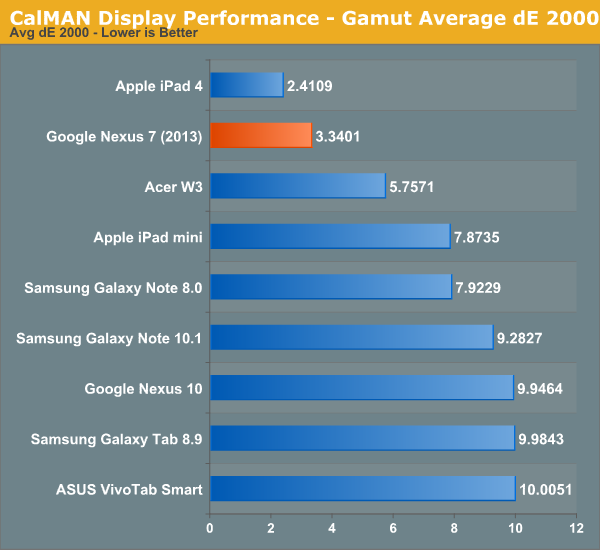
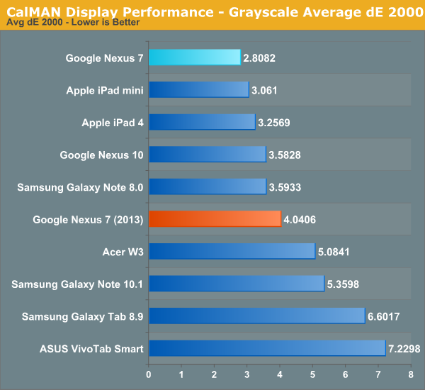
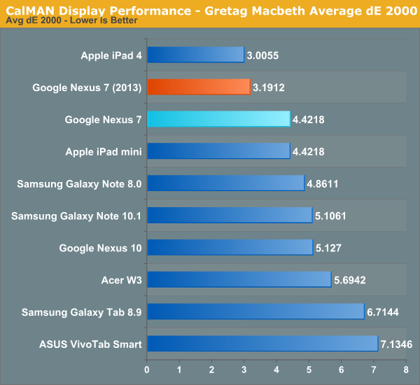
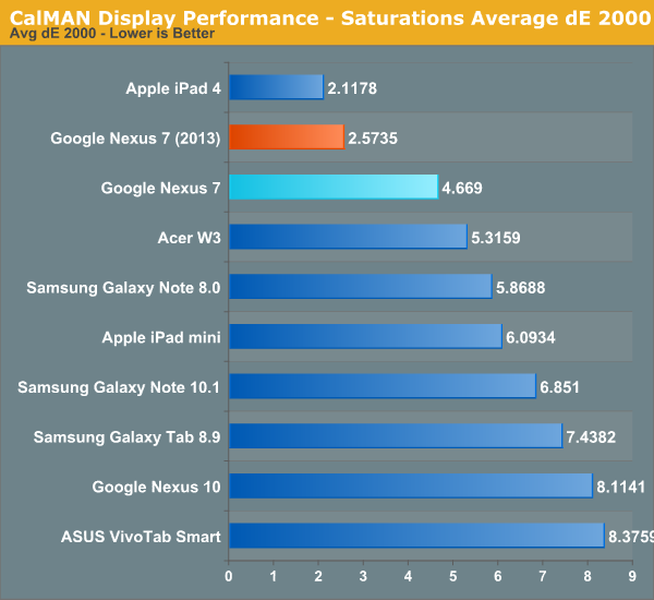
It turns out that the new Nexus 7 is actually very close to sRGB this time around, with overall gamut being just a bit bigger than the sRGB color space. In the GMB Delta-E and saturations Delta-E measures, arguably the two most relevant for color accuracy, the new Nexus 7 is second only to the iPad 4, and better than the iPad Mini in color accuracy, a significant step forwards from its predecessor.
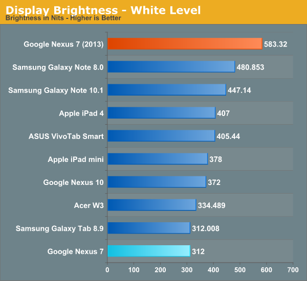
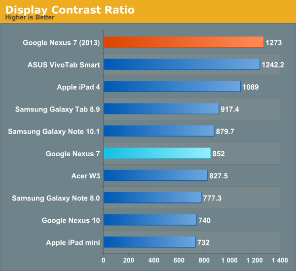
The new Nexus 7 also goes very bright, up to 583 nits, with excellent contrast of 1273. This is again not achieved using any dynamic contrast cheating since those functions are thoughtfully disabled.


On the display side of things I’m very pleased with how far the Nexus 7 has come, and it’s obvious that display quality was a big focus for the 2013 model.


252 Comments
View All Comments
Impulses - Sunday, July 28, 2013 - link
As the happy owner of an OG Transformer, I'm looking forward to upgrading to the new Nexus 7 (I've come to realize I prefer a smaller tablet for my uses), the TF will probably go to my father. Happy to support ASUS either way as I'm generally happy with their entire Android tablet strategy.Affectionate-Bed-980 - Saturday, July 27, 2013 - link
As much as I love quick reviews, please make sure that you follow up on your promises for a full review... soon. Where's that GS4 review Part 2 for example?FergusMackenzie - Saturday, July 27, 2013 - link
This look like an excellent tablet with one exception. 16:10 is a horrible aspect ratio on a tablet. Why does no major android manufacturer make a tablet with 4:3 aspect ratio?Broo2 - Saturday, July 27, 2013 - link
Most tablets are going 16:9 as that fits the 1920x1080 HD video standard and vendors probably get many complains from users watching HD 16:9 movies with black bars and the static sized Magazines/Comics/PDFs are a secondary concern.16:10 is not perfect for magazines/comics/PDFs, but it is better than 16:9; I have only seen the new Nexus 7 and the B&N Nook HD+ with this aspect ratio. The only 4:3s are the iPad and eInk eBook readers... :(
guidryp - Saturday, July 27, 2013 - link
Most Android tablets are 16:10, not 16:9.B&N Nook HD+ is not 16:10. It is 3:2. Which is a pretty good compromise. We need more like that.
Bob Todd - Monday, July 29, 2013 - link
Unless it was something odd with Cyanogenmod 10.1.2 on the Nook HD+, I'd have concerns about 3:2 in general. I always like the extra pixels, but I think that aspect ratio was rare enough that it tripped up a fair number of games that weren't tested properly on 3:2 (but worked fine on 16:9/16:10).charleski - Saturday, July 27, 2013 - link
In terms of rendering the varying aspect rations of books, comics and magazines 3:2 is probably the best compromise, but 16:10 isn't far off. 4:3 and 16:9 are both much worse.guidryp - Saturday, July 27, 2013 - link
It's irrelevant for regular novels which are just text, so you can read them on any ratio.Comics and Magazines would be good on 3:2, if your screen is big enough to show the whole page at once, which I would argue 7" isn't. If it isn't then matching ratios hardly matter. If you are going to be panning and zooming, I would definitely prefer 4:3 over 16:9/16:10.
Impulses - Sunday, July 28, 2013 - link
I like 16:10 in portrait a lot for web browsing and email, which is like 80% of my tablet use. Not sure why you'd prefer anything else for that or for media... 16:9 is noticeably narrower, grab any Win 8 tablet and see.Yofa - Saturday, July 27, 2013 - link
the original nexus 7 had a 1.2mp front-facing camera. that point is omitted from the comparison chart.