Hands on and Impressions from the HTC One - Formerly M7
by Brian Klug on February 19, 2013 10:30 AM EST- Posted in
- Smartphones
- HTC
- Mobile
- HTC One
- Snapdragon 600
Software & Sense
The HTC One runs Android 4.1.2, a choice which might seem alarming, but was done for stability and quality reasons, although 4.2 is coming. I think it might sound bad to ship with 4.1, but even Google acknowledged that 4.2 was primarily a release with more tablet features than something for smartphones, after all both are still Jelly Bean. Sense 5 replaces Sense 4 or 4+ which shipped on the One X and X+, and brings a radically different themed UI this time. I was able to survive with Sense 4, and Sense 4+ brought a lot of improvements, what we’ve seen of the new Sense 5 looks like it follows more Holo design rules than any of the other OEM skins I’ve seen so far. All of the Sense UI fonts and system fonts are Roboto, the font Google made for Android 4.x, though it’s often one of the lighter condensed weights. In Sense 5, all the first party HTC applications now also use the pivot bar, which was a key design element introduced as part of the Holo guidelines. Icons and menus are now very flat in Sense 5, giving it a much more modern look, though there are still some gradients if you hunt around for them.

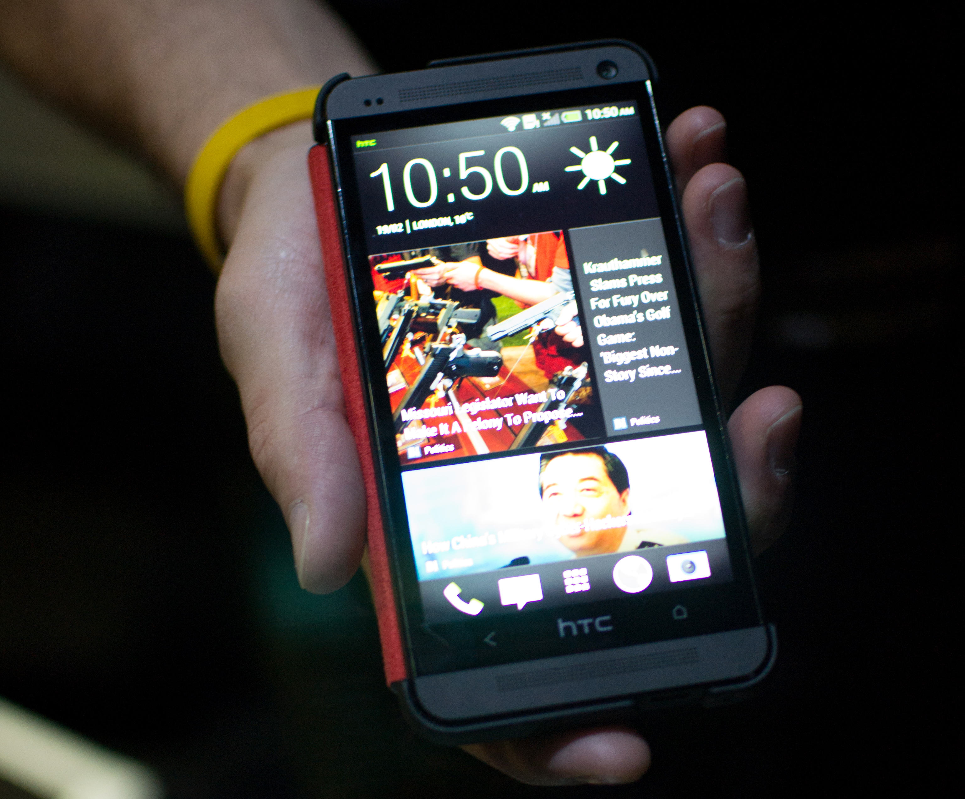
Probably the only huge deviation from Android is the inclusion of a completely new homescreen. Instead of having a grid of icons, the leftmost pane is home to a new feature called the Blinkfeed, which aggregates together content from a variety of online sources, media on the device (photos, videos, events), calendar events, and social media from linked accounts. The idea is to provide a quickly parsed visual menu of information to consume while glancing at the device. There are still widget panel homescreens, and the menus are sticky so that pressing home returns to the homescreen you were last on, in case you want to primarily use a widget panel as home instead of Blink.
The launcher also gets changed around in Sense 5. By default applications come sorted into logical folders, both to hint to users this is possible, and also to reduce anxiety for new users first diving into the launcher. The default view is a 3x4 grid which actually looks very refreshing, there’s still an option for a 4x5 grid for those wanting more density. Perhaps the biggest, most welcome improvement is that by default all operator applications will ship inside of a folder, rather than scattered all about the grid.
Another interesting choice is the decision to go with two capacitive buttons at the bottom of the HTC One instead of three. Last cycle, HTC got burned by following the Google guidance and doing away with the menu, err, “action overflow” button, leaving an on-screen action button in the overwhelming majority of Android applications that have yet to move away from this model. As a result, other players who included the menu button saw no black bar at the bottom. There’s also no app switcher button on the HTC One. Instead, just back and home. To get to an application switcher (which is now a 3x3 grid of thumbnails), one has to double tap the home button. Menu can be optionally enabled as a long press on the back button in a menu similar to what was added later in the One X. I think getting rid of a button is potentially risky, but probably simplifies things for new users.
Final Words
The HTC One industrial design is without a doubt the most striking I’ve seen from an Android phone to date. Unibody metal construction is something that at the high end we’ve only really seen out of Apple, and with the One, HTC has a major opportunity to set itself apart with a dramatically different in hand feel. Actively tuned antennas to make this possible without unintended attenuation, as well as improved CNC manufacturing volume are really the two enablers here.
Second only to the aluminum unibody story that is of the camera on the HTC One. HTC is taking perhaps the biggest risk of all with the camera, by choosing what is almost undeniably the right course of action and going against the prevailing trend of increasingly smaller and smaller pixels to drive the number of megapixels up. Megapixels is really the only number that has been sold to consumers, and with a 4.0 MP sensor, it’s instantly easy to see how the messaging will have to be set right for average consumers to appreciate that they’re getting around the same approximate size sensor as ship in other smartphones, if not slightly larger, but with dramatically bigger pixels. The result is, from my short time holding the HTC One next to a One X+, a dramatic difference in low light sensitivity, noise, and dynamic range indoors. The inclusion of optical image stabilization further improves things, and from a camera point of view the HTC One appears to be without a doubt the most serious Android smartphone camera experience.
HTC is announcing that in the USA the HTC One will be coming to AT&T, T-Mobile, and Sprint as the HTC One. Notably absent from that list is Verizon, unfortunately. Internationally HTC has an impressive list of operator partners, which I’ll spare going over in excruciating detail. The problem with the HTC One X wasn’t so much hardware as it was marketing and the fact that it only existed on one operator in the USA by that name. This time around, it’s one name, one brand, with no adulteration.
To say that the HTC One takes some bold risks is putting it lightly, but the hardware I’ve seen is impressive and without a doubt the best out of HTC, or any Android handset maker for that matter, to date. It’s too early to call who will be on top after this next cycle, but HTC seems well positioned with the HTC One at the top.


139 Comments
View All Comments
nerd1 - Tuesday, February 19, 2013 - link
720p in 4.7" is already 312PPI, and no one with 2.0/2.0 eyesight will see pixels from 10" distance.I just don't understand why this silly 'PPI' race is going on.
They put 4MP sensor and says they won't do the megapixel race - then why do the PPI race which is plain meaningless? At least high-MP camera is better for outdoor pics. 400+ppi screen is good for nothing.
repoman27 - Tuesday, February 19, 2013 - link
Are you old enough to remember when consumer oriented printers began focusing on dots per inch? 144 DPI clearly sucked, the early laser printers at 300 DPI were a godsend but expensive, and once prices came down and competition from inkjets heated up the race was on to 600, 1200 or more DPI. Today we take it for granted, but when was the last time you printed a document at less than 600 DPI?Unlike printers, LCDs don't need to handle halftone screens and can take advantage of anti-aliasing. However, I spend quite a bit of time reading very small text on my phone. I'll be happy when virtually all of the LCDs in my life are closer to 600 PPI. Also consider the sizable Asian market and the impact that resolution makes on non-latin script at small sizes.
Whining about real progress on a tech site is ridiculous, especially with all the pointless arguments about what viewing distance person x or person y can still discern a pixel at. If text is easier to read at higher resolutions for a good percentage of the population, then there is still a reason to go there. If you compare text and photos printed at 300 and 600 DPI it's obvious that most people can see a difference.
nerd1 - Tuesday, February 19, 2013 - link
DPI is different from PPI, as they need dithering to display halftones.And there is biological limit for display PPIs. You simply cannot outresolve 300PPI screen at 10 inch distance, even if your eyesight is 2.0/2.0.
repoman27 - Tuesday, February 19, 2013 - link
I already pointed out the halftone issue, which is a decidedly different technique than dithering. While you may not be able to readily distinguish individual pixels on a 300 PPI display from 10 inches, I will bet money that most people can tell the difference when looking at type on a 300 PPI display vs. a 600 PPI display.I used to do prepress work. I've looked at plenty of output at various resolutions that was strictly PostScript text or vector based graphics with no halftoning or dithering involved. 300 PPI is not enough to be indistinguishable from higher resolutions. The difference between 600 and 1200 requires a loupe for me.
Mind you I never said that 1920x1080 was a good choice of resolution for a phone. I'm happier with slightly smaller displays and different aspect ratios, but then again I almost never watch movies or play games on my phone.
The yield argument is ridiculous. The yields will always be negligible if nobody specs the damn things. I'm also not in the market for a cheaper phone. I want a better phone, and I'm quite willing to pay for it. Unfortunately no matter how much I seem to pay AT&T I can't manage to get anything better in the way of carrier service in my home market.
nerd1 - Tuesday, February 19, 2013 - link
And you just CANNOT increase resolution without sacrificing anything. High resolution LCDs requires more bright backlight, has lower yield and of course burdens GPU way more. (Remember current gen consoles cannot render any game in 1080p)If they use 720p panel instead, they can make the phone cheaper, more brighter (given the same backlight), and cooler (less GPU load). and most importantly last longer.
All these sacrifices for silly 1080p marketing gimmick nobody will distinguish from normal distances. Maybe in one year or two, some OEM will say that PPI race is meaningless and they will give 2x battery life instead. Ironically, HTC did the same with this phone with their camera MP count.
iamezza - Wednesday, February 20, 2013 - link
I agree, that trade-offs you make for the higher pixel count isn't worth it at this stage.Mithan - Tuesday, February 19, 2013 - link
Will this work with Android 5 when it comes out?Does anybody know?
steven75 - Tuesday, February 19, 2013 - link
If only going by the looks/materials this shames any other Android phone I've seen. Looks high end far unlike any of the popular Samsung devices.lefenzy - Tuesday, February 19, 2013 - link
frustrates me so muchmutatio - Tuesday, February 19, 2013 - link
Given that HTC has had some adjustments to their phones due to mimicking Apple, I'm surprised to see a complete lack of commentary by Klug on the obvious design elements that seem hijacked from the iPhone. The end product looks like a hybrid of the iPhone 5 (beveled chamfered edge, color scheme, antenna integration, etc.) and and iPhone 3G/S (rounded back). It looks sharp but the clear design rip-offs are obvious. Also, I'm not so sure about the whole cluster of gear along the top of the front panel. Would a center mounted camera make it too obvious of an Apple ripoff? The whole issue of eyes being slightly off focus while looking at the screen is always an issue but is best mitigated with a center mounted camera. There is always a compromise in terms of turning the device to a different orientation but it's always beneficial to have at least one of the orientations having a center mounted camera. It seems the corner position will make the user always appear to look off to the side in the image regardless of orientation. It's great to have amped up speakers, but IMHO, if the intent behind front facing cameras is to facilitate face-to-face social interaction, designs that work to distance the user from a more personal interaction should be reconsidered.