The new iPad: Retina Display Analysis
by Anand Lal Shimpi on March 19, 2012 5:49 PM ESTQuantifying Display Performance: Big Gamut Gains
Pixel density may have improved, but what about the rest of the display characteristics? We'll start with the usual suspects - brightness, black levels and contrast ratio:
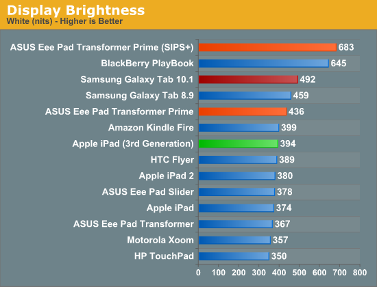
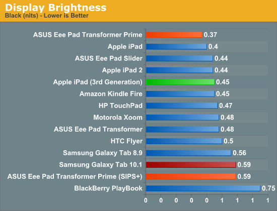
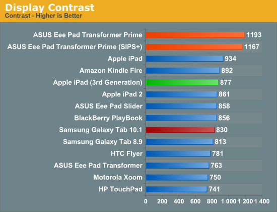
Despite a tremendous increase in pixel count and density, the new iPad delivers roughly the same brightness and contrast ratio as its predecessor. White point remains unchanged as well at ~6700K.
At the introduction of the new iPad, Apple briefly mentioned a 44% increase in color saturation from the new panel. Although the old display definitely looked good, the new one does actually look better. My eyes aren't normally the best judge of gamut, but we have some tools to help quantify exactly what I was seeing:
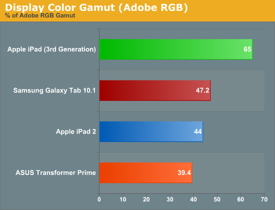
Color gamut has definitely improved. While the iPad 2 and TF Prime both were able to represent ~40% of the Adobe RGB color gamut, the new iPad jumps by nearly 50% to representing 65% of the Adobe RGB gamut. More impressive are the gains you see if you look at the color gamut of the new panel compared to the sRGB space:
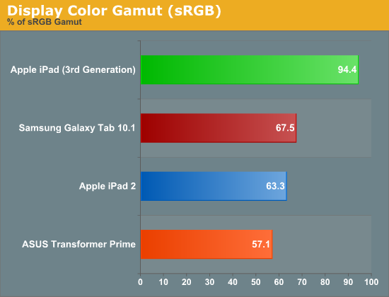
Here the panel is able to deliver nearly full coverage of the sRGB color gamut. Below is the CIE diagram for the new panel with an sRGB reference plotted on the same chart so you can visualize the data another way (the white triangle is the new iPad, the gray outer triangle is the sRGB reference):
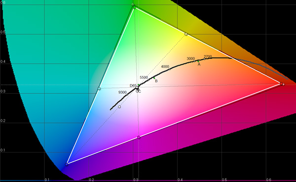
Near perfect coverage. The new iPad's display is a huge step forward in both pixel density and being able to represent a wider color gamut. While it's still no where near the quality of high-end PC displays, this is real progress for tablets. The bar has been raised.


172 Comments
View All Comments
AnnihilatorX - Tuesday, March 20, 2012 - link
You shouldn't really say that. The jump from 40% to 65% is 20%, not 50%
Don't mix percentile with relative ratios.
doobydoo - Tuesday, March 20, 2012 - link
When you start out at 40%, of anything, if you see a 20% improvement compared to that 40% starting point, you end up at 48%.Using percentages is correct, you just have to know what is a percentage of what, which admittedly should have been made clearer.
It would have been more incorrect to say the iPad had improved by 20% when that would imply it hasn't made as much of an improvement as it has.
doobydoo - Tuesday, March 20, 2012 - link
(To be clear, a percentage is a relative ratio. % = / 100 )Origin32 - Tuesday, March 20, 2012 - link
I hate it when people don't distinguish between percents and percent points. /petpeeve3rd alinea 3rd page I'm glad you asked
guidryp - Tuesday, March 20, 2012 - link
"While it's still no where near the quality of high-end PC displays"In what way? I have an NEC 2490 high end PC display (> $1000).
In most ways the new ipad display equals or betters it.
I hope Anand hasn't fallen into the trap thinking that Wider gamut = better.
There really is only one gamut standard in wide use and that is sRGB. Any deviation falling short(as old iPad did), or going beyond sRGB will produce less accurate color in most situations.
This display is as close to sRGB as I have seen in any monitor. Since that is actually the proper target to aim for (not simply wider = better), they have done an exemplary job.
medi01 - Tuesday, March 20, 2012 - link
On other tablets, Samsung's Galaxy in particular? (only 3 were shown in chart)medi01 - Tuesday, March 20, 2012 - link
I guess I know why it isn't shown:Gamut of Adobe RGB 1998
iPad 2 - 49.9%
iPad 3 - 66%
Galaxy Tab 10.1 - 62.8%
Transformer Prime (SuperIPS Off) - 40.2%
So older Galaxy Tab has much better color gamut than iPad2 and is very close to iPad3.
http://www.tomshardware.com/reviews/ipad-3-benchma...
midori - Tuesday, March 20, 2012 - link
@anand:I think we all saw enough of photos from microscopes and magnifying glass.
I don't really see a reason in posting comparison photos that are so "close" and zoomed in.
That just isn't real world scenario. We all get get that the screen has 4X pixel count but post comparison photos from normal usage distance. That way I can really see if I can benefit from all those extra pixels or not.
Graag - Tuesday, March 20, 2012 - link
The problem with normal size comparison photos is that they will generally be viewed on monitors with less than the iPad's resolution. Making it difficult to really tell the difference. Sort of how it would be hard to evaluate color TVs by looking at them on a B&W TV.uhuznaa - Tuesday, March 20, 2012 - link
One thing that would be really useful would be full-size screenshots of an iPad 2 and an iPad 3 displaying the same book-sized PDF.Especially PDFs are terrible on the older iPad. I mean, there're lots of really good apps for working with them, but the need to constantly zoom around is just maddening. The new display should really help here a lot.