In-Depth with the Windows 8 Consumer Preview
by Andrew Cunningham, Ryan Smith, Kristian Vättö & Jarred Walton on March 9, 2012 10:30 AM EST- Posted in
- Microsoft
- Operating Systems
- Windows
- Windows 8
Task manager
For the first time in memory, the Windows Task Manager has gotten a significant overhaul, and that doesn’t just refer to its new Metro-esque styling—Task Manager now combines functions from the old Task Manager, the Windows Resource Monitor, and MSConfig into a new, more useful app that provides a lot of information in a clean and simple way.
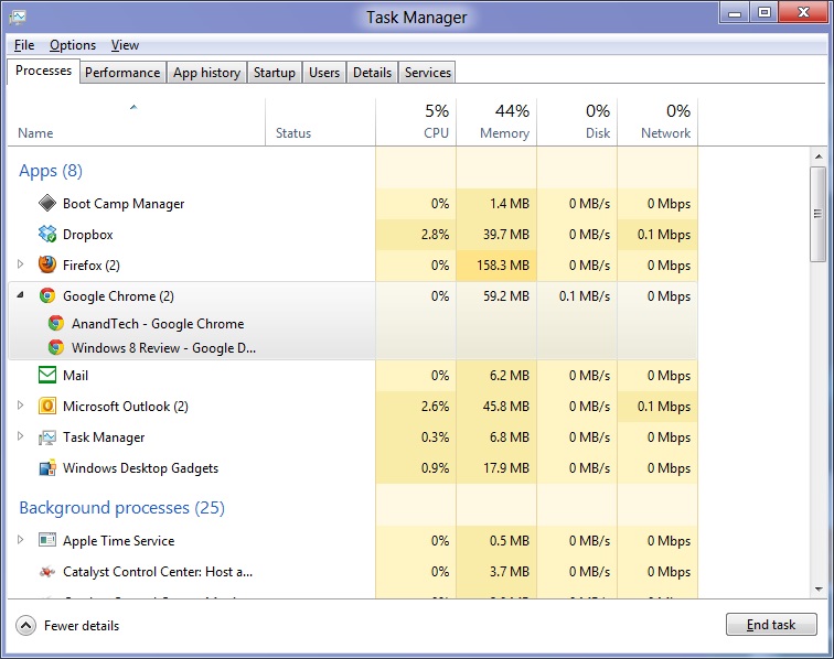
Open up the Task Manager and click “More Details” and the first thing you’ll see is the Processes tab, which gives you a clean list of all Metro and desktop apps running on your system and the resources they’re using—the new Task Manager tracks CPU, RAM, disk, and network bandwidth usage. You can see both absolute values (Firefox is using 164.7 MB of RAM) or in percentages (Firefox is using 8.9% of your RAM), and you can spot resource hogs at a glance—as you can see in the screenshot above, the colors in the Task Manager vary based on how much of a given resource a process is consuming. Apps, background processes, and Windows/system processes are each displayed under their own subheadings.
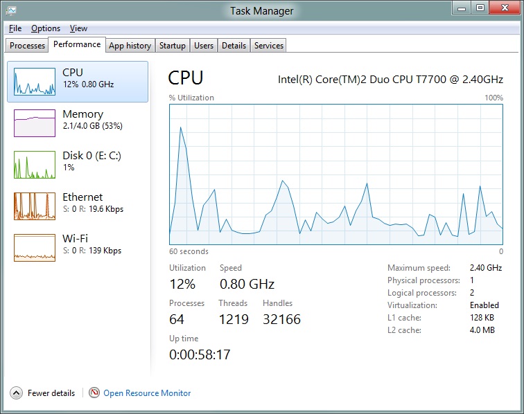
The Performance tab now tracks CPU, RAM, disk, and network usage, and it tracks each network interface separately for your convenience. The CPU graph can be configured to show activity on all cores combined or separately. You can view both graphs and hard numbers for each resource, and you can also see different information about your computer’s hardware—the current clock speed of your CPU, the number of RAM slots you have and how many are occupied, your current IPv4 and IPv6 addresses, and more. The Resource Monitor is still available if you need a more advanced view, but this tab alone drastically increases the Task Manager’s usefulness.
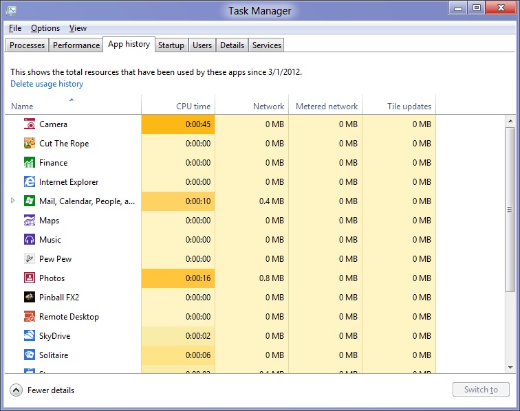
Next up, the App History tab shows statistics for resource usage over time. It’s mostly geared toward network usage, breaking out stats for how much data an app has used on both metered and non-metered networks, as well as how much bandwidth has been spent on keeping Metro live tiles up to date. It also gives you statistics for CPU time. App usage history can be deleted at any time if you’d like a fresh start.
The other tabs are pretty self-explanatory, so we’ll go through them quickly: the Startup tab shows a list of programs that launch when your computer starts. This functionality used to be handled by a combination of the “Startup” folder in the Start menu and a tab in the MSConfig.exe utility (which still exists, but is no longer used to control startup items). The Users tab shows resource usage broken out by logged-in users, much like in the old Task Manager, and will also allow administrators to disconnect users. The Details tab gives a complete unadorned list of all processes and their resource usage, while the Services tab shows all services on your computer whether they’re running or not—you can start, stop, or restart services from this tab, but you’ll have to go into the Services utility for more options.


286 Comments
View All Comments
Andrew.a.cunningham - Saturday, March 10, 2012 - link
Yes it will.poisonsnak - Saturday, March 10, 2012 - link
As Andrew said it will run fine on AMD hardware. I've been running the Developer Preview since September on my Phenom II X6 1100T & Radeon 6970, which I then (side-graded?) to an FX-8150, and then upgraded to the Consumer Preview.The only BSOD or crash I've ever had was when I tried to install the AMD USB filter driver under the developer preview - it warned me the driver was unlikely to work, I gave it my usual "I know better than you" and promptly got to see the fancy new Win8 BSOD screen.
rickmoranisftw - Monday, March 12, 2012 - link
Haters gonna hate man. I'm sorry people have blown up on you for no reason.Andrew.a.cunningham - Tuesday, March 13, 2012 - link
It's cool - mostly I'm just confused about it, but the constructive comments have far outnumbered the trollish ones at this point. :-)Either way, I'm working on getting an AMD system for future use.
kmmatney - Friday, March 9, 2012 - link
Don't worry about it. He tested enough systems, and you can make a guess as where AMD would stand in those systems. I agree that a lot of people use AMD - it's all I buy for friends and family as the Microcenter deals are too hard to pass up. I don't think it effects the review at all - Windows 8 won't look any different on an AMD system.rickmoranisftw - Monday, March 12, 2012 - link
I too just created an account today. Ive been reading anandtech for a while now but havent bothered to make an account. But today i had too.There is absolutely no reason for you or anyone else to blow up on Andrew for only using intel systems for this review, a review of a preview at that, when his reasoning was extremely simple. He just didnt have an AMD system on hand. Who are you to blame anyone of being biased when you know nothing about them.
I'm disappointed that i didn't read these comments until today (monday) or i would have commented sooner. I was so pissed off after reading these comments i messed up two different captcha's when making my account just now. I hope you're just saying this to try to feel some sense of superiority over someone who actually has a job on a real tech site, and not because you actually think andrew is that biased toward intel. Because that's just stupid.
Andrew.a.cunningham - Tuesday, March 13, 2012 - link
Thanks. :-)AeroRob - Friday, March 9, 2012 - link
I don't see how anyone who's spent so much as five minutes along with Windows 8 on a normal desktop computer--let alone hours--could say that the new start menu system is even remotely an improvement on the old system. It is unequivocally worse. It creates a jarring, disjointed experience, with an interface that is less versatile and consequently makes simple tasks more difficult.Why must I jump through hoops just to shut my computer down? Or if I'm not sure Windows considers what I'm looking for an app or a setting, why do I have to do multiple searches, when previous versions of Windows would show me all the possibilities?
It would be so simple for Microsoft to solve all these numerous (yet minor) annoyances: give a legacy desktop option. Just one little checkbox to where a user can specify that they would rather boot into the desktop than the Metro BS, and to restore the start menu to a Windows 7 state. You can't tell me that would be difficult in the least, but MS would rather be obstinate jerks, trying to force users into a "new experience" that they don't want, don't like, and that actively works to make their workflow more inefficient.
Change isn't a bad thing, but only when that change is an improvement. Going from the XP start menu to Vista's added functionality and made things easier. Going from 7 to 8, though, is a step backward, and users shouldn't have to suffer just because MS wants to push their little pet project.
jabber - Friday, March 9, 2012 - link
I'm glad I'm not the only one. I find myself having to move left to right across the screen to do stuff that a simple rightclick/clcik would do previously.Having to use the keyboard for stuff that a mouse click did previously as I cant work out if there is a mouse equivalent or if it exists at all.
No visual clues as to how to use it. Just clicking on all the empty space in the hope something useful happens.
I see one thing makes the desktop bit shrink to a small size in the middle of the screen. I have no idea what that is for.
I think Metro is fine for folks that have never used a computer for real day to day office work that brings home the bacon. You know the types.
AeroRob - Friday, March 9, 2012 - link
Assuming MS doesn't reverse course on their "Abandon the Start Menu" decision, hopefully by time the RTM version rolls out, they will include some sort of tutorial the first time you switch into desktop mode.Really, though, the whole ordeal reminds me of when Apple made the iPod Shuffle without any buttons on the physical device, and insisted on making users learn a sort of Morse code on the remote to accomplish anything. You could argue that a single button makes things "simplified," but that doesn't prevent it from being an inane, unproductive input method.