In-Depth with the Windows 8 Consumer Preview
by Andrew Cunningham, Ryan Smith, Kristian Vättö & Jarred Walton on March 9, 2012 10:30 AM EST- Posted in
- Microsoft
- Operating Systems
- Windows
- Windows 8
Task manager
For the first time in memory, the Windows Task Manager has gotten a significant overhaul, and that doesn’t just refer to its new Metro-esque styling—Task Manager now combines functions from the old Task Manager, the Windows Resource Monitor, and MSConfig into a new, more useful app that provides a lot of information in a clean and simple way.
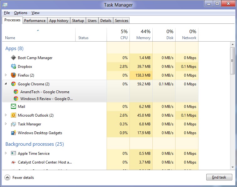
Open up the Task Manager and click “More Details” and the first thing you’ll see is the Processes tab, which gives you a clean list of all Metro and desktop apps running on your system and the resources they’re using—the new Task Manager tracks CPU, RAM, disk, and network bandwidth usage. You can see both absolute values (Firefox is using 164.7 MB of RAM) or in percentages (Firefox is using 8.9% of your RAM), and you can spot resource hogs at a glance—as you can see in the screenshot above, the colors in the Task Manager vary based on how much of a given resource a process is consuming. Apps, background processes, and Windows/system processes are each displayed under their own subheadings.
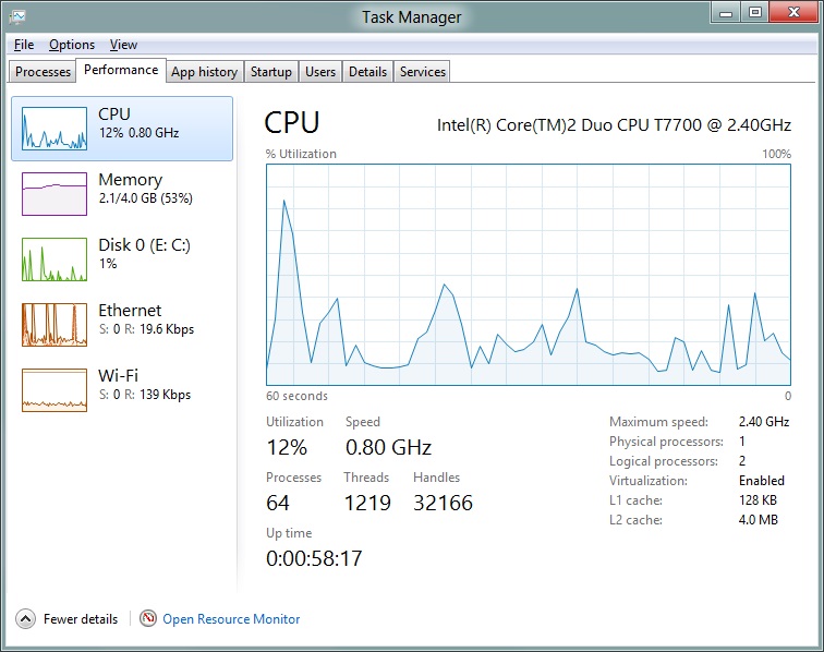
The Performance tab now tracks CPU, RAM, disk, and network usage, and it tracks each network interface separately for your convenience. The CPU graph can be configured to show activity on all cores combined or separately. You can view both graphs and hard numbers for each resource, and you can also see different information about your computer’s hardware—the current clock speed of your CPU, the number of RAM slots you have and how many are occupied, your current IPv4 and IPv6 addresses, and more. The Resource Monitor is still available if you need a more advanced view, but this tab alone drastically increases the Task Manager’s usefulness.
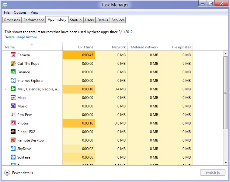
Next up, the App History tab shows statistics for resource usage over time. It’s mostly geared toward network usage, breaking out stats for how much data an app has used on both metered and non-metered networks, as well as how much bandwidth has been spent on keeping Metro live tiles up to date. It also gives you statistics for CPU time. App usage history can be deleted at any time if you’d like a fresh start.
The other tabs are pretty self-explanatory, so we’ll go through them quickly: the Startup tab shows a list of programs that launch when your computer starts. This functionality used to be handled by a combination of the “Startup” folder in the Start menu and a tab in the MSConfig.exe utility (which still exists, but is no longer used to control startup items). The Users tab shows resource usage broken out by logged-in users, much like in the old Task Manager, and will also allow administrators to disconnect users. The Details tab gives a complete unadorned list of all processes and their resource usage, while the Services tab shows all services on your computer whether they’re running or not—you can start, stop, or restart services from this tab, but you’ll have to go into the Services utility for more options.


286 Comments
View All Comments
Andrew.a.cunningham - Friday, March 9, 2012 - link
1) We'll probably do an analysis of that with an RTM version of the OS. I wouldn't expect it to change too drastically from a patched copy of Windows 7.2) Not guaranteed, but probably. When 7 was released, Vista got a Platform Update that added support for DX11, some WDDM 1.1 features, and a few other things: http://support.microsoft.com/kb/971644
Windows 7 is still in its mainstream support phase, so I'd expect those updates to be available after Windows 8 RTM.
R3MF - Friday, March 9, 2012 - link
many thanks Andrew.Andrew.a.cunningham - Friday, March 9, 2012 - link
Welcome! :-)valnar - Friday, March 9, 2012 - link
Isn't the fact that new Windows phone BOMBED in the marketplace enough reason not glorify this crappy GUI? The public has already spoken.And....what makes a good tablet or phone OS (touch screen) does not necessarily make a good desktop OS.
silverblue - Saturday, March 10, 2012 - link
True, however everybody has differing tastes. I don't mind it, personally, and it's not as if the Windows 7 desktop has gone forever.As for Mango, it's not on many devices and hasn't been out long. I also firmly believe that it's the first flavour (sorry) of Windows Phone that Microsoft has truly taken seriously. Give it time. Had dozens of devices been launched with Mango yet sales been poor, I'd have been more inclined to agree with you.
Touch screen technology has been around a while and it's about time that a mainstream OS had extensive functionality in this area.
Subzero0000 - Sunday, March 11, 2012 - link
>Isn't the fact that new Windows phone BOMBED in the marketplace enough reason not glorify this crappy GUI? The public has already spoken.Well, that's exactly why they have to FORCE metro to their biggest userbase (Desktop PC). They want people to get used to metro, then hopefully people get attached to it and choose to buy tablet/phone with metro.
PopinFRESH007 - Sunday, April 15, 2012 - link
+1This is where I think Apple's methodical, very deliberate, well thought out approach is going to win over a lot of people after Windows 8 launches. Microsoft already tried this in reverse order and it was awful until they instantly became irrelevant when the original iPhone launched. They crammed a mouse and keyboard OS into a crappy touchscreen phone and called it a day. Here they are cramming a touchscreen phone/tablet OS pasted on top of a desktop OS and figured out the least amount of work to make it possible to maneuver between the (what feels like) two OS's. When the review consistently has "There are actually two versions of..." you know you have done something wrong as an OS engineer.
I've given Win8 a fair shake, I've really tried to give it an honest everyday usage to give it a fair comparison. I have a Lumia 900 and have been running the consumer preview since it came out. I'm really going the extra mile to give the Metro UI a shot, but it just doesn't scale to a desktop (In the way windows 8 implements it) very well at all. I've used Win8 on a very nice prerelease tablet and it works wonderfully. Microsoft should really take a step back and survey the industry and learn from what has been successful and what has had problems. The iPad is crushing the tablet market because it benefits (like many Apple products) from a halo of the iPhone, iTunes, and iCloud. Google has realized their misstep in segmenting the phone & tablet OS's and I think Microsoft will come to realize that a touchscreen tablet has more in common with a touchscreen smartphone than it does with a keyboard and mouse desktop PC.
The thing about Metro is that it is very simplistic and *could* scale easily. Look at a Windows Phone 7 next to a Windows 8 Tablet and it's ability to scale is obvious. I think the real problem here is Microsoft is taking a Bold, half hearted, All-in, keep some chips in reserve, Go for the gusto, partially move to Metro. They cram it down your throat but don't believe in it enough to completely re-think the OS an move to it. I would like Windows 8 a whole lot more if it was a unified experience with Metro at it's center. The half ***ed cramming of two OS's with different UI's into one cup of tea is what really pushes me away from Windows 8. If they left the core of windows 7 under the hood so any windows 7 app's would run, and provide a simple framework for developers to create "live tile" shortcuts that plugin to the new services that Windows 8 will bring this would be a much better OS. If this is the future, GO FOR IT!! There should not be a control panel for "desktop" and a settings for Metro. There should not be Metro IE 10 and IE 10 for Desktop. If they built API's and service frameworks for developers to bridge Metro UI to C++ code and let developers design their software the best way that suits their needs there would be far better support. The Metro UI as a launcher for native C++ app's and HTML5 Metro apps would be great. This would be especially true if developers could push notifications and information to the live tiles for their app's. Imagine a multiplayer game like Battlefield 3 on Windows 8. On the Metro UI "Start" screen the Live Tile for BF3 would be alive with info from battlelog. So you could easily see if some friends are playing the game, or if there is new content/updates, etc... It would be like having the community features of Steam, without ever having to "Launch" anything. A quick glance at your games area of your Live Tiles and you could see who is online playing what games and quickly join in. The same thing would be true for a more professional app like Photoshop. Imaging if Adobe, using these types of API's could build in collaboration features tied into the Live Tiles & using SkyDrive. You could save an image in your skydive and share it to your fellow team members, then if there are changes and edits all of those peoples Live Tiles for Photoshop would reflect that new information. They have so much potential and are at a solid time to make the leap, the real leap to Metro with less risk. They have a solid "traditional" OS in Windows 7 that they could continue to sell. They also have the ability to really bring a new level of integration that has been absent from Microsoft products. Tie in Xbox Live like they did on Windows Phone 7, and integrate voice chat, the friend list, messaging, etc as system wide services. The list goes on and on with the amount of potential they have to make a seamless experience across all of their platforms from phone, to xbox to tablet to PC. It's sad to see this is the best they can do.
As mentioned above, I think Apples approach of using services like iCloud to bridge your data from a mobile platform to a desktop platform is a better strategy. Really looking at each element of a mobile OS and thinking how that will work on a desktop with a mouse and keyboard; working to merge what makes sense and leaving out what doesn't. I think Apple is also failing at this to some extent as well. They should be working on unifying their "Store's" so I could make an app that when loaded on an iPhone would have the iPhone UI, when loaded on the iPad would have the iPad UI and when loaded on a Mac would have a windowed UI, and the store would serve up the correct parts of the binary depending on if it's on a mobile device like iPhone/iPad or Mac.
/END RANT.
jabber - Friday, March 9, 2012 - link
The feedback has been 100% negative. Really really bad. No question I haven't seen a normal PC user yet that likes it or wants to use it.The feedback for Windows 7 was 90% positive.
Not looking good MS.
futurepastnow - Friday, March 9, 2012 - link
The feedback from the two "normal" non-technical computer users I showed it to was very negative. I let them play with it with no instructions or advice, and they couldn't do anything. It's the least intuitive interface ever.Oddly (or not oddly), the most computer-literate person I showed it to figured he could get used to it, since he uses keyboard commands for everything and they still work. He thinks Microsoft are out of their minds, though.
Perhaps that is Microsoft's problem, I wonder? All of their engineers, testers and QA people know all of the keyboard commands, which puts them in the 1% of computer users. Perhaps if they created a special version of Win8 for interface testing, which *required* mouse input for all actions, they'd seriously reconsider Metro.
Exodite - Saturday, March 10, 2012 - link
I don't know, I'm a software engineer myself and I wouldn't touch W8 with a 10ft pole.I like the minor underlying enhancements to things like the Task Manager and File Transfer dialog, though nothing of that can even begin to make up for the UI clusterfuck.
I run a multiple-display desktop system.
I _like_ nestled folder structures and rely on it to organize.
I prefer minimal clutter on the desktop, to the point the only application icons there are Chrome and MPC-HC, and half a dozen project folders. I also use minimal size icons.
Huge icons in listings, and the enormous amount of whitespace they add, is wasteful and inefficient.
I can't stand that good and intuitive UI elements like radiobuttons and checkboxes are giving way to touch-oriented dragbars, it just underlines wha ta gigantic step backwards the entire Metro experience represents.
Perhaps you're right about technical and professional users being less impacted by the horrors of W8 due to being more comfortable with keyboard shortcuts than users in general, my personal experience isn't enough to say one way or another.
On the other hand I'd argue that that particular group of people are least inclined to accept the changes because they very rarely have to. I don't have to use Windows as a development platform, I could quite trivially move to any *NIX platform of choice.
And if Microsoft doesn't see the light before Windows 7 hits EOL I might as well migrate platform, at least I can set up the UI as I prefer that way.