In-Depth with the Windows 8 Consumer Preview
by Andrew Cunningham, Ryan Smith, Kristian Vättö & Jarred Walton on March 9, 2012 10:30 AM EST- Posted in
- Microsoft
- Operating Systems
- Windows
- Windows 8
As soon as the setup process is finished, you’re presented with your first look at Windows 8’s primary innovation: Metro. This new UI, which originated in Windows Phone 7 and has since been extended to the Xbox 360, is the Wave of the Future at Microsoft, and it’s part and parcel of Windows 8. There is no classic Start menu to fall back on. There’s nothing built-in to the OS that allows you to disable it or boot to the desktop by default (though surely various hacks will enable this if they haven’t already). Metro is here, and if you use Windows 8 you’ll have to come to terms with it.
That’s because Microsoft is going a step further than Apple with regards to its operating systems: while Apple is busy porting iOS features and characteristics to a desktop operating system that is still recognizably OS X, Microsoft insists that the tablet is just another kind of PC, and to that end is building a unified OS for both tablets and traditional PCs. Microsoft tablets (whether running Windows 8 or Windows on ARM) will run the same core software as PCs, will be able to run many of the same apps as PCs, and (most importantly for Microsoft’s ecosystem of enterprise users) can be managed using the same tools as PCs. We’ve known for years that the traditional Windows desktop doesn’t work well on tablets, but does an interface designed for touch also work with a mouse and keyboard?
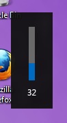 Metro, with its large fonts, bold colors, and large buttons was designed to be touched, and I think once we get some tablets designed for Windows 8 people are going to warm up to it. It’s well thought-out and with a little polishing will stand up well to iOS and Android in terms of features, and in terms of aesthetics it's already there—animations are fluid and attractive, and nice touches like a volume overlay (see right—finally!) bring an extra level of modern polish to Windows.
Brian Klug and Ryan Smith talked a bit about using Metro on a tablet in their piece on September’s Windows 8 Developer Preview, a process which is more or less the same in the Consumer Preview, so what I’ll be focusing on here is the general layout and function of Metro in the Consumer Preview, and my experience using it with a keyboard and mouse.
Introducing Metro
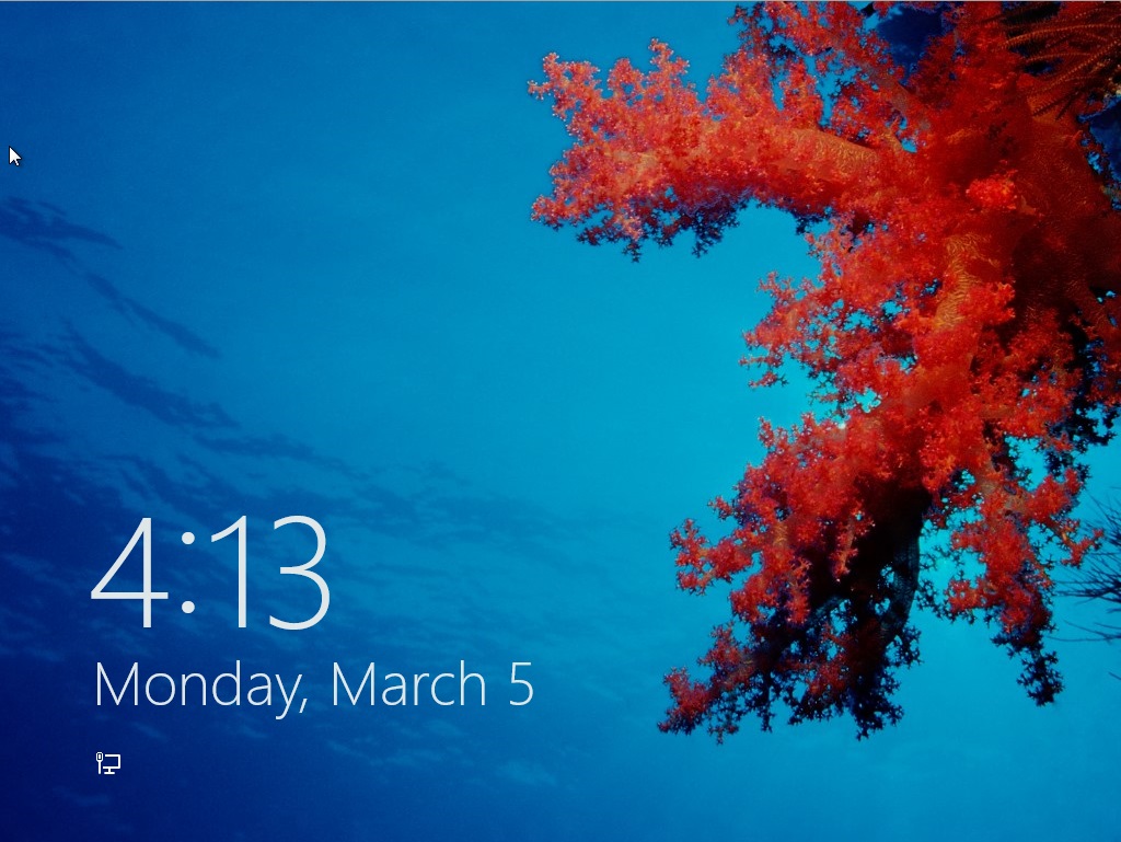
We’ll start with the entry point: the new login/lock screen. In previous Windows versions, this screen told you nothing about the computer—it was simply a gateway, and as such it either showed you a list of user accounts on the computer or displayed a CTRL + ALT + DELETE prompt with username and password fields. In Windows 8, the lock screen shows you the date and time and your current battery life and network connectivity status, set against a user-configurable background. Other Metro apps, like Mail and Messages, can also be configured to display status and notification messages on the lock screen. The look is reminiscent of most tablets and smartphones, but its big, high-resolution, striking images reminded me more of the Kindle Fire than anything. It’s a nice effect.
Press any key on your keyboard and the login image will slide upward, revealing the traditional Windows name and password fields. Authenticate, and you’ll be looking at the Metro-style Start screen.
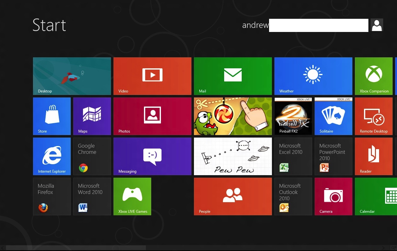
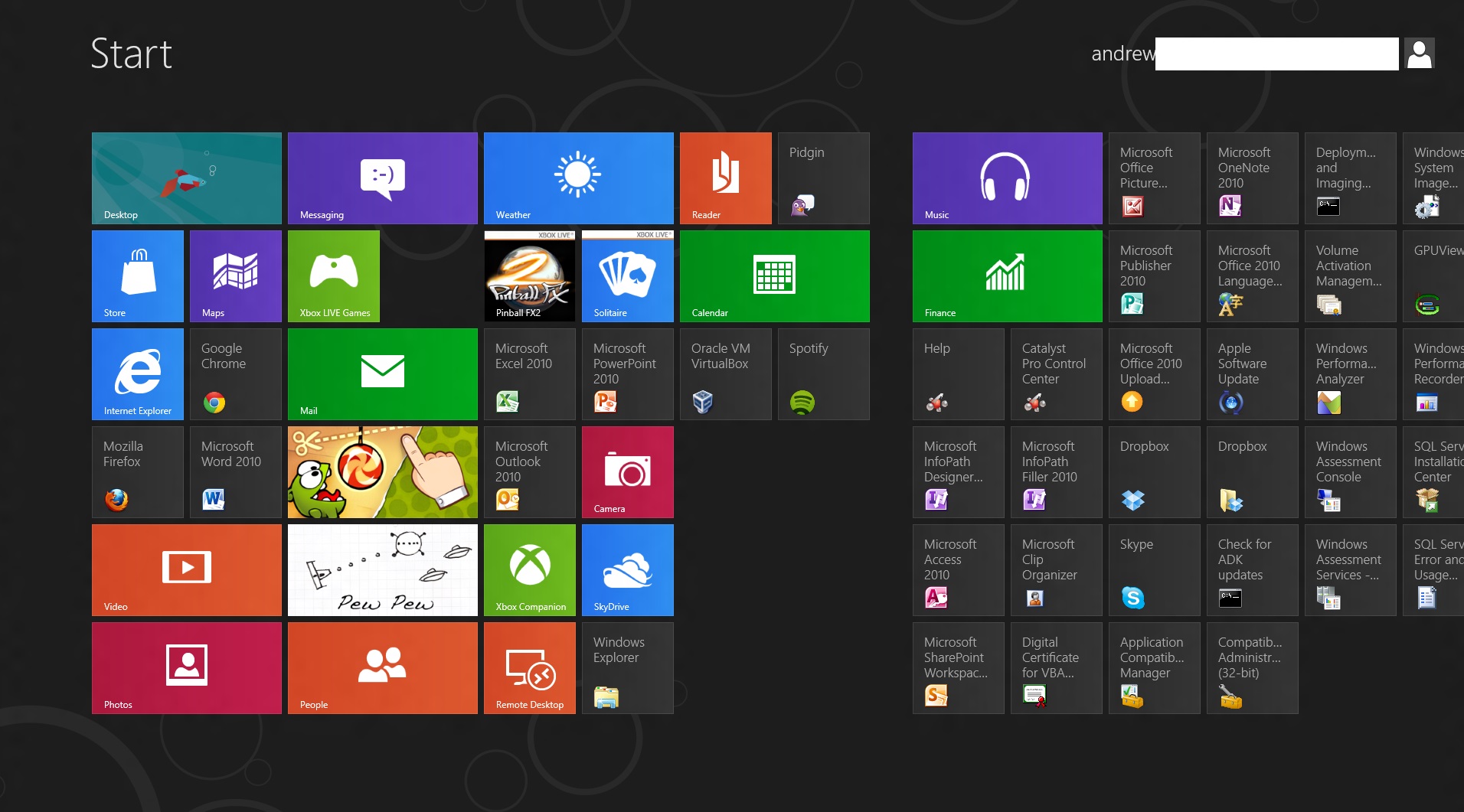
Tiles for Metro-style apps are big and colorful, and can usually be set to two sizes, a smaller square that allows for two tiles to sit side by side in a column, and a longer rectangle that spans the entire column. Metro columns on the Start screen will expand or contract to fill all of the screen resolution available to them, as evidenced in the screenshots above and below, and your mouse or trackpad’s vertical scrolling function will let you move left and right (horizontally, I know) through all of your apps. You can also scroll by grabbing the scrollbar at the bottom of the screen, or by moving your mouse pointer all the way to the left or the right of the screen.
Displays with more pixels can display more items
Above, you can see most of what constitutes a Metro page: tiles of apps lined up into neat columns. Tiles can be moved around at will, and will try their best to rearrange themselves dynamically. The wider gap between two of the columns is a divider between “pages” of apps. There is no limit to the horizontal size of pages, and you can freely drag tiles to either side of these wider divides.
Right-clicking a Metro app will bring up a list of actions at the bottom of the screen—most Metro tiles will let you shorten or lengthen them, remove them from the Start screen, or uninstall them.
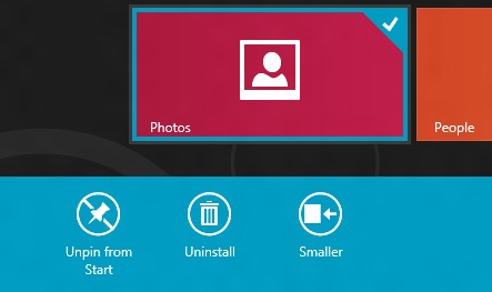
Standard desktop programs also show up on the Start screen as rather unglamorous-looking gray tiles that show the name of the program and its icon. Left clicking on it will dump you to the desktop and open the app as it would open in older versions of Windows, and right-clicking will bring up that app’s standard right-click menu in the Metro style across the bottom of the screen, with the added option to uninstall the program without going into the Programs and Features control panel.
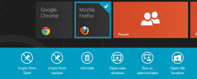
To add and remove desktop app icons from the Start screen, right-click them and then click “pin to Start.” Desktop apps can be pinned to and unpinned from the desktop taskbar and the Start screen from the desktop or from Metro, the first of many ways in which the two interfaces are integrated.
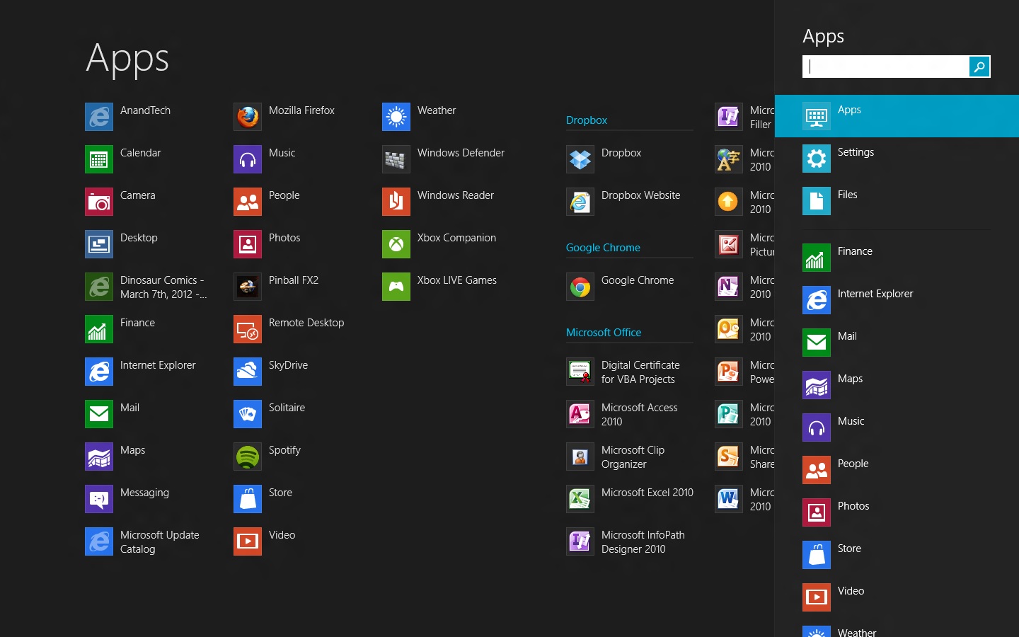
Windows Search can be invoked automatically from the Start screen if you begin typing. In Windows 8, there are three distinct search categories: Apps, which will display most Metro and desktop programs; Settings, which will search through the Metro and desktop control panels; and Files, which is self-explanatory. You can also search through any Windows Search-enabled Metro app, which you can see listed below the three main headings. I’d love to see a unified search group like we had in the Windows 7 Start menu, especially given the sometimes-blurry line between what appears in Settings and what appears in Apps, but search in Windows 8 is powerful and it’s fast, even using slower processors and mechanical HDDs.
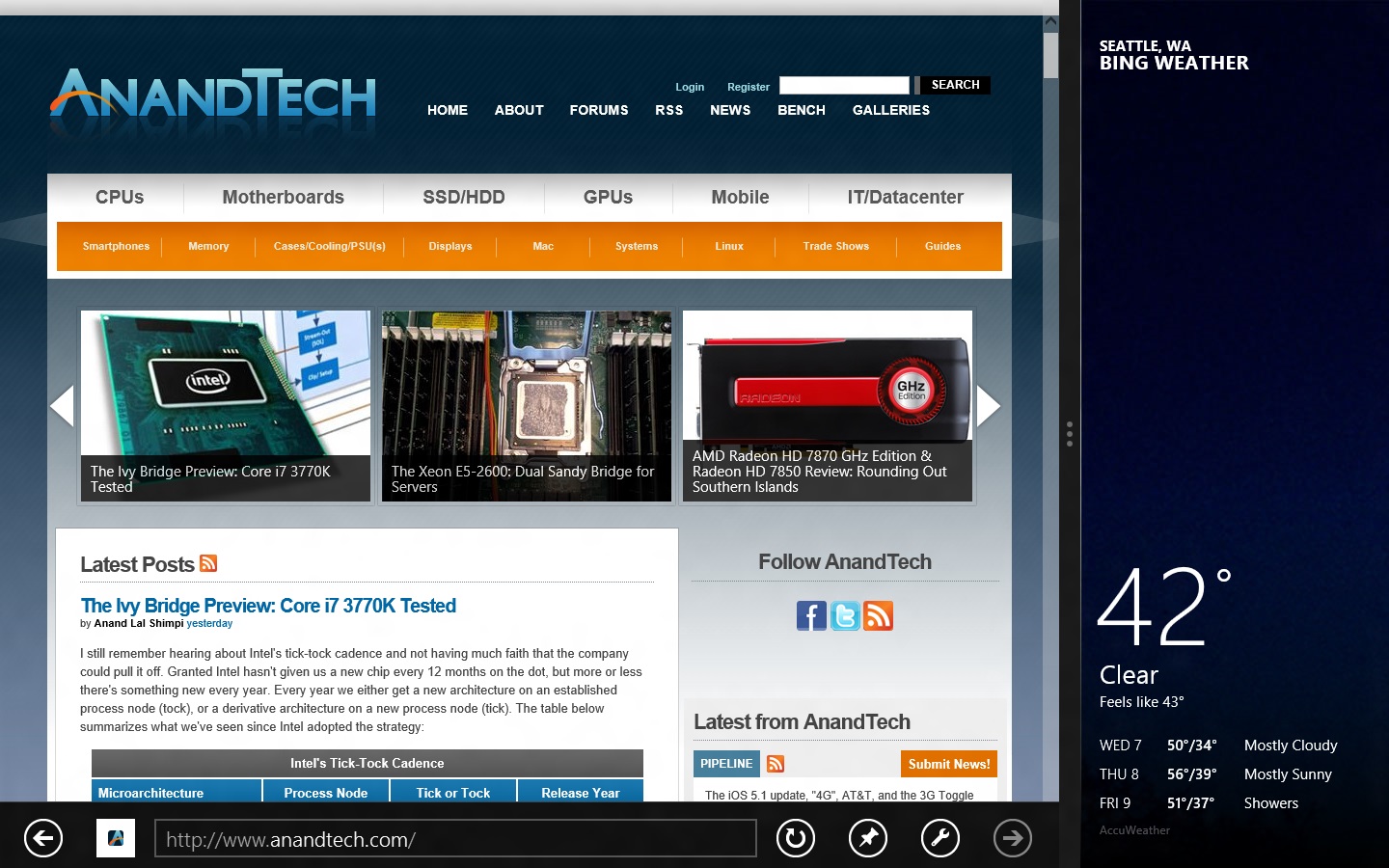
All Metro apps, including the desktop, can be “snapped” to the left or right edge of the screen, which lets one app use up about a fifth of the screen while another app uses the remaining space—I’ve seen this called “Metro Snap” and that’s how I’ll refer to it for the rest of the article. This is especially useful for things like Twitter or messaging clients that work well with a single vertical strip of screen space. Metro Snap will only work on panels that are 1366x768 or higher—anything smaller has too few horizontal pixels to make effective use of the feature—but the Windows desktop’s Aero Snap features will continue to work as they did in Windows 7.
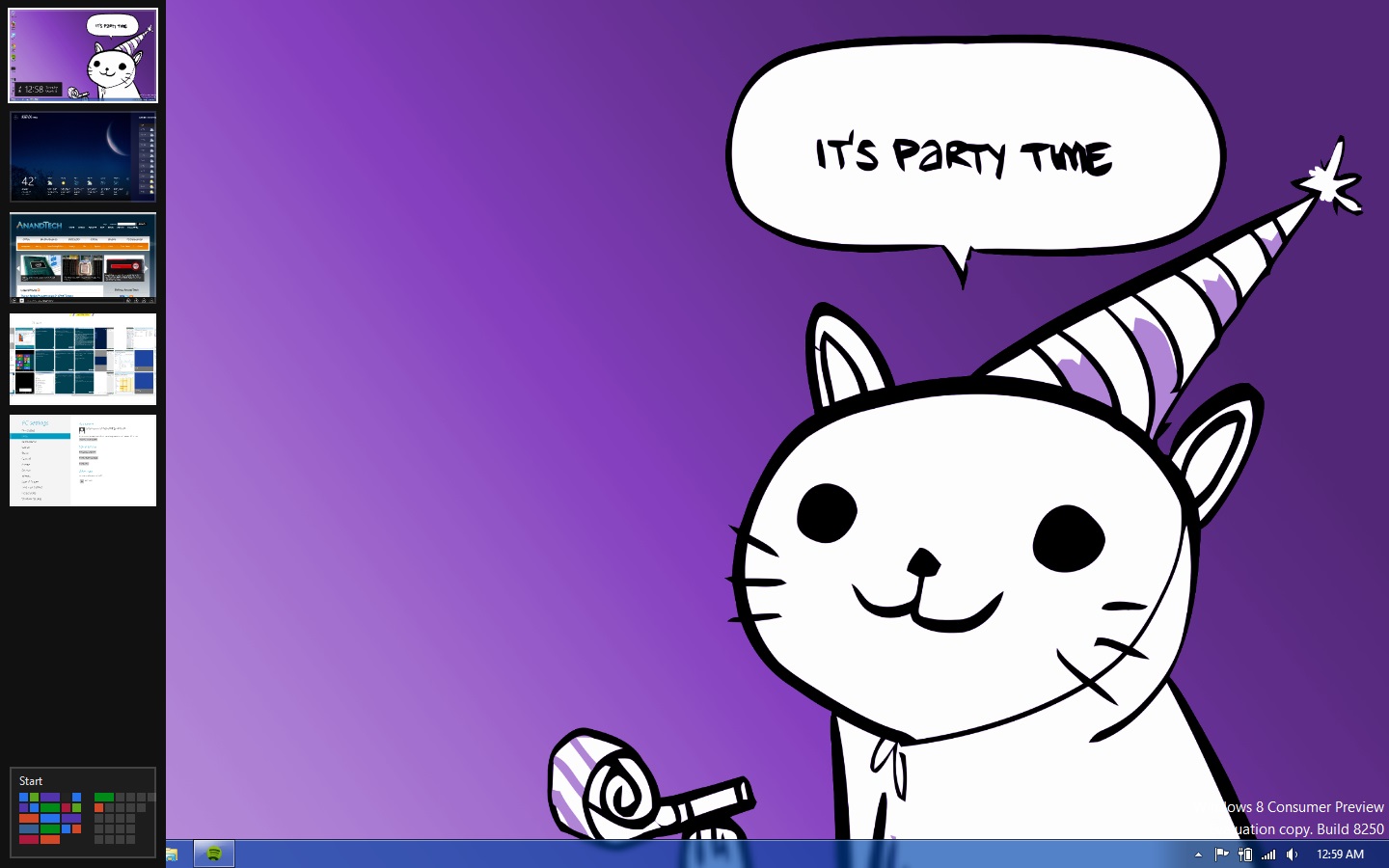
Party Cat knows when it is time to party. Also, the app drawer is on the left.
Metro has a few menus that can always be brought up no matter what app you’re using: the left edge of the screen is for an application drawer (above), which serves a function similar to the application switchers in iOS and Android. It shows all of your currently running apps and allows you to either switch to them from the currently running app or close them. The desktop will show up in the application drawer as a single item regardless of how many programs you have running on it, and while you can “close” it, this only makes the tile vanish from the drawer, and won’t close any of the programs running on the desktop.
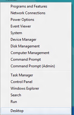
Update: Several readers have pointed out that right-clicking in the lower left corner of the screen brings up a mini-Start menu of sorts, where the Explorer, Search, the Run dialog box and several control panels can be accessed more easily. Thanks to all who sent this in!
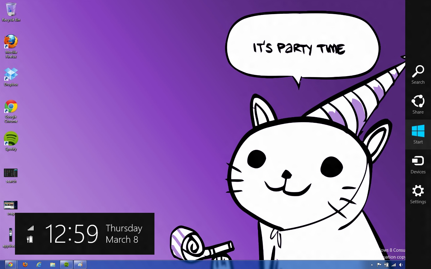
The right edge of the screen is for Charms (above), Microsoft’s name for the buttons that let you access several high-level settings and features. The Charms are, from top to bottom:
- Search, which brings up the Search menu (which, remember, can also be invoked by typing from the Start screen). The default search view is Apps.
- Share. While in a Metro app like Photos, you could use this charm to send a picture to someone using another Metro app like Mail.
- Start, which brings up the Start screen.
- Devices, which brings up attached devices like printers and extra monitors and gives you some configuration options for them—for instance, it will allow you to change your display settings if you’ve got a second monitor or projector attached, and it will bring up a Print menu if you click an attached printer. This charm is context-sensitive—if there’s nothing in your app to print (or if the app doesn’t support it), for example, any printers attached to your computer won’t show up in the menu as a selectable option.
- Settings. This brings up both general settings and options for the currently-running application as well as some system-wide settings like brightness, volume, notifications, language, network connectivity, and shutdown options. The “More PC Settings” link brings up the system-wide Metro control panel, where one can control things like the lock screen and Metro backgrounds, your PC’s refresh and reset functionality, and a few other settings.
Screen resolution requirements
As we’ve discussed, using Metro Snap requires a screen resolution of at least 1366x768, but there’s one more very important resolution requirement in Windows 8.
While working on my netbook, I quickly found that almost all Metro apps included in the Consumer Preview wouldn’t run on its 1024x600 display. After some research I found that, yes, Metro apps are only going to run on screens that are 1024x768 or higher. It’s important to give developers a minimum screen resolution to shoot for (and we may even see some tablets that use 1024x768 panels, given the precedent set by the iPad, the HP TouchPad, and others), but it means that users of PCs with smaller screens aren’t going to be able to use Windows 8’s defining feature (though the Start screen and system menus will still work just fine). This is too bad, since the limited amount of screen space on a netbook is a decent fit for Metro's simplified interface and full-screen apps.
Now that you know the basic features and layout of Metro, it’s time to teach you how to use it with a mouse and keyboard.


286 Comments
View All Comments
skanskan - Wednesday, March 14, 2012 - link
The task manager should also include a GPU resource monitor.It's been a long time since GPUs were introduced and we still need third party tools.
Oravendi - Wednesday, March 14, 2012 - link
Linux has allowed for different GUI managers for a long time. Why would Microsoft not offer Metro as a desktop option? Metro is probably better for tablets and cell phones, however if Microsoft were to produce software with the ability to turn Metro off then Metro might have slow or no adoption. Microsoft sees the money. It doesn't want the problems of software like Linux. Answer, force us to Metro and claim the old windows users don't want to change.Origin32 - Wednesday, March 14, 2012 - link
The problem I have with Metro is not that it's different.It's that its different while not adding anything for me as a desktop user. Yes, I'm sure this new interface is much easier to navigate on a tablet, but with M/K I have to click more rather than less to open the more advanced menus, I have to use two user interfaces simultaneously and I have to start to unlearn 10 years of keyboard shortcuts, options locations and all the kinds of things you do automatically in win7. Using Windows 8 will be a whole lot of effort for me, and Microsoft isn't really giving me anything in return for that effort. If they'd added something actually useful like support for multiple user logons on a SAMBA share in one session, a sandbox mode to try out new programs in or really any functionality at all, then I'd have to live with Metro.
Now all I get is a new GUI I sure didn't ask for.
jabber - Wednesday, March 14, 2012 - link
This is it for me too. I just don't get what it is they are trying to sell me here with regards to Metro.I don't get it MS, Sorry.
I've always upgraded my Windows versions due to improvements in performance, load times, functionality with new hardware and tech standards. Sure there are always a few UI changes but nothing that needs 5 minutes to get used to and on the whole they have been positive.
But with Metro there just isn't enough in the deal to make me want to bother using it.
I can get by fine without it. It isn't essential for those of us using desktops/laptops.
perpetualdark - Thursday, March 15, 2012 - link
Quite simply, the home market and the professional market are no longer driven off of each other, and need to diverge. In the past, the professional market drove the PC industry, and the OS was a reflection of that.Home use has grown to be a viable entity on it's own however, and the proof of that is Apple's success in the PC market. People at home want a computer that is media based, and focused around entertainment. Movies, Music, Social Media, and Home Integration are the keys there. They want their media, and they want it everywhere (at the computer, the tv, the laptop, the phone, in bed, in the bathroom, and in the kitchen). They want to be connected to their social media all the time, and have everything integrated into that.
Businesses don't need any of it, and it is all counterproductive to business. If anything, they want everything listed above to be GONE from the picture. Remove the games, the media, and the social aspects. Sharing needs to be tightly controlled, and the "cloud" is a fancy way of saying "security risk". Your boss doesn't want you listening to music, sharing it with others, or getting on facebook or skype to socialize, he wants you productive. Secure sharing of files, remote application use, tying together the office and the mobile workspace, communicating within the company and with the customers, and productive applications. It requires a COMPLETELY different interface because it has a completely different workflow.
Windows 8 is, on the surface anyway, a HOME version of the software. It is MS's attempt to slow Apple down on the home front. But aside from desktop publishing and education, Apple is not even in the business place, and although I couldn't give you numbers, I am willing to bet that the business market is still at least half of the revenues that MS sees in a year.
One more note: Look at Office. Millions of people knew all the ins and outs of Excel and Word, and then MS goes and changes the interface 100%. With NO way of going back. I resisted until recently, and after almost a year on office 2010, I hate it to this day. The ribbons suck, I can never find the things I am looking for, and they don't even have a basic paste function, they made it more complicated. Yeah, I can ctrl-v, but sometimes I want to right click and paste, not right click and hunt for the paste icon I am looking for. I hate icons. I want words. I speak english. If I want to paste special and choose to paste values, I want to right click, paste special, values, ok. I don't want right click and look for the icon that represents pasting values. I am literate, give me words, not icons that represent words. It is a disaster, and as a result, most companies still have Windows XP and Office 2003 installed. If it werent for so many viruses and malware targeting the weak security of XP, I would still have all my machines running on XP. I still run programs like Live Messenger in Vista mode so the icon goes in the tray and not on the bar. I don't understand why MS wants me to change so bad.. I don't want to change, I am more efficient the way I use it, so bugger off and leave me alone! I want my "up directory" button back, and I want the window button in excel back, so when I have 250 spreadsheets open (or even 2), I can switch without having to go to the right hand monitor and click on the excel icon and choose the window from there.. I just want to do it in excel. Come on, quit changing stuff just for the sake of changing..
shin0bi272 - Friday, March 16, 2012 - link
no... just no. Stop talking about stuff you know very little about. It just makes you look bad.Valahano - Friday, March 16, 2012 - link
Care to elaborate?slickr - Thursday, March 15, 2012 - link
Good job Andrew. After years of reading this website you with this obvious piece of propaganda have forced me from this moment on to stop visiting this website.This shameless advertising for this Microsoft crap of a operating system that they call windows 8 is sickening. How much did they pay you?
You people make me sick, at least be honest about it and write that you have been paid to write about their product in a positive way, I guarantee you people won't be too judgmental and will accept the fact that this website with its obvious bias for some time now has been loosing all its visitors and is forced to write propaganda articles for money!
Shinya - Thursday, March 15, 2012 - link
So basically because he likes something that you don't (even though he heavily criticized it) your limited brain capacity calculated that he was paid?Please stick with apple products iTard. Your lord n savior is waiting over at engadget.
shin0bi272 - Friday, March 16, 2012 - link
actually no hes right... if you look at what MS did with win8 its designed for tablets and they are violently forcing pc users to adapt the same gui that will be basically worthless to us and what does the author of this article say?"Yes, Metro is very different from what came before, and yes, Metro was clearly designed with touch in mind, but once you learn its tricks (and especially once you’ve got the new keyboard shortcuts dedicated to memory) it acquits itself as a flexible and powerful user interface."
Sucking up much?