In-Depth with the Windows 8 Consumer Preview
by Andrew Cunningham, Ryan Smith, Kristian Vättö & Jarred Walton on March 9, 2012 10:30 AM EST- Posted in
- Microsoft
- Operating Systems
- Windows
- Windows 8
Task manager
For the first time in memory, the Windows Task Manager has gotten a significant overhaul, and that doesn’t just refer to its new Metro-esque styling—Task Manager now combines functions from the old Task Manager, the Windows Resource Monitor, and MSConfig into a new, more useful app that provides a lot of information in a clean and simple way.
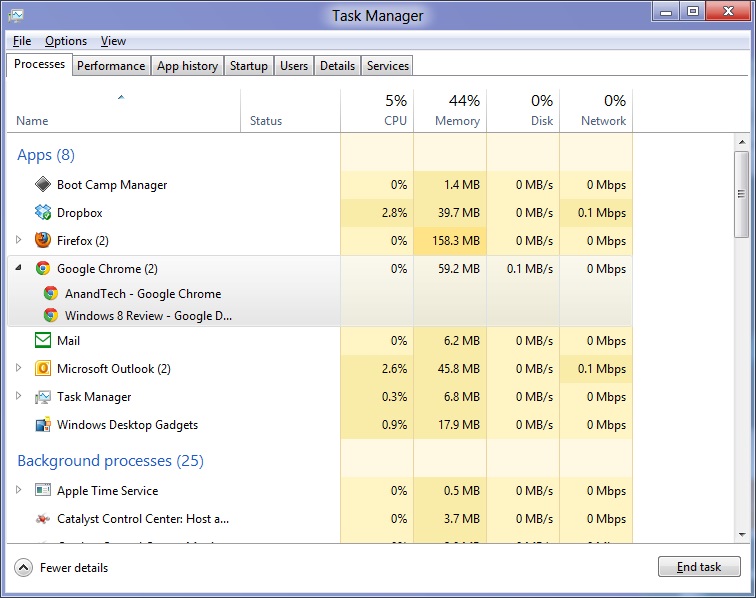
Open up the Task Manager and click “More Details” and the first thing you’ll see is the Processes tab, which gives you a clean list of all Metro and desktop apps running on your system and the resources they’re using—the new Task Manager tracks CPU, RAM, disk, and network bandwidth usage. You can see both absolute values (Firefox is using 164.7 MB of RAM) or in percentages (Firefox is using 8.9% of your RAM), and you can spot resource hogs at a glance—as you can see in the screenshot above, the colors in the Task Manager vary based on how much of a given resource a process is consuming. Apps, background processes, and Windows/system processes are each displayed under their own subheadings.
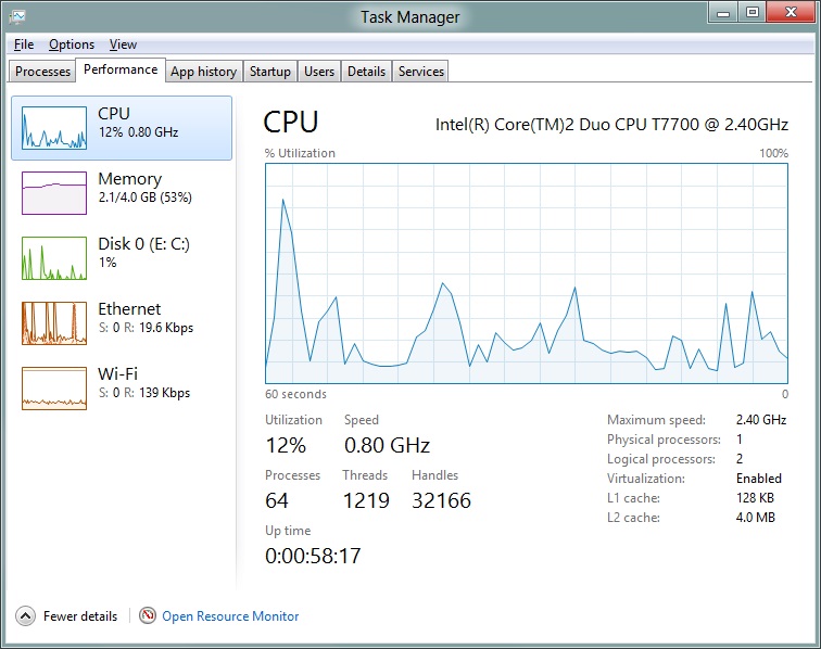
The Performance tab now tracks CPU, RAM, disk, and network usage, and it tracks each network interface separately for your convenience. The CPU graph can be configured to show activity on all cores combined or separately. You can view both graphs and hard numbers for each resource, and you can also see different information about your computer’s hardware—the current clock speed of your CPU, the number of RAM slots you have and how many are occupied, your current IPv4 and IPv6 addresses, and more. The Resource Monitor is still available if you need a more advanced view, but this tab alone drastically increases the Task Manager’s usefulness.
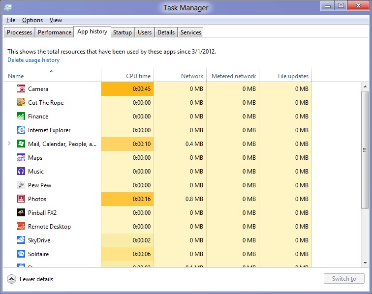
Next up, the App History tab shows statistics for resource usage over time. It’s mostly geared toward network usage, breaking out stats for how much data an app has used on both metered and non-metered networks, as well as how much bandwidth has been spent on keeping Metro live tiles up to date. It also gives you statistics for CPU time. App usage history can be deleted at any time if you’d like a fresh start.
The other tabs are pretty self-explanatory, so we’ll go through them quickly: the Startup tab shows a list of programs that launch when your computer starts. This functionality used to be handled by a combination of the “Startup” folder in the Start menu and a tab in the MSConfig.exe utility (which still exists, but is no longer used to control startup items). The Users tab shows resource usage broken out by logged-in users, much like in the old Task Manager, and will also allow administrators to disconnect users. The Details tab gives a complete unadorned list of all processes and their resource usage, while the Services tab shows all services on your computer whether they’re running or not—you can start, stop, or restart services from this tab, but you’ll have to go into the Services utility for more options.


286 Comments
View All Comments
rs2 - Sunday, March 11, 2012 - link
Seriously? I do not want either of those things.Please tell me that these are artifacts of running Windows 8 on a system with an underpowered graphics card, or at least that the rounded corners and "glass" effects simply have not been built in to the preview version.
Andrew.a.cunningham - Sunday, March 11, 2012 - link
Square windows here to stay, not a big deal. Windows borders can get more or less opaque depending on your settings, just like in 7.rs2 - Monday, March 12, 2012 - link
Maybe not a big deal, objectively speaking, but it feels like a step backwards to me. Between that and Metro I'm seriously considering just sticking with Windows 7. It does everything I need in a way that I like, with no trade-offs being made to support touch-based devices (which my desktop isn't).I'm starting to get the feeling that Microsoft could have another "XP vs. Vista" debacle on its hands, no? Back then I switched to Vista but never really felt that it was a significant improvement until Windows 7 came around. I didn't hate Vista or think that it was worse than XP the way a lot of people seemed to, but I wasn't really thrilled with it either. Windows 7 was an unquestionable improvement over both Vista and XP, however.
Perhaps this time I'll stick with "legacy" Windows 7 until Windows 9 comes out.
Andrew.a.cunningham - Monday, March 12, 2012 - link
Totally possible! Especially so in businesses, which move more slowly and are only now rolling 7 out over XP.The rounded vs. square corners thing is a matter of taste, I guess. It does seem to be showing up everywhere - Lion killed rounded buttons in favor of squared ones too. It's not important to me, but I suppose it is a little "old-school." :-)
AnnonymousCoward - Sunday, March 11, 2012 - link
Every new OS simply needs an option to use the old UI. That would take away the fundamental reason why users don't want newer OS's.I refuse to use anything beyond XP. Vista's and 7's Explorer is less functional, and other various UI functionality is different for the worse. Likewise, IE7/8/9 have a topbar that lacks real functionality and can't be customized, unlike IE6.
DanaGoyette - Monday, March 12, 2012 - link
Here are a couple of oddities I've noticed:* Start screen... If you try scrolling horizontally with a touchpad, absolutely nothing happens. In the developer preview, I had to read online to find out why the danged thing wouldn't scroll.
* Split-up search sucks.
Try this in Windows 7: Windows key -> "featu". So long as you don't have, say, "bluetooth feature pack" installed, you can just press enter to get to "Programs and Features".
Try it in Windows 8: Windows key -> Featu. Down, down, enter, enter. 4 key presses required to replace the original 'enter'.
* Start screen, another thing to try: Windows 7: search for something, then press the "context menu" key on the keyboard. You should get the right-click menu of the highlighted item. Windows 8: you get the right-click menu for the textbox you're typing in!
* The boot process seems weird on my Intel 320 SSD. After the initial disk activity, it sits there doing apparently nothing (no disk activity) for over 30 seconds. Effective boot time is around 60 seconds, not including POST. For comparison, resuming from hibernate to the login screen takes only about 4 seconds.
* You ever try it on a pen-only (Wacom) Tablet PC? It's worse than a mouse, because it seems to actively disable the screen corner gestures -- they don't work with the pen OR the touchpad on that system.
Now, for a nifty thing to try: right-click in the lower-left corner of the screen.
mbf - Monday, March 12, 2012 - link
Fixed that error on page 3 for you:"..Microsoft insists that the PC is just another kind of tablet..."
vivekgarg79 - Monday, March 12, 2012 - link
I have x86 (32 bit) m/c. I want to develop metro UI app, using VS2011 for windows 8. Will VS 2011 (x86) work on top of Windows 8 consumer preview (x86)??haplo602 - Monday, March 12, 2012 - link
I read the first 3 pages, then skipped to the conclusion. I realised I don't give a damn about any new Windows/Tiles version. Happy Linux camper since Windows XP.The UI change will be a big jump. It will be interesting to see the outcome.
iwod - Monday, March 12, 2012 - link
I couldn't believe how positive this review was, from a technical user prospective.And it surely prove M$ has little to no understanding of how UI should be designed. There is now Metro, and a half baked Desktop environment. I can see more user jumping on to Mac platform when Windows 8 comes out.
I think the root of all wrong doings; Tablet is just another PC. Which is where it all goes wrong.
P.S - I have been forcing Metro on myself for week now. I can definitely say it "could" be a great Tablet OS. Desktop? I will pass.